You've built what you think is the perfect app. The features work brilliantly, the design looks professional, and you've followed all the best practices. But when you launch it in the app store, something frustrating happens—users scroll right past it. They choose apps that look less polished, have fewer features, or cost more money. It makes absolutely no sense, and it's happening to thousands of app developers every single day.
The truth is, people don't make decisions the way we think they do. We assume users carefully compare features, read descriptions thoroughly, and make logical choices based on value. But that's not how the human brain actually works. Instead, our minds take shortcuts—little tricks that help us make quick decisions without getting overwhelmed by too much information.
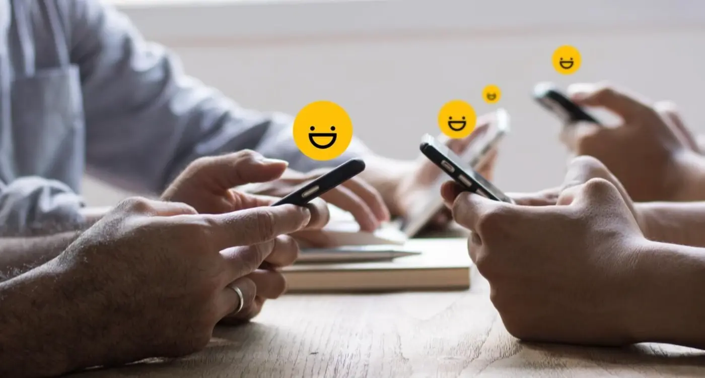
The most successful apps aren't always the best apps; they're the ones that understand how people's minds really work when making split-second decisions in the app store.
These mental shortcuts are called cognitive biases, and they shape every decision your potential users make about your app. From the moment someone sees your app icon to the second they decide whether to download it, their brain is using these hidden patterns. Understanding cognitive biases isn't about tricking people—it's about working with how their minds naturally function. When you align your app store strategy with ASO psychology, you're not just optimising for search algorithms; you're optimising for human behaviour. That's where the real magic happens in mobile app marketing, and it's exactly what we'll explore throughout this guide.
Understanding Cognitive Biases in Mobile Apps
After building hundreds of mobile apps over the years, I've learnt something that changed how we approach every single project—people don't make rational decisions about apps. Not even close! Your users are walking around with brains that take shortcuts, make assumptions, and jump to conclusions faster than you can say "download now". These mental shortcuts are called cognitive biases, and they're happening whether we like it or not.
Think about the last app you downloaded. Did you really spend ages comparing every feature? Probably not. You likely made that decision in seconds based on things like how many stars it had, whether it looked trustworthy, or if your mate recommended it. That's your brain using cognitive biases to make quick decisions without overloading you with information.
Why This Matters for App Development
When we're designing and marketing apps, we can work with these biases instead of against them. Your app store listing, your onboarding flow, even your app icon—they're all opportunities to align with how people's minds actually work. We're not trying to trick anyone; we're making it easier for users to make decisions they'll be happy with.
Common Biases We See Every Day
Some biases show up constantly in app behaviour. Here are the ones we encounter most:
- Social proof bias—people follow what others are doing
- Anchoring bias—the first piece of information shapes all other judgements
- Loss aversion—people hate missing out more than they love gaining something
- Availability bias—recent or memorable information feels more important
- Confirmation bias—people seek information that confirms what they already believe
Understanding these patterns isn't about manipulation—it's about creating apps that feel natural and intuitive to use. When you align your app with how people naturally think, everyone wins.
The Psychology Behind App Store Decisions
When users open the App Store, they're not making purely rational decisions. Their brains are working overtime, processing information through mental shortcuts that have developed over thousands of years. These cognitive biases shape every tap, swipe, and download decision they make—and understanding this psychology is what separates successful apps from the forgotten ones.
The first few seconds are absolutely critical. Users scan app listings the same way they'd glance at a shop window; they're looking for familiar patterns and quick signals that tell them whether something is worth their time. This is where the availability heuristic kicks in—people judge an app's quality based on the most easily recalled information, which is usually the icon, title, and star rating.
The Mental Shortcuts That Drive Downloads
Users rely on several key psychological triggers when browsing app stores:
- Visual hierarchy—their eyes naturally follow a Z-pattern across listings
- Pattern recognition—they look for familiar design elements that signal quality
- Loss aversion—free apps feel safer than paid ones because there's nothing to lose
- Confirmation bias—they seek information that supports their initial impression
Position your most compelling feature in the first line of your app description. Users spend less than 8 seconds scanning before they decide to read more or move on.
The Download Decision Process
The path from discovery to download isn't linear. Users bounce between screenshots, reviews, and descriptions, building confidence through multiple touchpoints. They're unconsciously asking: "Will this app solve my problem?" and "Can I trust this developer?" Your ASO psychology strategy needs to answer both questions within seconds, not paragraphs.
Smart developers structure their app store presence around these mental patterns rather than fighting against them. The goal isn't to manipulate users—it's to present information in a way that aligns with how their brains naturally process decisions.
Social Proof and User Reviews
When I'm working on app store optimisation for clients, there's one psychological principle that never fails to deliver results: social proof. It's simple really—people look to others to guide their decisions. If an app has thousands of five-star reviews, our brains automatically assume it must be good. This isn't laziness; it's how we've evolved to make quick decisions without analysing every detail ourselves.
User reviews are the most powerful form of social proof in app stores. They work because they feel authentic—real people sharing real experiences. But here's what most developers get wrong: they focus only on the star rating. The actual content of reviews matters just as much, if not more.
Making Reviews Work for You
Smart timing is everything when asking for reviews. We've found that requesting feedback right after users complete a positive action—like finishing their first successful task in the app—increases response rates significantly. People are more likely to leave positive feedback when they're feeling good about their experience.
The Psychology of Star Ratings
Something interesting happens with star ratings that most people don't realise. Apps with a perfect 5.0 rating can actually perform worse than those with 4.2-4.8 stars. Why? Because perfect ratings look fake. Users are naturally suspicious of anything that seems too good to be true—they want to see some negative reviews mixed in because it feels more honest.
The key is managing your review strategy actively, not just hoping good reviews will appear. Respond to negative feedback professionally, and you'll often see those one-star reviews updated to four or five stars. That responsiveness becomes social proof itself.
Anchoring and Price Perception
I've noticed something fascinating over the years working on mobile app marketing—people don't actually know what apps should cost. They rely on the first price they see to judge everything else. This is called anchoring, and it's one of the most powerful cognitive biases you can use in your app store strategy.
When someone lands on your app's store page, their brain immediately latches onto the first price it encounters. That becomes their anchor point. If they see a premium app priced at £9.99 first, then discover yours at £4.99, your app suddenly feels like excellent value. But if they've been browsing free apps all morning, that same £4.99 might seem expensive.
Strategic Price Positioning
This is where ASO psychology gets really interesting. You can actually influence how people perceive your app's value before they even see your price. If your app description mentions enterprise features or professional tools, users anchor their expectations higher. When they then see a reasonable price, it feels like a bargain.
The first price a customer sees doesn't just influence their purchase decision—it rewrites their entire perception of value in that moment
Freemium Psychology
Free apps with premium upgrades work brilliantly because they eliminate the initial price anchor completely. Users download without hesitation, then once they're invested in using your app, they encounter upgrade prices in a completely different mental context. They're no longer comparing against other apps—they're weighing the value of enhanced features against their current experience.
The key is understanding that pricing isn't just about covering costs or maximising profit. It's about cognitive positioning in your mobile app marketing strategy.
Scarcity and Urgency in App Marketing
When we're developing apps and planning their marketing strategies, one of the most powerful psychological tools we can use is creating a sense of scarcity or urgency. This taps into a basic human fear—missing out on something good. People naturally want things more when they think they might not be able to get them later.
In app stores, we see this working in several clever ways. Limited-time offers are probably the most obvious example; when users see "50% off for the next 48 hours" they're much more likely to download immediately rather than adding it to their wishlist. The fear of paying full price later pushes them to act now.
Creating Genuine Urgency
We've found that seasonal promotions work particularly well for this. Holiday sales, back-to-school offers, or summer fitness challenges all create natural deadlines that feel authentic to users. The key is making sure the urgency is real—fake countdown timers that reset every day will damage your credibility faster than you can say "app store rejection".
Scarcity That Actually Works
Scarcity works differently in the app world than with physical products. We can't really run out of digital downloads, but we can limit access in other ways. Beta testing programmes with limited spots, exclusive early access for the first 1000 users, or premium features available only to founding members all create that coveted sense of exclusivity.
The secret sauce here is balance—too much urgency and you look desperate, too little and users will happily download your app "later" (which often means never). We've learned that subtle pressure combined with genuine value creates the perfect environment for immediate action.
The Power of Visual Design Psychology
Your app icon sits alongside thousands of others in the app store, fighting for attention in a sea of colours, shapes, and text. What makes someone tap on yours instead of the competitor next to it? The answer lies in visual design psychology—a field that studies how our brains process and respond to visual information without us even realising it.
When I'm designing app store assets, I think about the split-second decisions users make whilst scrolling. Their brains are processing dozens of visual cues simultaneously: colour combinations, typography, imagery, and layout. Each element triggers subconscious responses that either draw users in or push them away.
Colour Psychology in Action
Different colours trigger different emotional responses and behaviours. Red creates urgency and excitement—perfect for fitness apps or games. Blue builds trust and reliability, which is why so many banking and productivity apps use it. Green suggests growth and health, making it ideal for wellness or finance apps.
Use contrasting colours for your app icon to make it stand out against both light and dark backgrounds in app stores.
Typography plays an equally important role in cognitive biases. Clean, simple fonts suggest professionalism and ease of use, whilst decorative fonts can imply creativity but might sacrifice readability. The size and weight of your text affects how users perceive the importance of different elements.
Visual Hierarchy and User Behaviour
Our eyes follow predictable patterns when scanning visual content. Most users read in a Z-pattern—top left, across to top right, diagonally down to bottom left, then across to bottom right. Smart app store optimization places the most important information along this natural eye path.
- Place your strongest selling point in the top-left corner of screenshots
- Use visual elements like arrows or contrast to guide the eye
- Keep important text away from areas where store badges might cover it
- Test your visuals at thumbnail size—that's how most users first see them
Building Trust Through Cognitive Shortcuts
Trust isn't something you can fake in the app world—believe me, I've seen plenty of developers try and fail spectacularly. Your users make snap judgements about whether to trust your app within seconds of seeing it, and they're using mental shortcuts to get there fast.
These shortcuts, called heuristics, help people make quick decisions without overthinking everything. When someone spots your app in the store, their brain is rapidly scanning for trust signals. A professional icon, clean screenshots, and a developer name that looks legitimate all trigger positive shortcuts. Miss these basics and you're fighting an uphill battle.
Visual Trust Signals That Work
The fastest way to build trust is through visual consistency. Your app icon should look like it belongs alongside the big-name apps users already trust. I'm not saying copy them—that's the opposite of what you want—but match their level of polish and professionalism.
Screenshots matter more than most developers realise. People use them to judge not just what your app does, but whether you care enough to present it properly. Blurry images or inconsistent design elements trigger distrust immediately.
Social Trust Shortcuts
Users rely heavily on social proof shortcuts when deciding whether to trust an app. They look for patterns that suggest other people like them have already made this choice successfully.
- High download numbers signal popularity and safety
- Recent positive reviews suggest active, satisfied users
- Developer responses to feedback show accountability
- Regular updates indicate ongoing commitment and security
- Clear contact information reduces perceived risk
The brilliant thing about understanding these shortcuts is that you can design your entire app store presence around them. When you make it easy for users to trust you quickly, they'll give your app the chance it deserves.
Conclusion
After spending years developing apps and watching countless clients struggle with app store visibility, I can tell you that cognitive biases aren't just academic theory—they're practical tools that can completely change your ASO psychology approach. We've covered how social proof influences download decisions, how anchoring affects price perception, and how scarcity creates urgency. These aren't tricks to fool users; they're ways to communicate value more effectively.
The beauty of understanding cognitive biases lies in how they work naturally with human behaviour rather than against it. When you position your app's price next to a premium competitor, you're using anchoring to highlight value. When you showcase genuine user reviews prominently, you're leveraging social proof to build confidence. These techniques work because they align with how our brains actually process information and make decisions.
Your mobile app marketing strategy doesn't need a complete overhaul to benefit from these insights. Start small—test different visual hierarchies in your app store listing, experiment with how you present pricing tiers, or adjust how you display user testimonials. The data will show you which approaches resonate with your specific audience.
What strikes me most about cognitive biases in app development is that they benefit everyone when used ethically. Users make better decisions when information is presented clearly, developers see improved conversion rates, and the app ecosystem becomes more efficient. Your app store strategy should feel natural to users whilst driving the business results you need—and understanding psychology helps you achieve both.