How Do You Build Buying Habits Into Your Mobile App?
Most mobile apps that make money do it through in-app purchases—not through the initial download. That's a massive shift from how things used to work, and it changes everything about how we need to design our apps. I mean, you can build the most beautiful app in the world but if people aren't actually buying anything through it, you've got a problem. A big one.
Here's what I've learned after years of building apps that actually generate revenue: buying isn't just about having a nice checkout button or making payments easy (though that helps, obviously). It's about understanding how people form habits and then designing your app to fit into those patterns. You know what? Most developers get this completely wrong—they focus on features and forget that people are creatures of habit. We do the same things, at the same times, often without even thinking about it.
The apps that succeed aren't just solving problems; they're becoming part of their users daily routines in ways that feel natural, not forced.
Think about the apps you use every day. The ones where you actually spend money. They probably don't feel pushy or sales-y, right? That's because the best apps build purchasing into the experience so smoothly that it feels like a natural next step rather than a transaction. And that's exactly what we're going to explore in this guide—how to design your app so that buying becomes a habit rather than a hurdle. We'll look at the psychology behind why people buy through apps, how to design onboarding that sets up purchase patterns from day one, and the specific techniques that turn one-time users into repeat customers. Its not about tricks or manipulation; it's about understanding human behaviour and designing with that knowledge in mind.
Understanding How People Form Habits
Right, let's talk about habits—because if you can understand how they actually form, you're halfway to building an app that people use regularly. And I mean properly use, not just download and forget about. The thing is, habits aren't mysterious at all; they're basically just loops that our brains create to save energy. Your brain loves shortcuts, it wants to automate as much as possible so it doesn't have to think about every single action you take throughout the day.
Here's the basic structure that every habit follows, and I've seen this play out in every successful app I've ever built:
- A trigger happens (something that tells your brain to start the behaviour)
- You perform an action (the actual thing you do)
- You get a reward (something that makes your brain happy)
- Your brain remembers this loop for next time
The key thing to understand is that habits form through repetition—but not just any repetition. Its repetition plus reward. If someone opens your app and gets what they need quickly, their brain notes that down. Do it again tomorrow? The connection gets stronger. By day seven or eight, you've started building a proper habit loop.
What makes mobile apps particularly good at habit formation is that we carry our phones everywhere. They're with us when we're bored, when we're waiting, when we're lying in bed. This constant proximity means you've got multiple opportunities each day to trigger your habit loop, which is way more than traditional products ever had. But here's where most apps get it wrong—they try to force the habit before theyve earned the right to be part of someone's routine. You can't just bombard people with notifications and expect them to form a positive association with your app; that's how you get uninstalled.
The Psychology Behind Mobile Purchases
Right, lets talk about what actually happens in someones brain when they buy something on their phone. Because its not the same as buying in a shop or even on a desktop computer—mobile purchases are their own beast entirely. The thing is, when people are on their phones they're usually doing something else at the same time; watching TV, waiting for a bus, lying in bed. Their attention is split, which means you've got maybe 3 seconds to convince them this purchase is worth making.
I mean, think about how you use your phone? You probably pick it up dozens of times a day without even thinking about it. That automatic behaviour is exactly what we want to tap into when building buying habits. Mobile purchases work best when they feel less like a big decision and more like a natural extension of what the user was already doing. The friction needs to be almost non-existent—every extra tap or form field gives someones brain time to say "actually, do I really need this?"
Here's the thing though; mobile screens are small and peoples thumbs get tired. If your buy button is tucked away at the bottom of a long page or requires three confirmation screens, you're basically asking people not to complete the purchase. The psychology here is simple—we want immediate gratification and our brains are wired to avoid effort wherever possible.
What Makes People Buy on Mobile
There are a few key psychological triggers that work particularly well on mobile devices:
- Scarcity—showing limited stock or time-limited offers creates urgency
- Social proof—seeing that other people bought something makes it feel safer
- Loss aversion—people hate missing out on something more than they enjoy gaining it
- Progress towards a goal—showing how close someone is to free delivery or a reward
- Familiar payment methods—Apple Pay, Google Pay and saved cards remove thinking time
The sweet spot for mobile purchases is under £30. Above that price point, people tend to switch to desktop or tablet where they feel more comfortable making bigger decisions. Design your mobile experience accordingly—push lower-value items and save recommendations for bigger purchases until theyre on a larger screen.
The Mobile Mindset Is Different
When people shop on mobile they're usually in what I call "snack mode"—quick, impulsive, driven by emotion rather than logic. Desktop shopping is "meal mode" where people compare prices across tabs, read reviews, sleep on decisions. Understanding this difference is absolutely critical. Your mobile app should make impulse purchases feel completely natural whilst still maintaining enough trust signals that people don't feel buyers remorse afterwards. Its a delicate balance, honestly, but when you get it right the conversion rates speak for themselves.
Designing Your Onboarding to Create Buying Patterns
Your onboarding experience is where buying habits are actually formed—not on your checkout screen. I mean, think about it. If someone downloads your app and has a confusing first experience, they're gone before you ever get a chance to show them what you're selling. Its that simple really.
The biggest mistake I see is apps that treat onboarding like a boring instruction manual. They show five screens explaining features nobody cares about yet, then dump the user into the main app hoping they'll figure it out. That doesn't work. What does work is getting users to their first "win" as quickly as possible—and making that win somehow related to the buying behaviour you want them to develop later.
Here's what I do with clients: we design onboarding that gets users to complete a small action that mirrors the purchase flow without actually requiring payment. So if you're building a food delivery app, don't start with account setup forms and feature explanations; get them browsing menus immediately, maybe even let them build a pretend order to see how it works. You're teaching them the muscle memory of ordering before they've spent a penny.
The other thing—and this is important—you need to collect the right information at the right time during onboarding. Don't ask for payment details on screen one (unless you're a subscription service where that's expected). But do ask for preferences, location, interests...whatever helps you personalise their experience straight away. When users see content that feels relevant to them within seconds of opening your app, they're far more likely to stick around long enough to develop those buying patterns you're after.
Using Triggers and Reminders Without Being Annoying
Right, let's talk about the elephant in the room—push notifications. I mean, we've all been there haven't we? You download an app and within hours you're getting bombarded with messages about offers you don't care about. It's bloody annoying and most people just turn off notifications or delete the app entirely. But here's the thing; when done properly, triggers and reminders are one of the most powerful tools for building buying habits into your mobile app.
The key is understanding the difference between being helpful and being intrusive. Good triggers are based on user behaviour and genuine utility, not just your desire to boost engagement metrics. If someone abandons their cart, sure—a gentle reminder after a few hours makes sense. But sending them three messages in one day? That's desperation and users can smell it a mile away.
Timing Is Everything
Actually, the best notifications are the ones users don't realise they needed until they receive them. I've worked on apps where we tested notification timing obsessively—and trust me, sending a food delivery reminder at 11:30am versus 1:00pm can make a massive difference to conversion rates. You need to study when your users are most receptive, which means looking at engagement patterns and understanding their daily routines.
The most effective triggers feel like a natural part of the user's routine rather than an interruption to it
Personalisation matters too, but it needs to be subtle. Use what you know about purchase patterns without being creepy about it. If someone buys coffee every Monday morning, a gentle reminder on Monday with a quick reorder option? Helpful. Mentioning their exact order history in the notification? A bit weird. And always—always—give users granular control over what notifications they receive. Let them choose categories, set quiet hours, adjust frequency. Its about respecting their space whilst still being there when they need you.
Building Trust Through Consistent User Experience
Right, lets talk about trust—because honestly, without it you've got nothing. I mean it. People won't hand over their money to an app they don't trust, and trust isn't built through fancy marketing or clever copy. Its built through consistency. Every single time a user opens your app, they're making a small decision about whether to continue using it or not; if the experience keeps changing or feels unreliable, they'll bounce.
I've seen brilliant apps fail because they kept changing their navigation structure or moving buttons around "to improve things". But here's the thing—users form mental models of how your app works. They learn where things are. When you mess with that, you're breaking their trust even if you think you're making improvements. Sure, sometimes changes are necessary, but they need to be introduced carefully with proper onboarding to explain whats different and why it matters to them.
Consistency isn't just about keeping buttons in the same place though. It's about performance too. If your app loads instantly on Monday but takes 10 seconds on Tuesday, users notice. If checkout works smoothly one day but crashes the next, you've just destroyed any buying habit you were building. People need to know what to expect every time they use your app—thats what creates the psychological safety that makes them comfortable spending money.
Key Areas Where Consistency Matters Most
- Visual design and layout staying recognisable across updates
- Loading times remaining stable regardless of time or day
- Payment flows working exactly the same way each time
- Error messages being clear and helpful consistently
- Customer support response times being predictable
- Product availability information being accurate and up-to-date
And you know what? The apps that nail this consistency thing are the ones that become part of peoples daily routines. They dont even think about using them anymore—they just do. That's when you've really succeeded in building a buying habit, because the trust is so strong that making a purchase feels as natural as opening the app itself.
Reward Systems That Actually Work
Right, lets talk about rewards—because I've seen so many apps get this completely wrong and its honestly painful to watch. You know what the biggest mistake is? Copying whatever gamification system some other app is using without thinking about whether it actually makes sense for your users. Points, badges, leaderboards...sure, they can work, but only if they're aligned with what your users actually care about.
The thing is, rewards need to feel earned but not out of reach. Too easy and they lose all meaning; too hard and people give up before they even try. I mean, if you're asking someone to make 50 purchases before they get anything meaningful back, you've already lost them. But here's where it gets interesting—rewards don't always have to be discounts or free stuff. Sometimes early access to new products works better. Sometimes its just recognising someone as a VIP customer. The reward needs to match what drives your specific audience.
Types of Rewards That Drive Purchases
From what I've seen working across different industries, these reward structures tend to perform best:
- Instant gratification rewards (small discount on next purchase immediately after completing one)
- Progress-based systems where users can see exactly how close they are to their next reward
- Tiered loyalty programmes that unlock better perks as users spend more
- Surprise rewards that appear unexpectedly after certain behaviours
- Social rewards like exclusive community access or referral bonuses
Variable Reward Schedules Work Best
Here's something I've tested extensively—variable rewards beat predictable ones almost every time. If users know they'll get 10% off every fifth purchase, that's nice but it doesn't create the same psychological pull as occasionally surprising them with something special. Mix predictable rewards (like points per purchase) with unexpected bonuses and you'll see much higher engagement. Just don't make it so random that people cant see any pattern at all, because then it feels arbitrary and people stop caring.
Test your reward thresholds carefully. If you're seeing lots of users getting 80% of the way to a reward and then dropping off, your threshold is probably too high. Drop it by 20-30% and watch what happens to completion rates.
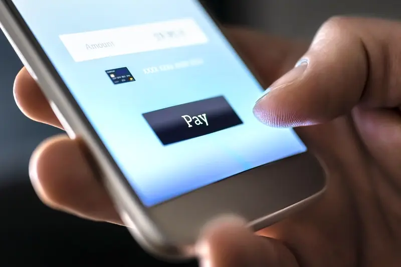
Reducing Friction in the Purchase Journey
Every extra step between "I want this" and "I've bought this" is a chance for someone to change their mind. I mean, we've all done it—added something to a basket, then got distracted by a poorly timed login screen or a checkout form that asks for your inside leg measurement. Its maddening really, and yet I still see apps making these same mistakes.
The best purchasing experiences feel almost invisible; they happen so quickly that users barely register they've completed a transaction. One-click purchasing was a proper revolution when Amazon introduced it, and mobile apps need to aim for that same level of simplicity. But here's the thing—reducing friction isn't just about speed, its about removing any moment where a user has to stop and think "wait, what do I need to do here?"
Common Friction Points That Kill Conversions
Let me walk you through the biggest culprits I see when reviewing purchase flows. These are the moments where users drop off, where they abandon baskets, where they uninstall apps and never come back:
- Forcing account creation before allowing a purchase—let people buy as guests first, then ask them to save their details
- Long checkout forms that ask for information you don't actually need (do you really need their date of birth?)
- Payment methods that don't match user preferences in that market—no Apple Pay in a UK app is a red flag
- Unexpected costs appearing at the last minute, particularly delivery fees that weren't mentioned earlier
- Poor error messaging that doesn't tell users what went wrong or how to fix it
- Loading screens that take more than two seconds between steps
Making Checkout Actually Work
Payment integration is where a lot of apps fall flat. You need to support the payment methods your users actually want to use, not just what's easiest for you to implement. In my experience, offering Apple Pay and Google Pay as options can increase conversion rates by 15-20% because they remove the need to type in card details on a tiny keyboard. Autofill is brilliant when it works, but it doesn't always work—so give people the path of least resistance.
Address entry is another massive pain point. If you're shipping physical products, use address lookup APIs that let people start typing their postcode and select from a list. It's faster, its more accurate, and it feels modern. Nobody wants to fill out six form fields when three taps could do the job.
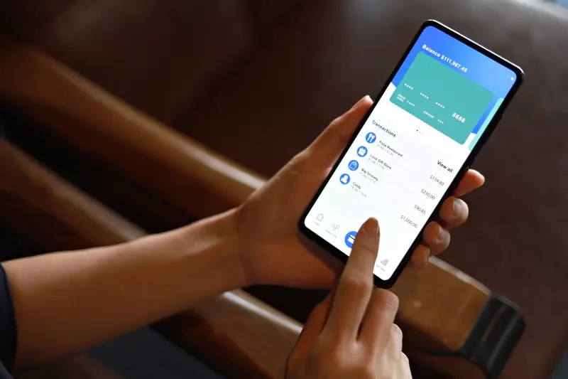
Making Repeat Purchases Feel Natural
The thing about repeat purchases is they shouldn't feel like purchases at all—they should feel like the obvious next step. I've worked on shopping apps where users bought something once and never came back, and I've worked on apps where people make purchases weekly without even thinking about it. The difference? Its all about removing the mental effort required to make that second, third, or tenth purchase.
One of my clients in the beauty space was struggling with this exact problem; they had decent first-time conversion rates but terrible repeat purchase numbers. Turns out their checkout process required users to re-enter payment details every single time, even though they'd bought from the app before. Mad, right? We implemented a proper saved payment system and—surprise surprise—repeat purchases jumped by 47% in the first month. People aren't lazy, they just don't want unnecessary friction when they're ready to buy something.
The best purchasing experience is the one your users don't have to think about
Create Purchasing Routines
Think about how people buy their morning coffee. They don't agonise over the decision each day—they just do it because its part of their routine. Your app needs to fit into existing routines rather than trying to create entirely new behaviours from scratch. If you're building a food ordering app, make it dead simple to reorder last week's favourite meal. If you're selling fitness equipment, remind users when its time to restock their protein powder based on their actual usage patterns.
Make The Path Shorter Each Time
Every purchase a user makes should teach your app something about what they want next. Use that information to make future purchases faster and more relevant. Show them products similar to what they've bought before, remember their preferences, and don't make them jump through the same hoops twice. A customer who's already bought from you three times doesn't need the same hand-holding as a first-time buyer.
Conclusion
Building buying habits into your app isn't about tricking people or using dark patterns—its about creating genuine value that makes people want to come back. I've seen too many apps fail because they focused on short-term conversions instead of long-term relationships with their users. The ones that succeed? They understand that habit formation is a marathon, not a sprint.
Here's the thing; every element we've discussed works together. Your onboarding sets expectations, your triggers bring people back at the right moments, your reward systems make them feel good about their choices, and reducing friction means they actually complete those purchases. But none of this matters if you don't start with a product that genuinely solves a problem people care about. I mean, you can't habit-engineer your way out of a bad product.
The apps I've built that perform best are the ones where buying feels like a natural extension of the user experience—not an interruption or an afterthought. When someone opens your app and thinks "oh yeah, I need to order more of that thing" without any conscious effort, that's when you know you've done your job properly. It happens because you've removed the mental burden of remembering, deciding, and acting.
Start small. Pick one or two areas from this guide and focus on getting those right before moving on. Maybe its your onboarding flow, or perhaps you need to rethink how you're using push notifications. Test everything, measure what actually works for your specific audience, and don't be afraid to change direction if something isnt working. The data will tell you what your users need—you just have to listen to it.
Share this
Subscribe To Our Learning Centre
You May Also Like
These Related Guides
How Do You Build Trust In A New Financial App?

How Do You Design Habit-Forming Mobile Apps That Users Love?