What Makes Users Trust a New App Within Seconds?
You've just spent months building an app. The design looks sharp, the functionality works perfectly, and you're confident it solves a real problem—but then you launch it and watch as users download it, open it once, and never come back. Its happened to more clients than I care to count, and honestly? The issue usually comes down to trust. Or rather, the lack of it.
Here's the thing—users make snap judgements about apps within the first few seconds of opening them. I mean literally seconds. They're scanning for signals that tell them whether your app is safe, professional, and worth their time. Miss those signals and they're gone, probably forever. And getting them back? Good luck with that; user acquisition costs are high enough without having to re-engage people who've already deleted your app.
I've seen this play out hundreds of times across different projects. An app might have incredible features buried three screens deep, but if the first impression doesn't communicate trustworthiness immediately, users will never stick around long enough to discover them. They won't give you the benefit of the doubt. Why would they when there are millions of other apps competing for their attention?
Trust isn't something you can add at the end of development—it needs to be baked into every decision from the very first screen a user sees
The tricky bit is that trust signals aren't always obvious. They're not just about having a padlock icon or a privacy policy link (though those help). Trust is built through dozens of small design choices, from how you handle permissions to how fast your app loads to the tone of your onboarding copy. Get these right and users will feel confident engaging with your app. Get them wrong and... well, you know what happens.
Why First Impressions Matter So Much
You know what? People make snap judgements about apps in the first 3-10 seconds of opening them. It's a bit mad really, but that's just how our brains work—we decide almost instantly whether something feels trustworthy or not. I've built apps that were technically brilliant but failed because they didn't nail this critical moment, and I've seen simple apps succeed because they got it right from the start.
The thing is, users dont give second chances like they used to. When someone downloads your app, they're already slightly skeptical (they've been burned before by apps that promised the world and delivered rubbish). So you've got this tiny window to prove you're different, that you're worth their time and attention. Miss that window and they'll delete your app without a second thought.
Here's what happens in those first few seconds—your app is being judged on multiple levels simultaneously:
- Does it look professional and well-made?
- Does it load quickly without crashes or weird behaviour?
- Are the first screens clear about what the app actually does?
- Does it ask for permissions in a way that feels reasonable?
- Do the visual elements match what was promised in the App Store listing?
And this is the kicker—users are comparing your app to the best apps theyve ever used, not to your competitors. They expect the same level of polish as Instagram or Spotify, regardless of whether you're a startup with three people or a massive company. Fair? Not really. But thats the reality we're working with.
I mean, the data backs this up too; most apps lose 77% of their daily active users within the first three days after install. That's not because the core functionality is bad—it's usually because the first impression didn't convince users to stick around long enough to discover the value. Getting those first seconds right isn't just nice to have, its everything.
Visual Design Elements That Build Instant Trust
Right, lets talk about what people actually see when they open your app for the first time—because this is where trust gets built or destroyed in seconds. I've seen beautiful apps fail because they looked cheap or unprofessional, and I've seen simple apps succeed because they got the visual basics spot on. Its not about being the flashiest app in the store; it's about looking like you know what you're doing and that users can rely on you.
The colour palette you choose says more than you think. Financial apps using bright neon colours? That's going to make people nervous. Healthcare apps with aggressive reds everywhere? Same problem. But here's the thing—you don't need to be boring. Blue and white might be safe for banking apps, but what matters more is consistency and intentionality. When your colours feel random or clash with each other, users sense that lack of attention to detail and they start questioning everything else about your app.
The Elements That Actually Matter
Typography is something most people don't consciously notice, but they definitely feel it when its wrong. Using too many different fonts makes your app look like a ransom note (not great for trust!). System fonts or well-chosen professional typefaces tell users you've put thought into the experience. Readable text sizes matter too—if I'm squinting to read your terms of service or button labels, I'm already doubting whether you understand mobile design at all.
White space is your friend here. Apps that cram everything onto the screen look desperate and overwhelming. Give elements room to breathe. It shows confidence and makes everything more scannable, which users appreciate when they're trying to decide if they can trust you or not.
Visual Consistency Builds Confidence
This is where a lot of apps fall down actually. Your buttons should look like buttons throughout the entire app—not rounded in one section and square in another. Your icons need to follow the same style. When visual elements are inconsistent, it signals that maybe the app was rushed or built by people who don't care about quality... and if you don't care about quality in the design, why would users think you care about security or their data?
Use a design system from day one, even if its just a simple style guide with your colours, fonts, and button styles documented. This keeps your app looking professional as you add new features.
Professional imagery makes a massive difference too. Stock photos that look obviously fake or low-resolution images hurt your credibility immediately. I mean, we all know those generic business photos with people pointing at laptops and grinning unnaturally—they scream "we didn't invest in this properly." If you're going to use images, make sure they're high quality and relevant to what you're actually offering.
Here are the core visual elements that directly impact trust:
- Consistent colour scheme that matches your brand and industry expectations
- Professional typography with clear hierarchy and readable sizes
- High-quality images or illustrations that feel authentic and relevant
- Proper spacing and layout that doesn't feel cluttered or chaotic
- Icons and buttons that follow a unified visual style
- Smooth animations that feel intentional, not just decorative
- Clear visual feedback when users interact with elements
One last thing people overlook—your app icon and splash screen set expectations before users even get inside. If your icon looks like it was made in five minutes or your splash screen takes forever to load with no indication of progress, you've already planted seeds of doubt. That first visual impression starts before the app fully opens, so don't neglect those early touchpoints just because they seem small.
Permission Requests and Privacy Signals
Right, lets talk about permissions—because this is where most apps completely blow their chance at building trust. I've seen apps ask for access to your camera, location, contacts and microphone all within the first 30 seconds of opening them. Its mad really. Why would anyone say yes to that? You wouldn't invite a stranger into your home and immediately hand them your photo albums and address book, would you?
The timing of permission requests matters more than most developers realise; actually, I'd say its one of the biggest mistakes I see across the board. When someone opens your app for the first time, they don't trust you yet—they're still deciding whether you deserve their time and attention. Hitting them with permission popups before they've even seen what your app does is like asking someone to marry you on the first date. And here's the thing, once someone taps "Don't Allow" on iOS, getting them to change their mind requires navigating through Settings, which most people will never bother doing.
When to Ask for Permissions
The best approach? Wait until the exact moment when someone needs that feature. If your app has a photo sharing function, ask for camera access when they tap the camera button—not before. This creates what we call "contextual permission requests" where the user understands why you need access because they're actively trying to use that feature. Makes sense, right?
Being Honest About Data Usage
Privacy signals go beyond just permissions though. Users are paying attention to things like whether you have a clear privacy policy (written in plain English, not legal jargon), what data you collect, and crucially—what you do with it. Since the iOS privacy labels became mandatory, people can see exactly what data an app collects before they even download it. I mean, transparency isn't optional anymore.
Here's what builds trust from a privacy perspective:
- Only ask for permissions when theyre actually needed for a specific feature
- Explain clearly why you need each permission before the system popup appears
- Offer alternative ways to use the app if someone denies a permission
- Keep your privacy policy accessible and written for humans, not lawyers
- Be upfront about any data sharing with third parties
- Give users control over their data with easy-to-find settings
One thing I've noticed is that apps which take privacy seriously—really seriously, not just paying lip service to it—tend to have better retention rates. People feel safer, and when people feel safe they stick around longer. It's that simple, basically.
The Critical Role of Loading Speed
Right, let's talk about something that genuinely makes or breaks user trust in those first few seconds—loading speed. I mean, you could have the most beautiful app in the world, but if it takes more than a couple of seconds to load, users will assume something's wrong. They'll think your app is broken, or worse, that you don't know what you're doing.
Here's the thing about loading speed and trust; they're more connected than most people realise. When an app loads quickly, it sends a signal that the company behind it is competent and professional. A slow loading app? That immediately raises questions about whether the rest of the experience will be just as clunky. Studies show that if an app takes longer than 3 seconds to become usable, nearly half of users will abandon it. Three seconds! That's barely enough time to decide if you want tea or coffee.
Every second of delay in loading time directly correlates to users questioning whether they can trust this app with their time, data, and attention
What I've seen over the years is that loading speed acts as a proxy for overall quality in users minds. Fast loading suggests good engineering, proper testing, and attention to detail—all trust signals that happen subconsciously. Slow loading suggests the opposite, regardless of what your app actually does once its finally ready. The technical bits matter too; optimising image sizes, lazy loading content, and showing progress indicators all help, but the goal is simple—get users to something useful as quickly as possible. Because in those first moments, speed isn't just a technical metric, its a trust signal that tells users whether you respect their time.
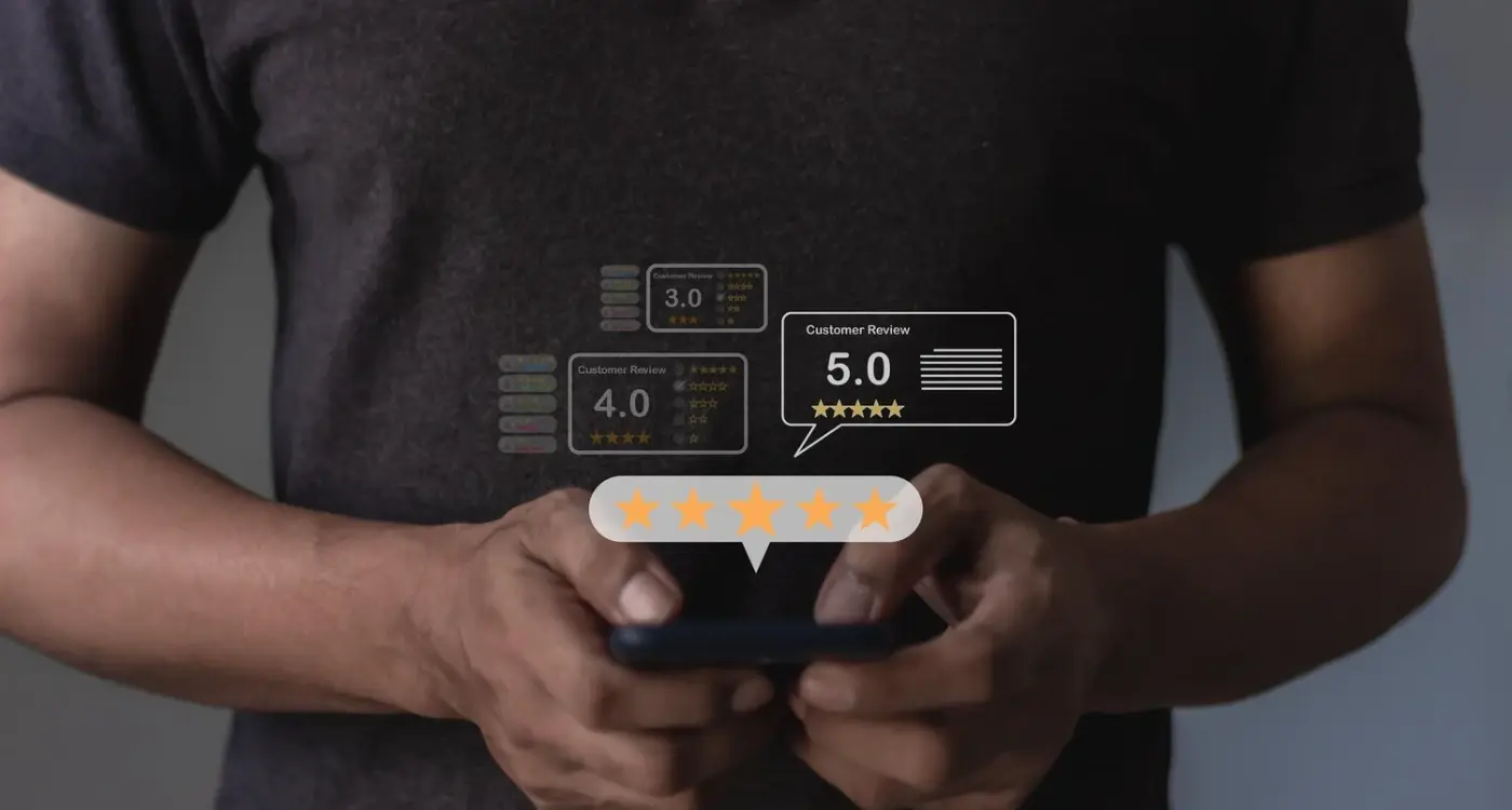
Social Proof and Recognition Badges
Here's the thing—when you launch an app, nobody knows who you are. Its that simple really. But if you can show users that other people trust you, or that recognised organisations have verified your app, suddenly everything changes. I mean, we see this all the time in the apps we build; adding the right trust signals can actually make or break those first few seconds of user interaction.
Social proof works because humans are naturally inclined to follow what others are doing. If your app has 50,000 five-star reviews, that tells a new user something important—lots of people tried this and didn't hate it enough to leave a bad review! But here's where it gets interesting...the type of social proof you display matters just as much as having it in the first place.
Trust Signals That Actually Work
From what I've seen building apps across different industries, these are the trust indicators that genuinely move the needle:
- App store ratings displayed prominently (but only if they're above 4.0—don't shoot yourself in the foot)
- Number of downloads or active users, though be careful with this one; if the number's too low it can backfire
- Security certifications like ISO 27001 or SOC 2 compliance badges for B2B or fintech apps
- Media mentions from publications your target audience actually reads
- Awards from recognised industry bodies, not those "pay to win" badges you can buy online
- Client logos if you're a B2B app—seeing familiar company names creates instant credibility
Getting the Balance Right
One mistake I see constantly? Apps that go overboard with badges and logos, turning their interface into a chaotic mess of trust signals. Honestly, three to five well-chosen indicators work better than twenty mediocre ones. And please, don't make up fake reviews or inflate your numbers; users aren't stupid and they will spot it. The app stores have gotten really good at detecting review fraud too, so its genuinely not worth the risk to your entire app listing.
Clear Communication During Onboarding
I've watched thousands of users go through onboarding flows over the years, and here's what I've learned—people abandon apps the second they feel confused. Not frustrated, not annoyed... confused. There's a difference. When someone doesn't understand what they're supposed to do next or why they're being asked for information, they just close the app and forget about it. And here's the mad bit—most developers dont even realise its happening because there's no error message, no crash report, just silence.
The best onboarding experiences I've built use simple, direct language that explains exactly what's happening at each step. "We need your email address to send you a confirmation code" is miles better than just having an email field with no context. People want to know the why behind every action you're asking them to take. And honestly? They deserve to know. Every piece of information you collect, every permission you request, every step in your process needs a clear explanation that makes sense to someone whos never seen your app before.
One thing that works really well is progressive disclosure—showing people information only when they need it rather than dumping everything on them at once. Guide users through one task at a time; let them complete something successfully before moving on. Success breeds confidence, and confident users trust your app more. I mean, it sounds obvious when you say it out loud, but you'd be surprised how many apps try to explain everything in the first thirty seconds.
Use a progress indicator during onboarding so users know how many steps remain. Nobody likes feeling trapped in an endless process, and visibility of the finish line dramatically improves completion rates.
The language you use matters more than most people think. Avoid technical jargon, industry terms, or clever copy that requires interpretation. This isn't the place to show off your writing skills—its the place to be crystal clear about what you need and why. Short sentences work best. Questions can help too? They engage people and make the experience feel more conversational rather than like filling out a form. But keep them simple and don't overdo it; too many questions makes people feel like they're being interrogated rather than welcomed into your app.
Security Features Users Actually Notice
Here's the thing—most security features are invisible to users, and that's actually a problem when you're trying to build trust in those first few seconds. People want to feel safe, but they need visible proof that you're taking their security seriously. Its not enough to just have good security; you need to show it in ways that matter to regular people who aren't tech experts.
The lock icon in your app's login screen is one of those small details that actually registers with users. Same goes for that little message saying "Your data is encrypted" during sign-up—it might seem basic but I've seen user trust scores jump just from adding these visual cues. Biometric login options (fingerprint or face recognition) are particularly powerful because they're both secure and convenient, which is a rare combination. When users see you support Face ID or fingerprint login, they immediately assume your app is modern and takes security seriously.
Security Indicators That Build Confidence
Two-factor authentication is another feature that users notice and appreciate. But here's where most apps get it wrong—they make it feel like a burden rather than a benefit. The key is positioning it as optional protection rather than a mandatory hassle. Let users know its there for when they want extra security; dont force it on them during their first session.
- Visible encryption badges or icons during sensitive operations
- Clear privacy policy links that are easy to find (not buried in settings)
- Biometric authentication options presented early
- Two-factor authentication offered as an optional extra layer
- Session timeout notifications that explain why you're logging them out
- Password strength indicators that actually help users create better passwords
What Users Ignore vs What They Notice
I mean, you can have the most sophisticated security infrastructure in the world, but if users dont see any evidence of it, it wont help build trust. Actually, the opposite is true too—displaying too many technical security certifications can overwhelm people and make your app feel complicated. The best approach? Show security features at the moments when users are actively thinking about safety, like during login, payment, or when handling personal information.
Conclusion
Building trust in those first few seconds isn't about fancy tricks or manipulating users—its about respecting them and their time. I mean, when you think about it, trust is really just the sum of dozens of small decisions you make during development; each permission request, every loading screen, the way you handle errors, how transparent you are about data usage. Get these right and users will give you a chance. Get them wrong and they'll delete your app before you even know they existed.
The thing is, most developers focus on features and forget about feelings. But here's what I've learned after building apps for so many different clients across different industries—people make decisions based on how an app makes them feel, not its feature list. That polished visual design, that clear explanation of why you need camera access, that instant response when they tap a button? These aren't nice-to-haves anymore, they're the baseline for entry into peoples lives.
You know what? Trust signals don't need to be complicated. Actually, the simpler the better. Show them you've thought about their security. Explain what you're doing and why. Load quickly. Look professional. Use social proof when you have it. Be honest when you don't. These basics will get you further than any clever growth hack ever could.
The apps that succeed long-term are the ones that earn trust immediately and then keep earning it every single day through consistent, respectful behaviour. Its not a one-time thing—trust is something you build continuously. And honestly, if you cant get users to trust you in those first few seconds, you wont get the opportunity to build anything at all. So make those seconds count, because you really only get one shot at a first impression.
Share this
Subscribe To Our Learning Centre
You May Also Like
These Related Guides
Why Do Most Social Media Apps Fail?
What Psychological Barriers Block App Adoption?