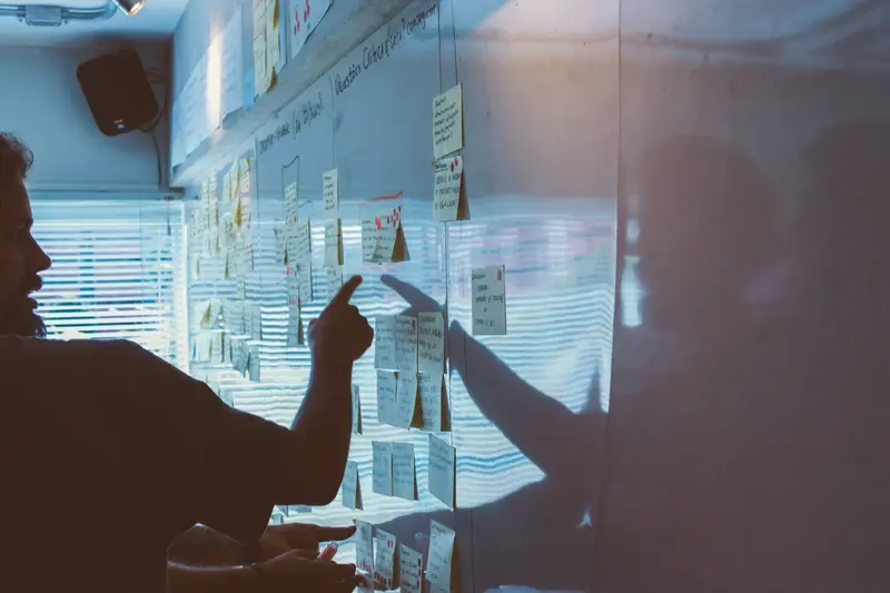
Which Features Should I Add First When Users Ask for More?
Your app is doing well. Users are engaged, downloads are steady, and then it happens—the feedback starts pouring in. "Can you add dark mode?" "What about offline sync?" "We need better filters!" Suddenly you're drowning in feature requests, and every single one sounds reasonable. But here's the thing: saying yes to everything is the fastest way to kill your app's focus and blow your development budget.
I've watched countless apps lose their way because they tried to be everything to everyone. They started with a clear purpose, but after months of adding "just one more feature," they became bloated, confusing messes that nobody wanted to use. The cruel irony? Most of these features were requested by users who genuinely thought they'd love them.
The graveyard of failed apps is full of products that had every feature users asked for, but none of the features they actually needed.
Feature prioritisation isn't just about picking the shiniest requests from your feedback pile. It's about understanding the difference between what users say they want and what will actually make your app more successful. Some features seem small but create massive technical debt. Others look expensive but can transform your entire user experience.
In this guide, we'll walk through a practical system for deciding which features deserve your attention first. You'll learn how to spot the difference between vocal minorities and genuine user needs, how to calculate the real cost of new features, and most importantly—when to say no to good ideas. Because sometimes the best thing you can do for your app is resist the urge to add just one more button.
Understanding What Users Really Want vs What They Say
Here's the thing about user feedback—it's absolutely necessary but often misleading. I've lost count of how many times clients have come to me with a list of "must-have" features their users requested, only to build them and watch usage drop off a cliff. Users are brilliant at identifying problems but terrible at prescribing solutions.
When someone says "I need a dark mode" what they might actually mean is "this app hurts my eyes at night." When they ask for "more customisation options" they could be saying "I can't find what I need quickly." The real skill isn't collecting feedback—its translating what people say into what they actually need.
I always dig deeper when users make specific feature requests. Instead of asking "what features do you want?" I ask "what's frustrating about your current experience?" or "tell me about the last time you got annoyed using the app." These questions reveal the underlying problems rather than surface-level solutions.
What to Listen For
- Pain points they describe repeatedly
- Tasks they mention taking too long
- Workarounds they've created
- Features they use differently than intended
- Complaints about things feeling "clunky" or "confusing"
User behaviour data tells a different story than user surveys. People might say they want 50 different filter options, but if you look at the data, 90% only ever use three of them. They'll request complex reporting features but never export anything. Watch what they do, not just what they say they want.
The best features solve problems users didn't even realise they had. Focus on making existing workflows smoother rather than adding entirely new capabilities—that's where the real value lies.
The Hidden Costs of Feature Bloat
Feature bloat isn't just about making your app look messy—it's about the real costs that pile up when you keep saying yes to every feature request. I've seen brilliant apps turn into confusing messes because the development team couldn't resist adding "just one more thing" every time users asked for it.
The first cost hits you in development time and budget. Each new feature doesn't just need to be built; it needs to work with every other feature you've already created. That simple "add a dark mode" request? It means updating every single screen, testing it with all your existing features, and making sure it doesn't break anything. What looks like a week's work becomes three weeks, and three weeks becomes your entire monthly budget.
Before adding any new feature, calculate the true cost: development time + testing time + maintenance time + user confusion = the real price you'll pay.
But here's what really hurts—bloated apps perform worse. More features mean more code, bigger file sizes, slower loading times, and more things that can go wrong. Users don't care that you added fifty new features if the app crashes when they try to do the one thing they actually came for.
The Real Costs of Feature Bloat
- Longer development cycles that delay important updates
- Higher maintenance costs as each feature needs ongoing support
- Increased app size that puts off users with limited storage
- More complex user interfaces that confuse new users
- Higher testing costs as every feature interaction needs checking
- Reduced app performance affecting user experience
The hardest pill to swallow? Feature bloat often makes your core users less happy, not more. They came to your app because it did one thing really well, and now they can't find that thing among all the new buttons and menus you've added.
Creating a Simple Scoring System for New Features
Right, let's get practical here. You need a way to compare feature requests that doesn't involve endless meetings or gut feelings—though honestly, gut feelings are pretty valuable when you've been doing this for years!
I use what I call the "Traffic Light System" because it's dead simple and anyone on your team can understand it. You score each feature request on three things: Impact (how much will this help users?), Effort (how hard is it to build?), and Revenue (will this make or save money?). Each gets a score from 1 to 5, with 5 being the best.
How to Score Each Feature
For Impact, ask yourself: does this solve a major pain point or just a nice-to-have? Features that fix broken user journeys get a 5; cosmetic tweaks might get a 2. Effort is about development time and complexity—a simple button change scores high, whilst rebuilding your entire payment system scores low. Revenue is straightforward: will this directly increase sales, reduce costs, or improve retention?
Here's the scoring breakdown:
- Impact: 1 (barely noticeable) to 5 (game-changing for users)
- Effort: 1 (months of work) to 5 (done in a few days)
- Revenue: 1 (no financial benefit) to 5 (clear money-maker)
Add up the scores and you get a number between 3 and 15. Anything scoring 12 or above goes on your priority list. Between 8-11? Maybe later. Below 8? Probably not worth it unless there's something special about the request.
The beauty of this system is its simplicity—you can score features in minutes, not hours, and everyone understands why certain features make the cut whilst others don't.
When to Say No to Good Ideas
This might sound mad, but saying no to good ideas is one of the hardest parts of app development. I've sat in countless meetings where clients present genuinely clever features—things that would actually improve their app—but I have to be the person who says "not yet". It's not because I don't like the ideas; it's because good ideas can kill good apps if they come at the wrong time.
Here's the thing about feature prioritisation: every feature you add makes your app a bit more complex. Users have to learn it, your team has to maintain it, and your app becomes slower to load and harder to navigate. Even the best features come with baggage attached.
The 80/20 Rule in Practice
In my experience, about 80% of users will only ever use 20% of your app's features. That core 20% needs to be absolutely perfect before you start thinking about anything else. I've seen apps lose thousands of users because they focused on adding new bells and whistles instead of fixing the fundamental experience that everyone actually uses.
The best feature is often the one you decide not to build because it would distract from what really matters
When Good Ideas Become Bad Timing
A good idea becomes a bad decision when it competes for resources with something more important. If users are asking for a new social sharing feature but your app crashes on older devices, guess which one should win? The unglamorous bug fixes and performance improvements aren't exciting, but they're what keep users happy and coming back. Save those brilliant new features for when your foundation is rock solid—they'll be worth the wait.
Quick Wins That Keep Users Happy
Right, let's talk about the features that make users smile without breaking your development budget. After years of building apps, I've noticed something interesting—users often judge an app's quality by the smallest details, not the big flashy features you spent months building.
The secret? Focus on friction points first. You know those tiny annoyances that make people go "ugh" when using your app? Fix those. I'm talking about things like slow loading screens, confusing navigation, or having to re-enter information they've already provided. These aren't sexy features, but they're the ones that keep people coming back.
The Low-Hanging Fruit List
Here's what I always recommend tackling first when users start asking for more:
- Add loading indicators everywhere—people hate staring at blank screens
- Implement proper error messages that actually help users understand what went wrong
- Create keyboard shortcuts for power users (they'll love you for it)
- Add search functionality to any list with more than 10 items
- Include confirmation dialogs for destructive actions like deleting data
- Enable offline viewing for previously loaded content
- Add "recently viewed" or "favourites" sections to save users time
The beauty of these features is that they're relatively quick to implement but have massive impact on user satisfaction. I've seen apps go from 2-star to 4-star ratings just by fixing loading states and error handling. Mental, isn't it?
Don't overlook the basics either. Things like remembering user preferences, allowing customisation of notifications, and making sure your app works properly in dark mode. These might seem obvious, but you'd be surprised how many apps get this wrong. When users feel like your app "gets" them and their preferences, they're much more likely to stick around and recommend it to others.
Features That Actually Drive Business Growth
Here's what I've learned after years of building apps—there's a massive difference between features users ask for and features that actually move the needle on your business metrics. It's honestly one of the biggest misconceptions I see: thinking that happy users automatically equals business growth. Don't get me wrong, user satisfaction matters loads, but some features will transform your bottom line while others just make people feel good for about five minutes.
The features that drive real growth fall into specific categories. Revenue generators are your obvious winners—things like subscription upgrades, premium feature unlocks, or in-app purchases that users actually want to buy. But here's the thing that might surprise you: retention features often have more impact than acquisition ones. A simple push notification system that actually adds value can boost monthly active users by 20-30%. That's real money we're talking about.
Growth-Focused Feature Categories
- Revenue features: subscription tiers, premium unlocks, marketplace functionality
- Retention boosters: smart notifications, personalisation, progress tracking
- Viral mechanisms: sharing tools, referral systems, social proof elements
- Engagement drivers: gamification, streaks, community features
- Conversion optimisers: onboarding improvements, checkout streamlining
I always tell clients to look at their analytics before deciding on new features. Which screens have the highest drop-off rates? Where do users spend the most time? What actions correlate with long-term retention? The answers usually point you towards features that'll actually matter.
Track one key business metric for every feature you build. Whether its user retention, average revenue per user, or conversion rates—if a feature doesn't move your chosen metric within 30 days of launch, consider whether it was worth the development time.
The best growth features often feel invisible to users. They're the ones that make everything else work better, smoother, faster. Sometimes the most boring feature on your roadmap—like improving your app's loading speed—will have more business impact than that flashy new tool everyone's been asking for.
Testing Before You Build
Here's something I wish I'd learned earlier in my career—building features based on user requests without testing first is like ordering a meal you've never tried before. Sometimes it works out brilliantly, but more often than not, you end up with something that looks nothing like what you expected.
I've seen too many apps waste months building features that users thought they wanted, only to discover nobody actually uses them once they're live. It's honestly one of the most frustrating things in app development, especially when you could have figured this out with just a few days of proper testing.
The good news? You don't need to build anything complex to test whether a feature will work. I mean, we're not talking about creating full prototypes here—sometimes a simple mockup or even a detailed description is enough to gauge real interest.
Quick Testing Methods That Actually Work
Start with what I call "fake door testing." Add a button or menu item for the proposed feature, but instead of building the actual functionality, show a coming soon message when users tap it. Track how many people click it—this tells you way more about genuine demand than any survey ever could.
You can also create basic wireframes or mockups and show them to your existing users. Ask specific questions about how they'd use it, when they'd use it, and what they'd expect it to do. Pay attention to their facial expressions and body language—sometimes that tells you more than their words do.
- Email surveys to your most active users with mockups attached
- In-app polls asking users to vote on potential features
- Social media posts showing concept designs
- User interviews focusing on specific use cases
- A/B testing different feature descriptions
The key is measuring actual behaviour, not just opinions. Users might say they love an idea, but if they don't interact with your test version, that's your real answer right there.
How to Communicate Your Decisions to Users
Right, so you've made your feature prioritisation decisions—now comes the tricky bit. How do you tell users that their brilliant idea isn't making it into the next release? This is where a lot of app teams mess up, honestly. They either go completely silent or send some generic "thanks for the feedback" response that makes users feel ignored.
The secret is being transparent about your process without drowning people in technical details. When someone suggests a feature, acknowledge it quickly—within 48 hours if possible. Tell them you've added it to your product roadmap for evaluation. That simple response shows you're listening and taking them seriously.
Make Your Roadmap Visible
I always recommend creating a simple public roadmap that shows what you're working on, what's coming next, and what you're considering for the future. You don't need anything fancy; a basic webpage or even a shared document works fine. Users love seeing that their suggestions are actually being considered alongside everything else.
The best way to manage user expectations is to show them exactly how you make decisions, not just what decisions you've made
When You Say No, Explain Why
Here's the thing—users can handle being told no, but they can't handle being ignored or given vague excuses. If you're not building their requested feature, tell them why. Maybe it doesn't align with your core user base, or perhaps there's a technical constraint they don't know about. Be honest but kind.
And here's a pro tip: when you do say no to a feature, try to suggest an alternative solution or point them towards existing functionality that might solve their problem. Sometimes users ask for complex features when a simple workaround already exists in your app.
Conclusion
You know what? After years of building apps and watching clients wrestle with feature requests, I've learned that the most successful apps aren't the ones with the most features—they're the ones that get the right features in the right order. It sounds simple when you put it like that, but honestly, its one of the hardest parts of app development.
The framework we've covered in this guide isn't just theory; it's what actually works in the real world. I use this exact process with every client, whether they're a startup with their first app or a massive company adding to their mobile suite. Score your features based on user impact and development effort. Test before you build. Say no to the good ideas so you can say yes to the great ones.
But here's the thing—this process only works if you stick to it. I've seen too many app owners start with good intentions, then throw it all out the window when their biggest client asks for something specific. Don't do that. Your scoring system is there to protect you from making expensive mistakes, not to be ignored when things get difficult.
Remember that users don't always know what they want until they see it working. They might ask for complex reporting features when what they really need is better data visualization. They might request more customization options when clearer defaults would solve their problem faster. Your job is to dig deeper, understand the real problem, and solve it in the simplest way possible.
The apps that win in the long run are the ones that grow thoughtfully, one well-chosen feature at a time.
Share this
Subscribe To Our Learning Centre
You May Also Like
These Related Guides

How Do I Know Which User Feedback To Act On First?
What Features Should You Remove to Beat Competitors?