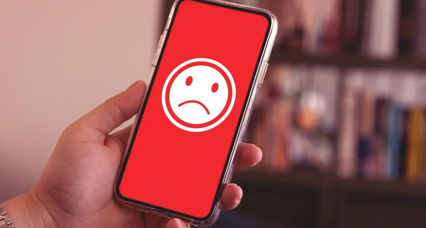
A well-known travel booking app launched with a gorgeous interface—clean lines, beautiful imagery, and an award-winning design that made competitors jealous. Within months, its App Store rating plummeted to 2.1 stars. Users loved how it looked but couldn't actually book flights without the app crashing. The stunning visuals meant nothing when people couldn't complete their purchases.
This scenario plays out more often than you'd think in the mobile app world. I've seen countless beautifully designed apps get absolutely slated in reviews, and it's always puzzling at first glance. How can something that looks so good perform so badly with users? The truth is, app design and user satisfaction aren't as connected as most people assume they are.
Great visual design is just the surface layer of what makes an app successful. Users don't leave five-star reviews because your colour scheme is perfect—they leave them because your app actually works when they need it to. When I'm reviewing app designs with clients, I always remind them that nobody has ever said "this app crashes constantly, but the typography is lovely, so I'll keep using it."
Beautiful design can get users to download your app, but only reliable performance will keep them there
The disconnect between visual appeal and user satisfaction runs deeper than most app owners realise. Users might be drawn in by sleek screenshots on the App Store, but their reviews reflect the reality of daily use—slow loading times, confusing navigation, missing features, and technical problems. Understanding why this gap exists is the first step towards building apps that look good AND get good reviews.
The Design Illusion Problem
Here's the thing that catches most app owners off guard—you can have the most gorgeous interface in the world, but if users can't actually use your app properly, they'll absolutely slate you in the reviews. I've seen it happen countless times over the years, and honestly, it never gets less frustrating to watch.
The problem is what I call "design theatre"—when an app looks incredible in screenshots and demos but falls apart the moment real users try to accomplish actual tasks. Sure, your onboarding screens might look like they belong in a design museum, but can users actually find what they're looking for once they're past that pretty introduction? That's where things get messy.
Common Design Illusion Mistakes
I see these patterns repeatedly when clients come to us after their "beautiful" app has tanked in the reviews:
- Navigation that looks clean but hides basic functions three taps deep
- Text that's too small to read because it "looked better" in the mockups
- Buttons that don't look like buttons—users genuinely can't tell what's clickable
- Beautiful animations that make simple actions feel sluggish and annoying
- Colour schemes that work great on designer monitors but fail accessibility standards
- Layouts that look perfect on one screen size but break on everything else
The worst part? Many of these apps get glowing coverage on design blogs whilst simultaneously getting torn apart by actual users who just want to get things done. Its a classic case of designing for other designers rather than real people with real problems.
What really stings is that fixing these issues often means making the app look "less pretty" in traditional design terms. But here's what I've learned—an app that helps users accomplish their goals quickly will always beat one that just looks good in a portfolio. Always.
When Performance Kills Great Visuals
You know what's heartbreaking? Watching a beautiful app get absolutely slated in reviews because it takes forever to load. I've seen this happen more times than I'd like to admit—designers and developers spend months crafting these gorgeous interfaces, only to have users tear them apart because the app crashes every time they try to scroll through a gallery or submit a form.
The thing is, users don't separate design from performance in their minds. They just know the app looks good but feels rubbish to use. And that's what ends up in their reviews. "Beautiful app but completely useless" is basically the kiss of death for any mobile application.
The Performance Killers Nobody Talks About
Here's what actually tanks app performance behind those stunning visuals:
- Massive image files that haven't been optimised for mobile screens
- Complex animations that look great but murder older devices
- Too many elements loading simultaneously on a single screen
- Heavy fonts and graphics that slow down rendering times
- Background processes running constantly for "real-time" features
I've worked on apps where the design team created these incredible visual experiences—we're talking magazine-quality layouts with beautiful imagery and smooth transitions. But when we tested on anything other than the latest iPhone or Samsung flagship? Absolute disaster. Users with devices that were even two years old were getting loading times of 8-10 seconds just to open the main screen.
Always test your app on older devices during development. If it runs smoothly on a three-year-old mid-range phone, you're golden. If not, you need to optimise before launch.
The cruel irony is that the more visually impressive you try to make your app, the more likely you are to create performance issues that kill user satisfaction. Finding that balance—that's where the real skill lies in mobile development.
User Expectations vs Reality
Here's the thing about mobile users—they're absolutely ruthless. And I mean that in the nicest way possible! But seriously, people have incredibly high expectations for apps these days, and those expectations often don't match up with what developers think they're delivering.
I've seen beautifully designed apps get torn apart in reviews because users expected them to work like completely different apps. It's a bit mad really. Someone downloads a fitness app expecting it to work exactly like Instagram's social features, then gets frustrated when the sharing functionality works differently. The design might be spot-on, but if it doesn't match what's in the user's head, you're getting one-star reviews.
The problem gets worse when your app looks professional—users automatically assume it'll behave like the big-budget apps they use daily. They see your polished interface and think "this should work as smoothly as Netflix" or "why can't I do everything I can do in WhatsApp?" That's not fair, but that's reality.
Common Expectation Mismatches
- Thinking free apps should have zero limitations or ads
- Expecting instant loading regardless of internet connection
- Wanting desktop-level functionality on mobile screens
- Assuming all apps work the same way across platforms
- Believing every feature should be discoverable without instructions
The solution isn't to lower your design standards—it's about managing expectations from the first moment someone sees your app. Your app store description, onboarding flow, and even your app icon need to communicate what your app actually does, not just how good it looks. Because honestly, a user who downloads expecting something different is already halfway to leaving a bad review, no matter how beautiful your interface is.
The Onboarding Experience Trap
You know what gets me every time? When I see a gorgeous app with a one-star review that says "couldn't even figure out how to use it." It's honestly heartbreaking—and completely avoidable. The onboarding experience is where most beautifully designed apps go to die, and developers don't even realise its happening.
Here's the thing about first impressions: users will give you about 30 seconds to prove your app is worth their time. Maybe 60 seconds if they're feeling generous. During those precious moments, your beautiful interface means absolutely nothing if people can't work out what to do next. I've seen apps with stunning visuals get hammered in reviews because users couldn't find the sign-up button or didn't understand the core value proposition.
The Tutorial Nightmare
Most apps try to solve onboarding with lengthy tutorials—big mistake. Nobody wants to sit through five screens of "tap here, swipe there" instructions before they can actually use your app. Users want to jump in and start getting value immediately. The best onboarding experiences teach users by letting them accomplish something meaningful within their first few interactions.
The most successful apps I've built focus on getting users to their 'aha moment' as quickly as possible, not on showing them every feature
Think about it this way: if your app design requires extensive explanation, the design isn't working. Good app design should guide users naturally through their first experience without making them think too hard about what comes next. When onboarding flows are clunky or confusing, even the prettiest interface becomes a barrier rather than a bridge to engagement.
Technical Debt Behind Pretty Interfaces
Here's the thing about technical debt—it's invisible until it isn't. I've seen gorgeous apps that look like they belong in a design museum but crash every time someone tries to update their profile. The interface might be stunning, but underneath its running on code that was cobbled together months ago when deadlines were tight and "we'll fix it later" became the team motto.
Technical debt happens when developers take shortcuts to meet launch dates or add features quickly without properly updating the underlying architecture. Sure, it gets the job done in the short term, but it's like building a beautiful house on shaky foundations. Eventually, something's going to give.
Common Signs of Technical Debt in Apps
- Slow loading times despite fast internet connections
- Random crashes during basic functions
- Features that work inconsistently across different devices
- Battery drain issues that users notice immediately
- Updates that break existing functionality
- Poor performance on older devices
The worst part? Users don't care about your technical challenges. They see a polished interface and expect everything else to match that level of quality. When it doesn't, they feel deceived—and that's when the negative reviews start flooding in.
I've worked with clients who spent months perfecting their app's visual design but allocated just weeks for proper backend development and testing. The result was predictably disastrous: beautiful apps that users couldn't rely on. The lesson here is simple—good design isn't just what you see on the surface; its how everything works together underneath. Technical debt will always catch up with you, and when it does, no amount of pretty animations can save your app store rating.
App Store Optimisation Gone Wrong
Here's something that drives me absolutely mad—apps that look gorgeous in their store listings but deliver a completely different experience once you download them. I've seen this happen so many times over the years, and it's one of the quickest ways to rack up angry reviews despite having brilliant app design.
The problem usually starts with over-promising in the app store description. Marketing teams get excited about new features and start making claims the app can't actually deliver. They'll say things like "lightning-fast performance" when the app takes ages to load, or "seamless integration" when half the features don't work properly together. Users download based on these promises—and when reality doesn't match up? Bad reviews flood in.
Screenshots are another minefield. I've worked with clients who wanted to show mockups of features that weren't even built yet! Sure, the designs look fantastic, but when users can't find those features in the actual app... well, you can guess how that goes. Apple and Google are getting stricter about this, but plenty of apps still slip through with misleading visuals.
The Keyword Stuffing Trap
Then there's keyword stuffing in app titles and descriptions. Some developers think cramming every possible search term into their listing will boost visibility. What actually happens is you end up with confusing, unreadable descriptions that set wrong expectations about what your app actually does. Users download thinking they're getting one thing and find something completely different.
Keep your app store listing honest and specific. Show real screenshots, write clear descriptions of what your app actually does, and resist the urge to overpromise features you haven't perfected yet.
The worst part? Once those negative reviews start coming in, they're incredibly hard to recover from, even if you fix the underlying issues.
Brand Reputation Protection Strategies
When your beautifully designed app starts collecting negative reviews, your first instinct might be to panic—but honestly, that's the worst thing you can do. I've seen too many app owners go into damage control mode without actually understanding what's causing the problem in the first place.
The key is to respond quickly but thoughtfully. Set up alerts for new reviews so you're not discovering problems weeks after they've started snowballing. When someone leaves a one-star review saying your app is "rubbish" despite its gorgeous interface, dig deeper. What were they actually trying to do? Where did the experience break down for them?
Proactive Monitoring and Response
Your app store reviews are just the tip of the iceberg. People complain on social media, in forums, and to their mates long before they bother writing an App Store review. Set up Google Alerts for your app name and monitor social channels—you'll catch issues early and can often resolve them before they become public complaints.
When responding to negative reviews, avoid the corporate speak. Be human about it. Acknowledge the problem, explain what you're doing to fix it, and give them a timeline. I've seen apps turn their reputation around simply by showing they actually care about user feedback.
Building Review Recovery Systems
Here's something most developers miss: you need a system for encouraging satisfied users to leave reviews. The people having a smooth experience rarely think to rate your app—it's the frustrated ones who are motivated to write reviews. Build subtle prompts into your app that ask for feedback after positive interactions, not random moments. And for goodness sake, make it easy for people to reach your support team before they resort to public complaints.
Look, after years of working with clients who've had their beautiful apps torn apart in reviews, I can tell you this much—great design is just the starting point, not the finish line. You can have the most stunning interface in the world, but if your app crashes when someone tries to complete a purchase? Well, you're going to hear about it in one-star reviews.
The biggest mistake I see is treating app design like it's purely visual. Sure, those gorgeous screenshots will get people to download your app, but what happens next is what really matters. Users don't care how pretty your loading screen is if they're staring at it for thirty seconds; they don't care about your award-winning colour scheme if they can't figure out how to reset their password.
What I've learned is that successful mobile app development means thinking about design as the entire user experience—not just how things look, but how they work, how fast they respond, and whether they actually solve the problem people downloaded your app to fix. App performance and user reviews are directly linked, and no amount of visual polish can mask fundamental issues with functionality or speed.
The good news? Once you understand that user expectations go way beyond aesthetics, you can build apps that not only look good but actually deliver on their promises. That's when you start seeing those five-star reviews rolling in. Because at the end of the day, people review experiences, not interfaces—and the best app design creates experiences that users genuinely want to recommend to others.