Your phone buzzes and within seconds you've tapped that notification—but why? I've spent years building mobile apps and studying what makes users react instantly to some messages while completely ignoring others. The difference isn't random; it's psychology in action.
Every day we receive dozens of app notifications, yet most of them get swiped away without a second thought. But occasionally one appears that stops us in our tracks and compels us to act immediately. As someone who's designed notification systems for everything from fitness apps to financial platforms, I can tell you there's actual science behind these split-second decisions.
The apps that master this art don't rely on luck—they understand how our brains process information under pressure. They know which words trigger urgency, when to send messages for maximum impact, and how to make us feel like we're missing something important if we don't respond. Its not manipulation; it's understanding human nature and using that knowledge to create genuinely useful experiences.
The most effective app messages don't just inform users—they create an emotional response that bridges the gap between seeing and doing
What I find fascinating is how small changes in wording, timing, or design can completely transform a message's effectiveness. A notification that gets ignored at 3pm might drive massive engagement at 7pm. A generic message might be dismissed, but personalise it slightly and suddenly users can't help but tap through. Understanding these patterns has helped my clients increase their engagement rates by 200-400%—and the principles are surprisingly simple once you know what to look for.
The Psychology Behind Instant Action
Right, let's get straight to the point—some app messages make us tap immediately while others get ignored. Why? It all comes down to how our brains are wired.
When you see a notification, your brain goes through a quick decision process that takes less than three seconds. During those seconds, you're weighing up whether this message deserves your attention right now. The apps that win this battle understand something most don't: they know how to trigger what psychologists call the "action impulse."
Your brain is constantly looking for three things when it sees any message. First, is this relevant to me personally? Second, do I need to act quickly or can this wait? And third, what happens if I ignore this completely?
The Instant Gratification Circuit
Here's what really happens in your brain when you see a well-crafted app message. The notification hits your phone's screen, your eyes process the text, and within milliseconds your brain starts releasing small amounts of dopamine—that's the chemical that makes you feel good about taking action.
But here's the clever bit. The best app messages don't just promise you'll feel good later; they make you feel good about acting right now. They do this by creating what I call "micro-rewards"—tiny hits of satisfaction that come from simply tapping the notification.
Think about it like this: when Duolingo sends you "Your 7-day streak is at risk!" it's not just telling you information. It's making your brain think about losing something you've already earned. That creates discomfort, and the easiest way to stop that uncomfortable feeling? Tap the message and do a quick lesson.
The apps that get this right understand that people don't act on logic—they act on emotion first, then justify it with logic afterwards.
Timing Is Everything
You know what makes me laugh? People spend months perfecting their app message content, then send it at completely the wrong time. I've seen brilliant messages get ignored simply because they arrived when users were sleeping, working, or dealing with their morning commute chaos.
The timing of your app messages can make or break user engagement—and I mean that literally. Send a food delivery notification at 11:30am when someone's getting hungry for lunch? Perfect. Send the same message at 3am? You'll probably get your app deleted faster than you can say "push notification."
When Your Users Are Actually Paying Attention
After years of analysing user behaviour data, I've noticed some clear patterns. Most people check their phones heavily during three key windows: first thing in the morning (around 7-9am), during lunch breaks (12-1pm), and in the evening wind-down period (6-8pm). But here's the thing—these windows shift depending on your app's purpose and your user demographics.
Gaming apps often see peak engagement in the evenings and weekends; productivity apps work better during weekday mornings. E-commerce apps? They perform brilliantly on Sunday afternoons when people are browsing online. It sounds obvious when I say it like that, but you'd be surprised how many apps ignore these basic patterns.
The Context Problem
Timing isn't just about the hour of the day—it's about understanding what your users are likely doing at that moment. A fitness app sending workout reminders during typical work hours (9-5) often gets poor responses. But send those same reminders at 6am or 6pm? Suddenly your engagement rates jump up significantly.
Test your message timing by sending the same content to different user groups at various times, then track which time slots generate the highest engagement rates. You might be surprised by what you discover about your specific audience.
Words That Work Like Magic
After building hundreds of apps, I've noticed something fascinating—certain words make people tap buttons instantly while others get completely ignored. It's not magic, but it feels like it when you see the engagement stats.
The most powerful word in any app message? "You." It sounds obvious, but most apps still write messages like "Users can now access premium features" instead of "You can now access premium features." The difference in tap rates is honestly quite dramatic.
Here's what I've learned actually works in the real world:
- "Free" still works wonders - even though everyone's heard it a million times, our brains can't help but pay attention
- "Limited time" - creates urgency without being pushy
- "Just for you" - makes people feel special, even when it's sent to thousands
- "Almost done" - perfect for getting people to complete sign-ups or profiles
- "New" - simple but effective for feature announcements
But here's the thing—context matters more than the actual words. "Your order is ready" works brilliantly for a food delivery app but sounds weird in a fitness tracker. The best messages feel like they belong naturally in your app's conversation with users.
I've seen apps increase their conversion rates by 40% just by changing "Sign up now" to "Get started free." The second version removes friction (no mention of commitment) and adds benefit (free). Small changes, big results.
One mistake I see constantly? Using corporate speak in casual apps. "Optimise your experience" sounds boring. "Make your workouts better" gets people interested. Write like you're talking to a friend, not presenting to a board room—your users will thank you for it.
The Fear of Missing Out Factor
You know what? FOMO might just be the most powerful psychological trigger we have in our messaging toolkit. I've seen apps use this fear of missing out to drive engagement rates through the roof—but here's the thing, it has to be done right or it backfires spectacularly.
The human brain is wired to pay attention to scarcity and time-sensitive opportunities. Its a survival instinct that goes back thousands of years. When we see "Only 2 left in stock" or "Sale ends in 1 hour," our brains basically panic a little bit and push us toward action. But in the app world, we need to be much more subtle about it.
Creating Genuine Urgency
The key word here is genuine. Users have become incredibly good at spotting fake urgency—those countdown timers that magically reset when you refresh the page? They don't work anymore. Actually, they make people trust your app less.
What does work is creating real, time-sensitive value. Limited-time events, flash sales with actual inventory limits, or exclusive content that truly disappears after a certain date. I've worked on fitness apps where daily challenges expire at midnight—not because we're trying to trick anyone, but because that's how the feature genuinely works.
The most effective FOMO messages don't feel like marketing; they feel like helpful reminders from a friend who doesn't want you to miss out on something good.
Social proof works brilliantly here too. Messages like "3 of your friends just completed today's workout" tap into FOMO without being pushy. People don't want to be left behind by their social circle, and that's perfectly natural human behaviour we can work with—not against.
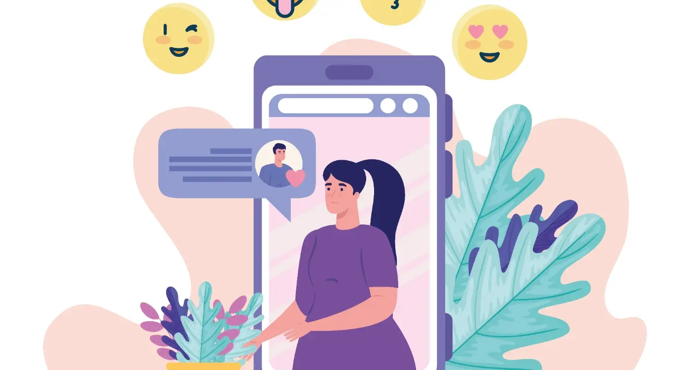
Making Messages Feel Personal
You know what's mad? The difference between "You have a new message" and "Sarah sent you a photo from last night's dinner" is huge. But most apps still send generic messages that feel like they were written by a robot—which, let's be honest, they probably were!
I've seen apps increase their open rates by 40% just by adding the users name to push notifications. It sounds simple, but personalization goes way deeper than that. The best messages feel like they were crafted specifically for you, based on your behavior, preferences, and timing.
Think about how Netflix tells you "Because you watched..." or how Spotify creates playlists "Made for You." These aren't just marketing tricks; they're using data to make every interaction feel personal. When someone opens your app and sees content that matches their interests, location, or previous actions, it creates this little moment of "wow, they get me."
Levels of Personalization That Actually Work
- Basic details: Name, location, time zone
- Behavioral data: Last actions, favourite features, usage patterns
- Contextual information: Weather, local events, time of day
- Social connections: Friends' activity, shared interests
- Predictive content: What they might want next
But here's the thing—and I can't stress this enough—personalization only works if its genuinely useful. Nobody wants to feel like they're being watched or manipulated. The goal is to make someone's life easier or more enjoyable, not to creep them out with how much you know about them.
The apps that get this right feel less like technology and more like a helpful friend who remembers what you like.
How Visual Design Changes Everything
Right, let's talk about something that most developers completely mess up—the visual side of app messages. I've seen brilliant notification strategies fall flat on their face simply because someone thought a wall of plain text would do the job. It won't.
Your brain processes visual information about 60,000 times faster than text. That's not some marketing fluff, that's actual science. When someone glances at their phone and sees your notification, you've got maybe half a second before they decide whether to tap or swipe away. The visual elements you choose in that split second make all the difference.
Colour psychology plays a huge role here; red creates urgency (think sale notifications), blue builds trust (perfect for security updates), and green suggests positive action (like "Your order is ready"). But here's where it gets interesting—the same colour can trigger completely different responses depending on your app's overall design language. If your entire app is blue and suddenly you send a red notification, people pay attention.
Icons and Imagery That Actually Work
The icon you choose isn't just decoration. I've tested notifications with generic app icons against ones with contextual imagery, and the difference in engagement rates is mad—sometimes 40% higher with the right visual cues. A shopping cart icon for abandoned basket reminders, a clock for time-sensitive offers, or even a simple emoji can transform how people perceive your message.
Test your notification designs on actual devices in different lighting conditions. What looks great on your desktop monitor might be completely unreadable on a phone in bright sunlight.
The spacing, font size, and even the notification banner style all contribute to whether someone takes action or ignores your message entirely. Get the visuals right, and suddenly your words become much more powerful.
The Science of Habit Formation
Right, let's talk about something that keeps me fascinated—how apps actually rewire our brains. I mean, its not magic, though it might feel like it sometimes. There's proper science behind why you automatically check your phone when you hear that notification sound, even when you're trying to focus on something else entirely.
The habit loop is basically three parts: cue, routine, reward. Your phone buzzes (cue), you check the app (routine), you get that little dopamine hit from seeing something new (reward). Apps that understand this loop don't just send random messages—they create triggers that become automatic responses over time.
Building Micro-Habits Through Smart Messaging
Here's what I've learned from building apps that people actually stick with: you need to start small. Really small. Instead of asking users to complete their entire profile on day one, successful apps might just ask for one piece of information per message. "Quick question—whats your favourite coffee?" feels manageable; "Complete your profile now!" feels like work.
The best apps I've built use what I call "celebration moments"—tiny confirmations that make users feel good about taking action. When someone responds to a message, they get immediate positive feedback. Not just "Thanks!" but something that acknowledges the specific action: "Great choice! We'll remember you love oat milk lattes."
The Compound Effect of Consistent Engagement
This is where the magic really happens. Each small interaction builds on the last one, creating what researchers call "commitment consistency." When someone responds to three simple messages from your app, they're much more likely to respond to the fourth. And the fifth. Their brain starts categorising your app as "something I engage with" rather than "something that bothers me."
The apps that survive long-term understand this isn't about manipulation—its about creating genuinely useful habits that serve the user first.
After years of building apps and watching user behaviour patterns, one thing has become crystal clear to me—the messages that make people act immediately aren't accidents. They're the result of understanding how our brains work, what drives us to tap that notification, and why some words feel urgent while others get ignored completely.
The apps that succeed in today's crowded marketplace are the ones that respect their users' time and attention. They don't bombard people with pointless notifications; they craft messages that genuinely add value to someone's day. Whether it's letting you know your taxi has arrived, reminding you about a flash sale on something you actually want, or nudging you to complete a workout—the best messages feel helpful, not annoying.
But here's what I've learned from building hundreds of these systems: it's not just about the psychology tricks or the perfect timing (though those matter). It's about creating a relationship between your app and its users that feels human and respectful. People can sense when you're trying to manipulate them versus when you're genuinely trying to help them achieve something they care about.
The most successful apps I've worked on treat notifications like a conversation, not a megaphone. They learn from user behaviour, adapt their messaging style, and always give people control over what they receive and when. That's the difference between an app people love and one they delete after a week. Your messages should make users' lives better, not more stressful. Get that right, and everything else falls into place.