

The Times
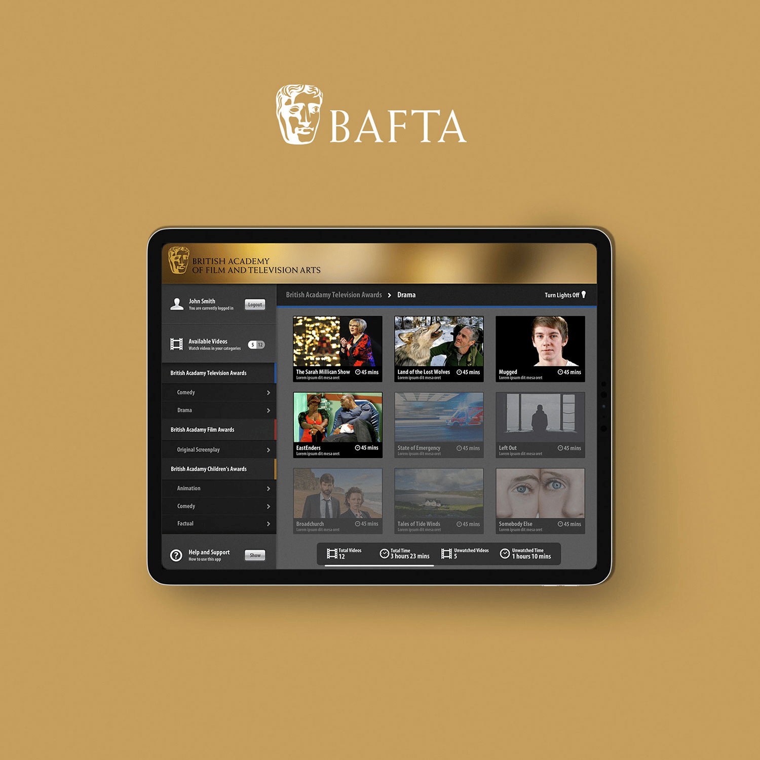
Due to the history of The Times newspaper, the app version had to imitate the print edition as closely as possible. Performance and efficiency was critical to delivering an engaging and fluid reading experience so new caching and navigation techniques were developed especially for this project.
What We Did
UX/UI Design
Development
Support
Canon UST
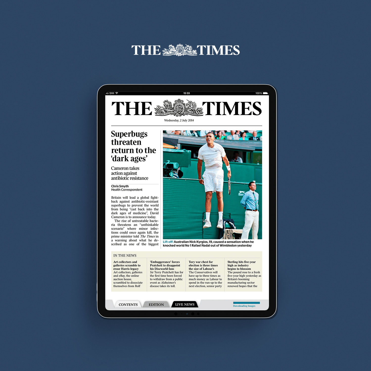
Originally intended as a back-office training tool, the Canon UST was such a hit that it was released to the general public. The app and CMS allowed Canon to showcase different features of their cameras and allow people to learn key concepts by ‘using’ the cameras in a virtual setting.
What We Did
UX/UI Design
Development
Support
Scape
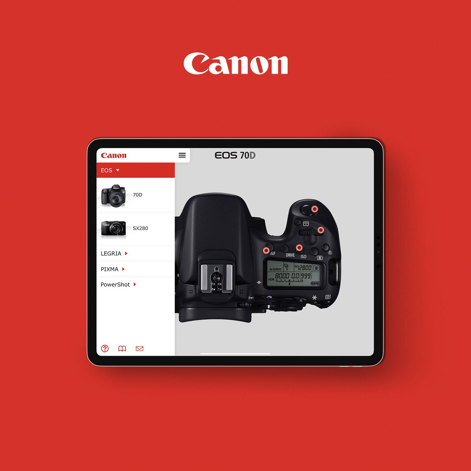
Designed for the large numbers of students that use Scape for their accommodation, the Scape Student Living app keeps users up-to-date with their parcels, maintenance issues, events and wellbeing content from a beautifully designed, user-focused app. The app is deployed to multiple countries.
What We Did
Strategy
Development
Support
Dee Zaster
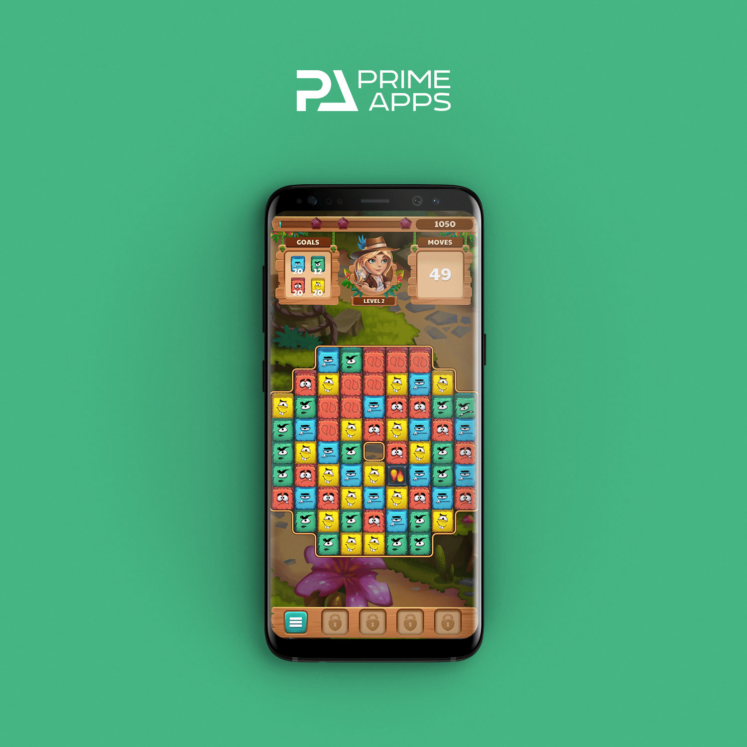
Based on the popular casual puzzle games such as Toy Blast and Candy Crush, this game was created for a client with a passion for games. Due to the high competition of the mobile gaming category, the app had to have incredibly high production values. The game was awarded an award for exceptional quality.
What We Did
UX/UI Design
Development
Support
Marketing
CHANEL
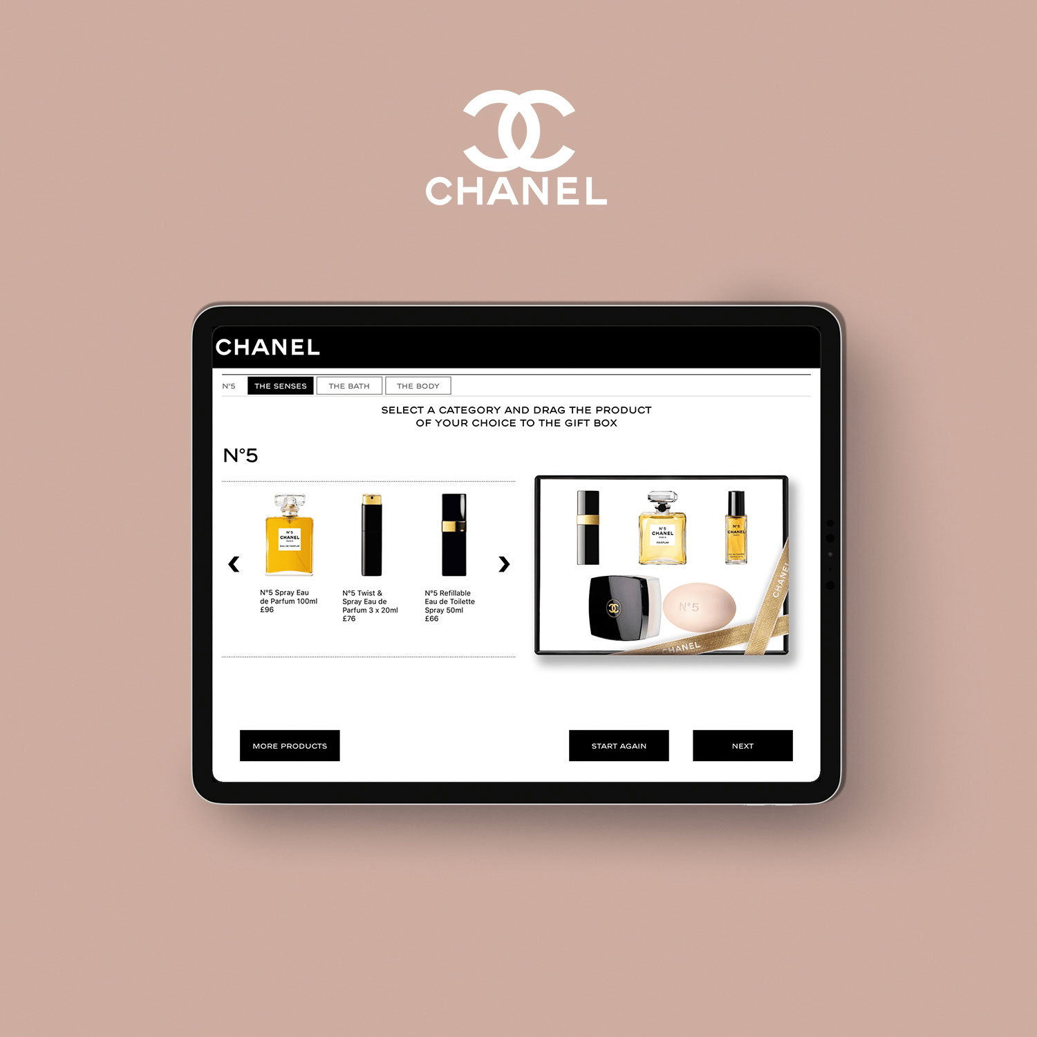
The Christmas Hamper app for CHANEL was one of three we produced, with this one being deployed in their Regent Street store in London. Placed at the store entrance to entice shoppers to purchase a customised gift hamper for their loved ones, the app was highly intuitive and tactile.
What We Did
UX/UI Design
Development
Clearcast
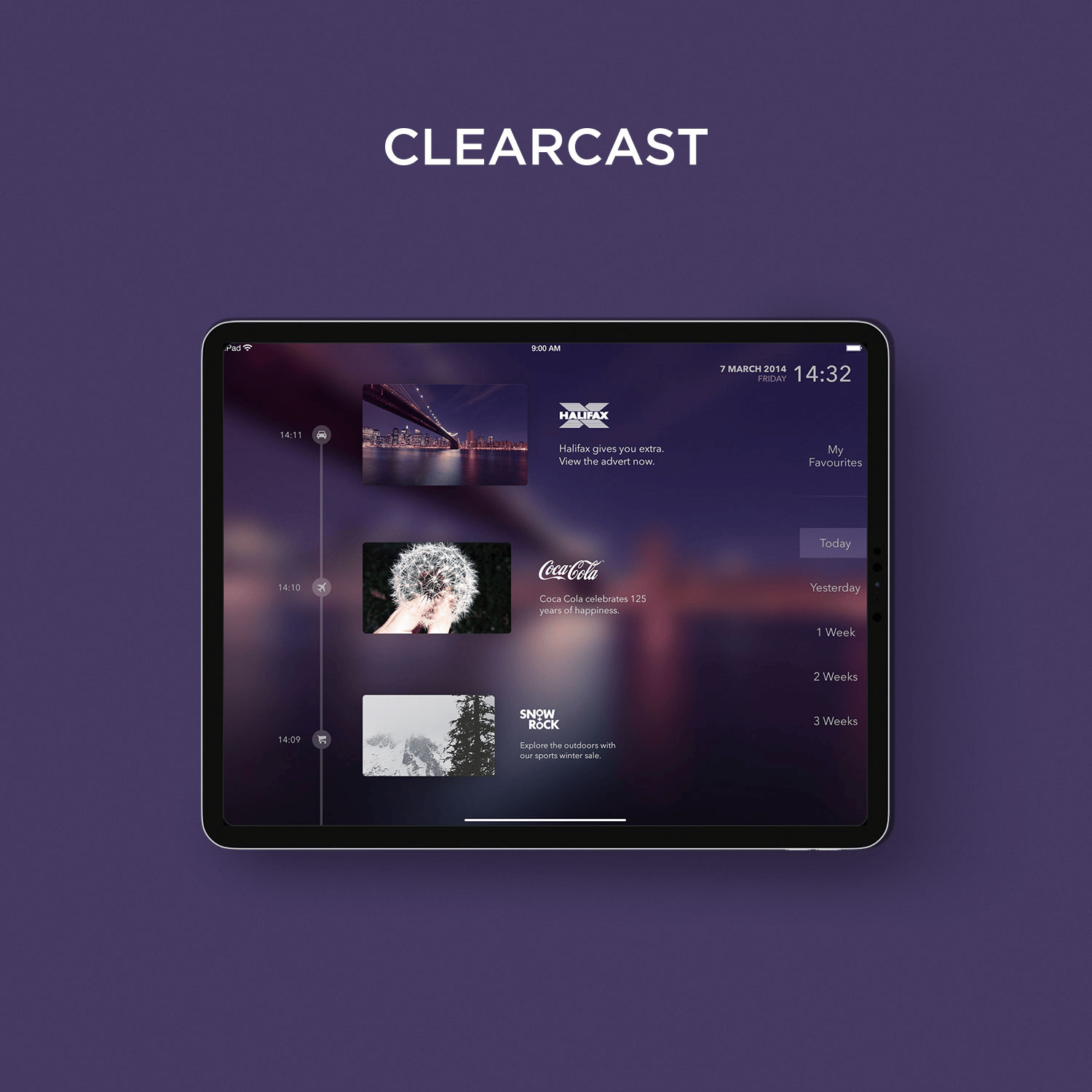
As a second-screen proof-of-concept, this app used complex audio recognition to sync the device with the adverts the user was currently viewing, providing a much richer shopping experience than TV alone. The app presented fun challenges and games to viewers to increase engagement.
What We Did
Strategy
UX/UI Design
Development
iDrated
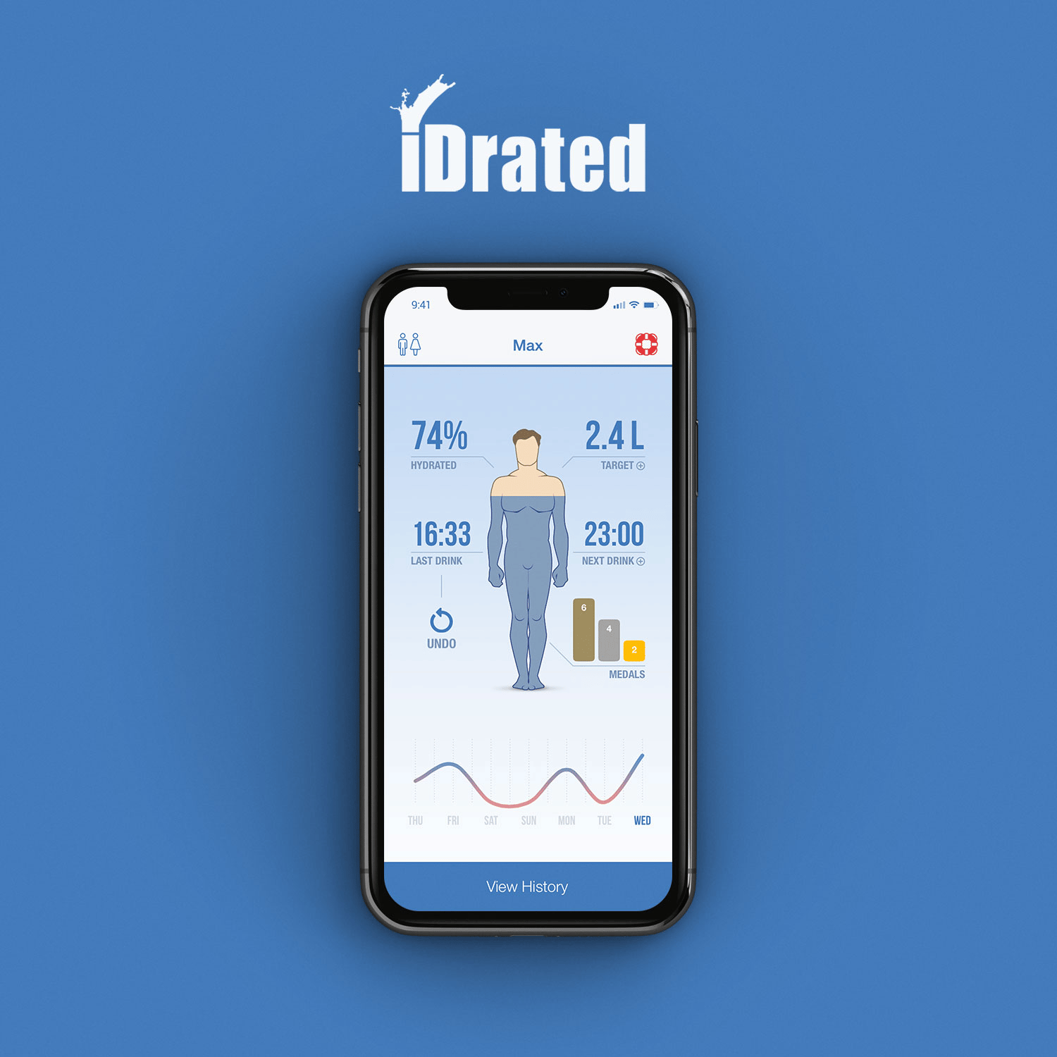
The iDrated app was originally created as a portfolio piece to show how simple and intuitive apps can be however quickly gained interest with over 500k users downloading it and using it on a daily basis. The app became so popular that during one summer it took the number 1 spot on the entire Apple App Store.
What We Did
UX/UI Design
Development
Support
Marketing
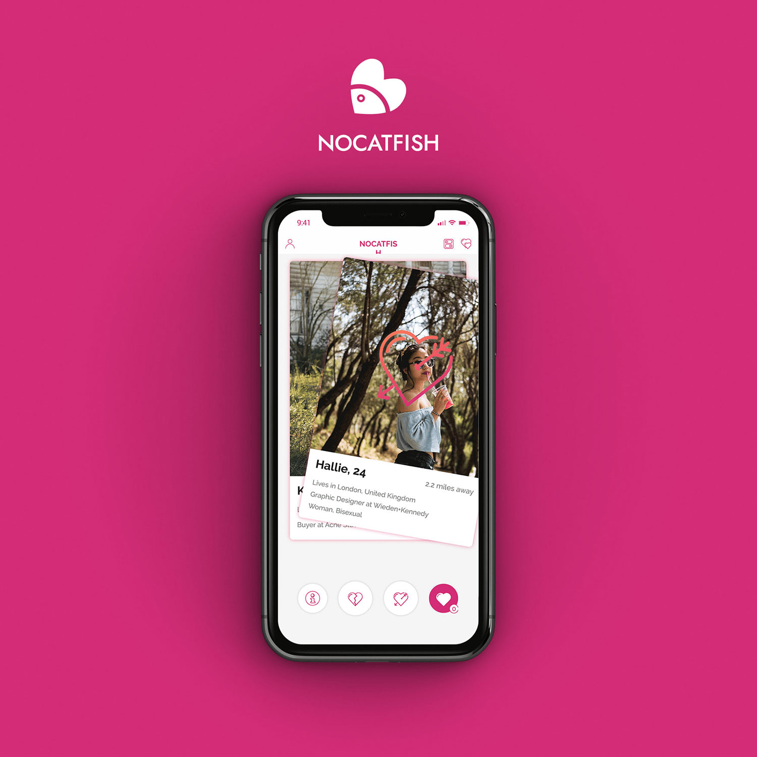
NoCatfish
With so many fake profiles online, the dating market was crying out for a safer, more trustworthy app, hence NoCatfish. We built this app along traditional dating lines but with some key technology that verifies people, ensuring that their photos are really them, no bots, no fake profiles.
What We Did
Strategy
UX/UI Design
Development
Support
Marketing
BAFTA
This concept piece was produced for BAFTA in order to create a more engaging and useful experience for both reviewers of the awards and also for more general consumers to gain an insight into the very best of film and television. The product was a research and development concept.
What We Did
UX/UI Design
Development
