Have you ever wondered why some apps feel instantly familiar whilst others leave you scratching your head, even when they're perfectly designed? After working in app design for over eight years, I can tell you the answer often comes down to cultural sensitivity—or the lack of it. When you're creating an app that needs to work across different countries and cultures, understanding your international audience isn't just nice to have; it's make or break.
I've seen brilliant apps fail spectacularly in new markets simply because the designers assumed what worked in one culture would work everywhere. Red might mean good luck in China, but it signals danger in many Western countries. A gesture that's friendly in one place could be offensive in another. These aren't small details you can fix later—they're fundamental design decisions that shape how users experience your app.
The best app design isn't just about making something look good; it's about making something that feels right to the people who'll actually use it
Whether you're planning to launch internationally from day one or considering expansion down the line, understanding cultural sensitivity in app design will save you time, money, and embarrassment. Let's explore what you need to know to create apps that truly connect with users around the world.
Why Culture Matters in App Design
I've watched countless apps fail not because they were poorly built, but because they completely ignored cultural differences. It's one of those mistakes that seems obvious in hindsight—but when you're deep in development, it's easy to assume everyone thinks like you do.
Culture shapes how people interact with technology in ways most developers never consider. The colours that feel trustworthy in one country might signal danger in another. The gestures that seem natural to Western users could be offensive elsewhere. Even something as simple as reading direction affects how people expect to navigate through your app.
The Real Cost of Cultural Blindness
When apps ignore cultural sensitivity, the consequences are swift and expensive. Users abandon apps that feel foreign or uncomfortable; app store ratings plummet, and word-of-mouth marketing turns negative. I've seen brilliant apps with solid functionality get torn apart in reviews simply because they felt culturally tone-deaf.
Smart app design means recognising that your users bring their cultural backgrounds with them every time they tap your icon. Their expectations about privacy, social interaction, authority, and even basic navigation have been shaped by their cultural context. When you design with this in mind, you create experiences that feel natural and welcoming rather than awkward and exclusionary. Good app design is crucial for success in any market, but it becomes absolutely essential when working across cultures.
- Colour meanings vary dramatically between cultures
- Text direction affects layout and navigation expectations
- Social features need different approaches in different regions
- Religious and cultural symbols carry specific meanings
- Privacy expectations differ significantly worldwide
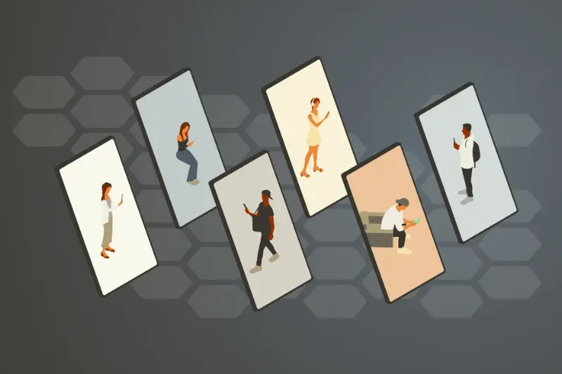
Understanding Your Global Audience
Right, let's get into the nitty-gritty of who you're actually building your app for. I've worked on apps that completely flopped in certain markets simply because the team didn't do their homework on cultural differences—and trust me, it's painful to watch months of work go down the drain because of assumptions.
The first thing you need to wrap your head around is that your users aren't just different people; they're people from different worlds. What works brilliantly in London might be completely confusing in Tokyo or Mumbai. I'm not just talking about language here—though that's part of it—I'm talking about how people think, behave, and interact with technology.
Research Methods That Actually Work
You can't just guess what your international audience wants. You need proper research, and here's what I've found works best:
- User interviews with people from your target markets
- Cultural consultants who understand local customs
- Competitor analysis in each region
- Social media monitoring to understand preferences
- Local app store reviews and ratings analysis
Start with one or two key markets rather than trying to please everyone at once. You can always expand later once you've nailed your core international app design approach.
The beauty of understanding your global audience is that it makes every other design decision easier. Once you know how your users think and what they expect, creating detailed user personas becomes much more straightforward.
Colour Psychology Across Cultures
Colours carry different meanings around the world—and getting this wrong in your app can be a costly mistake. What looks professional and trustworthy in one country might seem unlucky or even offensive in another. I've seen apps fail spectacularly because developers assumed their colour choices would work everywhere.
Take red, for example. In Western countries, red often signals danger or error messages in apps. But in China, red represents good fortune and prosperity; it's the colour of celebration. Using red for error states in a Chinese market could confuse users completely. White is another tricky one—whilst it suggests cleanliness and simplicity in Western design, it's associated with mourning in many Asian cultures.
The Business Impact of Colour Choices
Green might seem like a safe choice for success messages, but it's not universally positive. In some Middle Eastern countries, green has strong religious significance that might not align with your app's purpose. Purple, often seen as luxurious in the West, can represent mourning in Thailand.
The smart approach? Research your target markets thoroughly before settling on a colour scheme. Understanding color psychology in app design can make a massive difference to user adoption and cultural acceptance.
Text and Language Considerations
Getting your text right for international app design can make or break your global success—and I've seen plenty of apps fail because they got this wrong. It's not just about translating words from English to another language; different cultures read, write, and process information in completely different ways.
Right-to-left languages like Arabic and Hebrew will flip your entire interface around. Your navigation buttons, text alignment, and even the flow of information needs to mirror what users expect. I've worked on apps where we had to rebuild entire screens because we didn't account for this early enough in the design process. Having proper designs before speaking to an app developer becomes even more crucial when planning for multiple markets.
Text Length and Space Planning
German text can be 30% longer than English, whilst Chinese characters might take up less horizontal space but need more vertical room. Your buttons, menus, and text fields need to accommodate these differences without breaking your design.
The most expensive translation mistake is the one you discover after launch when half your interface is cut off in another language
Cultural context matters too—what sounds friendly in one culture might seem rude in another. Formal language works better in some markets, whilst others prefer casual, conversational tone. Testing with native speakers isn't optional; it's the difference between an app that feels natural and one that feels like it was made by outsiders.
Navigation Patterns Around the World
Different cultures have completely different expectations when it comes to getting around inside apps. I've learnt this the hard way over the years—what works brilliantly in London might confuse users in Tokyo or Mumbai. The way people expect to move through digital spaces is deeply tied to their cultural background and daily habits.
In Western countries, we're used to reading from left to right, so our apps naturally follow this pattern. Tab bars sit at the bottom, back buttons live in the top-left corner, and we swipe left to move forward through content. But in Arabic-speaking countries where text flows right to left, users expect the opposite—back buttons should be on the top-right, and forward navigation moves right to left.
Bottom Navigation vs Side Drawers
Asian markets often prefer side drawer menus over bottom navigation tabs. This stems from how people hold their phones and cultural preferences for hierarchical information structures. Meanwhile, Western users tend to favour bottom tabs because they're easier to reach with thumbs during one-handed use.
The key is researching your target markets before deciding on navigation patterns. Don't assume what works in your home country will work everywhere else—test with real users from different cultural backgrounds to avoid costly mistakes later on. Prioritising UX over UI considerations becomes even more important when designing for international markets.
Visual Elements and Cultural Symbols
Getting visual elements right in international app design is trickier than most people think. What looks perfectly normal in one country can be offensive or confusing in another—and trust me, I've seen some spectacular mistakes over the years! The key is understanding that symbols, icons, and imagery carry different meanings across cultures.
Take something as simple as a thumbs up icon. In most Western countries, it means "good job" or "I agree." But in parts of the Middle East, it's considered quite rude. The same goes for colour combinations with religious symbols, animals that are considered sacred or unclean in certain cultures, and even the direction people appear to be moving in images.
Common Visual Elements That Vary by Culture
- Hand gestures and body language in icons
- Religious symbols and imagery
- Animals (particularly pigs, cows, and dogs)
- Numbers (especially 4 in East Asian cultures, 13 in Western cultures)
- Flags and national symbols
- Gender representation and clothing styles
The safest approach is to test your visual elements with local users before launch. What seems universal often isn't, and small changes can make a huge difference to how your app is received in different markets. Understanding emotion in app design is particularly crucial since visual elements are often the first thing users notice.
Always research local customs before choosing icons or imagery for your app design—what's positive in one culture might be offensive in another.
Testing Your App with International Users
Once you've designed your app with cultural sensitivity in mind, you need to test it properly—and I mean really test it, not just hand it to your mate who studied French at university! Getting feedback from actual users in your target markets is the only way to know if your cultural adaptations are working.
Finding the Right Test Users
You'll want to recruit native speakers and locals from each region where you plan to launch. Don't just focus on language; cultural context matters just as much. A Spanish speaker from Mexico will have different expectations than one from Spain, and those differences can make or break your app's success.
Remote testing tools make this easier than ever. You can conduct user interviews, usability tests, and gather feedback without flying around the world. Though I'll admit, the travel would be nice! Understanding what makes an app popular in different markets will help you focus your testing efforts on the right areas.
What to Test For
- Navigation flow and menu structure
- Icon recognition and understanding
- Colour associations and emotional responses
- Text readability and cultural appropriateness
- Payment methods and checkout processes
- Loading times and technical performance
Pay attention to the small stuff too—date formats, address fields, phone number inputs. These seemingly minor details can frustrate users and signal that you don't understand their market. The feedback you get will be invaluable for refining your app before launch. Designing with intent to align features with business goals becomes much more focused when you understand exactly what your international users need.
Conclusion
Creating apps that work across different cultures isn't just about translating words—it's about understanding people. After working with clients from all over the world, I've learned that the smallest details can make the biggest difference. A colour that feels welcoming in one country might feel unlucky in another; a simple gesture icon could be misunderstood completely.
Getting international app design right takes time and research, but it's worth every minute. Your users will notice when you've made the effort to understand their culture, and they'll appreciate your app much more for it. The brands that succeed globally are the ones that don't just push out the same design everywhere—they adapt thoughtfully.
Start small if you're just beginning your international journey. Pick one or two key markets and really get to know them well. Test with real users from those countries, not just your colleagues who happen to speak the language. Watch how people actually use your app, because what works in theory doesn't always work in practice. Most importantly, stay curious about different cultures and keep learning. The world is full of different ways of thinking, and your app design should reflect that diversity.