Nearly 80% of patients abandon healthcare apps within the first month of downloading them. That's a staggering number when you consider these apps could genuinely improve someone's health or even save their life. The problem isn't usually the functionality—it's trust. Or rather, the lack of it.
People approach healthcare apps differently than they do social media or shopping apps. They're not just sharing photos or buying trainers; they're potentially sharing their most private medical information with a complete stranger. The stakes feel higher because they are higher. One wrong move, one design choice that feels off, and users will delete the app faster than you can say "data breach".
When people interact with medical apps, they're not just users—they're patients placing their health in digital hands
The fascinating thing about healthcare apps is that trust isn't built through marketing or clever copywriting. It's built through design. Every button placement, every colour choice, every animation tells users whether they should feel safe or suspicious. The psychology behind these design decisions can make the difference between an app that transforms patient care and one that collects digital dust. Understanding how to build that trust through thoughtful design isn't just good practice—it's the foundation of successful medical app development.
The Science Behind Medical App Trust
Trust isn't just a feeling—it's actually something we can measure and understand through research. When it comes to medical apps, scientists have spent years studying exactly what makes patients feel safe enough to share their health information and follow digital advice.
The psychology is fascinating really. Our brains are wired to be extra careful when it comes to health matters, which makes perfect sense from an evolutionary standpoint. We're naturally suspicious of anything that could affect our wellbeing, and this includes the apps we use to track symptoms or communicate with doctors.
What Research Tells Us
Studies show that trust in healthcare apps comes down to three main factors. People need to feel confident that the app works properly, that their private information stays private, and that real medical professionals are somehow involved in the process. It's not enough for an app to look professional—it needs to demonstrate competence through its behaviour.
- Clear information about who created the app and their medical credentials
- Transparent privacy policies written in plain English
- Evidence of regulatory approval or medical endorsements
- Consistent, reliable performance without crashes or errors
- Quick response times when users need help or support
The interesting thing is that trust builds slowly but breaks quickly. One confusing error message or unexpected app crash can undo weeks of positive user experience. That's why getting the fundamentals right from day one matters so much in healthcare app development.
Understanding User Psychology in Healthcare Apps
When people open healthcare apps, they bring a unique set of emotions and expectations that's quite different from any other type of app. They might be worried about symptoms, managing a chronic condition, or simply trying to book an appointment. This mental state affects how they interact with every button, form, and piece of information you present to them.
The biggest psychological barrier we face in medical app development is fear—fear of making mistakes, fear of misunderstanding medical information, and fear of their data being misused. Users approach healthcare apps with heightened anxiety levels, which means their cognitive load is already maxed out before they even start using your app. Understanding why emotion is important in app design becomes crucial when designing for users who are already emotionally vulnerable.
The Trust-Building Mindset
Users actively look for credibility markers when using healthcare apps. They want to see professional language (but not overly complex jargon), clear disclaimers about when to seek emergency care, and obvious connections to qualified medical professionals. They're also hyperaware of any technical glitches—a broken link or slow loading time can immediately trigger doubts about the app's reliability.
Always include clear escalation paths to emergency services and make it obvious when users should consult a real doctor instead of relying solely on the app.
Visual Design Elements That Build Confidence
When someone opens a healthcare app for the first time, they're making a snap judgement about whether they trust it or not—and I'm talking milliseconds here. The visual elements you choose can make or break that trust before they've even read a single word. Clean, professional layouts with plenty of white space immediately signal competence; cluttered interfaces with too many colours scream amateur hour.
Professional Icons and Imagery
Medical icons need to be instantly recognisable and consistent throughout your app. A wonky stethoscope icon or a pill that looks more like a sweet isn't doing you any favours. Real photographs of diverse healthcare professionals—not those stock photos where everyone looks like they're posing for a toothpaste advert—help users connect with the human side of healthcare.
Visual Hierarchy That Guides
Your app should guide users naturally through their tasks without them having to think too hard about it. Large, clear headings, proper spacing between sections, and logical grouping of related information all contribute to this sense of professional organisation. When people can find what they need quickly, their stress levels drop and their confidence in your app rises. It's that simple, really—good design gets out of the way and lets people focus on their health.
How Navigation Affects Patient Comfort
Getting lost in a healthcare app when you're already worried about your health? That's the last thing anyone needs. I've worked on medical app development projects where we've seen users abandon the app completely just because they couldn't find what they were looking for within the first thirty seconds.
Think about it—when someone opens a healthcare app, they're often stressed, anxious, or in pain. They don't want to spend ages hunting through menus or trying to work out confusing icons. They want to book that appointment, check their test results, or find their medication information quickly and easily.
Clear Pathways Reduce Stress
The best healthcare apps use what we call 'progressive disclosure'—showing users only what they need at each step. Instead of overwhelming them with every possible option on the home screen, we guide them through a logical journey. Book appointment? Three taps maximum. Check results? Two taps and you're there.
Simple navigation in healthcare apps isn't just about usability—it's about reducing the cognitive load on people who are already dealing with health concerns
Breadcrumbs, clear back buttons, and consistent menu structures all play a part in building app trust. When users feel confident they can find their way around your app, they're more likely to use it regularly and recommend it to others. That's behavioural design working at its best.
Using Colour and Typography to Reduce Anxiety
The colours and fonts you choose for your healthcare app can make the difference between a patient feeling calm or stressed. I've worked on medical apps where we've completely changed the user experience just by switching from harsh reds to soft blues—it's remarkable how much impact these choices have on people's emotions.
Colour Psychology in Medical Apps
Blue is your best friend when designing healthcare apps. It naturally makes people feel secure and trustworthy, which is exactly what patients need when they're already worried about their health. Green works well too, especially for wellness features, whilst soft purples can feel caring and supportive. Red should be used sparingly—only for genuine emergencies or critical alerts, never for regular interface elements.
Typography That Comforts
Your font choices matter more than you might think. Sans-serif fonts like Helvetica or Open Sans are easier to read on small screens and feel modern without being intimidating. Keep your text size large enough that people don't have to squint—when someone's feeling unwell, the last thing they need is eye strain making their day worse.
Avoid using too many different fonts or colours on one screen; it creates visual chaos that adds to anxiety rather than reducing it. Simple, clean design with plenty of white space helps patients focus on what's important without feeling overwhelmed.
Privacy and Security Through Design Choices
When users open healthcare apps, they're immediately scanning for visual cues that tell them their personal medical information is safe. I've learnt over the years that trust isn't just about having good security—it's about showing users you have good security through smart design decisions.
The placement of security badges, privacy notices, and data protection symbols speaks volumes before users even read a single word. These elements need to be visible but not overwhelming; present without being pushy. Users want reassurance, not a lecture about encryption protocols.
Visual Trust Signals That Work
- Security certificates displayed prominently during login
- Clear data usage explanations in plain English
- Visible logout options on every screen
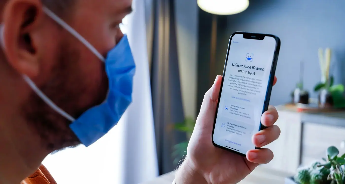
- Biometric authentication prompts that feel natural
- Progress indicators during secure data transmission
The psychology here is fascinating—users often judge an app's security within seconds of opening it. Small details like showing a lock icon during data entry or using secure form styling can make the difference between a user feeling confident or concerned about sharing their health information. These considerations are particularly important when we look at how mobile devices are revolutionising the healthcare industry globally.
Place security indicators where users naturally look first—near login fields and data entry forms—rather than burying them in settings menus.
Getting this balance right means your healthcare apps can build genuine trust through thoughtful behavioural design, not just technical features hidden in the background.
Testing User Behaviour in Medical Apps
When we build medical apps at Glance, I always tell my team that we can't just guess what users will do—we need to watch them actually use the app. Testing with real people is the only way to know if our designs actually work in practice. You might think a button is obvious, but put it in front of someone who's worried about their health and suddenly it becomes confusing.
Real Users, Real Reactions
The best insights come from watching people use your app when they're genuinely stressed or concerned about their health. We've learned that users behave completely differently when they're anxious compared to when they're calm. They miss obvious buttons, skip important information, and make assumptions that seem strange until you understand their mindset.
What We Look For
During testing sessions, we pay attention to where people hesitate, what they tap first, and—most tellingly—what questions they ask out loud. These moments reveal gaps between what we think is clear and what actually makes sense to someone using the app. We also track how long people spend on different screens; if someone's stuck somewhere for too long, that's usually a sign that something needs fixing. Understanding what causes mobile apps to fail helps us identify potential issues before they become major problems.
The goal isn't perfection—it's understanding. Every test teaches us something new about how people interact with medical technology when they're vulnerable. These insights help us create stellar apps that stand out from the many healthcare applications that fail to gain user trust.
Conclusion
Building trust in healthcare apps isn't just about making them look pretty—it's about understanding how people think and feel when they're dealing with their health. We've covered a lot of ground here, from the psychology behind why users trust certain design choices to the practical ways you can implement these ideas in your own medical app development projects.
The truth is, people are naturally cautious when it comes to their health data, and that's completely understandable. They want to feel safe, secure, and confident that the app they're using will protect their information and function reliably, especially in moments that matter. This means every design decision—from onboarding flows and consent prompts to in-app messaging and data access pathways—needs to reinforce safety and transparency at every step. Integrating visible privacy settings, clear consent mechanisms, and intuitive controls helps reassure users that they remain in charge of their information. By weaving these trust signals into the foundational experience, you’re not just checking regulatory boxes—you’re actively demonstrating respect for patient autonomy and privacy. Ultimately, sustained trust is built when users consistently experience seamless, predictable, and secure interactions that make it easy to care for their health with confidence.