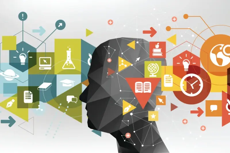
Every second, your brain processes eleven million bits of information—but you're only consciously aware of about forty of them. That staggering filtering system is what determines whether someone loves your app or deletes it within minutes of downloading. The difference between a successful app and one that gets forgotten isn't just good design or clever features; it's understanding how the human brain actually works when it encounters your interface.
Most app designers rely on intuition and best practices, which isn't necessarily wrong. But what if we could go deeper? What if we could design apps that work with our brain's natural patterns instead of against them? This is where neuroscience and cognitive psychology come into play—not as abstract academic concepts, but as practical tools that can transform how we approach app development.
The best interfaces are invisible to the user because they align perfectly with how our minds expect things to work
Throughout this guide, we'll explore how your users' brains respond to colour, motion, and layout; why certain interaction patterns feel natural while others feel clunky; and how memory, attention, and emotion shape every tap and swipe. You don't need a psychology degree to apply these principles—you just need to understand what's happening inside your users' heads when they open your app.
What Your Brain Actually Wants from Apps
Your brain is quite demanding when it comes to apps—it wants things fast, simple, and rewarding. After years of working with clients who've built everything from shopping apps to fitness trackers, I've noticed the same patterns emerge time and again. People don't just want apps that work; they want apps that feel good to use.
Speed and Simplicity
Your brain processes information incredibly quickly, but it also gets frustrated when things take too long or feel complicated. When someone opens your app, their brain is already making snap judgements within milliseconds. If the app loads slowly or the first screen looks confusing, that's it—you've lost them. The brain wants clear paths forward, obvious buttons, and predictable outcomes. Think about the apps you use most often; they probably don't make you think too hard about what to tap next.
Rewards and Recognition
Here's something interesting—your brain releases dopamine when you complete tasks or receive positive feedback. That's why notification badges work so well, and why apps with progress bars or achievement systems keep people coming back. The brain craves these little wins. It wants to feel accomplished, even if it's just marking off a to-do item or earning points for walking 10,000 steps. Smart app designers tap into this natural reward system without being manipulative about it.
The Science Behind User Behaviour
Understanding why people behave the way they do when using apps isn't just good practice—it's the difference between an app that gets deleted after five minutes and one that people genuinely love using. I've watched countless apps fail not because they looked bad or didn't work properly, but because the team behind them didn't understand basic human psychology.
When someone opens your app, their brain is making hundreds of tiny decisions every second. Where should I tap first? What does this button do? Is this worth my time? These aren't conscious thoughts; they're happening automatically in the background whilst your user thinks they're just "using an app".
The Three Layers of Brain Processing
Your brain processes information in three distinct layers, and each one affects how people interact with your app design:
- Instinctive Level: Fight or flight responses, immediate reactions to colours and shapes
- Behavioural Level: Learned patterns, muscle memory, and habits
- Reflective Level: Conscious thought, decision-making, and problem-solving
Cognitive Load Theory
People can only process so much information at once. When you overload someone's brain with too many choices or complex interfaces, they simply give up. This is why the most successful apps feel almost stupidly simple—they're designed to work with your brain, not against it.
Keep your main app screens to no more than 7±2 interactive elements. This follows Miller's Rule, which shows that most people can only hold 5-9 items in their working memory at once.
Memory and Learning in App Design
Your brain is constantly trying to remember things and forget others—it's quite selective about what gets stored long-term. When people use your app, their brains are making snap decisions about what's worth remembering and what can be discarded. This happens within seconds of opening your app.
The trick is understanding how memory works in practice. People remember things better when they can connect new information to something they already know. That's why familiar icons work so well—the shopping cart symbol doesn't need explaining because everyone already knows what it means.
Making Information Stick
Repetition helps, but not the annoying kind. When users see the same visual patterns throughout your app—same colours for buttons, consistent placement of menus—their brains start to recognise these patterns without conscious effort. This frees up mental energy for the actual tasks they want to complete.
Short-term memory can only hold about seven pieces of information at once. That's why cramming too many options on one screen usually backfires; people simply can't process it all. Breaking complex tasks into smaller steps works much better because it matches how our brains naturally learn new processes.
The best apps teach users gradually. They introduce one new feature at a time rather than overwhelming people with everything at once—this creates positive learning experiences that keep people coming back.
Attention and Focus Principles
Our brains are surprisingly bad at multitasking—despite what we tell ourselves when we're juggling five different apps at once! Neuroscience research shows that what we think is multitasking is actually just rapid task-switching, and each switch costs us mental energy. This has massive implications for app design and development.
When someone opens your app, you've got about 3-8 seconds before their attention starts wandering. That's not long at all. The prefrontal cortex, which handles focus and attention, gets tired quickly when it's overwhelmed with choices or complex interfaces. I've seen countless apps fail because they tried to show everything at once—the dreaded "feature creep" that makes users feel lost.
The Power of Single-Task Design
Apps that work best follow what cognitive psychology calls the "single-task principle." Each screen should have one clear purpose. Instagram understood this brilliantly; when you open the app, you see photos. That's it. No confusion, no cognitive overload.
The human brain can only consciously focus on one complex task at a time, making simplicity the ultimate sophistication in app development
The secret is using visual hierarchy and progressive disclosure—showing users what they need when they need it, nothing more. Understanding what design principles create the most intuitive mobile app interfaces helps ensure that white space isn't wasted space; it's breathing room for your user's brain.
Emotional Responses and User Experience
Your brain doesn't just think—it feels everything you do on your phone. Every tap, swipe, and scroll triggers emotional reactions that happen faster than conscious thought. The limbic system, which controls emotions, processes information about 20 times quicker than your logical brain; this means people feel whether they like your app before they even understand what it does.
The Power of Positive Emotions
When users feel good whilst using an app, their brains release dopamine—the same chemical that makes you happy when you eat chocolate or get a text from someone you fancy. Smart app designers trigger these positive feelings through micro-interactions like satisfying button animations, pleasant sounds, or that little celebration when you complete a task. Instagram knows this well; the heart animation when you double-tap creates a tiny moment of joy that keeps people coming back.
Managing Negative Emotions
Fear and frustration are app killers. When someone can't find what they're looking for or an action doesn't work as expected, stress hormones flood their system. The amygdala—your brain's alarm system—literally screams "danger!" even though it's just a confusing interface. This is why clear error messages, intuitive navigation, and consistent design patterns aren't just nice to have—they're neurological necessities that keep users calm and engaged. Understanding why emotion is important in app design can help developers create interfaces that support rather than stress users.
Decision Making and Interface Design
Your brain makes thousands of tiny decisions every single day—and that includes every tap, swipe, and scroll when someone uses your app. The brilliant thing about neuroscience research is that it's shown us exactly how people make these split-second choices. When faced with options, our brains follow predictable patterns that we can design for.
The prefrontal cortex handles decision-making, but here's the catch—it gets tired quickly. This is why choice paralysis can kill your app's success when you present someone with too many buttons or menu options and their brain literally struggles to cope. Studies show that people perform better with fewer choices, which is why the most successful apps keep their interfaces clean and focused.
The Two-Second Rule
Users decide whether to stay or leave an app within two seconds of opening it. That's barely enough time to process what they're seeing, let alone read detailed instructions. Your interface needs to communicate its purpose immediately through visual hierarchy and familiar patterns.
Limit primary actions to three or fewer per screen. Your users' brains will thank you for it, and your conversion rates will show the difference.
Smart app design works with these cognitive limitations rather than against them. Use progressive disclosure to reveal information gradually, and always provide clear visual feedback when users make choices—their brains are wired to expect confirmation that their decisions have registered. Learning from what developers can learn from the top app development companies shows how successful apps consistently apply these psychological principles.
Conclusion
After working with hundreds of apps over the years, I can honestly say that understanding how our brains work has changed everything about how I approach design. It's not just about making things look pretty anymore—though that still matters, don't get me wrong! It's about creating experiences that feel natural and effortless for users.
The science we've covered isn't just academic theory; it's practical knowledge that can make or break your app. When you design with memory limitations in mind, respect attention spans, and tap into emotional responses the right way, users notice. They might not be able to explain why your app feels better than the competition, but they'll keep coming back to it.
I've seen apps with brilliant functionality fail because they ignored these principles—and I've watched simpler apps succeed wildly because they understood what users' brains actually wanted. The difference between good and great often comes down to these psychological details that most people never think about, which is why designing with intent to align app features with business goals requires this deeper understanding of user psychology.
Your users' brains are doing incredible work every time they open your app, processing information, making decisions, forming memories. When you design with that in mind, you're not just building an app—you're creating something that works with human nature rather than against it. And that's when the magic happens.