
How much money are you losing every day because people download your mobile app but never use it again? The answer is probably more than you think, and the causes are often hiding in plain sight within your app's design. Most business owners blame poor marketing or tough competition when their app fails to gain traction, but the real problem tends to be much more basic than that...poor design choices that make people abandon the app within minutes of opening it for the first time.
Users will forgive many things, but a confusing or frustrating experience isn't one of them
Building apps for the past ten years has taught me that the difference between an app that succeeds and one that disappears into obscurity often comes down to a handful of design decisions made early in the development process. The problem is that these mistakes are so common that many developers and business owners don't even realise they're making them, which means they keep repeating the same patterns across different projects and wondering why the results never improve.
What makes this particularly frustrating is that fixing these issues doesn't require a complete rebuild or a massive budget increase. Most of the time, it's about understanding what actually makes users leave and then making targeted changes to address those specific pain points, which is exactly what we're going to explore in this article.
Poor Navigation Will Send Users Running
The way people move through your mobile app determines whether they'll stick around long enough to see its value, and navigation problems are one of the fastest ways to lose someone who just downloaded your app. When we rebuilt a healthcare booking app three years back, the client was confused about why 73% of users were leaving after viewing just one screen, but the moment we looked at the navigation structure it became obvious...users had no idea how to get from the home screen to the booking function because the button was hidden in a side menu that required three taps to access.
People expect to reach any major function in your app within two taps from the home screen. That's not a suggestion, it's a requirement if you want to keep users engaged. The apps that perform best in terms of retention are the ones where users can immediately understand where to go and how to get back to where they were, which sounds simple but requires careful planning during the design phase.
Navigation bars should stay in the same place throughout the entire app experience, whether that's at the bottom of the screen for iOS or in a drawer menu for Android (though bottom navigation is becoming more popular on Android too). Moving navigation elements around between different screens creates confusion and makes people feel like they're learning a new interface every time they open a different section of your app, which is exhausting and unnecessary. This kind of navigation inconsistency is exactly the type of issue that can lead to critical maintenance oversights that ultimately kill mobile apps.
Complex User Interfaces Drive People Away
The fitness tracking app we designed for a gym chain in Manchester started with seventeen different data points on the home screen because the client wanted to show users everything the app could do. The bounce rate was terrible. Users would open the app, see this wall of information and buttons and graphs, and close it immediately because they couldn't work out where to start or what to do first.
Your mobile app interface needs to show people one clear action they should take, not bombard them with every possible feature at once. We stripped that fitness app down to three main elements on the home screen (start workout, view progress, and today's goal), and within two weeks the daily active users increased by 140% because people could actually understand what they were supposed to do when they opened the app. This principle aligns perfectly with cognitive load theory and why simple apps consistently outperform complex ones.
Test your home screen with someone who's never seen your app before and ask them to tell you what they think they should do first. If they hesitate or guess wrong, your interface is too complex.
- Limit your home screen to a maximum of three primary actions
- Use clear labels instead of clever or branded terms that require explanation
- Group related features together rather than spreading them across multiple screens
- Remove any feature that less than 20% of your users actually engage with
The mobile screen is small, which means every pixel needs to earn its place by either providing information users need or enabling an action they want to take. Decorative elements and unnecessary visual complexity just get in the way of what people are trying to accomplish, and when users feel like they're fighting with your interface, they stop fighting and delete the app instead. Understanding why functionality matters more than just pretty design is crucial for creating apps that users actually want to keep using.
Slow Loading Times Kill App Retention
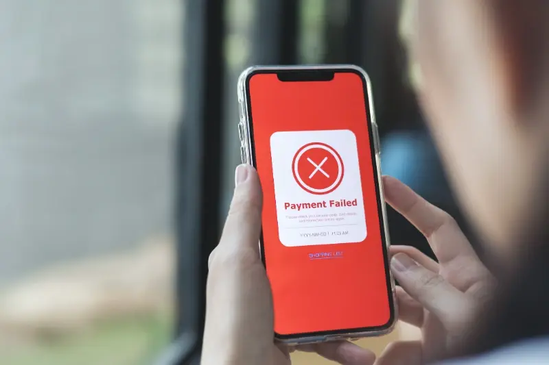
Users will wait about two seconds for your app to load before they start getting frustrated, and after five seconds most of them will close the app and might never open it again. That margin is razor thin, but it reflects how people actually behave with mobile apps rather than how we wish they would behave.
A retail client came to us with an app that took nine seconds to load the product catalogue because they were loading high-resolution images for every single item at once, which completely destroyed the user experience. People would open the app, see a loading spinner, wait a few seconds, and then close it and just visit the website instead, which defeated the entire point of having a mobile app in the first place. These kinds of performance red flags are often warning signs of deeper issues that need immediate attention.
| Load Time | User Behaviour | Retention Impact |
|---|---|---|
| Under 2 seconds | Smooth experience, no frustration | Baseline retention |
| 2-5 seconds | Noticeable delay, mild frustration | 15-25% drop in next-day retention |
| Over 5 seconds | Significant frustration, app closure | 40-60% drop in next-day retention |
The technical solutions here involve lazy loading (only loading content as the user scrolls to it), image compression, caching data locally on the device, and optimising your backend API responses. For that retail app, we implemented progressive image loading where users saw a low-resolution version instantly that then sharpened as the full image loaded in the background, which made the app feel responsive even though the actual load time hadn't changed that much.
Testing your app on older devices with slower processors and poor network connections is necessary because that's what a large portion of your user base is actually using, not the latest iPhone or flagship Android device. An app that runs beautifully on your development machine but stutters on a three-year-old phone with a patchy 4G connection is an app that's going to lose users in the real world. This is why thorough testing across different devices and conditions is absolutely essential before launch.
Ignoring Mobile-First Design Principles
Designing a mobile app isn't the same as shrinking down a website to fit on a smaller screen, but that's exactly what many businesses try to do because it seems faster and cheaper than creating a proper mobile experience from scratch. The financial services app we worked on two years ago started as a direct port of the company's web dashboard, complete with dropdown menus, hover states that don't work on touch screens, and tiny text that required zooming to read.
Mobile users have different needs, different contexts, and different patience levels compared to desktop users
People use mobile apps while they're standing on a train, walking down the street, or sitting in a waiting room with one hand occupied, which means your interface needs to work with thumb-based navigation and large touch targets that someone can hit accurately without looking directly at their screen. Buttons and interactive elements should be at least 44 pixels square (that's about 7mm on most screens), with adequate spacing between them so users don't accidentally tap the wrong thing.
Text size matters more on mobile than anywhere else because people are viewing content at arm's length rather than the comfortable reading distance of a desktop monitor. Anything smaller than 16 pixels for body text is too small, and your primary headings should be at least 24 pixels to create clear visual hierarchy that users can scan quickly without having to read every word. Small design details like micro-interactions can significantly improve how users perceive and interact with these mobile-optimised elements.
Forms on mobile apps need to be drastically simplified compared to their web equivalents because typing on a mobile keyboard is slower and more error-prone than typing on a physical keyboard. Every field you remove from a form increases the completion rate, so only ask for information you absolutely need right now, not everything you might want to know at some point in the future.
Overwhelming Users With Too Many Features
The project management app we built for a construction company started with 23 different features because the stakeholders kept adding "just one more thing" during the planning phase, and by the time we launched, the app was so bloated with functionality that new users couldn't find the core features they actually needed. User testing sessions showed people getting lost in menus, confused about which feature to use for basic tasks, and generally feeling overwhelmed by the sheer number of options. This kind of feature overload is particularly problematic during the critical onboarding phase when first impressions matter most.
Apps become successful by doing a small number of things really well, not by doing everything adequately. The most downloaded and highest-rated apps in any category tend to have clear, focused functionality that solves one specific problem better than any alternative, rather than trying to be an all-in-one solution that does everything.
- Identify the one primary action that 80% of your users need to complete
- Design your entire interface around making that action as easy as possible
- Move secondary features into settings or secondary navigation
- Remove any feature that doesn't directly support your core use case
- Test with actual users to confirm they can complete the primary action in under 30 seconds
Feature creep happens gradually during development when different stakeholders push for their preferred additions, but each new feature adds complexity to your interface, increases your development timeline, raises your maintenance burden, and dilutes the core experience that makes your app valuable in the first place. Learning to say no to feature requests is one of the hardest skills in app development, but it's what separates apps that users love from apps that try to please everyone and end up satisfying no one. When planning your app features, it's helpful to think about building a focused MVP that prioritises core functionality over feature breadth.
Neglecting Accessibility Loses Half Your Audience
About 15% of the global population lives with some form of disability, which means ignoring accessibility in your app design is the same as deliberately excluding millions of potential users who could benefit from your product. The banking app we redesigned for a client in Leeds had no consideration for screen readers, used colour as the only way to indicate errors, and had contrast ratios so low that people with any vision impairment couldn't read the text.
Accessibility isn't just about users with permanent disabilities though...it affects anyone using your app in bright sunlight (which makes low-contrast text invisible), anyone with a temporary injury like a broken arm, anyone who's getting older and experiencing age-related vision changes, and anyone trying to use your app in a situation where they can't give it their full attention.
Enable VoiceOver on iOS or TalkBack on Android and try to complete your app's main task without looking at the screen. If you can't do it, neither can your vision-impaired users.
Colour and Contrast
Your colour scheme needs sufficient contrast between text and background to be readable by people with colour blindness or low vision, which means a contrast ratio of at least 4.5:1 for normal text and 3:1 for large text. Tools like the WebAIM contrast checker can tell you if your colour combinations meet these requirements, and fixing contrast issues is usually as simple as making your text slightly darker or your background slightly lighter.
Touch Targets and Spacing
People with motor control difficulties (which includes anyone with arthritis, tremors, or just cold hands) need larger touch targets with more spacing between interactive elements. The minimum size of 44x44 pixels that helps all users becomes necessary for these users to interact with your app at all, and buttons placed too close to screen edges are particularly difficult for anyone with limited hand mobility.
Inconsistent Design Elements Confuse Users
When your buttons look different on different screens, when your colour scheme changes between sections, or when your typography styles vary throughout the app, you're creating cognitive load that makes users work harder to understand your interface. The education app we worked on for a tutoring company had three different button styles, two different navigation patterns, and text that changed colour seemingly at random, which made students feel like they were using several different apps stitched together rather than one complete product.
Design consistency isn't about being boring or repetitive...it's about creating patterns that users can learn once and then apply throughout their entire experience with your app. When someone learns that blue buttons perform actions and grey buttons cancel them, they should be able to rely on that pattern everywhere in your app without having to stop and think about whether this particular blue button might do something different. Getting feedback from real users rather than just internal stakeholders is crucial for identifying these consistency issues that might not be obvious to the development team.
| Design Element | Why Consistency Matters | Common Mistakes |
|---|---|---|
| Buttons | Users learn which actions are primary vs secondary | Changing button styles between screens, inconsistent spacing |
| Typography | Creates clear information hierarchy | Too many font sizes, mixing font families, irregular line heights |
| Navigation | Users know how to move through the app | Moving navigation between top and bottom, hiding nav on some screens |
| Colour | Reinforces brand and creates meaning | Using different colours for same actions, too many accent colours |
Design systems solve this problem by documenting every reusable component in your app (buttons, input fields, cards, navigation elements) along with rules for when and how to use each one. Even if you're working with a small team or building a simple app, creating a basic design system with colour codes, typography scales, and component specifications ensures that everyone building the app maintains visual consistency throughout the entire product. This systematic approach is particularly important when making technical decisions that need to scale as your app grows and evolves.
Conclusion
The design mistakes covered here account for the majority of user abandonment and poor retention we see across mobile apps in every industry, from healthcare to retail to entertainment. The good news is that none of these problems require starting over from scratch or spending tens of thousands on a complete rebuild...they're all fixable with focused design improvements that directly address user frustrations.
What makes these mistakes particularly damaging is that they compound each other. An app with poor navigation and slow loading times and an overly complex interface doesn't just have three separate problems, it has one massive problem that drives users away faster than any single issue would on its own. But the opposite is also true...fixing these design issues creates a multiplier effect where improvements to navigation make your interface feel simpler, which makes load times feel faster, which makes users more forgiving of minor imperfections elsewhere.
Testing your app with real users who haven't seen it before remains the most reliable way to identify which of these mistakes are affecting your specific product. What seems obvious to you after months of working on the app might be completely confusing to someone opening it for the first time, and until you watch actual users struggle with your interface, you won't know which problems are most pressing for your particular audience.
If you're struggling with user retention or wondering why people aren't engaging with your mobile app the way you expected, get in touch and we can review what's happening with your specific product.
Frequently Asked Questions
Test your app with someone who's never seen it before and ask them to complete your main task without any guidance. If they can't reach key features within two taps from the home screen, or if they get lost trying to navigate back to where they started, your navigation needs simplification.
The biggest mistake is treating mobile like a shrunk-down version of your desktop interface instead of designing for thumb navigation and one-handed use. Mobile users need larger touch targets (minimum 44 pixels), bigger text (16+ pixels for body text), and simplified forms because they're often using the app while distracted or in challenging environments.
If users hesitate or can't immediately identify what action to take when they open your app, you have too much complexity. Limit your home screen to maximum three primary actions and remove any feature that less than 20% of your users actually engage with.
Users start getting frustrated after 2 seconds and will often abandon your app after 5 seconds of loading time. Test your app on older devices with poor network connections since that reflects what many of your users are actually experiencing, not just the latest flagship phones.
Enable VoiceOver (iOS) or TalkBack (Android) and try to complete your app's main task without looking at the screen. Also check that your text has sufficient contrast (use tools like WebAIM contrast checker) and ensure all interactive elements are at least 44x44 pixels with adequate spacing.
Inconsistent design creates cognitive load that makes users work harder to understand your interface, leading to frustration and abandonment. When buttons, colors, and navigation patterns change throughout your app, users have to relearn how to interact with each new screen instead of building familiarity.
Focus on the problems that affect your core user journey first - typically navigation and loading speed have the biggest immediate impact on retention. These issues compound each other, so fixing navigation often makes your interface feel simpler and loading times more tolerable.
Most of these issues can be addressed through targeted design improvements rather than complete rebuilds, making them much more cost-effective to fix than you might expect. The exact cost depends on your app's complexity, but addressing navigation, simplifying interfaces, and improving consistency are typically straightforward updates that don't require rebuilding your entire backend.


Share this
Subscribe To Our Blog
You May Also Like
These Related Stories

Cognitive Load Theory: Why Simple Apps Win Every Time
The Most Common Mistakes in Banking App Development