
Did you know that the colour of an app can affect how users feel and the behaviour they exhibit? In this blog post, we will discuss the principles of colour psychology and how it applies to the visual side of mobile application design. We will look at how, as a designer, you can use different colours to create different emotions and reactions in your users. We will also provide some tips on how to use colour to achieve good engagement rates for your app. Understanding the psychology of app design is key to having a successful app and happy users.
Creating standout mobile apps hinges on a deep understanding of colour psychology, font types, and layout designs. These foundational elements significantly shape the user experience and influence an app’s success. This guide examines how these crucial design aspects work together to craft intuitive, appealing, and efficient applications that engage and resonate with users. Mastering these design principles can dramatically enhance user engagement and satisfaction.
Introduction to Mobile App Design Elements
The success of a mobile app depends on more than just its functionality; it also depends on how users feel about the app. This is where colour psychology, typography, and layout play critical roles. Each element contributes to the overall user experience, influencing perceptions, emotions, and behaviours.
What is Colour Psychology?
Colour psychology is the study of how colours can affect our emotions and behaviour. It is a key theory in the design world. Different colours can evoke different feelings in people, especially when used within apps. For example, the colour red is often associated with anger or danger, while the colour green or blue is associated with calmness or relaxation. The use of colour in the design of your apps can be used to create a desired emotion or behaviour in users based on the goal you want those users to achieve.

When choosing the colour palette for your apps, it is important to consider what feeling you want your users to experience and what behaviour you want them to exhibit. Do you want your app to be calming and relaxing? Or do you want it to be exciting and energising? Once you have decided on the feeling you want to create, you can choose colours to evoke this feeling.
The Role of Colour in App Design
Colour psychology is an integral part of mobile app design, affecting everything from user perception to their decision-making process. Different colours can evoke various emotions and reactions, making it crucial for designers to choose their colour palette wisely to align with the app's goals.
The Emotional Impact of Colours
- Red: Often associated with energy and urgency, red can increase user engagement and prompt quick decisions. However, it can also signal danger, so it should be used sparingly.
- Blue: Known for its calming effects, blue can help establish trust and security, making it ideal for banking or healthcare apps.
- Green: Associated with harmony and balance, green is perfect for apps focused on health, wellness, or environmental functions.
- Yellow: This colour stands for optimism and can catch users' attention quickly, suitable for CTAs or warnings, but excessive use might be overwhelming.
- Purple: Signifying luxury and creativity, purple is excellent for brands looking to portray elegance or exclusivity.
Cultural Sensitivity and Colour Selection
It is also important to consider the different meanings of colours in various cultures. For example, the colour white is often associated with purity and innocence in Western cultures. However, in Eastern cultures, the colour white is often associated with death and mourning.
When choosing colours for your app, make sure to consider the different cultural associations of colours for your user. This will help ensure that your app is designed in a culturally appropriate way.
Colour meanings vary significantly across different cultures, which is critical to consider when designing apps for a global audience. For example, while white represents purity in many Western cultures, it could signify mourning in some Eastern cultures. This cultural sensitivity can help avoid misunderstandings and enhance the user experience.
Accessibility
When using colour in your app design, it is also important to consider the amount of contrast between the foreground and background colours. Too much contrast can be overwhelming for users and make it difficult to read text. Conversely, too little contrast can make text appear washed out and difficult to read. Finding the right balance of contrast is important for creating an app that is easy to use and navigate for every single user.
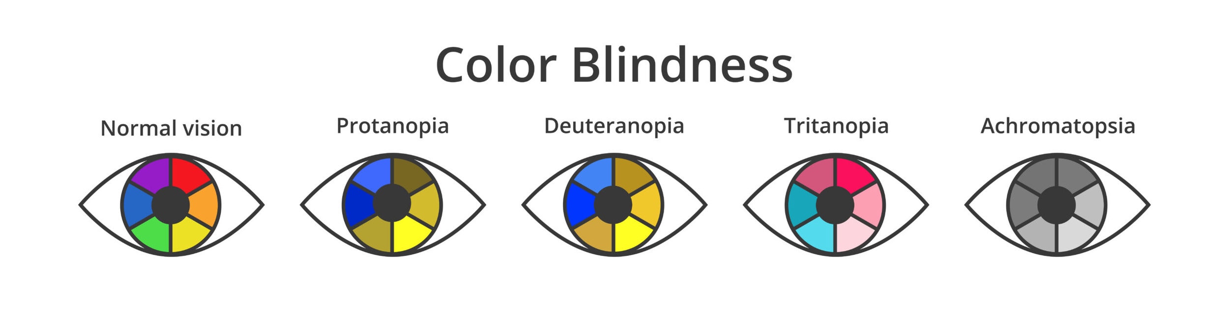
When it comes to accessibility, your app design should also take into account users who are colourblind. Approximately eight per cent of men and five per cent of women are colourblind, so some of your users will experience these difficulties. When designing your app, consider using a colour palette that will be accessible to all users, regardless of their level of colour vision.
Colour Motivation
A successful app design should motivate the user to achieve some objective and is a key psychology principle. Colour is one of the principal ways that designers can do this. Colour plays a huge part in the branding and personification of your mobile app. Different colours will have a different effect on the psychology of your users.
Creating a hierarchy of colours is a way of using colour to indicate to a user the relative importance of different elements on the screen and is a primary principle when it comes to affecting user behaviour. Making certain elements stand out by using lots of colours and keeping other elements quite light in colour will help to guide the user’s attention.

Strategic Use of Colours in User Interface (UI) Design
Incorporating colour psychology into UI design involves more than just aesthetic appeal—it's about using colour strategically to guide user behaviour and improve usability. Here’s how:
-
Navigation and Accessibility
Colours can help differentiate elements on the screen, guiding users through their interactions with the app. High contrast between text and background improves readability, while a thoughtful colour scheme can make navigation more intuitive.
-
Highlighting Actions and Key Features
Using distinct colours for different actions (like primary and secondary buttons) can reduce user errors and streamline interactions within the app. For example, a bright colour for a ‘Submit’ button on a form can draw attention and prompt action, increasing conversion rates.
Optimising App Design for Various Audiences
Understanding the demographics of your app’s target audience is crucial. Age, gender, and cultural background can influence how colours are perceived. For instance, younger audiences might prefer vibrant, contrasting colours, while older users may find subtle hues more appealing and easier on the eyes.
Implementing Adaptive Colour Schemes
With the rise of personalised user experiences, adaptive colour schemes can significantly enhance user engagement. Allowing users to choose from a selection of themes or automatically adjusting colours based on external factors like time of day not only improves aesthetics but also usability.
The Importance of Fonts in User Experience
Fonts do more than convey text; they also affect the readability, mood, and perception of the app:
Branding and Font Identity
Fonts help solidify brand identity. The typeface chosen for an app can reflect its personality and core values. For instance:
- Serif fonts like Times New Roman, known for their traditional appearance, convey formality and reliability, making them suitable for apps focused on business or professional services.
- Sans-serif fonts such as Helvetica are favoured for their clean and modern look, aligning well with tech, lifestyle, or innovative apps that aim to project a straightforward and accessible vibe.
The consistent use of a specific font helps reinforce brand recognition and can enhance the overall user experience by making the app feel more cohesive and familiar to users.
Font Styles and Their Psychological Impact
Different font styles can evoke different feelings and convey varied messages:
- Display fonts are more distinctive and can be used to draw attention to promotions or important features. However, due to their often elaborate forms, they should be used sparingly to avoid cluttering the interface and diminishing usability.
- Script fonts mimic handwriting and can add a personal touch, often used in apps that wish to convey elegance, creativity, or intimacy.
Understanding the emotional connotations of different fonts can help in making informed decisions that align with the app’s goals.
Availability and Compatibility Across Platforms
When selecting fonts, it's important to consider their availability across different operating systems and devices to ensure a consistent user experience. Some fonts are universally available, while others may require licensing or may not be supported on certain platforms. Using web-safe fonts or embedding custom fonts ensures that your design retains its intended appearance across all user touchpoints.
Combining Fonts
The combination of fonts can enrich the design but requires careful consideration to maintain readability and aesthetic harmony:
- Pairing fonts involves selecting two or more fonts that complement each other. Typically, one font is used for headings and another for body text. For example, a bold sans-serif for headings paired with a light serif for body text can create a dynamic yet readable layout.
- Contrast in typefaces can be achieved by mixing fonts with distinct weights, styles, or spacing. This not only adds visual interest but also helps organise information and guide the user's eye through the content.
By carefully selecting and applying fonts, designers can significantly influence the user's perception and interaction with the app, enhancing both the functional and emotional aspects of the user experience.
Optimising App Layouts Through Psychological Principles
The layout of a mobile app is critical for facilitating a smooth and intuitive user journey. By effectively organising and arranging visual elements using psychological principles, designers can significantly enhance user interaction and satisfaction. Here’s an in-depth look at how these principles apply to app layout design:
Organisational Principles
Effective app layouts are not just about aesthetics; they're about organising content in a way that's intuitive and aligns with how users process information:
- Proximity: This principle suggests that items that are physically close to each other are perceived as related. Grouping related elements together, such as placing all navigation buttons in one area, helps reduce cognitive load and makes the app easier to use.
- Hierarchy: Establishing a clear hierarchy in the app design helps users prioritise information and navigate more effectively. This can be achieved through varying font sizes, colours, or element placement, directing attention to the most important information first.
- Simplicity: Keeping the layout simple and uncluttered avoids overwhelming the user. This involves minimising the number of actions needed to perform tasks and reducing the overall cognitive effort required by the user.
Design Elements
Specific design elements play a crucial role in how effectively a layout performs:
- Alignment: Proper alignment creates a clean, organised interface that enhances both readability and visual appeal. Aligning elements consistently across screens helps create a sense of cohesiveness and order.
- Contrast: Utilising contrasting colours for text and backgrounds not only enhances readability but also serves to highlight the most important elements, such as CTAs (Call to Action) and alerts. High contrast is particularly important for accessibility, ensuring that all users can navigate the app comfortably.
- Repetition: Repeating visual elements throughout the app provides a consistent and predictable experience, which can reassure and guide users. Consistent use of colours, fonts, and button styles helps reinforce memory and improve navigability.
Layout Patterns and User Behavior
Understanding common user behaviours and expectations can inform more effective layout designs:
- F-Pattern Layout: Research shows that users often scan screens in an 'F' shape. Placing important information at the top or left side of the screen can ensure it’s seen more often.
- Z-Pattern Layout: For less text-heavy pages like homepages or landing pages, a Z-pattern can guide the eye from top left to top right, down to the bottom left, and then to the bottom right, which is ideal for strategically placing key information and CTAs.
- Grid Systems: Utilising grids in app design helps create a balanced and orderly layout that improves aesthetic appeal and practical functionality. Grids provide a guide for placing elements systematically, enhancing the structural layout of content.
Adaptive and Responsive Designs
To cater to a diverse range of devices and screen sizes, adaptive and responsive designs are essential:
- Responsive Design: Ensures that the app’s layout adjusts smoothly across different screen sizes and orientations, maintaining usability and aesthetics without compromising functionality.
- Adaptive Design: Involves creating multiple fixed layout sizes based on common screen sizes. While more rigid than responsive design, it allows for more tailored designs that can meet specific usability standards for each device type.
By employing these psychological principles and design strategies, app developers and designers can create layouts that not only look good but also facilitate a smoother, more intuitive user experience. An optimised layout considers both the psychological impact on the user and the practical functionality of the app, ensuring that it is accessible, easy to navigate, and effective in meeting the needs of diverse users.
Combining Elements for Cohesive Design
To create a truly engaging and effective app, designers must integrate colour, font, and layout in a way that is cohesive and aligned with the app’s goals. This holistic approach to design considers:
- User demographics: Tailor colour schemes and typography to appeal to your target demographic, such as vibrant colours and casual fonts for younger users.
- Cultural considerations: Adapt your designs to be culturally appropriate and accessible to a global audience.
- Accessibility: Ensure that colour contrasts, font sizes, and layout choices comply with accessibility standards to accommodate all users, including those with disabilities.
Colour Psychology Top Tips
Here are some top tips for using colour in your app design:
- Choose a colour scheme that reflects the personality of your app and ensure your designer understands the brand. This is the quickest way to get a user to understand your product.
- Your app’s colour scheme should be in line with its overall tone and message. If your app is fun and light-hearted, then you might want to use bright, cheerful colours. If your app is more serious or business-focused, then you might want to use a more muted colour palette.
- Think about the colours that are most associated with your app’s genre, industry, or target market. For example, if you are designing an e-commerce app for a luxury fashion brand, then you might want to use a glamorous colour scheme of black, white, and gold.
- Consider the different meanings of colours in different cultures. As mentioned before, the colour white can have very different associations in Eastern and Western cultures. Make sure to choose colours that will be appropriate for your app’s global audience and won’t offend the user.
- Pay attention to the level of contrast between foreground and background colours. Too much contrast can make text difficult to read for your users.
Conclusion: The Power of Psychology in App Design
Understanding and applying the principles of psychology in mobile app design can transform a functional tool into an engaging, intuitive, and indispensable resource for users. By carefully selecting colours, fonts, and layouts that resonate with your target audience, you can enhance the user experience, increase user retention, and ultimately drive success for your app.
This comprehensive approach not only educates but also inspires app developers and designers to think deeply about the psychological aspects of their work, leading to more thoughtful and user-centred app designs.
Let's continue the conversation about the psychological impact of design elements in mobile apps. Share your thoughts and experiences on how integrating these principles has influenced your app's success!


Share this
How Colour Psychology can be Applied to Mobile Apps

Improve The Retail Experience With A Well-Developed Mobile App