It may come as a surprise, but after functionality, colour is the most important element to any app design. Using the right colours is not only good for aesthetic purposes, but it can help users navigate and use your app more easily and even give them an idea of your app’s purpose when they first see it in the marketplace. For example, apps for mind and body are often designed with a natural and serene colour palette that incorporates pale greens, blues and neutral colours. A social media app is likely to borrow from a vibrant primary colours palette (think about the boldness of Facebook, Snapchat, WhatsApp and Twitter’s logo colours). Whether you are developing a yoga app, an anti-virus app or a new social media app, colour can make your app stand apart from the rest and play a huge role in its success. Find out how Psychology can factor into getting the best engagement rates from your users with our guide.
What is Colour Psychology?
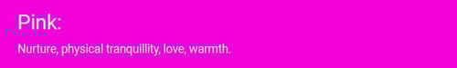
To answer that question in depth we would be here for hours, but in a nutshell, colour psychology is the study of colours and how they can influence human behaviour. There are four primary psychological colours – blue, green, yellow and red. Each relates respectively to the mind, the body, the emotions and the harmony that exists between these elements. When mixed to create secondary colours, these four primary colours become eleven that can be harnessed to generate specific behaviour in humans.
The Eleven Colours and The Psychology Behind Them


Finding the Right Colour Scheme For Your App
When there are infinite possible colour schemes available to you, it can be difficult to decide on the one that will work best for your app. Not only will that colour dictate how your app looks, but it will also affect your marketing and anything else relating to your app’s brand. Unless you want to undergo an expensive rebranding in the future, it makes sense to get it right the first time.

There are 3 simple and essential steps that we recommend you should follow when identifying your company’s business logo:
- Determine your brand’s personality
- Explore colour psychology
- Analyse your competition
Choosing colour combinations that complement each other will make your app more appealing to users and it will be easier for them to use. You might want to play around with different combinations on a colour wheel or try out two or three colours together. It’s proven that people preferred less complicated colour schemes that used no more than three colours.
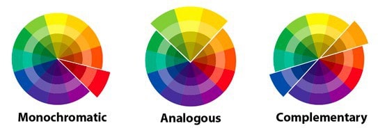
So, how do you go about choosing the perfect colour scheme? Well, much of the hard work has been done for you in that there are already a number of predefined colour schemes, as follows:
Monochromatic Colours: Colour schemes that use a monochromatic palette include colours that go well together as each colour is taken from the same base colour. For example, if you used primary blue as your base colour, the scheme would use blues of different hues, shades and tones. This produces a very soothing effect on the user.
Analogous Colours: These colour schemes pull together colours that sit next to each other on the colour wheel. For example, orange and red sit together and when used in different shades in unison, they can look very effective. These colours are action colours and perfect for apps that feature to-do lists or exercise programmes.
Complementary Colours: Colours in this scheme sit on opposite sides of the colour wheel. They form a strong contrast together that will attract the user’s attention. Red and green, yellow and purple and orange and blue are all complementary colours. However, when using them you should choose one as the dominant colour and the other to create accents so that you avoid overloading the user with too many bright colours.
The Colour Affects System
The Colour Affects System is based on three key principles:
- All people are affected by colour psychologically
- Some of this may be personal, but there are a lot of aspects that are objective, unaffected by culture, gender, or age, meaning they are predictable
- There are four groups of colours that affect people differently
Group 1 – Morninglight/Spring
![]()
- Clean, clear, fresh, and delicate warm colours, containing no black
- Personality: externally motivated, warm, friendly, fresh, youthful, clever, light on their feet, optimistic
- Negatively they can be perceived as frivolous, cheap, and insubstantial
These colours will work best for young and fun brands, especially those that want to appeal to a younger audience, for example, media companies, marketing agencies or toy manufacturers.
Group 2 – Dreamlight/Summer
![]()
- Cool, delicate, subtle, and not necessarily light colours, that contain a bit of grey
- Personality: internally motivated, calm, collected, gentle, witty, elegant, graceful, soothing
- Negatively they can be perceived as unfriendly, elitist, dry, and aloof
These colours are perfect for brands that want to evoke the feeling of timelessness, elegance and delicacy.
Group 3 – Firelight/Autumn
![]()
- Rich, fiery, warm, and offbeat colours that contain black tints, but black itself doesn’t belong in this group
- Personality: externally motivated, intense, strong, fiery, friendly, reliable
- Negatively they can be perceived as flamboyant, bossy and tedious
- When misused, these colours can look boring and old-fashioned
Due to their visual strength, these are the most commonly used colours in branding. They’re appropriate for companies with a proud heritage, for which strength and integrity are important.
Group 4 – Starlight/Winter
![]()
- Cold, clear, strong, contrasting colours, either very light or very dark, include pure black and white
- Personality: internally motivated, command respect, objective-driven, efficient and sophisticated
- Negatively they can be perceived as cold, uncaring, unfriendly, elitist and expensive
These colours are very bold and modern. They work great for brands that are sophisticated, chic and aspirational. High standards, leadership, state-of-the-art product and cutting-edge design are often associated with this colour palette.
Our Final Thoughts
The colours you use in your app will infuse themselves throughout its design, from its home screen icon to its functionality features. Well thought-out colour schemes can provide an outstanding visual experience for users and help provide a competitive advantage over similar apps in the marketplace. Whether you are designing a security app, a restaurant app or an app aimed at children, colour can help you to define your product, appeal to the right target market and attract a loyal user base. It’s worth paying attention to the 4 most popular colours used worldwide, which are Blue (53%), Green, Grey and Black (28%), White (27%) and Red (17%).
If you have an app idea and you would like to know which colour scheme you should include, Talk To Us today and we can provide help!


Share this

The Psychology of App Design

The Psychology of Colour and App Design