A fitness app gets downloaded 50,000 times in its first month. Sounds like success, right? Wrong. Within three months, only 2,000 people are still using it regularly. The other 48,000? They've deleted it, forgotten about it, or worse—they actively avoid opening it. This isn't unusual; it's the norm.
Mobile app abandonment rates are brutal. Most apps lose around 80% of their users within the first three days after download. By day 30, that number climbs even higher. But here's what's interesting—it's not always because the app is broken or useless. Often, perfectly functional apps with genuine value get ditched because they fail to understand how people's minds work.
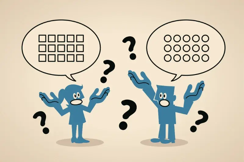
Understanding user psychology isn't just nice to have anymore; it's the difference between an app that survives and one that gets forgotten in the digital graveyard
App retention isn't really about features or fancy designs—though those help. It's about tapping into the psychological triggers that make people want to come back. The apps that get this right don't just survive; they become part of people's daily routines. The ones that don't? Well, they become expensive lessons in what not to do. Behavioural design principles can transform how users interact with your app, turning casual downloaders into loyal, engaged users who actually stick around.
The Real Reasons Users Delete Apps
Let's be honest about what really happens after someone downloads your app. They open it once, maybe twice, and then it sits there collecting digital dust until they need storage space for photos. When that moment comes, your app gets the chop without a second thought.
The statistics are brutal—most apps lose 80% of their users within the first three days. But why does this happen so consistently? It's not usually because the app is terrible (though some are). It's because users have specific expectations, and when those aren't met immediately, they move on.
The Top Deletion Triggers
- The app takes too long to load or feels sluggish
- Users can't figure out how to do what they wanted within 30 seconds
- Too many permission requests before showing any value
- The app crashes or has obvious bugs
- Push notifications become annoying rather than helpful
- The interface looks outdated or unprofessional
- Users can't see the benefit or value proposition quickly
What's interesting is that most of these issues happen before users even experience the core functionality. They're judging your app on everything except what it actually does—and that judgement happens fast. We're talking seconds, not minutes.
How Our Brains Work When Using Apps
Our brains are wired to make snap judgements about everything we encounter—and mobile apps are no exception. Within seconds of opening an app, your brain has already decided whether it's worth your time or heading straight for the digital bin.
The thing is, our brains are lazy. They want things to be simple and predictable. When we open an app, we're looking for patterns we recognise and actions that feel natural. If an app makes us think too hard or breaks the rules we expect, our brain treats it like a threat and tells us to run away. That's why apps with confusing navigation or unexpected button placements get deleted so quickly.
The Three-Second Rule
Research shows that users form their opinion about an app within three seconds of opening it. During those precious moments, your brain is processing visual hierarchy, scanning for familiar icons, and trying to understand what the app actually does. If it can't figure that out quickly, it triggers what psychologists call 'cognitive load'—basically, your brain getting tired from working too hard.
Place your most important features where users naturally look first: the top-left corner for scanning, and the bottom centre for primary actions. This matches how our eyes naturally move across screens.
This is why successful apps feel intuitive from the moment you open them. They're designed to work with your brain, not against it.
Why First Impressions Make or Break Everything
Your app gets exactly three seconds. That's it. Three seconds to convince someone that downloading your app wasn't a mistake—or they're gone forever. I've watched this happen countless times with apps we've built, and the ones that nail those first few moments always perform better than those that don't.
Your brain makes snap judgements about everything, and apps are no different. The moment someone opens your app, their brain is already deciding whether this feels trustworthy, useful, or worth their time. If your loading screen takes too long, if the interface looks confusing, or if they can't figure out what to do next—game over.
The Three-Second Rule
Most people will close an app before they even see what it does if something feels wrong in those opening moments. Maybe the colours clash. Maybe there's too much text. Maybe it just feels... off. These aren't logical decisions—they're emotional ones that happen faster than conscious thought.
The good news? You can control this. Simple onboarding that shows value immediately, clean design that doesn't overwhelm, and making sure your app actually works properly the first time someone uses it. Get these right, and you've already beaten most of your competition.
The Psychology Behind Sticky Apps
Here's what separates apps that stick around from those that get deleted after a week—they understand how our brains are wired. The most successful apps don't just solve problems; they create habits. And habits, as we know, are incredibly hard to break.
Behavioural design is all about tapping into three core psychological triggers. First, there's variable rewards—think about how slot machines work, but in a good way. Apps like Instagram use this by showing you different content each time you open them. You never know what you'll see, which keeps your brain coming back for more. Second, there's social validation—we're hardwired to care what others think. Apps that let you share achievements or get likes are basically feeding this primal need.
The best apps don't compete for attention—they become part of your routine
Creating Positive Feedback Loops
The third trigger is progress tracking. Our brains love feeling like we're moving forward, even in tiny steps. Fitness apps nail this by celebrating every workout, no matter how small. The secret sauce isn't manipulation—it's understanding that good user psychology makes apps genuinely useful and satisfying to use. When you design with these principles in mind, app retention naturally improves because you're working with human nature, not against it.
Building Apps That People Actually Keep
Right, so we've talked about what makes people delete apps and the psychology behind keeping them—now let's get practical. Building an app that sticks isn't about throwing every feature you can think of at users; it's about being smart with what you include and when you show it.
Start Small, Think Big
The best apps I've worked on over the years all had one thing in common: they solved one problem really well before trying to solve ten problems poorly. Users need to understand what your app does within seconds of opening it. If they're confused, they're gone. That's just how it works.
Progressive disclosure is your best friend here—show users features gradually as they need them rather than overwhelming them upfront. Think about how you learned to drive; you didn't start on the motorway, did you? Same principle applies to app design.
Make Every Interaction Count
Every tap, swipe, and notification is an opportunity to either build trust or break it. Loading states should feel fast even when they're not; error messages should be helpful, not frustrating; and success moments should feel rewarding. These tiny details add up to create an experience that people actually want to return to rather than endure.
Conclusion
App retention isn't just about building something that works—it's about understanding how people's minds work when they interact with your product. We've covered a lot of ground here, from the psychology of first impressions to the behavioural triggers that keep users coming back. The truth is, most apps fail not because they're technically broken, but because they ignore the human element.
User psychology drives every tap, swipe, and decision your users make. When you design with this in mind, you're not just creating an app; you're crafting an experience that feels natural and rewarding. The apps that succeed long-term are the ones that make users feel understood, not frustrated.
Mobile app abandonment will always be a challenge—that's just the nature of the beast. But when you apply behavioural design principles thoughtfully, you give your app the best chance of survival. Small changes in how you present information, reward progress, and guide user actions can make massive differences in retention rates.
Building apps that people actually keep isn't about luck or having the biggest marketing budget. It's about respecting your users' time, understanding their motivations, and designing experiences that genuinely add value to their lives. Get that right, and the psychology takes care of itself.