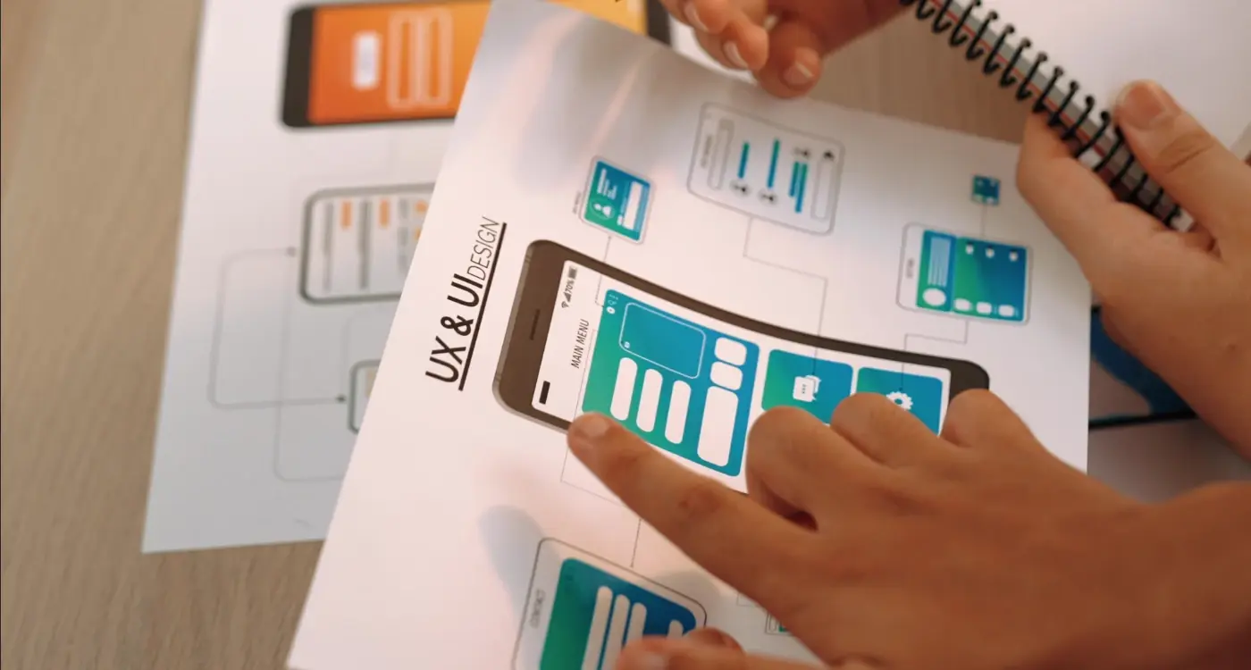
How Do I Turn User Frustration Into Valuable App Insights?
Your app has thousands of downloads, decent ratings, and yet something feels off. Users install it, open it once or twice, then disappear forever. Sound familiar? You're not alone—this happens to most app developers at some point, and it's one of the most frustrating things you can experience after pouring your heart into creating something you thought people would love.
The thing is, when users get frustrated with your app, they rarely tell you about it directly. They don't send angry emails or leave detailed reviews explaining exactly what went wrong. Instead, they just leave. Quietly. And that silence can drive you mad because you're left guessing what happened and why your brilliant idea isn't working the way you hoped.
User frustration isn't your enemy—it's actually your most valuable teacher, if you know how to listen to it properly
What most people don't realise is that user frustration contains incredibly valuable information about your app. Every frustrated user is showing you exactly where your app falls short, what confuses people, and what needs fixing. The trick is learning how to spot these signals and turn them into actionable insights that actually improve your app.
After working with mobile apps for years, I've seen how the most successful developers approach this challenge. They don't try to eliminate user frustration completely—that's impossible. Instead, they build systems to capture it, understand it, and use it to make their apps better. That's what we're going to explore together in this guide.
Understanding What User Frustration Really Means
User frustration isn't just someone getting a bit annoyed with your app—it's much deeper than that. When users feel frustrated, they're experiencing a breakdown between what they expected your app to do and what it actually did. Think of it like this: they came to your app with a specific goal in mind, and somewhere along the way, your app got in their way instead of helping them.
The tricky bit is that frustration shows up in different ways for different people. Some users will tap buttons repeatedly when nothing happens. Others will close the app immediately and never come back. Some might leave angry reviews, while others just silently uninstall and move on with their lives. This is why measuring frustration can be so challenging—you're not always going to get a clear signal that says "I'm frustrated!"
The Three Types of App Frustration
From what I've observed over the years, user frustration generally falls into three buckets. There's functional frustration—when features don't work as expected or the app crashes. Then there's emotional frustration—when the app makes users feel stupid or confused about what to do next. Finally, you've got efficiency frustration—when your app works fine but takes too long to get users where they want to go.
Why Users Don't Always Tell You They're Frustrated
Here's something that catches many app developers off guard: most frustrated users won't actually tell you they're frustrated. They'll just leave. This means you need to become a detective, looking for clues in user behaviour rather than waiting for explicit feedback. The real insights come from watching what users do, not just what they say.
Finding the Hidden Signals in User Behaviour
Users rarely tell you directly what's wrong with your app—they show you through their behaviour. I've spent years watching how people actually use mobile apps, and the patterns are fascinating. Someone might tap a button three times before giving up. They'll scroll past your main feature without seeing it. Or they'll abandon their shopping basket right at the final step.
These aren't random actions. They're signals pointing to specific problems in your user experience. The trick is knowing where to look and what to look for.
Heat Maps Show the Real Story
Heat maps reveal exactly where users tap, swipe, and spend their time. You'll often find people trying to tap elements that aren't actually buttons—that's a clear sign your design is confusing them. Dead zones where nobody clicks? That's valuable screen space going to waste.
Set up session recordings to watch real users navigate your app. Five minutes of watching actual behaviour beats hours of guessing what might be wrong.
The Numbers Behind User Frustration
Some behaviour patterns scream frustration louder than others. Here's what to monitor:
- Multiple taps on the same element (usually means it's not responding)
- Quick back-and-forth navigation between screens
- Long pauses on simple tasks
- Rage tapping—rapid, repeated taps in frustration
- High bounce rates from specific screens
- Incomplete form submissions with multiple attempts
User behaviour analytics tools can track all of this automatically. The key is checking these metrics regularly and connecting the dots. When you see unusual patterns emerging, that's your cue to investigate deeper and turn that user frustration into actionable app insights.
Collecting Feedback That Actually Matters
Getting feedback from users sounds straightforward, doesn't it? Just ask them what they think and wait for the responses to roll in. But here's the thing—most feedback you'll receive is either too vague to be useful or comes from people who aren't really your target users anyway. After years of helping clients navigate this challenge, I've learned that collecting meaningful feedback is more about asking the right questions than asking lots of questions.
The biggest mistake I see teams make is relying too heavily on star ratings and generic "How was your experience?" surveys. These tell you almost nothing about what's actually wrong with your app. When someone gives you two stars, that's frustrating, sure, but it doesn't help you fix anything. What you need instead is specific, actionable information about where users get stuck, what confuses them, and what stops them from completing tasks.
Focus on behaviour, not opinions
The best feedback comes from watching what people actually do rather than listening to what they say they do. In-app analytics can show you where users drop off, which buttons they never press, and which screens they abandon quickly. But you need to combine this data with targeted questions that dig deeper. Instead of asking "Do you like this feature?" try asking "When did you last use this feature and what were you trying to achieve?"
Make it easy to give feedback
People won't fill out long surveys, but they might answer one quick question that pops up at the right moment. Timing matters enormously—ask for feedback right after someone completes an action or encounters a problem, not randomly when they open your app. Keep your questions short and specific, and always explain what you'll do with their responses.
Making Sense of What Users Are Really Saying
After years of working with mobile apps, I've learned that users rarely say exactly what they mean. When someone writes "this app is rubbish" in a review, they're not giving you much to work with—but they are telling you something went wrong. The real skill in user feedback analysis comes from reading between the lines and spotting the patterns that matter.
Most user complaints fall into predictable categories once you know what to look for. Performance issues usually show up as comments about speed or crashes, but users might describe them as "annoying" or "broken". Navigation problems often get labelled as "confusing" or "hard to use". The key is grouping similar complaints together and looking for the common thread.
What People Say vs What They Mean
When users say "I can't find anything", they're usually not talking about a search problem—they're telling you about poor information architecture. If multiple people mention that your app "feels slow", dig deeper into which specific actions feel sluggish rather than just assuming it's a general performance issue.
The most valuable user feedback often comes disguised as the harshest criticism
Spotting the Real Issues
Look for emotional language in feedback—words like "frustrated", "confused", or "gave up" are goldmines for understanding user experience problems. These emotional markers usually point to the moments where your app's mobile app psychology isn't quite right. Users don't get emotional about minor inconveniences; they get upset when something blocks them from achieving their goal. That's where your biggest opportunities for user experience improvement live.
The Psychology Behind App Abandonment
After years of working with frustrated app owners, I've noticed something interesting—most people think users abandon apps because they're broken or ugly. That's not quite right. The truth is much more complex and sits firmly in the realm of human psychology.
When someone downloads your app, they arrive with a specific expectation in their mind. They want to solve a problem, complete a task, or get entertained. If your app doesn't deliver on that promise within the first few interactions, their brain starts looking for an exit route. It's not personal—it's just how we're wired as humans.
The Three Psychological Triggers
There are three main psychological reasons why people abandon apps, and understanding these can transform how you approach user retention:
- Cognitive overload—when users feel overwhelmed by too many options or complex navigation
- Broken mental models—when your app works differently from what users expect based on their past experiences
- Lack of immediate value—when people can't quickly see how your app benefits their life
The cognitive overload issue is particularly sneaky because it often happens during onboarding. You're excited to show users everything your app can do, so you create lengthy tutorials or pack the interface with features. But users just want to get started—they don't want a masterclass in your app's capabilities.
The Emotional Layer
There's also an emotional component that many developers miss. When users struggle with your app, they don't just feel confused—they feel stupid. Nobody wants to feel stupid, so they leave rather than persist. This emotional response happens much faster than logical thinking, which means you've got seconds, not minutes, to make users feel competent and successful.
The good news? Once you understand these psychological patterns, you can design experiences that work with human nature rather than against it.
Turning Problems Into Feature Opportunities
Here's something I've learnt after years of mobile app development—user frustration isn't your enemy, it's actually your biggest ally. Every complaint, every angry review, every abandoned session is telling you exactly what your users want. The trick is learning how to listen properly and turn those problems into features that people actually need.
When users get frustrated with your app, they're showing you gaps in your product. Maybe they can't find what they're looking for quickly enough, or perhaps a process takes too many steps. Instead of seeing these as failures, start viewing them as feature requests written in invisible ink. User feedback analysis becomes much more powerful when you shift your mindset this way.
The Feature Discovery Process
Mobile app psychology teaches us that users rarely tell you what they want directly—they show you through their behaviour. When someone abandons your checkout process halfway through, they're not just leaving; they're telling you the process is too complicated. That frustration becomes your roadmap for user experience improvement.
Create a "frustration to feature" document where you list every user complaint alongside a potential solution. This helps you spot patterns and prioritise development efforts based on real user needs.
The most successful apps I've worked on have been built by teams who treat user frustration as valuable app insights rather than problems to ignore. They understand that behind every frustrated user is someone who cares enough about your product to get annoyed when it doesn't work properly.
Common Frustration Patterns
- Too many taps to complete simple tasks
- Unclear navigation or confusing user interface
- Slow loading times or poor performance
- Missing features that users expect
- Complicated sign-up or onboarding processes
Remember, every feature in your app should solve a real user problem. When you start looking at frustration this way, you'll never run out of ideas for making your app better.
Testing Your Solutions With Real Users
After you've identified problems and built solutions based on user feedback, you might think your work is done. Not quite! The solutions you create need testing with actual users before you roll them out to everyone. This step catches issues you didn't expect and makes sure your fixes actually work.
Real user testing doesn't have to be complicated or expensive. Start small with just five to ten users who match your target audience. Give them specific tasks to complete using your new features or improvements. Watch how they interact with your app—don't just listen to what they say, observe what they do. People often say one thing but behave differently when they're actually using the app.
Setting Up Simple Tests
Keep your testing sessions short, around fifteen to twenty minutes maximum. Any longer and people get tired, which affects their feedback quality. Record the sessions if possible (with permission, obviously) so you can review them later. Sometimes you'll spot things during the second viewing that you missed the first time around.
Ask users to think out loud whilst they navigate through your app. This gives you insight into their thought process and helps you understand where confusion happens. When they get stuck, resist the urge to jump in and help immediately—let them work through it first.
What to Do With Test Results
Look for patterns in the feedback rather than focusing on individual complaints. If three out of five users struggle with the same button placement, that's worth addressing. If only one person mentions something, it might not be a priority unless it's a serious usability issue.
Document everything and compare results against your original problem. Did your solution actually solve what you set out to fix? Sometimes the answer is no, and that's perfectly fine—it's better to discover this now than after launch.
Building Systems That Listen Continuously
Right, so you've done the hard work—you've spotted user frustration, collected feedback, and made some changes to your app. Job done, surely? Well, not quite. The thing about user feedback is that it never stops coming, and neither should your efforts to capture it.
Building systems that listen continuously means setting up processes that work around the clock, not just when you remember to check in. We're talking about automated feedback collection, regular user surveys that don't feel like homework, and monitoring systems that flag issues before they become major problems. Your app should be like a good friend who actually listens—always ready to hear what users have to say.
Making Feedback Collection Feel Natural
The best feedback systems don't feel like systems at all. They're woven into the user experience so smoothly that people barely notice they're providing insights. Think in-app rating prompts that appear at the right moment, not when someone's rushing to complete a task. Or feedback buttons that sit quietly in corners, ready when users need them.
The most valuable user insights come from users who don't even realise they're giving feedback
Setting Up Your Listening Posts
You want multiple touchpoints for gathering user frustration data—app store reviews, support tickets, social media mentions, and analytics that show where people get stuck. Each source tells a different part of the story. App store reviews might reveal major pain points, whilst analytics show you exactly where users abandon ship. The trick is checking these regularly and connecting the dots between different feedback sources to spot patterns early and improve your app's ratings.
Conclusion
After eight years of building apps and watching teams struggle with user feedback, I've learned that frustration is actually a gift—though it might not feel that way when you're dealing with negative reviews and dropping engagement rates. The difference between successful apps and failed ones isn't whether users get frustrated; it's what you do with that frustration once it surfaces.
Throughout this guide, we've covered how to spot the real signals in user behaviour, collect feedback that goes beyond surface complaints, and turn those insights into features that people actually want. But here's what I want you to remember most: this isn't a one-time process. User needs change, technology evolves, and what frustrated users six months ago might be completely different today.
The apps that thrive are the ones that build listening into their DNA—not just during crises, but as part of their regular routine. You don't need expensive tools or massive teams to do this well. You need curiosity, patience, and the willingness to accept that sometimes what users say they want isn't what they actually need.
Start small with the techniques that make sense for your situation right now. Pick one method from this guide and commit to using it consistently for the next month. Whether that's setting up simple user recordings, creating a feedback loop that actually gets responses, or just paying closer attention to support tickets, the key is starting somewhere and building from there. Your users are already telling you what they need—you just need to listen properly.
Share this
Subscribe To Our Learning Centre
You May Also Like
These Related Guides
What's The Difference Between Reviews And User Feedback?

How Do You Validate User Personas Through Data Analysis?