
How Do You Design Mobile-Friendly Emails for App Users?
Mobile email design has become one of those topics that keeps me up at night—not because its complicated, but because so many businesses are still getting it wrong. After building apps for nearly a decade, I've watched countless clients pour money into beautiful mobile apps only to completely botch their email marketing. Its a bit mad really, because your emails are often the first touchpoint users have with your brand after downloading your app.
The numbers don't lie here. Over 70% of people read emails on their phones, yet I still see emails that look like they were designed for desktop computers from the early 2000s. Tiny text you need a magnifying glass to read, buttons so small you'd need a stylus to tap them, and images that take forever to load. You know what happens? People delete your emails without reading them, or worse, they unsubscribe completely.
The difference between a well-designed mobile email and a poorly designed one can be the difference between a user engaging with your app daily or forgetting it exists entirely
But here's the thing—mobile email design isn't just about making things smaller or responsive. Sure, that's part of it, but there's so much more to consider. How does your email design work with your app's overall user experience? Are you using the same visual language? Does your call-to-action button actually work when someone taps it with their thumb while walking down the street? These are the questions that separate successful app marketers from those who wonder why their engagement rates are rubbish. And trust me, getting this right can transform how users interact with your app.
Understanding Mobile Email Design Fundamentals
Right, let's get straight to the point—mobile email design isn't just about making things smaller. I've seen too many brilliant app campaigns fall flat because the emails looked terrible on mobile devices. And considering that over 80% of people read emails on their phones? That's a proper disaster waiting to happen.
The thing is, mobile email design has its own set of rules that are completely different from web design or even app design. Your users are probably checking emails whilst walking, on the tube, or waiting in queues. They've got about three seconds to decide if your email is worth their attention—that's it.
Core Mobile Email Principles
First thing you need to understand is thumb navigation. People scroll with their thumbs, they tap with their thumbs, and if something's too small or awkwardly placed, they'll just delete your email. Its that simple. The optimal width for mobile emails is around 320-600 pixels, but here's what really matters:
- Single column layouts work best—forget fancy multi-column designs
- Font sizes should be minimum 14px for body text, 22px for headlines
- Touch targets need to be at least 44px tall and wide
- Keep your subject lines under 30 characters
- Preheader text should complement your subject line, not repeat it
The Mobile-First Mindset
You know what I've learned after years of fixing broken email campaigns? Start with mobile, then work your way up to desktop. Not the other way around. When you design for mobile first, you're forced to prioritise what really matters in your message.
Your app users are already comfortable with mobile interfaces—they expect that same level of polish in your emails. Dark mode compatibility is becoming non-negotiable too; more email clients are supporting it, and your users will notice if your emails look rubbish in dark mode.
Responsive Design Techniques for Email
Right, let's talk about the technical side of making emails that actually work on mobile devices. I've seen so many app marketing campaigns fall flat because the email design looked great on desktop but was completely broken on phones. And here's the thing—most of your app users are checking their email on mobile, so getting this wrong means you're basically throwing money down the drain.
The foundation of good mobile email design is fluid layouts. This means using percentage-based widths instead of fixed pixel measurements. Your email container should max out at around 600px for desktop, but shrink gracefully on smaller screens. I always tell clients to think mobile-first when we're designing their email templates—it's much easier to scale up than to squeeze everything down.
Media Queries and Breakpoints
Media queries are your best friend for responsive emails, though I'll warn you—email client support can be a bit patchy. Gmail's mobile app supports them, Apple Mail loves them, but Outlook? Not so much. Here are the key breakpoints I use for most app marketing emails:
- 480px and below for smartphones
- 481px to 600px for larger phones and small tablets
- 601px and above for desktop views
Within these breakpoints, you can adjust font sizes, hide unnecessary elements, and stack columns vertically. I often hide decorative images on mobile to save space and focus attention on the main message and call-to-action.
Table-Based Layouts vs Modern Techniques
Here's where it gets interesting. While the rest of the web has moved on from table-based layouts, email design is still stuck in the past because of client compatibility issues. I use a hybrid approach—tables for structure, but with modern CSS techniques layered on top for enhanced mobile experiences.
Single-column layouts work best on mobile. When you have multiple columns on desktop, use media queries to stack them vertically on smaller screens. This prevents that horrible horizontal scrolling that makes users delete emails immediately.
Always use the viewport meta tag in your email head: <meta name="viewport" content="width=device-width, initial-scale=1">. Without this, mobile devices will render your email at desktop width and scale it down, making everything tiny.
Touch targets are crucial for mobile email design. Make sure your buttons and links are at least 44px tall—anything smaller and users will struggle to tap them accurately. I learned this the hard way when a client's app download campaign had terrible conversion rates because the download button was too small to tap reliably.
Typography and Text Optimization
Getting typography right for mobile emails is where I see a lot of businesses trip up—and honestly, it's understandable because what works on desktop can look absolutely terrible on a phone screen. The fonts you choose and how you size your text can make or break whether someone actually reads your email or just deletes it straight away.
Here's the thing about mobile typography; you need to think bigger than you're comfortable with. I always tell clients to use at least 14px for body text, but really 16px is your sweet spot. Sure, it might look massive on your desktop, but on a mobile screen it's perfectly readable. And for headings? Don't be shy—go with 22px or larger. Your users will thank you for it.
Font Selection for Mobile Readability
Stick to web-safe fonts that render consistently across different email clients. Arial, Georgia, and Verdana are your friends here. Fancy custom fonts might look great in your brand guidelines, but they can cause rendering issues in email clients—and nobody wants their carefully crafted message to display as a mess of default fonts.
Line spacing is crucial too; aim for 1.4 to 1.6 times your font size. This gives your text room to breathe and makes it much easier to scan on small screens. I've seen emails where the text was so cramped together that reading it felt like hard work.
Text Hierarchy Best Practices
Your text hierarchy needs to be obvious at a glance. Use these guidelines for mobile-optimized text sizing:
- Main headlines: 22-28px, bold weight
- Secondary headings: 18-22px, medium weight
- Body text: 16px, regular weight
- Small text/disclaimers: 14px minimum (never go smaller)
Keep your line lengths short too—around 35-40 characters per line works best for mobile reading. Long lines of text become difficult to follow when someone's scrolling through on their phone during their morning commute.
Visual Elements and Image Handling
Right, let's talk about images in mobile emails—this is where I see loads of apps go wrong, and it's honestly quite frustrating because it's so fixable. The thing about mobile email design is that images behave differently than they do on your website or in your app itself. They're often blocked by default, they load slowly on patchy mobile networks, and they can completely break your layout if you don't handle them properly.
First rule: never rely on images alone to tell your story. I've seen too many beautifully designed emails that look like Swiss cheese when images don't load. Your email should make perfect sense even with all images turned off—that means using proper alt text that actually describes what the image shows, not just "image" or worse, nothing at all.
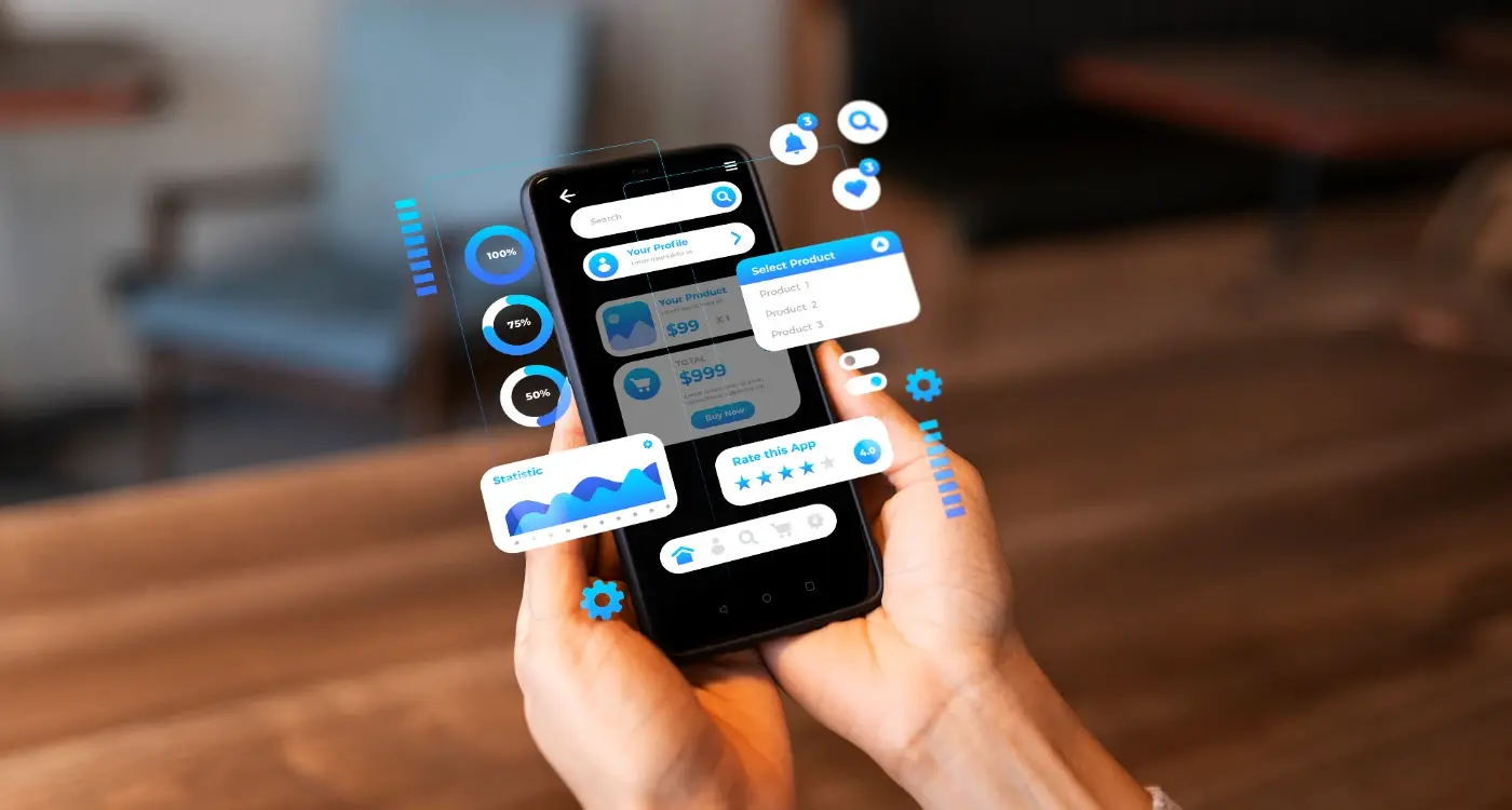
When it comes to including app screenshots in your marketing emails, the same mobile-first principles apply. These visual elements can be powerful for showcasing your app's interface, but they need to be optimised for small screens and fast loading times.
Optimising Image Sizes and Formats
Keep your images small—we're talking file size, not just dimensions. A good rule I follow is keeping individual images under 100KB and your total email under 1MB. Use JPEGs for photos and PNGs for graphics with text or logos. And here's something that might help: compress your images before adding them to your email template; your users' data allowances will thank you for it.
The best mobile email images support your message rather than replace it—they should add value, not carry the entire communication burden.
Width-wise, stick to a maximum of 600 pixels for your email template, but make sure your images scale down properly on smaller screens. I always test how images look at 320px wide because that's still a common mobile viewport. Use CSS to make images responsive with max-width: 100% and height: auto. Trust me, your Android users especially will appreciate emails that don't require horizontal scrolling!
Call-to-Action Buttons That Convert
Right, let's talk about the most important part of any email—getting people to actually tap that button. I've seen brilliant email campaigns tank because the call-to-action was rubbish, and mediocre emails perform really well just because they nailed this bit.
The thing about mobile screens is they're tiny compared to desktop monitors. What looks like a perfectly clickable button on your laptop becomes a frustrating little target when you're holding your phone with one hand whilst walking down the street. Your CTA buttons need to be at least 44 pixels tall—that's the minimum touch target size that Apple recommends, and honestly, I'd go bigger if you can.
Colour choice matters more than you might think. Your button needs to stand out from everything else in the email, but it also needs to feel like it belongs to your app's visual identity. I always tell clients to use their primary brand colour for the button background, then pick a contrasting colour for the text that passes accessibility standards.
Button Design Essentials
- Make buttons at least 44 pixels tall for easy tapping
- Use plenty of white space around each button
- Keep button text short—3 words maximum works best
- Place your main CTA above the fold on mobile screens
- Test button colours against your email background for contrast
Here's something that catches people out—button text. "Click here" or "Learn more" are pretty useless when someone's scanning through their emails quickly. Be specific about what happens next: "Download App", "View My Order", or "Start Free Trial" work much better because they set clear expectations.
And for the love of all that's holy, only include one primary CTA per email. Sure, you can have secondary actions like social media links, but your main message should have one clear next step. Multiple competing buttons just confuse people and hurt your conversion rates.
Testing Across Different Email Clients
Right, let's talk about the elephant in the room—email client testing. After years of building apps and watching countless email campaigns either soar or crash, I can tell you that what looks perfect in your design tool might look absolutely terrible in Outlook 2016. It's honestly one of the most frustrating parts of mobile email design, but it's something you just can't skip.
The main culprits you need to worry about are Gmail (both mobile and desktop), Apple Mail, Outlook (various versions), and Yahoo Mail. Each one handles CSS differently, supports different features, and has its own quirks that'll drive you mad. Gmail strips out certain styles, Outlook still uses Word's rendering engine (yes, really!), and Apple Mail sometimes decides your carefully crafted buttons should look completely different.
The Smart Way to Test
You don't need to test on every single email client that exists—that way lies madness. Focus on where your app users actually check their emails. For most mobile apps, that means Gmail mobile, Apple Mail on iOS, and maybe Outlook mobile. Check your email analytics to see which clients your users prefer; you might be surprised at what you find.
Use Litmus or Email on Acid for comprehensive testing, but don't rely on them completely. Nothing beats sending test emails to real devices and checking them yourself—I've caught issues that testing tools missed more times than I can count.
The key is testing early and often. Don't wait until your email is "finished" to start testing. I always do a basic test after I've got the structure sorted, then again after adding images and styling. It saves you from having to completely rebuild things when you discover that your beautiful gradient background doesn't work in half the clients your users actually use.
When I'm designing emails for app users, I always think about them as part of the bigger picture. Your app and your emails need to work together like they're best mates—not like strangers who've never met.
The biggest mistake I see companies make? Their emails look nothing like their app. One minute users are in your beautifully designed app with its custom colours and sleek interface, then they get an email that looks like it came from a completely different company. It's honestly quite jarring.
Start with your app's visual identity. Use the same colour palette, the same fonts (or web-safe alternatives), and maintain that same tone of voice. If your app has a playful, friendly vibe, your emails should too. But here's the thing—don't just copy and paste your app design into an email template. Email clients are proper fussy about what they'll display correctly.
Your email content should complement what users are doing in your app, not compete with it. Are they halfway through onboarding? Send them a gentle nudge with tips. Haven't opened the app in a while? A re-engagement email with their personalised stats works wonders. I've seen open rates jump by 40% when emails reference specific in-app behaviour.
Make sure your call-to-action buttons deep-link directly to relevant sections of your app—not just the home screen. If you're promoting a new feature, take them straight there. And always, always test those links on both iOS and Android. There's nothing worse than a broken deep link that dumps users on their browser instead of opening your app.
Remember, your emails are often the bridge that brings dormant users back to your app. Make that bridge as smooth as possible.
Personalization and Dynamic Content
Right, let's talk about making your emails feel like they were written just for each user. I mean, nobody wants to feel like they're just another email address in a database, do they? Personalisation in mobile email design goes way beyond just sticking someone's first name in the subject line—though that's still a solid starting point, to be fair.
The magic happens when you combine user data from your app with smart email design. Think about it; your app knows loads about how people behave, what features they use, when they're most active. Why not use that intelligence? I've seen conversion rates jump by 40% when clients start sending emails that actually reflect what users are doing (or not doing) in their apps.
Dynamic Content That Actually Works
Dynamic content blocks are your secret weapon here. You can show different product recommendations, feature highlights, or even completely different layouts based on user segments. Someone who hasn't opened your app in two weeks? They need a different message than your power user who logs in daily.
The best personalised emails feel like they're continuing a conversation your app started, not interrupting with something completely irrelevant.
But here's where mobile makes things tricky—you've got limited screen space, so your personalisation needs to be spot on. There's no room for generic content that doesn't serve a purpose. Every element needs to earn its place on that small screen. Dynamic images work brilliantly for this; showing users their own progress, recent activity, or personalised recommendations in visual format. Just make sure those images load quickly and have proper alt text for accessibility. The technical side isn't too complex once you get the hang of it, honestly.
Conclusion
Right, so we've covered quite a bit of ground here—from responsive design basics to personalization tricks that actually work. But here's the thing I want you to remember: mobile email design isn't just about making things smaller. It's about understanding how your app users behave when they're checking emails on their phones.
I've seen too many businesses get this wrong. They design beautiful desktop emails and then wonder why their mobile engagement rates are terrible. The truth is, your app users are probably checking emails whilst walking, commuting, or waiting in queues. They want information fast, and they want it to be dead simple to understand.
The techniques we've discussed—single column layouts, large touch targets, optimized images—these aren't just best practices, they're necessities. Your call-to-action buttons need to be big enough to tap easily, your text needs to be readable without zooming, and your loading times need to be quick. Otherwise people will just delete your email and move on.
Testing is where most people fall down though. You can't just check how your email looks on your iPhone and call it a day. Android users, different email clients, various screen sizes—they all matter. The good news? Once you get into the habit of mobile-first email design, it becomes second nature.
Your app users are mobile users first. Design for them, test for them, and you'll see your email performance improve significantly. It's that simple, really.
Share this
Subscribe To Our Learning Centre
You May Also Like
These Related Guides
How Can I Make My App Icons More Engaging and Clear?

Why Should I Choose Behavioural Design For My App?