
How Can I Make My App Icons More Engaging and Clear?
A major logistics company recently discovered that their driver app had a 40% lower adoption rate compared to competitors, despite having better functionality. The problem? Their app icon looked like every other generic transport app on the market—a simple truck silhouette that users couldn't distinguish from dozens of similar apps. After redesigning their icon with a distinctive colour scheme and clearer visual hierarchy, driver engagement increased by 60% within three months. That's the power of proper icon design.
Your app icon is basically your storefront window in the digital world. It's the first thing potential users see when browsing app stores, and it needs to work incredibly hard in that tiny square space. I've watched brilliant apps fail because their icons didn't grab attention, and I've seen mediocre apps succeed purely because they nailed their visual identity from day one.
The thing is, designing effective app icons isn't just about making something pretty—though that certainly helps! It's about understanding how people's brains process visual information in milliseconds. When someone's scrolling through hundreds of apps, your icon has maybe half a second to communicate what your app does and why they should care. That's not much time, is it?
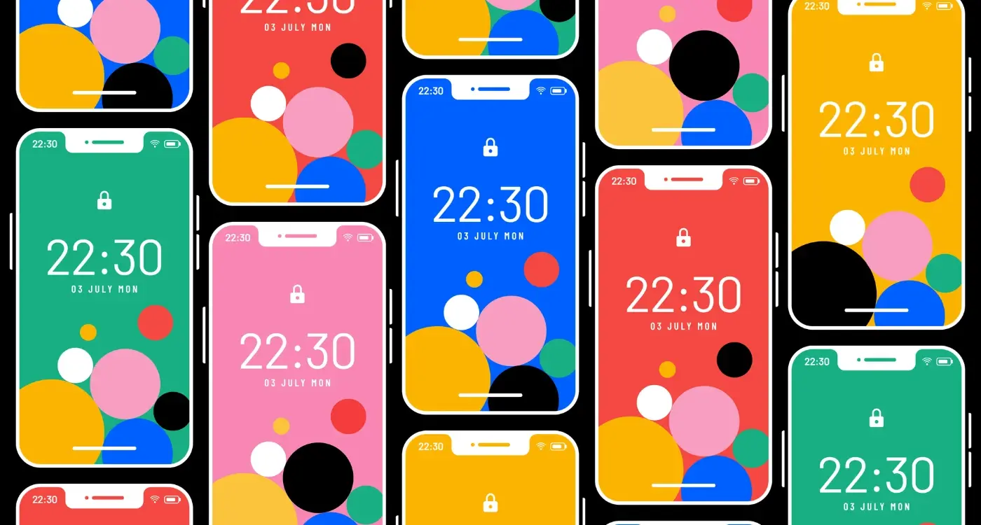
The best app icons don't just represent your app; they become a symbol that users actively seek out and recognise instantly, even at thumbnail size
Throughout this guide, we'll explore the psychology behind what makes icons work, dive into practical design principles, and cover the technical considerations you need to know for different platforms. Whether you're launching your first app or redesigning an existing one, getting your icon right can make the difference between success and obscurity in today's crowded app marketplace.
Understanding the Psychology Behind App Icons
Right, let's talk about what's actually happening in peoples minds when they look at your app icon. Because honestly, there's a lot more going on than you might think—and understanding this psychology can make or break your app's success on the store.
The thing is, users make decisions about apps in milliseconds. I'm talking about snap judgements that happen before they even realise they're thinking. Your icon isn't just a pretty picture; its the first impression, the handshake, the "hello" that determines whether someone bothers to read your app description or just scrolls past.
The Three-Second Rule
Here's what I've learned after years of watching user behaviour: people scan app stores like they're flipping through TV channels. Fast. Really fast. Your icon has about three seconds—maybe less—to communicate what your app does and why they should care. That's not long enough to tell a story or show off clever design details that nobody will notice.
The most successful icons I've designed over the years follow what I call the "glance test." Can someone understand what your app is about in a single glance? If they need to squint, think, or guess, you've already lost them to the next icon down the page.
Emotional Triggers That Actually Work
People don't download apps with their logical brain—they download with their emotional brain first, then justify the decision later. Your icon needs to trigger the right emotion instantly. A fitness app should make someone feel motivated or energetic. A productivity app should feel organised and reliable. A game should look fun or intriguing.
But here's the tricky bit: different colours, shapes, and symbols trigger different emotions in different people. What feels friendly to one person might feel childish to another. Understanding how mental models guide user perception can help you create icons that align with what users expect to see. That's why testing your icons with real users (which we'll cover later) is so important.
Simplicity vs Detail in Icon Design
Right, let's talk about one of the biggest debates in icon design—how much detail is too much? I've seen countless app icons that look like someone tried to cram an entire user manual into a 60x60 pixel square. It's mental, really.
The golden rule I follow is this: your icon should be instantly recognisable at the smallest size it'll appear on someone's phone. That means designing for the tiny version first, not the other way around. I always start by sketching icons at actual size on paper—sounds old-fashioned, but it forces you to focus on what really matters.
Simple doesn't mean boring though. Some of the most engaging icons I've designed use just two or three visual elements but combine them in clever ways. Think about how Spotify uses that simple curved lines design—it's basically three arcs, but it immediately says "sound waves" or "music" to your brain.
Test your icon by squinting at it from arm's length. If you can't tell what it is, you've got too much detail packed in there.
But here's where it gets tricky—sometimes your app genuinely needs more detail to stand out in its category. Photography apps often need to show depth and quality; finance apps might need to convey trust and professionalism through more refined elements. The key is knowing which details to keep and which to bin.
I've found that icons with 3-5 clear visual elements tend to perform best in user testing. Anything more and people's eyes start to glaze over. Anything less and you risk looking too generic. It's about finding that sweet spot where your icon is simple enough to be clear but detailed enough to be memorable.
Colour Theory and Visual Impact
Right, let's talk about colour—something that can make or break your app icon faster than you'd think. I've seen brilliant apps get ignored because their icon colours were completely wrong for their target market. It's a bit mad really, how much impact colour has on whether someone taps download or scrolls past.
Here's the thing about colour psychology: it actually works. Red creates urgency and excitement (think YouTube, Netflix), blue builds trust and reliability (Facebook, Twitter), green suggests growth or health (WhatsApp, Spotify), and purple often signals creativity or luxury. But here's where it gets interesting—cultural context matters massively. What works in the UK might not work in Asia or the Middle East.
Contrast and Accessibility
Your icon needs to work on light backgrounds, dark backgrounds, and everything in between. I always test icons on different wallpapers because that's where users will actually see them. If your icon disappears against a common wallpaper colour, you've got a problem.
Don't forget about colour-blind users either—about 8% of men and 0.5% of women have some form of colour blindness. Your icon should still be recognisable even if someone cant distinguish between certain colours.
- Test your icon in greyscale to check if it still works without colour
- Avoid using red and green as the only way to convey information
- Make sure there's enough contrast between different elements
- Consider how your colours look next to competitors on the app store
- Remember that colours look different on various screen types and brightness levels
The key is finding colours that not only represent your brand but also stand out in the crowded app store environment. Sometimes that means being bold; sometimes it means being unexpectedly subtle.
Typography and Text in App Icons
Here's something I tell every client who wants to add text to their app icon—don't. Seriously, in most cases its a recipe for disaster and I've seen it fail more times than I can count. But there are exceptions to every rule, and when text works in app icons, it really works.
The main problem with typography in icons is size. Your icon needs to look good at 20x20 pixels on some screens; that beautiful custom font you spent weeks choosing becomes an illegible blob. I've watched brilliant apps get overlooked because their icon looked like someone sneezed on a keyboard when viewed at small sizes.
When Text Actually Works
There are apps where text is the whole point—think note-taking apps, word processors, or alphabet learning games for kids. In these cases, the text becomes symbolic rather than literal. You're not trying to make people read "Notes" in tiny letters; you're using letterforms as recognisable shapes.
The best text-based icons use typography as pure visual form, not readable content
If you absolutely must use text, keep it to one or two characters maximum. Single letters work well—think Netflix's bold "N" or the old iTunes "i". Numbers can work too, but avoid anything longer. And please, for the love of all that's holy, don't try to fit your entire app name into the icon space.
Technical Considerations
When working with text in icons, stick to bold, simple fonts with thick strokes. Thin, elegant typefaces might look lovely on your business cards, but they disappear when scaled down. Sans-serif fonts generally work better than serif ones—those little decorative bits on serif fonts just turn into visual noise at small sizes. Test your icon at every size the platform requires before you commit. What looks clear on your laptop screen might be completely unreadable on an actual device.
Testing Your Icons with Real Users
Here's something most people don't realise—you can design the most beautiful icon in the world, but if real users don't understand it or connect with it, you've basically wasted your time. I've seen gorgeous icons that tested terribly because they looked nothing like what people expected from that type of app.
The good news? Testing your icons doesn't have to be complicated or expensive. You can get meaningful feedback with just a handful of people from your target audience. I usually start with simple preference tests—show people two or three icon variations and ask which one they'd be most likely to tap on their phone. But here's the thing, don't just ask what they prefer; ask them what they think the app does based on the icon alone.
Quick Testing Methods That Actually Work
You know what works really well? The five-second test. Show someone your icon for five seconds, take it away, then ask what they remember about it and what they think it does. If they can't recall the main elements or they're completely wrong about its purpose, you've got work to do.
Another method I love is the app store scroll test. Create a mockup of your icon sitting alongside real competitors in the app store search results; then see which one people notice first. It's bloody obvious when an icon just disappears among the competition.
- Test icon recognition in 3-5 seconds
- Compare against competitor icons in context
- Ask what users think the app does
- Test on actual device screens, not just computer monitors
- Include people who've never seen your app before
Remember, your mum's opinion doesn't count unless she's your target user! Get feedback from people who would actually download and use your app—their reactions will tell you everything you need to know.
Platform-Specific Design Considerations
Right, let's talk about something that trips up loads of developers—the fact that iOS and Android have completely different design languages. I mean, it sounds obvious when you say it out loud, but you'd be surprised how many apps I've seen that just slap the same icon across both platforms without any thought.
iOS users expect a certain level of polish and consistency with Apple's design guidelines. Their icons tend to be more refined, with subtle gradients and carefully crafted shadows. The whole system feels cohesive because Apple maintains strict standards. Android, on the other hand, gives you much more freedom to experiment—but that doesn't mean you should go mad with it!
iOS Design Guidelines
Apple's Human Interface Guidelines are pretty specific about icon design. They want rounded corners (but they'll apply them automatically), no text overlays, and a focus on simple, recognisable imagery. The icon should look good at all sizes, from the tiny notification badge right up to the App Store listing.
Android's Flexible Approach
Google's Material Design gives you more wiggle room. You can use different shapes, add subtle animations, and even include minimal text if it serves the design. But here's the thing—just because you can doesn't mean you should overdo it.
Create separate icon versions for each platform rather than using a one-size-fits-all approach. It's extra work, but your app will feel native to each ecosystem.
- iOS icons should avoid transparency and work within Apple's visual framework
- Android icons can use adaptive shapes and respond to system themes
- Consider how your icon looks against different wallpapers and backgrounds
- Test your icons on actual devices, not just in design software
The bottom line? Respect each platform's conventions while maintaining your brand identity. Users notice when something feels out of place, even if they can't put their finger on why.
Common Icon Design Mistakes to Avoid
After years of designing app icons for clients across different industries, I've seen the same mistakes pop up time and time again. It's honestly quite predictable—and completely avoidable if you know what to look for.
The biggest mistake I see? Cramming too much into a tiny space. I get it, you want to show everything your app does, but an icon isn't a billboard. When you try to include your company logo, app name, three different symbols, and a gradient background, you end up with visual chaos. Users scrolling through the App Store won't stop to decode your masterpiece—they'll just move on to something clearer.
The Most Common Icon Design Pitfalls
- Using text that becomes unreadable at small sizes
- Copying popular app styles without understanding why they work
- Ignoring platform guidelines for iOS and Android
- Creating icons that look identical to existing successful apps
- Using gradients or effects that don't scale down properly
- Making icons that only work on light backgrounds
- Designing for desktop resolution instead of mobile screens
Here's something that always surprises new clients: your icon needs to work in dozens of different contexts. App stores, home screens, notification panels, search results, settings menus. If your icon relies on fine details or subtle colour differences, it'll fail in most of these situations.
The other big mistake? Not testing your icon alongside competitors. Your beautifully crafted icon might look perfect in isolation, but if it disappears next to similar apps in the same category, you've got a problem. I always recommend creating mockups of app store search results to see how your icon performs in the real world.
Tools and Resources for Icon Creation
Right, let's talk about the actual tools you'll need to create your app icons. I mean, having all the theory in the world won't help if you can't actually make the thing! The good news is that you don't need to spend thousands on software to create professional-looking icons.
For beginners, I'd genuinely recommend starting with Figma—it's free, works in your browser, and has become the industry standard for interface design. The learning curve isn't too steep, and there are loads of icon templates and design systems you can use as starting points. Sketch is another solid option if you're on Mac, though it does cost money. Adobe Illustrator is the heavyweight champion for vector graphics, but honestly? It might be overkill if you're just doing icons.
Free Resources That Actually Don't Suck
Here's where things get interesting. There are some brilliant free resources out there that can speed up your workflow. The Noun Project has thousands of icon concepts (though you'll need to heavily modify them to avoid looking generic). Unsplash and Pexels offer free imagery if you're doing photo-based icons. Google's Material Design icons library is also worth exploring for inspiration.
The best tool is the one you'll actually use consistently, not the one with the most features
One thing I always tell clients—don't get caught up in having the "perfect" tool. I've seen people spend weeks researching software instead of actually designing. Pick something, learn it properly, and start creating. You can always upgrade later when you know what you actually need. And please, test your icons at actual app size before you fall in love with them!
Creating engaging and clear app icons isn't just about making something that looks nice—it's about communicating your app's purpose in a split second and making people want to tap on it. After working on hundreds of app projects, I can tell you that a well-designed icon can literally make or break your download rates.
The most successful icons I've seen follow a few simple principles: they're instantly recognisable, work well at tiny sizes, and tell users exactly what to expect from the app. But here's the thing—there's no magic formula that works for everyone. What matters is understanding your users and testing your designs with real people, not just your team.
Remember that your icon will live alongside thousands of others on people's phones. It needs to stand out without being flashy, communicate clearly without being cluttered, and feel familiar while still being distinctive. That's quite a tall order, isn't it? But when you get it right, the results speak for themselves.
The tools and techniques we've covered will help you create something professional, but the real secret is iteration. Design multiple versions, test them with actual users (not your mum or your best mate), and be prepared to make changes based on what you learn. Some of my best-performing icons went through five or six major revisions before they clicked with users.
Your app icon is often the first impression people have of your entire product. Make it count. Take the time to get it right, because in a crowded marketplace, every detail matters when it comes to convincing someone to give your app a chance.
Share this
Subscribe To Our Learning Centre
You May Also Like
These Related Guides

What Makes App Store Screenshots Convert Better?

What Psychological Triggers Boost Your App's Conversion Rate?