How Does Psychology Apply To Healthcare App Development?
Every day, millions of people tap open a healthcare app hoping to feel better, understand their symptoms, or manage a medical condition. Yet here's something that might surprise you—most of these apps fail not because of poor medical information, but because they completely ignore how the human brain actually works. The success of any medical app isn't just about having the right data; it's about understanding the psychology behind why people make health decisions in the first place.
Think about it this way: when someone opens a healthcare app, they're often worried, confused, or searching for answers about something deeply personal. Their emotional state affects every tap, swipe, and decision they make within that app. This is where behavioural design becomes absolutely crucial—it's the difference between an app that gets deleted after one use and one that genuinely helps people improve their health.
The most successful healthcare apps don't just deliver medical information; they understand the emotional journey of their users and design every interaction to support both their medical needs and psychological wellbeing.
Throughout this guide, we'll explore how psychology shapes every aspect of healthcare app development. From building trust with anxious patients to making complex medical jargon understandable, you'll discover why the most effective medical apps are built on solid psychological principles rather than just clinical expertise alone.
Understanding the Human Mind in Healthcare Apps
When I first started working on healthcare apps, I thought it would be just like any other project—clean interface, good functionality, job done. How wrong I was! Healthcare apps aren't just tools; they're dealing with people's deepest fears, hopes, and anxieties about their wellbeing. That changes everything.
Think about it this way: when someone opens your banking app, they might feel a bit stressed about money. But when they open a health app, they could be worried about whether that chest pain means something serious or if their child's fever is getting worse. The stakes feel much higher, and our brains react differently under that kind of pressure.
This is where mobile devices are revolutionising the healthcare industry, creating unprecedented opportunities to reach patients when they need support most.
How Fear Affects User Behaviour
Fear makes people do strange things with apps. They'll tap buttons repeatedly, skip through important information, or abandon the app entirely when they need it most. I've watched users during testing sessions literally hold their breath while waiting for health results to load. That's the reality we're designing for.
The Trust Factor
People need to believe your app won't make their health worse. This isn't about fancy graphics or clever features—it's about understanding that someone using your app might be scared, confused, or desperate for answers. Every design choice needs to acknowledge that human reality.
How Our Brains Make Health Decisions
Here's something that might surprise you—our brains don't always make the best health choices, even when we know what's good for us. I've worked on dozens of healthcare apps over the years, and one pattern keeps showing up: people know they should exercise more, eat better, or take their medication on time, but they just don't do it. Why? Well, it turns out our brains are wired in ways that can work against us when it comes to health decisions.
The human brain loves shortcuts. When we're making health choices, we often rely on what feels easiest right now rather than what's best for us long-term. This is called present bias—we value immediate rewards much more than future benefits. That chocolate bar feels more appealing than the abstract idea of being healthier next year. Your medical app needs to work with this tendency, not against it.
The Two Systems in Our Head
Our brains operate using two different systems when making decisions. The first system is fast and automatic—it makes quick judgements without much thinking. The second system is slower and more thoughtful, but it requires effort and energy. Most of our daily health decisions happen in that first, automatic system, which means your healthcare app design needs to make the healthy choice feel like the obvious, easy choice.
Design your medical app interface so that the healthiest action is always the most obvious button or option on the screen—don't make users think too hard about what they should do next.
Building Trust Through Smart Design Choices
Trust is the foundation of any good healthcare app—without it, you've basically built a fancy piece of software that nobody wants to use. People are naturally cautious about sharing their health information, and rightfully so! When someone opens your healthcare app for the first time, they're making a leap of faith that you'll handle their most personal data with care.
Visual Cues That Signal Safety
The colours you choose matter more than you might think. Blue and green naturally make people feel calm and secure, which is why so many medical brands use them. Harsh reds or bright oranges? They tend to trigger anxiety—not what you want when someone's already worried about their health. Clean, organised layouts with plenty of white space help users feel like they're in safe hands.
Making Security Visible
People need to see that their information is protected. This means displaying security badges clearly, using simple language to explain privacy policies, and showing users exactly what data you're collecting and why. Don't hide these details in tiny text at the bottom of screens—make them easy to find and understand. When it comes to handling sensitive health data, understanding GDPR compliance for healthcare apps is essential for building that trust. When users feel informed, they feel safer; when they feel safer, they trust your app enough to actually use it properly.
Making Complex Medical Information Simple
Medical information can be scary and confusing—I've seen people panic after reading their test results online because the numbers meant nothing to them. When designing a healthcare app, we need to remember that most users aren't doctors. They're regular people trying to understand their health, and throwing medical jargon at them isn't helpful.
The trick is breaking down complex information into bite-sized pieces. Instead of showing "Systolic Blood Pressure: 140mmHg", show "Your blood pressure is a bit high today" with a simple colour system. Green for good, amber for watch out, red for time to call your doctor. Users understand traffic lights; they don't understand medical abbreviations.
Visual Cues Work Better Than Numbers
Charts, graphs, and progress bars make data feel less intimidating. When someone sees their cholesterol levels dropping on a visual graph over three months, that's more meaningful than a list of numbers. The brain processes visual information faster than text—that's just how we're wired.
The best medical app is one that makes you feel informed, not overwhelmed
Context matters too. Don't just tell someone their heart rate is 85 BPM; explain what that means for them right now. Is it normal? Should they be concerned? A good healthcare app translates medical data into human language, making users feel confident about their health decisions rather than confused by them.
Encouraging Healthy Habits That Actually Stick
The biggest challenge I see when building healthcare apps isn't the technical side—it's getting people to actually use them long-term. You can create the most beautiful medication reminder in the world, but if someone stops opening it after two weeks, what's the point? The psychology behind habit formation is fascinating and something we need to bake into our app design from day one.
Start Small, Think Big
People fail at healthy habits because they try to change too much too quickly. Your app should encourage tiny wins first. Instead of asking users to exercise for an hour, start with a five-minute walk. Make it so easy they can't say no; then gradually build from there. This approach works because our brains love small victories—they release dopamine which makes us want to repeat the behaviour.
Make Progress Visible
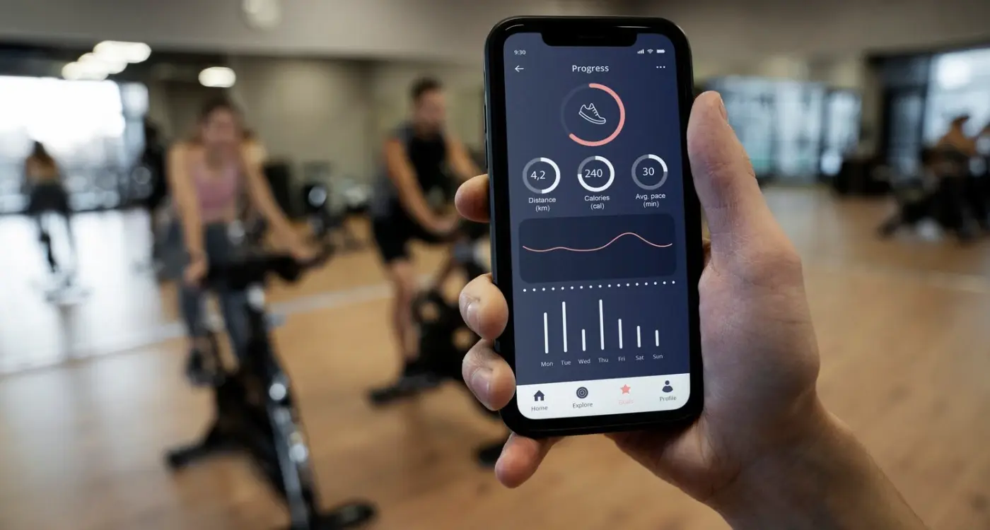
Humans are visual creatures and we love seeing progress. Simple progress bars, streak counters, or before-and-after photos can be incredibly motivating. But here's the thing—don't make people wait weeks to see progress. Show them something positive after every single action they take, no matter how small. This immediate feedback loop is what separates apps that get deleted from ones that become part of someone's daily routine, and it's one of the key differences between so-so apps and stellar apps.
Reducing Anxiety and Stress in Medical Apps
Medical apps have a unique challenge—they're often used when people are already worried about their health. I've worked on healthcare apps where users told us they felt more anxious after using the app than before opening it. That's not what we want! The key is understanding that your medical app might be someone's first interaction with scary health information or their lifeline during a difficult diagnosis.
Think about the colours you use; bright reds and oranges can trigger alarm responses in users' brains. Soft blues and greens feel calmer and more trustworthy. The language matters too—instead of "abnormal results" try "results that need follow-up." It's the same information but one version sends people into panic mode whilst the other keeps them grounded.
Simple Changes Make Big Differences
Loading screens are anxiety goldmines if you're not careful. When someone's waiting for test results, those three seconds feel like three hours. Add progress indicators and reassuring messages like "processing your information securely" rather than leaving people staring at a blank screen wondering if something's gone wrong.
Always include clear next steps after displaying medical information. Anxiety peaks when people don't know what to do with the information they've just received.
Behavioural design in healthcare apps means recognising that you're not just displaying data—you're managing someone's emotional response to that data. Get this right and your healthcare app becomes a source of comfort rather than stress.
Designing for Different Types of Healthcare Users
Not all healthcare app users are the same—and I learnt this the hard way when we built an app that tried to please everyone and ended up pleasing no one! Your 75-year-old grandmother checking her blood pressure has completely different needs than a 25-year-old fitness enthusiast tracking their workouts. The psychology behind how these groups use apps is worlds apart.
Older Adults Need Extra Support
Older users often approach healthcare apps with caution; they're worried about making mistakes or breaking something. They need bigger buttons, clearer text, and simple navigation that doesn't jump around. But here's what many developers miss—they also want to feel independent and capable. Design interfaces that guide without patronising.
Young Adults Want Control and Speed
Younger users expect healthcare apps to work like their favourite social media platforms. They want quick access to information, the ability to share data with friends or doctors, and features that fit into their busy lives. They're comfortable with technology but impatient with slow or clunky interfaces.
The key is understanding that different age groups have different comfort levels with technology and different expectations about how healthcare should work. Design your app's interface and features around these psychological differences, not against them. This is particularly important when considering how app development is transforming the developing world, where diverse user groups may have varying levels of digital literacy and different cultural approaches to healthcare.
Conclusion
After eight years of building healthcare apps and medical platforms, I can tell you that psychology isn't just a nice-to-have—it's what separates apps that people actually use from those that get deleted after a week. We've covered a lot of ground here, from understanding how our brains process health information to designing interfaces that build genuine trust with users.
The most successful healthcare app projects I've worked on all had one thing in common: they respected the user's mental state. Whether someone was anxiously waiting for test results or trying to remember their medication schedule, these apps worked with human psychology rather than against it. That meant clear information hierarchy, calming colour choices, and behavioural design that gently nudged users towards better health habits without being pushy.
Here's what I want you to take away from this guide. Your medical app needs to do more than just function well—it needs to understand that behind every tap and swipe is a real person with real concerns about their health. When you design with empathy and psychological principles in mind, you create healthcare apps that don't just inform users; they actually help them feel more confident and in control of their wellbeing.
Share this
Subscribe To Our Learning Centre
You May Also Like
These Related Guides

How Do I Design Apps for Gyms and Fitness Studios?

Why Should I Choose Behavioural Design For My App?


