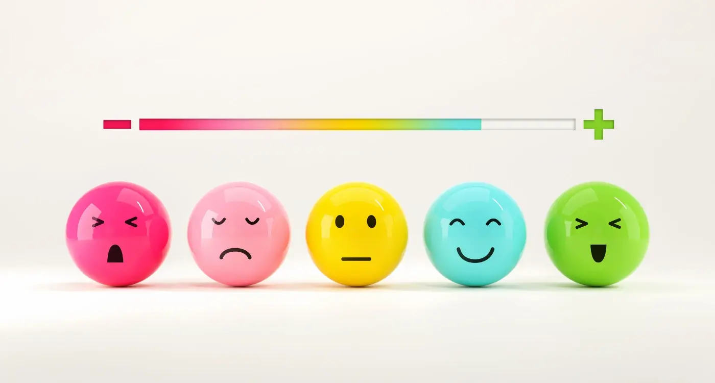
What Emotions Should Your App Create in New Users?
Most people think building an app is about features and functionality—what the app does, how fast it loads, whether the buttons work properly. And sure, those things matter. But here's what really determines if someone keeps using your app or deletes it within the first five minutes: how it makes them feel. I've watched brilliant apps with solid tech fail completely because they ignored the emotional side of user experience, while simpler apps with less impressive features become absolute juggernauts because they understood user psychology. Its a bit mad really, but the difference between an app that gets used and one that gets forgotten often comes down to those first few seconds of emotional response.
Think about the last time you opened a new app. You probably felt something—maybe excitement, maybe confusion, maybe a bit of anxiety about whether you'd figure it out. Those feelings weren't accidents; they were the result of hundreds of design decisions made by the development team. The colours they chose, the words they used, how much information they threw at you right away, whether they made you create an account before showing you anything useful. Every single choice creates an emotional reaction in your users brain, and those reactions determine whether they'll stick around or bounce.
The apps that succeed dont just solve problems—they create emotional experiences that users want to return to again and again.
In this guide, we're going to break down exactly which emotions your app should create during those critical first interactions with new users. Not the theoretical stuff you read in design books, but the practical psychology that actually works in real apps serving real people. Because getting this right can mean the difference between an app that grows organically through word-of-mouth and one that burns through your marketing budget with nothing to show for it.
Understanding the Psychology Behind First Impressions
Here's something I've learned after building apps for nearly a decade—you've got about 15 seconds to convince someone your app is worth their time. That's it. And in those 15 seconds, users aren't really thinking about features or functionality; they're feeling things. They're forming an emotional response before their logical brain even kicks in.
When someone opens your app for the first time, their brain is making snap judgements based on visual hierarchy, colour choices, animation speed, even the tone of your copy. Its like meeting someone at a party—you form an impression almost instantly, and changing that impression later? Bloody difficult. This is why we obsess over onboarding flows and first-time user experiences, because you genuinely dont get a second chance at this.
The tricky bit is that different people respond to different emotional triggers. A banking app needs to make users feel secure and in control from the very first screen—minimalist design, clear numbers, no surprises. But a fitness app? That needs energy, motivation, maybe even a bit of challenge to get people pumped up. Get this wrong and users will bounce faster than you can say "uninstall".
What works is understanding that first impressions arent really about what your app does—they're about how it makes people feel about themselves. Does it make them feel smart for choosing it? Does it make them feel capable? Or does it make them feel lost and frustrated? I always tell clients to test their onboarding with actual users, not just their team, because what feels obvious to you after months of development might feel completely confusing to someone seeing it fresh. And confusion? That's the fastest way to lose someone.
Making Users Feel Safe and Confident
When someone downloads your app for the first time, they're taking a risk—even if its a small one. They're giving you space on their phone, their time, and possibly their personal data. If you don't make them feel safe right from the start, they'll delete your app before you even get a chance to show them what it can do. I've seen this happen so many times with clients who focus all their energy on features but forget that trust needs to be earned, not assumed.
Safety in app design isn't just about security badges and privacy policies (though those matter too). It's about showing users they're in control. When someone opens your app, they should never feel like they're being pushed into decisions they don't understand or forced down a path they didn't choose. Every button should make sense; every screen should have a clear purpose. If users don't know what will happen when they tap something, you've already lost them.
Here's the thing—confidence comes from clarity. When I'm designing onboarding flows, I always make sure users know exactly where they are, what they're doing, and how to get back if they change their mind. Show them progress indicators. Give them clear labels. Let them skip steps if they want to. These aren't just nice-to-haves; they're the foundation of making someone feel like they're in safe hands.
Always include a clear back button or exit option during onboarding—users need to know they can leave at any point without consequences, which actually makes them more likely to stay and complete the process.
And look, I get it. You want to collect user data, you want to send push notifications, you want to do all these things that help your app succeed. But if you ask for too much too soon, you'll scare people away. Build confidence first by letting users experience value before you ask for anything in return. Once they trust you, they'll be much more willing to share information or grant permissions because they understand why it matters.
Creating Moments of Delight Without Overdoing It
Right, so this is where things get tricky—you want your app to feel special and memorable, but you don't want users rolling their eyes at unnecessary animations or confetti explosions every time they tap a button. I mean, we've all used those apps that try way too hard to be fun and just end up being annoying, haven't we?
The best moments of delight are the ones users barely notice at first; they just make the experience feel nicer somehow. A subtle bounce when you pull to refresh. A gentle haptic feedback when something succeeds. A friendly little checkmark that appears when you've completed a task. These tiny details add up without getting in the way of what people actually came to do.
But here's the thing—timing matters more than you'd think. If someone's trying to quickly check their bank balance or book an urgent appointment, they dont want cute animations slowing them down. Moments of delight work best when users have achieved something meaningful or when theres natural downtime in the experience. Completing a purchase? Sure, a nice confirmation animation makes sense. Waiting for content to load? A clever loading state can actually make the wait feel shorter.
I've seen so many apps make the mistake of adding delight to every single interaction, and it becomes exhausting really fast. The key is restraint. Choose maybe three or four moments in your core user journey where a bit of personality makes sense, and leave everything else simple and functional. Your users will appreciate the polish without feeling like they're being constantly entertained like toddlers at a birthday party. Less is genuinely more here.
When Confusion Is Actually Your Biggest Enemy
You know what kills apps faster than anything else? Confusion. I mean it—not bugs, not crashes, not even poor design. Its confusion that makes people close your app and never come back. The moment a user opens your app and thinks "what am I supposed to do here?" you've lost them. They won't give you a second chance, they won't read your help documentation, they'll just leave and probably download your competitors app instead.
Here's the thing about confusion—it creates anxiety. And anxiety is the opposite of what we want users to feel. When someone cant figure out how to complete a basic task in your app, their stress levels actually rise; its been measured in studies. They start questioning their own intelligence, which is a terrible emotional state to put anyone in. The worst part? Most developers don't even realise their app is confusing because they've been staring at it for months during development.
A confused user will always choose to do nothing rather than risk making a mistake, which means your carefully designed features simply won't get used
I've seen apps with brilliant functionality fail completely because the interface was unclear. Buttons that looked like decorations. Navigation that required three taps when one would do. Labels that used internal company jargon instead of plain language. All of this adds up to cognitive load—basically, your users brain has to work too hard to understand whats happening. And mobile users? They're often distracted, multitasking, or in a hurry. They don't have the patience to decode your interface. Clarity isn't just nice to have, it's the foundation of every positive emotion your app will create. Get rid of confusion first, then worry about delight.
The Balance Between Excitement and Overwhelm
This is where most apps get it wrong—they throw everything at users the moment they open the app for the first time. I mean, I get it, you're proud of all the features you've built and you want people to see them. But here's the thing; showing someone everything at once is like trying to teach them an entire language in one afternoon. It just doesn't work.
When a new user opens your app, they're already making a mental investment. They've downloaded it, they've accepted the permissions (hopefully you didn't ask for too many), and now they're giving you maybe 30 seconds to prove you're worth their time. If you bombard them with popup tutorials, feature highlights, permission requests, and account setup screens all at once? They'll close the app and probably never come back. Its that simple really.
The trick is to create what I call "progressive discovery"—letting users find features as they need them rather than explaining everything upfront. Think about how you learned to use WhatsApp or similar messaging apps; you probably started by just sending a text, then later discovered you could send photos, then voice messages, then status updates. Each discovery felt natural because it happened when you were ready for it.
What Actually Causes Overwhelm
Let me break down the most common culprits I see in apps that create that overwhelmed feeling:
- Too many onboarding screens (anything over 3-4 is pushing it)
- Asking for permissions before explaining why you need them
- Complex navigation structures with too many tabs or menu options
- Feature tooltips that pop up one after another without letting users actually try things
- Forcing account creation before showing any value
- Dense interfaces with too much information on a single screen
Finding Your Sweet Spot
The apps that nail this balance do something clever—they create excitement through small wins rather than big reveals. They let you accomplish one meaningful thing quickly, which builds confidence and curiosity. Then they gently introduce new capabilities when the context makes sense. You want users thinking "oh that's cool, what else can this do?" not "bloody hell, where do I even start with all this?"
A good test? If your mum or dad couldn't figure out the core function of your app within 60 seconds, you've probably tipped too far toward overwhelm. Strip it back. You can always add progressive disclosure of advanced features later, but you cant recover from losing users in their first session.
Building Trust Through Transparent Design Choices
Trust is one of those things that takes ages to build but can disappear in seconds—and nowhere is this more true than in mobile apps. I've seen beautifully designed apps completely fail because users didn't feel comfortable with what was happening behind the scenes. You know what? It's completely understandable. When someone downloads your app, they're essentially inviting you into their pocket, and that's a pretty intimate space really.
The biggest mistake I see developers make is hiding important information because they think it'll make the experience "cleaner" or more streamlined. Sure, a minimal interface looks nice, but if users don't understand what your app is doing with their data or why you need certain permissions, they'll feel uneasy. That nagging doubt will sit in the back of their mind every time they open your app. I mean, would you use something if you weren't quite sure what it was doing with your personal information?
Being Upfront About What You Need
When your app asks for camera access or location data, explain why in plain language before the system permission popup appears. Not after. Not in some buried settings page. Right there, in the moment. I always tell clients to write these explanations as if they're talking to their mum—no technical jargon, no vague corporate speak. Just honest communication about what you need and why it makes their experience better.
Actually, some of the most successful apps I've worked on have taken transparency even further by showing users what happens to their data in real-time. Little indicators that show when location is being used, clear buttons to delete your data, simple privacy dashboards that don't require a law degree to understand. These design choices create an emotional response that's really powerful; people feel respected and in control, which builds that trust foundation your app needs to succeed.
Add a "Why we need this" screen before every permission request that uses simple, benefit-focused language—users are far more likely to grant access when they understand its value to them.
Why Emotional Design Differs Across Industries
Here's something I've learned from building apps across different sectors—what works brilliantly in one industry can completely fall flat in another. A banking app that feels playful and fun? That's going to make people nervous about their money. A fitness app thats overly serious and formal? Nobody's going to want to open it every morning.
The emotional tone you need to set depends entirely on what you're asking users to do and how vulnerable they feel doing it. When someone opens a healthcare app to check their test results, they need calm reassurance and absolute clarity;when they open a food delivery app, you want them to feel hungry, excited, and maybe a bit indulgent. These are completely different emotional states that require totally different design approaches.
Financial apps need to balance accessibility with authority—users want to feel like their money is being taken seriously, but they also don't want to feel stupid or overwhelmed by jargon. E-commerce apps work best when they create a sense of discovery and possibility without feeling pushy or manipulative. Dating apps (and I've built a few of these!) need to make people feel hopeful and confident, not anxious or judged.
Industry-Specific Emotional Priorities
Different sectors require different emotional foundations, and getting this wrong can sink an otherwise well-built app:
- Healthcare apps prioritise trust, privacy, and calm—users are often anxious already
- Finance apps need confidence and control—people want to feel smart about their money decisions
- Entertainment apps thrive on excitement and anticipation—but not so much it becomes stressful
- Productivity apps should create focus and accomplishment—not guilt or pressure
- Social apps need belonging and validation—without creating addiction or comparison anxiety
- Education apps balance challenge with encouragement—making learning feel achievable
I mean, its not rocket science once you think about it—you just need to understand what state of mind your users are in when they need your app, and what state of mind they want to be in when they're done using it. That gap? That's what your emotional design needs to bridge.
How to Test Whether Your App Creates the Right Feelings
Right, so you've designed your app with emotions in mind—but how do you actually know if its working? This is where things get a bit tricky because you can't just ask users "hey, how are you feeling?" and expect honest answers. People are rubbish at articulating their emotions, especially when they're using an app.
The most reliable method I use is watching real people use the app without any guidance. I mean it—literally sit behind them (or screen record if you're doing remote testing) and watch what happens. You'll see everything; the confused frown when they can't find a button, the slight smile when something works perfectly, the frustrated tap-tap-tap when loading takes too long. Facial expressions don't lie, and that's pure gold for understanding emotional responses.
Time-on-screen metrics can tell you a lot too. If users are abandoning your onboarding after 8 seconds, something's making them feel wrong—maybe anxious, maybe bored, maybe overwhelmed. Compare that data against where people drop off and you'll start seeing patterns. Are they leaving right after a specific screen? That's your problem area.
The gap between what users say they feel and what they actually feel while using your app is often massive, which is why observation beats surveys every single time
Here's what I do that works really well—ask users to complete a specific task (like creating an account or finding a feature) then immediately after, ask them to describe their experience using emotion words. Give them a list: confident, confused, excited, frustrated, safe, worried. Its much easier for people to pick from options than generate answers from scratch. You know what? The results are genuinely eye-opening, and they'll show you exactly which emotions your app is actually creating versus what you intended.
Look—after building apps for nearly a decade, I can tell you that the emotional experience you create in those first few minutes will make or break your app. Its not about having flashy animations or throwing confetti every time someone taps a button; its about understanding what your users need to feel so they actually stick around and use what you've built.
The apps that succeed are the ones that make people feel something genuine from the start. Safety when they're entering payment details. Confidence when they're navigating through your interface. A little spark of joy when something works exactly how they expected it to—or better yet, works in a way that's even simpler than they imagined. But here's the thing: these emotions don't happen by accident, they're designed intentionally by teams who've really thought about their users journey.
I've watched countless apps fail because they got this bit wrong. They created confusion when users needed clarity. They overwhelmed people when they should have guided them gently. Or worse, they made users feel uncertain about whether their data was safe or if the app would actually do what it promised. And once you've lost someone's trust in those first moments? Getting them back is nearly impossible.
What I want you to take away from all this is simple: test your app with real people, watch how they react, listen to what they say (and what they don't say), and be willing to change things that aren't working. The emotional design of your app isn't some abstract concept—its the difference between an app that gets used once and deleted, and one that becomes part of someone's daily routine. Make your users feel understood, make them feel safe, give them little moments that make them smile... and you'll be miles ahead of most apps out there.
Share this
Subscribe To Our Learning Centre
You May Also Like
These Related Guides
What Emotional Triggers Create Lasting App User Engagement?

Creating Emotionally Engaging Apps [The Feel Factor Podcast Ep. 1]