What Makes App Descriptions Persuade People to Click Install?
Your app's description gets about three seconds of attention before someone decides to install or scroll past. That's it. Three seconds. I've watched this play out thousands of times across the apps I've built—and its the single most undervalued piece of the entire development process. You can spend months building the perfect app, invest in beautiful design, get the functionality spot on, but if your description doesn't convince people to click that install button? None of it matters.
Here's the thing though—most app descriptions are terrible. They're filled with jargon nobody understands, features that don't mean anything to regular people, and they sound like they were written by a committee of lawyers and marketers who've never actually used a mobile phone. I mean, how many times have you read something like "leveraging synergistic solutions to optimise your workflow" and actually known what that means? Because I haven't got a clue.
The best app descriptions don't talk about what the app does; they talk about what changes in your life after you start using it.
What makes someone hit install isn't a list of technical specifications or a bunch of corporate speak about "empowering users". Its understanding what problem they're trying to solve right now, in this exact moment, and showing them you've got the answer. When I write descriptions for clients, we spend more time talking about their users' frustrations than we do about the app's features—because that's what actually converts browsers into users.
The mobile app market is crowded. Really crowded. There are millions of apps competing for attention, which means your description needs to work harder than ever before. But here's what most people get wrong: they think working harder means writing more, adding more features, explaining everything the app can do. Actually, the opposite is true.
Understanding User Psychology in Three Seconds
Right, let's talk about what actually happens in those first few seconds when someone lands on your app store page. Three seconds—that's genuinely all you get before people decide whether to keep reading or swipe away. Bit scary when you think about it that way.
In my years building apps, I've watched countless user testing sessions where people scroll through app listings. And honestly? Most of them barely read anything. They're scanning. Looking for reasons to either install or move on. Their brain is asking three questions almost instantly: What does this do? Is this for me? Can I trust this? If your description doesnt answer these in those first three seconds, you've already lost them.
The Brain Makes Quick Judgements
Here's what people don't realise—users aren't being lazy or difficult when they skim your carefully crafted description. Their brain is actually protecting them from information overload. Think about it; there are millions of apps out there, and people need a way to filter through all that noise quickly. So their brain has developed shortcuts, looking for specific signals that indicate whether something is worth their time.
When someone first sees your app description, their brain is processing visual patterns before they even start reading words. The length of your first sentence matters. The formatting matters. Whether you've used bullet points or written a wall of text—all of this gets processed in milliseconds. Its not conscious decision making; it's instinctive filtering based on patterns theyve seen thousands of times before.
Emotion Beats Logic Every Time
One mistake I see constantly is app descriptions that lead with features and technical specs. "Our app uses advanced algorithms to..." Nobody cares. Not yet, anyway. What they care about is how they'll feel when they use your app. Will it make their life easier? Will it save them time? Will it make them look good to their friends? These emotional triggers are what drive that initial three-second decision, and the logical stuff can come later once you've got their attention.
The First Sentence That Changes Everything
Your first sentence needs to do something most people get completely wrong—it needs to speak directly to the person reading it, not about how great you think your app is. I've seen thousands of app descriptions over the years and the ones that convert best all share this one trait; they acknowledge what the user wants before they start talking about what the app does. Its a subtle difference but bloody hell does it matter when you look at the install rates.
The thing is, most developers write their first sentence like this: "AppName is the leading solution for task management" or "We've built the most powerful fitness tracker." But here's the thing—nobody cares about that yet. They're scanning dozens of apps and you've got maybe three seconds to make them stop scrolling. What works better is starting with the problem or desire: "Tired of forgetting important tasks?" or "Want to actually stick to your workout plan?" See the difference? You're meeting them where they are, not where you want them to be.
What Your Opening Line Should Do
Your first sentence has three jobs and it needs to do all of them at once. First, it confirms to the user they're in the right place—that this app is for people like them. Second, it hints at a transformation or benefit without listing features yet. And third, it needs to be short enough that people can read it in a glance. I mean, if your opening sentence is three lines long you've already lost them.
Test your first sentence by asking someone outside your industry to read it. If they cant immediately tell who the app is for and what problem it solves, rewrite it.
Common First Sentence Mistakes
There are patterns I see again and again that tank conversion rates right from the start. Here's what doesn't work:
- Starting with your company name or history—users dont care about your journey yet
- Using jargon or technical terms that only industry insiders understand
- Making broad claims like "the best" or "number one" without context
- Writing in passive voice that makes everything feel distant and corporate
- Trying to appeal to everyone instead of your actual target user
The apps that get this right understand that persuasion starts with empathy. You need to show you understand the users problem before you can convince them you have the solution. Its not about being clever or creative for its own sake—its about connecting with someone who's actively looking for help with something specific. When you nail that first sentence everything else becomes easier because you've already earned their attention.
Breaking Down Features People Actually Care About
Here's what I've learned after building apps for nearly a decade—nobody actually cares about your features list. Not really. I mean, sure, they'll read it, but what they're actually doing is translating each feature into benefits that matter to their lives. And if you make them do that translation work themselves? You've already lost half your potential downloads.
The trick is understanding that users dont want features—they want outcomes. They want to save time, make money, feel better, look good, or solve a problem thats been bugging them. When I write app descriptions now, I always start with the outcome first, then back it into the feature. Instead of "Advanced scheduling algorithm" I write "Never miss an important meeting again—our smart scheduler figures out the best time for everyone." See the difference? One makes people work to understand its value; the other just tells them what they'll get.
The Features That Actually Convert
After testing hundreds of app descriptions, I've noticed patterns in what makes people click install. Its not always what developers think matters most. Heres what actually moves the needle:
- Speed and performance—people hate waiting, so "instant sync" or "loads in under a second" matters more than you'd think
- Offline functionality—being able to work without internet is genuinely valuable but often buried in descriptions
- Privacy and security—especially now that people are more aware of data collection practices
- Customisation options—users want to feel like the app is theirs, not a one-size-fits-all solution
- Integration with tools they already use—nobody wants another siloed app cluttering their phone
But here's the thing—just listing these isn't enough. You need to connect each one to a real-world situation where it matters. "Works offline" becomes "Check your account balance even when the tube has no signal." Thats when features transform into compelling reasons to download.
Social Proof Without Sounding Desperate
Right, so you've built a decent app and you want people to know other people use it—makes sense. But here's where most developers go completely wrong; they plaster their app descriptions with numbers that sound impressive but mean absolutely nothing to the average user. "Over 50,000 downloads worldwide!" Cool. Is that good? Bad? Should I care? The problem is that social proof only works when it actually proves something meaningful.
I've seen this countless times over the years. An app will shout about having millions of users but the reviews tell a different story—2.3 stars and complaints everywhere. That's not social proof, thats a warning sign. Real social proof needs context and specificity. Instead of saying "Trusted by thousands," try "Used by over 3,000 teachers to mark homework 60% faster." See the difference? One is just a number, the other explains why those 3,000 people chose your app and what they got from it.
The best social proof answers the question your potential user is secretly asking: did this work for someone like me?
Here's what actually works in app store descriptions—mention specific user groups who've benefited from your app, reference real results without exaggerating them, and for goodness sake don't make up awards that don't exist. I mean, "Winner of Best New App 2019" sounds good until someone googles it and finds nothing. Its embarrassing really. If you've got legitimate press coverage or recognisable clients, mention them briefly but don't make it the entire focus of your description. People download apps to solve their problems, not because TechCrunch wrote about you once. Keep the social proof relevant, specific, and tied directly to the benefits users care about—not just vanity metrics that make you feel good but don't actually persuade anyone to install.
Writing for Skimmers and Readers
Here's the truth about app store visitors—most of them aren't reading your description word for word. They're skimming. Actually, studies show that about 80% of users will scan your description in less than 10 seconds before making a decision. That's not much time, is it?
So you need to write for both types of people: the skimmers who want quick info and the careful readers who'll dig into the details. Its not one or the other; you need both groups to convert.
Start with short paragraphs. Really short. Two or three sentences max. This creates natural break points that make scanning easier—and honestly, long blocks of text just look intimidating on a small screen.
Use bullet points for your key features. Skimmers love them because they can grab the important bits without wading through full sentences. But here's what most people get wrong: they list features without explaining the benefit. "Advanced search functionality" means nothing to someone browsing the app store; "Find what you need in seconds, not minutes" tells them why they should care.
Bold text works brilliantly for highlighting key phrases, but don't overdo it. If everything's bold, nothing stands out. Pick the words that matter most—your main benefit, your unique selling point, the thing that makes you different.
For the readers who want more detail? Give it to them in the second half of your description. Front-load the scannable stuff, then provide the deeper explanation below. This way both user types get what they need without compromising the others experience.
And please, for the love of all things mobile, use line breaks. White space isn't wasted space—it's breathing room that makes your description actually readable instead of overwhelming.
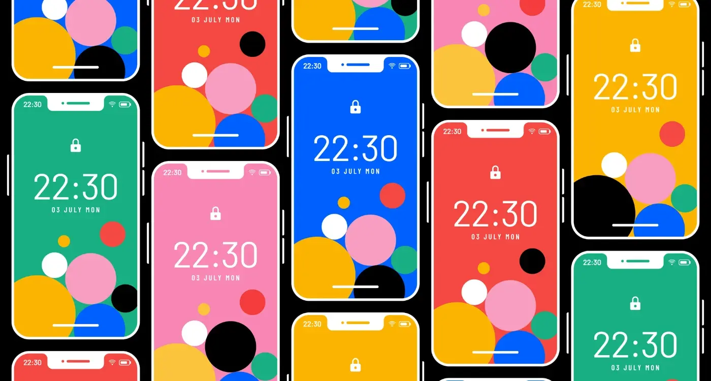
The Screenshots and Description Dance
Here's what most people get wrong—they treat screenshots and descriptions like they're separate things. But they aren't, not really; they work together to tell your apps story, and if they're not saying the same thing? That's when you lose people.
I've seen it happen dozens of times. Someone writes a brilliant description about how their app solves a specific problem, but then their screenshots just show generic menu screens or settings pages. Or worse, they've got screenshots highlighting features that aren't even mentioned in the description. Its confusing, and confused people don't click install.
The way I see it, your screenshots should basically prove what your description promises. If you say "track your spending in seconds", show a screenshot of someone actually tracking their spending. If you claim "beautifully simple design", well, your screenshots better look beautiful and simple. This sounds obvious but you'd be surprised how many apps miss this connection.
Making Them Work Together
When someone lands on your app page, they're going to look at your screenshots first—that's just how people browse. So your screenshots need to create curiosity that your description satisfies. Think of it like this: screenshots grab attention and raise questions, descriptions answer those questions and push toward the install.
Reference your best screenshot in your description. Something like "As you can see, tracking your habits takes just one tap" creates a direct link between what they're seeing and what they're reading.
The Rhythm That Works
Here's my usual approach that's worked pretty well over the years:
- First screenshot shows your main benefit (this goes with your opening sentence)
- Middle screenshots demonstrate key features (these match your feature list)
- Last screenshot shows social proof or a special offer (this reinforces your credibility)
- Description follows the same order, expanding on what each screenshot shows
The biggest mistake? When your description talks about features 1, 2, and 3, but your screenshots show features 4, 5, and 6. People notice that disconnect, even if they dont consciously realise it, and it creates doubt about whether your app actually does what you say it does.
What Not to Say in Your App Description
Right, let's talk about the things that make users hit the back button faster than you can say "download now." I've seen some terrible app descriptions over the years—ones that promise the world but deliver nothing, ones that sound like they were written by a robot, and ones that just make you cringe a bit. Its time we addressed what not to do.
First up, don't tell people your app is "the best" or "number one" unless you can back it up with actual proof. Users have heard this so many times its lost all meaning; they scroll right past these claims without a second thought. Same goes for calling your app "revolutionary" or "the future of" whatever industry you're in. Show don't tell is the rule here—let your features and user reviews do the talking.
Never list technical specifications that mean nothing to regular people. Nobody cares that you used "advanced algorithms" or "proprietary technology" unless you explain what that actually does for them. I mean, what does that even mean to someone just looking for a fitness tracker? Be specific about benefits instead—"tracks your runs without draining your battery" beats "utilises advanced GPS optimisation" every single time.
Don't beg for ratings or reviews in your description. Honestly, it looks desperate and takes up space you could use to explain why your app is worth downloading. And please, for the love of all things mobile, don't say your app is "easy to use" or has a "simple interface"—that should be a given, not a selling point. If you need to tell people its easy to use? That's usually a red flag that its not.
Here's the thing—avoid generic phrases like "designed for you" or "made with love" because they say absolutely nothing about what your app actually does. Users want concrete information, not fluffy marketing speak. And whatever you do, don't write your description like its a press release; nobody wants to read "We are pleased to announce" or "It is with great excitement." Just get to the point and tell people what they'll get when they tap install.
Testing and Measuring What Actually Works
Right, so you've written what you think is a brilliant app store description—but here's the thing, your opinion doesn't matter. I mean, it matters a bit, but what really matters is whether it actually gets people to install your app. And the only way to know that for certain is to test it.
Most developers write one description and leave it there for months, sometimes years. Its a huge missed opportunity because app store descriptions aren't set in stone—you can change them, test different versions, and see which one performs better. The app stores give you this data for free through their analytics dashboards; you just need to look at it and actually do something with the information.
Start by tracking your conversion rate (the percentage of people who view your app page and then install). This is your baseline. Then make one change—maybe you rewrite your first sentence, or you shift the order of your feature list, or you add a different type of social proof. Wait a week or two to gather enough data, then compare the results. Did your conversion rate go up or down? By how much?
The best app store descriptions are never finished—they're constantly evolving based on real user behaviour and market feedback
Here's what I typically test: opening sentences, feature ordering, length of description (short vs detailed), tone (professional vs casual), and the specific benefits highlighted. But—and this is important—only test one thing at a time. If you change three things at once and your conversion rate drops, you wont know which change caused the problem. Keep notes on every test you run; its easy to forget what you changed two months ago when you're looking at the data.
Pay attention to your install-to-uninstall ratio too. If your new description increases installs but people delete the app within a day, you've probably oversold what your app actually does. That's not a win, thats a problem.
Conclusion
Writing app descriptions that actually convert—its both simpler and more difficult than most people think. Simple because the principles are straightforward: understand your users, speak their language, lead with benefits, show social proof, and make every word earn its place. Difficult because it requires you to really know your audience and to resist the temptation to talk about how clever your app is rather than how useful it is.
I've seen apps with genuinely brilliant functionality fail because their descriptions read like technical manuals, and I've seen fairly average apps succeed beyond anyone's expectations because they nailed the human side of things. The description isn't just marketing copy—it's the bridge between someone having a problem and discovering that your app might solve it.
The thing is, you cant just write your description once and forget about it. The apps that perform best treat their descriptions like living documents; they test different approaches, they update based on user feedback, they watch what competitors are doing and they adapt. User expectations change, language evolves, and new features need highlighting. What worked brilliantly six months ago might be tired now.
But here's what doesn't change—people want to know what your app does, why it matters to them specifically, and whether other people like them have found it useful. Answer those three questions clearly and honestly in your description and you're already ahead of probably 80% of apps in the store. Its not about being clever or witty (though that can help if its authentic). Its about being clear, being relevant, and respecting the fact that someone is giving you maybe ten seconds of their attention. Make those seconds count.
Share this
Subscribe To Our Learning Centre
You May Also Like
These Related Guides
How Does Colour Psychology Impact App Store Performance?
What Makes People Install an App From the App Store?