Over 73 million people now wear smartwatches worldwide, yet most wearable app experiences are absolutely terrible. I see this constantly when working with clients who want to expand their mobile apps to smartwatches—they assume they can just shrink their smartphone interface and call it a day. That's like trying to fit a double-decker bus through a cat flap!
The truth is, smartwatches operate in a completely different world from smartphones. Your wrist isn't your pocket. People glance at their watch for seconds, not minutes. They're often walking, running, or doing something with their hands. The screen is tiny, the interaction time is minimal, and the battery life is precious.
The best wearable app is one that disappears into your daily routine without you even noticing it's there
After years of developing wearable apps for various clients, I've learned that successful smartwatch features share common traits—they're quick, contextual, and solve specific problems that smartphones can't. This guide breaks down exactly which features work brilliantly on smartwatches and which ones should stay firmly planted on your phone. We'll explore everything from screen limitations to battery considerations, helping you create a user experience that people actually want to use rather than immediately delete.
Understanding Smartwatch Screen Limitations
Right, let's talk about the elephant in the room—smartwatch screens are tiny. I mean, really tiny. We're talking about displays that are roughly the size of a large coin, and yet people expect them to do everything their phone can do. That's just not realistic, and understanding this limitation is the first step to building a decent smartwatch app.
Most smartwatch screens range from about 1.2 to 1.9 inches diagonally. Compare that to your phone's screen, which is probably around 6 inches, and you'll start to see the problem. You simply can't fit the same amount of information on a smartwatch screen without making everything so small it becomes unusable.
Text Size Matters More Than You Think
When designing for smartwatches, text needs to be large enough to read at a glance—literally. People don't want to squint at their wrist trying to decipher tiny letters. This means you can typically fit maybe 3-4 lines of text comfortably on screen at once. Any more than that and you're asking for trouble.
Touch Targets Need Space
Fingers haven't got any smaller just because screens have. Touch targets on smartwatches need to be big enough for adult fingers to tap accurately. We're talking about buttons that are at least 44 pixels wide—which on a tiny screen takes up a considerable amount of space. This severely limits how many interactive elements you can include without creating a frustrating user experience.
Quick Access Features That Actually Work
When building a wearable app, you need to remember that people aren't going to spend ten minutes scrolling through menus on their wrist. They want to get in, do something quickly, and get out. That's the whole point of smartwatch apps—they solve problems fast.
I've worked on dozens of smartwatch projects over the years, and the most successful ones share something in common: they make the most important features available within two taps maximum. Any more than that and people just pull out their phone instead.
The Big Three Quick Access Features
Here are the features that consistently work well for user experience on smartwatch apps:
- Timer and stopwatch functions (perfect for cooking, workouts, or meetings)
- Weather at a glance with today's conditions
- Quick reply options for messages (pre-written responses work brilliantly)
- Camera remote control for taking photos
- Music playback controls
Put your most-used feature on the main screen. Don't make people hunt for it in submenus—that defeats the purpose of having a wearable app in the first place.
The trick is picking which features deserve prime real estate on your watch face. Ask yourself: what would someone need to do in under 10 seconds? Those are your quick access candidates. Everything else can live deeper in the app structure.
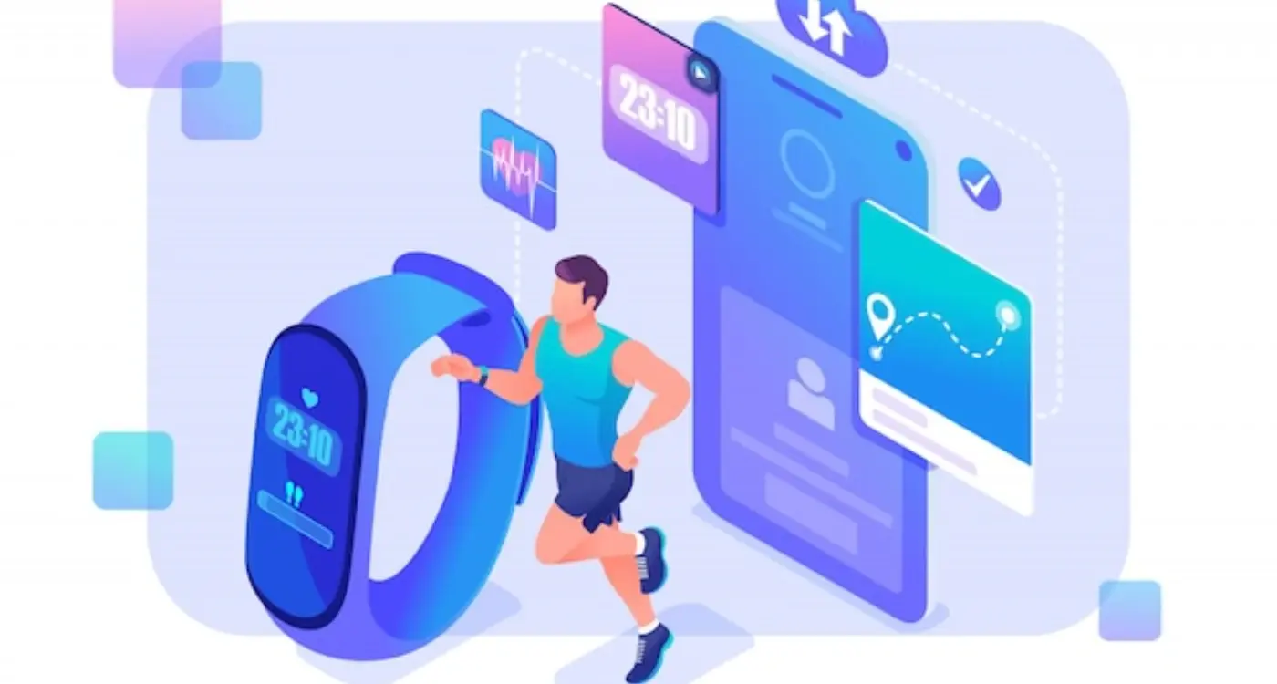
Health and Fitness Tracking Capabilities
Health and fitness tracking is where smartwatches really shine—and frankly, it's probably why most people buy them in the first place. The sensors built into these devices can monitor heart rate, count steps, track sleep patterns, and even measure blood oxygen levels. But here's what I've learned from years of developing these apps: the magic isn't in collecting the data, it's in presenting it in a way that actually helps people.
Real-Time Feedback That Works
The best fitness apps I've worked on focus on giving users immediate, actionable information. A simple heart rate zone indicator during workouts performs much better than complex charts that require scrolling. People want to glance at their wrist and instantly know if they're pushing too hard or need to step it up. Quick vibration alerts when users hit their step goals or need to move after sitting too long work brilliantly—they're personal reminders that don't require looking at the screen.
Keep It Simple, Keep It Useful
The biggest mistake I see with fitness apps is trying to cram too much information onto that tiny screen. Users don't need to see their entire workout history during a run; they need current pace, distance, and time. Save the detailed analytics for the phone app where there's proper screen real estate. The smartwatch should be your fitness companion, not your fitness dashboard.
Notification Management Done Right
Getting notifications right on a wearable app isn't just about showing them—it's about showing the right ones at the right time. I've worked on countless smartwatch projects over the years, and trust me, nothing kills user experience faster than a wrist that buzzes every thirty seconds with junk notifications.
The golden rule is simple: be selective. Your smartwatch should act like a smart filter, not a megaphone for every app on your phone. Most successful wearable apps I've helped build focus on three types of notifications—urgent communications, health alerts, and time-sensitive reminders. Everything else can wait until the user picks up their phone.
Smart Filtering Makes All the Difference
The best smartwatch apps learn from user behaviour. If someone consistently dismisses notifications from a particular app, the system should pick up on that pattern and stop showing them. This isn't rocket science; it's just good manners.
A notification that adds no value is just an interruption wearing a digital disguise
Quick actions are where smartwatch notifications really shine. Being able to reply with a pre-written message, mark something as done, or dismiss an alert without reaching for your phone—that's the sweet spot. Keep these actions simple and limit them to three options maximum; any more and you're asking users to perform surgery on a postage stamp.
Voice Controls and Hands-Free Operation
Voice controls on smartwatches aren't just a nice-to-have feature—they're practically mandatory. Think about it: you're wearing a tiny computer on your wrist, and half the time your other hand is busy carrying shopping bags, holding a coffee, or gripping a bike handlebar. Voice commands become your lifeline to actually using the thing.
The best smartwatch apps make voice interaction feel natural and quick. Simple commands like "start timer for 10 minutes" or "add milk to shopping list" work brilliantly because they're short and specific. Complex multi-step voice commands? Not so much. I've seen apps try to cram entire conversations into voice controls, and it just doesn't work on a device this small.
Keep Voice Commands Short and Sweet
Your app should respond to voice commands that people can say in under three seconds. Any longer and users will give up and just tap the screen instead. The magic happens when voice controls feel faster than manual input—which isn't hard to achieve when you're dealing with a screen the size of a postage stamp.
When Voice Controls Shine
Voice works best for quick actions: setting reminders, starting workouts, sending preset messages, or controlling music playback. These are the moments when people really appreciate hands-free operation, and your app will feel genuinely useful rather than just clever.
Battery Life Considerations for App Features
Here's something most people don't realise about smartwatches—they're basically tiny computers strapped to your wrist with batteries smaller than a coin. I've worked on plenty of wearable app projects over the years and battery drain is always the elephant in the room that everyone pretends isn't there until launch day.
The features that kill battery life fastest are usually the ones that sound most impressive in meetings. Constant GPS tracking, vibrant animations, frequent server syncing—they all sound brilliant until your users are charging their watches twice a day. Location services are particularly brutal; I've seen apps drain a full battery in three hours just from aggressive location polling.
Smart Battery Management
The trick isn't avoiding power-hungry features completely—it's using them intelligently. Background sync should happen every few minutes, not every few seconds. Animations need to be subtle and brief. GPS tracking works best when triggered by specific user actions rather than running continuously.
Test your wearable app's battery impact from day one of development. Don't wait until the end—by then it's too late to make meaningful changes without rebuilding core features.
User Experience vs Power Consumption
Smart battery management actually improves user experience rather than limiting it. Users would rather have a functional app that lasts all day than a feature-rich one that dies by lunchtime. The best wearable apps I've seen prioritise the features users actually need while being ruthless about cutting battery-draining extras.
Conclusion
Building smartwatch apps that people actually want to use comes down to understanding what these tiny devices do best—and what they don't. After working with countless clients who've wanted to cram their entire mobile app onto a watch screen, I can tell you that restraint is your best friend here. The most successful smartwatch apps we've built have been the ones that focus on just a few core features and execute them brilliantly.
The golden rule I always share with my team is this: if someone has to think about how to use your smartwatch app, you've already lost them. These devices work best when they anticipate what users need before they even know they need it. Quick glances at notifications, seamless health tracking that runs in the background, and voice commands that actually work—these are the features that create genuine value.
Battery life will always be a limiting factor, so every feature you add needs to earn its place. I've seen too many promising apps fail because they tried to do everything instead of doing a few things exceptionally well. Focus on solving one problem really well rather than solving ten problems poorly. Your users will thank you for it, and your app will have a much better chance of becoming something people rely on daily rather than something they delete after a week.