How Do I Make My Wellness App Accessible For People With Disabilities?
Picture this: you've spent months perfecting your wellness app. The meditation features are spot-on, the workout tracking is smooth, and the sleep monitoring works beautifully. Then someone mentions accessibility and suddenly you realise—what if people with disabilities can't actually use your app? It's a sobering thought that hits many app developers when they least expect it.
I've worked on countless wellness apps over the years, and I can tell you that accessibility often gets pushed to the bottom of the to-do list. Not because developers don't care, but because they simply don't know where to start. The truth is, making your wellness app accessible isn't just about ticking boxes or meeting legal requirements—it's about creating something that genuinely helps everyone achieve better health and wellbeing.
One in five people worldwide live with a disability, yet most apps are designed as if they don't exist
This guide will walk you through everything you need to know about making your wellness app truly inclusive. We'll cover the common barriers people face, practical solutions you can implement, and real testing strategies that actually work. By the end, you'll understand that inclusive design isn't an afterthought—it's what separates good apps from great ones.
Understanding Accessibility in Wellness Apps
Accessibility in wellness apps isn't just a nice feature to have—it's something that can make or break the experience for millions of people. I've worked on enough wellness projects to know that when we design apps for meditation, fitness tracking, mental health support, or nutrition monitoring, we're dealing with users who might be going through difficult times; the last thing they need is an app that creates more barriers.
Think about it this way: someone using a wellness app might already be dealing with physical pain, anxiety, depression, or other health challenges. If your app isn't accessible, you're basically telling these users they don't matter. That's not just bad business—it's missing the whole point of wellness apps in the first place.
What Makes Wellness Apps Different
Wellness apps face unique accessibility challenges that other apps don't. Users might need to interact with your app during panic attacks, chronic pain flares, or when their vision is affected by medication. The interface needs to work when someone's hands are shaking, when they can't see clearly, or when they're struggling to concentrate.
The good news? Making your wellness app accessible doesn't mean compromising on design or functionality. It means thinking more carefully about how different people might use your app and building in flexibility from the start.
Key Areas That Need Attention
- Visual elements like text size, colour contrast, and screen reader compatibility
- Audio features including captions, volume controls, and sound alternatives
- Physical interaction methods like gesture alternatives and button sizing
- Cognitive support through clear navigation and simple language
- Emergency features that work when users are in distress
Common Accessibility Barriers That Wellness Apps Face
I've worked on dozens of wellness apps over the years, and I keep seeing the same accessibility problems crop up again and again. The truth is, most developers don't realise they're creating barriers until someone points it out. It's not malicious—it's just that we often design for ourselves rather than thinking about users with different needs.
The biggest culprits are usually visual barriers. Text that's too small to read, colour combinations that don't have enough contrast, and buttons that are impossible to spot. I've seen meditation apps with pale grey text on white backgrounds—try reading that if you have low vision! Then there are the motor accessibility issues; tiny tap targets that require precision many users simply don't have, and gesture-based controls that assume everyone can swipe and pinch with ease.
The Most Common Barriers We Encounter
- Poor colour contrast that makes text unreadable
- Missing alternative text for images and icons
- Auto-playing videos or sounds without user control
- Complex navigation that confuses screen readers
- Time-limited content that disappears too quickly
- Forms without proper labels or error messages
Start by downloading a screen reader app and trying to use your wellness app without looking at the screen. You'll quickly discover which parts of your app are completely unusable for visually impaired users.
Audio barriers are sneaky too. Apps that rely solely on sound cues leave deaf users completely in the dark, whilst apps without captions or transcripts exclude huge portions of their potential audience.
Visual Accessibility Features That Make Apps Usable for Everyone
When I'm working with clients on wellness apps, visual accessibility often gets pushed to the bottom of the priority list—and that's a mistake I see far too often. Visual accessibility isn't just about people who are blind; it covers a massive range of users including those with low vision, colour blindness, or even temporary vision problems like eye strain.
The good news? Most visual accessibility features are pretty straightforward to implement if you plan for them from the start. Text size controls are your best friend here—users should be able to make text bigger without breaking your beautiful design. I always tell my team to test apps at 200% text size because that's when you'll spot the real problems.
Colour and Contrast Considerations
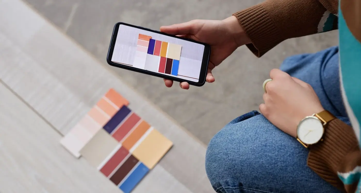
Colour contrast is where many wellness apps fall down completely. Those lovely pastel themes might look calming, but they're often impossible to read for people with visual impairments. Your text needs proper contrast against its background—there are free tools that'll check this for you in seconds.
Navigation and Visual Cues
Never rely on colour alone to communicate information. If your app shows progress with a green bar, add a percentage or label too. Screen readers can't see colours, and neither can users with certain types of colour blindness. Alternative text for images and icons is non-negotiable—it takes minutes to add but makes your app accessible to screen reader users.
Audio and Sound Accessibility for Better User Experience
Sound plays a massive role in how we experience wellness apps—from guided meditation sessions to workout timers that beep when it's time to rest. But here's what many developers miss: not everyone experiences audio in the same way, and some people can't hear it at all. Making your wellness app's audio accessible isn't just about adding subtitles (though that's part of it); it's about creating multiple ways for users to receive the same information.
Making Audio Content Work for Everyone
When your app uses audio cues, you need visual alternatives too. If your meditation app chimes to signal the end of a session, pair that with a gentle screen flash or vibration. Voice instructions during yoga flows should have text alternatives that users can read instead. Captions aren't optional—they're necessary for people who are deaf or hard of hearing, but they also help people learning English or those in noisy environments.
Good accessibility design benefits everyone, not just people with disabilities—it's about creating options that work in different situations and for different needs
Volume controls need to be separate from system volume so users can adjust meditation music without affecting their phone's ringtone. Background music shouldn't compete with spoken instructions—many people with hearing aids or processing difficulties struggle when multiple audio sources play simultaneously. These small changes make your wellness app usable for millions more people.
Motor and Physical Accessibility Considerations
When I first started working with wellness apps, I didn't realise how many people struggle with the basic touch gestures we take for granted. Tapping, swiping, pinching—these movements can be incredibly difficult for users with motor impairments, arthritis, or conditions like Parkinson's disease. Your app needs to work for everyone, not just those with perfect dexterity.
The most important thing you can do is make your touch targets bigger. Apple recommends 44x44 pixels minimum, but I'd go even larger for wellness apps where users might be accessing content during stressful moments or physical discomfort. Space these targets well apart too; nothing's more frustrating than accidentally hitting the wrong button when you're trying to log your medication.
Physical Accessibility Features to Include
- Large, well-spaced buttons and interactive elements
- Support for voice control and dictation
- Alternative input methods like switch control
- Adjustable gesture sensitivity settings
- One-handed operation modes
- Customisable interface layouts
Testing with Assistive Technology
Don't forget that many users rely on assistive devices like styluses, mouth sticks, or specialised keyboards. Your app should respond properly to these tools; test with iOS Switch Control or Android's accessibility shortcuts to see how your app performs. The best wellness apps I've worked on always include settings that let users customise the interface to match their physical capabilities, including voice control features.
Cognitive Accessibility in Wellness App Design
Cognitive accessibility is often the most overlooked area when designing wellness apps, and that's a real shame. People with conditions like ADHD, dyslexia, autism, or memory difficulties face unique challenges when using apps—especially wellness apps that often require tracking habits, remembering schedules, or processing complex information about their health.
I've worked with clients who've been surprised to learn that cognitive disabilities are actually the most common type of disability. Yet most wellness apps are designed with unnecessarily complex interfaces that make them difficult to use for anyone with attention or memory challenges.
Making Information Easy to Process
Your wellness app needs to present information in bite-sized chunks. Long paragraphs of health advice or complicated meditation instructions can overwhelm users with cognitive differences. Break content into short sentences and use bullet points where possible.
- Use simple, everyday language instead of medical jargon
- Provide clear headings that explain what each section does
- Add progress indicators so users know where they are
- Include reminders and prompts without being pushy
- Allow users to customise how much information they see at once
Supporting Memory and Attention
Memory support is crucial in wellness apps. Users shouldn't have to remember complex sequences or worry about losing their progress if they get distracted.
Always save user progress automatically and provide gentle reminders about where they left off when they return to your app.
The goal is creating an app that supports users rather than adding to their cognitive load. When wellness apps are designed with cognitive accessibility in mind, they become more inclusive and genuinely helpful for everyone's mental wellbeing.
Testing Your Wellness App with Real Users Who Have Disabilities
I'll be honest with you—building an accessible wellness app is one thing, but testing it properly is where most developers fall short. You can follow every guideline in the book, tick all the accessibility boxes, and still end up with an app that real users with disabilities find frustrating to use. That's because there's a massive difference between theoretical accessibility and actual usability.
The best way to test your wellness app is to get it in front of people who actually live with disabilities every day. These users will spot issues you never even considered and show you how they really interact with technology. When we work with clients at Glance, we always recommend recruiting participants who represent your target audience—not just any users with disabilities.
What to Focus On During Testing
Real user testing reveals problems that automated tools miss completely. You want to watch how people navigate your meditation timers, track their fitness goals, or access their health data. Pay attention to where they get stuck, what they skip entirely, and which features they find most valuable.
- Observe how users complete key tasks like logging symptoms or setting reminders
- Ask about their current workarounds and pain points with similar apps
- Test with assistive technologies users actually own and know how to use
- Focus on real-world scenarios rather than artificial testing conditions
Remember, you're not just testing for compliance—you're testing for genuine usability and whether your app actually improves people's wellness journey. This approach to designing apps for every user ensures your wellness app truly serves its purpose.
Conclusion
Building an accessible wellness app isn't just about ticking boxes—it's about opening your doors to everyone who could benefit from what you've created. I've worked on countless wellness apps over the years, and the ones that truly succeed are those that consider all users from day one, not as an afterthought.
The truth is, accessibility and inclusive design make your app better for everyone. When you add captions for users who are deaf, you're also helping people who exercise in noisy gyms. When you design clear navigation for users with cognitive differences, you're making life easier for someone using your app while they're stressed or tired. These features work together to create a more thoughtful, usable experience.
Don't let the scope of accessibility overwhelm you—start somewhere and keep improving. Focus on the basics first: good colour contrast, proper text sizing, screen reader support, and clear navigation. Test with real users who have disabilities whenever possible; their feedback will be more valuable than any checklist.
The wellness space has the power to genuinely improve people's lives, but only if those people can actually use what you build. Making your app accessible isn't just good practice—it's the right thing to do.
Share this
Subscribe To Our Learning Centre
You May Also Like
These Related Guides

What Is Accessibility in Mobile App Design and Why Does It Matter?

How Do I Create Accessible Mobile App Interfaces?


