What Makes Banking Apps Feel Safe and Easy to Use?
Opening your banking app while sitting on the bus, trying to check your balance before you buy lunch—and that split second of worry hits you. Is this connection secure? What if someone's watching over my shoulder? Its a feeling millions of people have every single day when they use their banking apps. And you know what? That uncomfortable feeling tells us everything about what makes a good banking app versus a brilliant one.
I've spent years building fintech app design projects for banks and financial startups, and the challenge is always the same: how do you make people feel completely safe whilst moving their money around on a tiny screen? Because here's the thing—people will forgive a slow loading time on a recipe app or a clunky interface on a game. But get the mobile banking UX wrong and they'll switch to your competitor faster than you can say "overdraft". The stakes are just too high when real money is involved.
The best banking app interface is the one that makes you feel like your money is locked in a vault whilst being as easy to use as sending a text message
Financial app security and ease of use shouldn't be opposites, but somehow they often feel that way. I mean, we've all used apps that make you jump through seventeen security hoops just to check your balance, right? Or worse, apps that feel so simple you start wondering if they're actually protecting your information at all. Getting that balance right in payment app design is what this guide is all about—understanding the real factors that make banking apps feel both safe and easy to use, without the technical jargon that usually comes with it.
Why People Need to Trust Their Banking Apps
Trust is everything when it comes to banking apps—and I mean everything. Think about it, people are quite literally handing over access to their life savings, their mortgage payments, their childrens university funds. If theres even a tiny bit of doubt in their mind about whether the app is safe, they wont use it. Simple as that.
I've built banking apps for different financial institutions over the years and the conversations always start the same way: how do we make people feel safe? And here's the thing—it's not just about actually being secure (though obviously that's non-negotiable), its about making people feel secure every single time they open the app. Those are two very different challenges.
When someone downloads your banking app for the first time, they're taking a leap of faith. They don't know what happens to their data behind the scenes. They cant see the encryption or the security protocols or any of that technical stuff. What they can see is whether the app looks professional, whether it asks for permissions that make sense, and whether it behaves in ways that feel predictable and safe.
What Makes People Trust a Banking App
- Clear security messages that explain what's happening without using scary technical words
- Familiar login methods like fingerprint or face recognition that they already use elsewhere
- Instant notifications when money moves in or out of their account
- Quick access to help when something doesn't look right
- Consistent design that doesn't change randomly between updates
But here's where it gets tricky—too much security theatre can actually backfire. I've seen apps that bombard users with so many security checks and warnings that people start to wonder if the bank is overcompensating for something. Its a delicate balance, really.
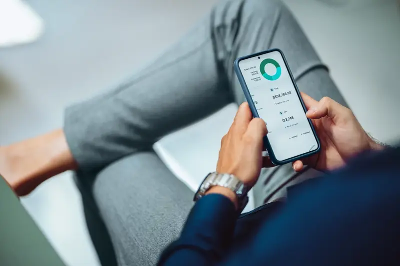
How Your Banking App Looks and Feels
When you open a banking app, the first thing you notice is how it looks;actually, that's not quite true—you notice how it makes you feel. Does it look trustworthy? Can you find what you need quickly? Are the buttons big enough to tap without hitting the wrong thing? I've spent years designing fintech app design interfaces and honestly, getting this right is harder than most people think.
The interface of a banking app needs to do two things at once: it needs to feel modern and easy to use, but it also needs to feel serious and safe. That's a tricky balance. If you make it too playful, people won't trust it with their money. Make it too boring and formal, and they'll find it frustrating to use every day. The colours matter more than you'd expect—most banking app interface designs stick to blues and greens because they feel calm and trustworthy, while reds are used carefully (usually just for warnings or negative balances).
But here's the thing—its not just about looking nice. Every tap, every swipe, every animation needs to feel responsive and quick. When someone's checking their balance or making a payment, they dont want to wait around. Mobile banking UX is all about speed combined with clarity. You need to see your balance immediately when you open the app, no hunting around through menus. Modern design approaches like liquid glass UI can add that premium feel that builds trust while maintaining the clean aesthetics users expect from financial applications.
What Makes a Good Banking Interface
After building dozens of payment app design projects, I've noticed the same elements keep showing up in the ones that people actually enjoy using:
- Large, easy-to-read numbers for your balance—no squinting required
- Clear contrast between text and background so its readable in sunlight
- Buttons that are big enough to tap easily (at least 44 pixels, trust me on this)
- Consistent placement of common actions like transfers or payments
- Visual feedback when you tap something so you know it worked
- Simple navigation that doesn't require remembering where things are hidden
Financial app security also shows up in how things look. You'll often see padlock icons, shield symbols, or reassuring messages that remind you your information is protected. These aren't just decoration—they're building confidence every time you use the app. And those little loading animations? They're not just there to look pretty, they're telling you the app is working, thinking, processing your request. Without them, people panic and start tapping everything repeatedly!
Test your app interface with real users before launch—what makes sense to designers often confuses actual customers, and you won't know until you watch someone try to find their transaction history for the first time.
Making Money Stuff Simple to Understand
Right, so this is where a lot of banking apps fall flat on their face—they take something that should be straightforward and turn it into a confusing mess of jargon and complicated menus. I mean, most people just want to know how much money they have, where its going, and whether they can afford that takeaway on Friday night. But instead they get confronted with terms like "available balance" versus "current balance" and a dozen different categories they never asked for.
The best banking apps I've worked on treat financial information like a conversation, not a spreadsheet. They use plain language; they show you what matters most right away, and they explain things without making you feel stupid for asking. If someone transfers £50 to their mate, the app should just say "You sent £50 to Sarah" not "Debit transaction processed to beneficiary account." Actually, its surprising how many banks still get this wrong even though we've known for years that clear language builds trust faster than anything else.
What People Actually Need to See
When someone opens their banking app, they need three things immediately: how much money they have, where it went recently, and whether anything looks odd. Everything else is secondary. The apps that work best put this information front and centre—no hidden menus, no scrolling through pages of options, just the facts presented clearly.
- Show the main balance in big, readable numbers at the top of the screen
- List recent transactions with recognisable merchant names, not reference codes
- Group spending into categories that make sense (like "food" not "miscellaneous retail transactions")
- Explain fees and charges in simple terms when they happen
- Make it easy to search for specific payments without learning special syntax
Breaking Down Complex Money Things
Here's the thing—banking involves some genuinely complex stuff sometimes. Interest rates, overdraft charges, international transfer fees... these things can get complicated. But that doesn't mean we should just throw technical explanations at people and hope they figure it out. The apps that do this well break down complex information into bite-sized pieces; they use progressive disclosure (showing basic info first, with the option to dig deeper if needed) and they provide context for numbers that might otherwise seem random.
For example, if someone's getting charged an overdraft fee, dont just deduct the money and list it as "account fee." Show them why it happened, how to avoid it next time, and maybe even alert them before it happens again. That's the difference between an app that feels like it's working against you and one that feels like its actually on your side, helping you manage your money better.
Keeping Personal Information Protected
Right, lets talk about the thing that keeps most banking app users up at night—data security. I mean, we're dealing with people's money here, their account numbers, their spending habits, everything really. And if your fintech app design doesn't make security feel solid from the first moment someone opens the app, you've already lost them.
When I build banking apps, I think about security in two ways: theres the actual technical protection (encryption, secure authentication, all that good stuff) and then theres how safe the app feels to use. Both matter equally. You could have military-grade encryption running in the background, but if your banking app interface looks sketchy or confusing? People won't trust it. And honestly, I don't blame them.
The biggest mistake I see in financial app security is making it too complicated. Sure, we want strong protection—but if someone needs fifteen minutes and a PhD to log into their account, they'll give up. The best mobile banking UX finds that sweet spot where security is strong but doesn't feel like a burden. Biometric authentication is brilliant for this; Face ID or fingerprint scanning is both secure and dead simple to use.
Security shouldn't feel like punishment for wanting to check your bank balance
Here's what actually works in payment app design: clear privacy settings that people can understand without a law degree, obvious indicators when you're on a secure connection, and transparent explanations about what data you collect and why. Don't hide this stuff in tiny text at the bottom of a terms page. Put it front and centre. When users understand how their information is protected, they feel more confident using your app—and that confidence translates directly into trust and regular usage.
What Happens When Something Goes Wrong
Things break sometimes. Apps crash, payments fail, screens freeze—its just part of using technology really. But when it comes to banking apps, these moments can feel absolutely terrifying because we're talking about peoples actual money here. The difference between an app that feels safe and one that doesnt often comes down to how it handles these problem moments.
I mean, think about it. You're trying to pay a bill and suddenly the app crashes. Where did your money go? Did the payment go through twice? Is your account locked now? These questions race through your mind in seconds, and if the app doesnt give you clear answers quickly, panic sets in. That's why the best banking apps I've built always—always—show you exactly whats happening when something goes wrong.
Clear Messages When Things Break
Good banking apps never leave you guessing. If a payment fails, they tell you why in simple words like "Your payment didnt go through because you dont have enough money in this account" instead of showing some cryptic error code like ERR_7482. And they tell you what to do next, whether thats trying again or contacting support or checking your balance. The worst thing you can do is show people a blank screen or a spinning wheel that never stops—honestly, that's where trust dies.
Getting Help When You Need It
Every banking app needs a proper help system thats actually helpful. Not buried six menus deep. Not just a list of FAQs that dont answer your question. The apps that feel safest have chat support built right in, or at least a phone number you can call without having to hunt for it. Because when someones worried about their money, they need to talk to a real person who can sort it out right now.
Getting Started Without Feeling Lost
The first time someone opens your banking app is absolutely critical—if they feel confused or overwhelmed in those first few minutes, there's a good chance they'll give up and never come back. I mean, we've all downloaded an app, opened it, felt a bit lost, and just closed it again. Banking apps cant afford to let that happen because people need to trust them with their money, and trust starts from the very first interaction.
When I design onboarding flows for fintech apps, I always think about what the user actually needs to do first. Not what we want to show them, but what they need. Big difference there. Most people just want to check their balance or make a payment—they don't want to sit through ten screens explaining every feature the app has. Save that for later. The best banking app interfaces get users to their "aha moment" as quickly as possible; that moment when they think "oh, this is actually useful" and decide to keep using it.
What Makes a Good First Experience
Here's what I've learned works best in mobile banking UX for new users:
- Keep the signup process short—ask for the bare minimum information needed to create an account
- Explain security features without being scary about them (you're protecting them, not warning them)
- Show don't tell—let people see what the app does rather than reading about it
- Make it really obvious how to do the most common tasks straight away
- Give people a quick win early on, like successfully checking their balance or setting up a payee
One mistake I see a lot in payment app design is asking for too much too soon. Biometric setup, notification preferences, linked accounts, profile completion—it can wait. Get them doing something valuable first, then gradually introduce the other stuff. Its the difference between someone completing setup and someone abandoning your app on day one.
Always include a "skip for now" option on optional setup steps—let users explore the app and come back to finish setup when they're ready. Forced onboarding flows have terrible completion rates in financial app security testing.
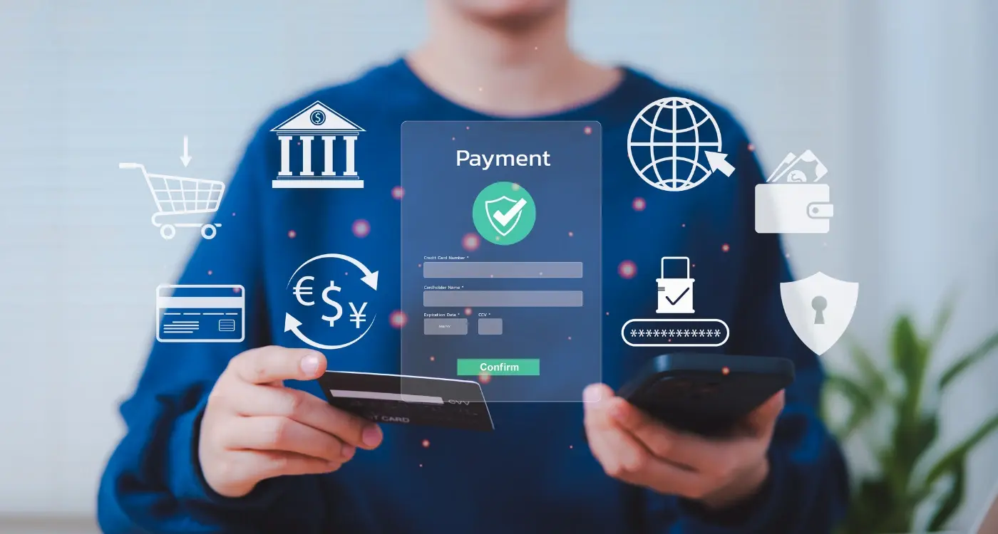
Moving Money Around Safely
When you send money through a banking app, there's actually loads happening behind the scenes to keep everything safe. I mean, you tap a few buttons and boom—money moves from your account to someone elses. But here's the thing: that simple experience you see is masking some pretty complex security measures that need to work perfectly every single time.
Most banking apps use something called two-factor authentication for transfers, especially larger ones. This might be a code sent to your phone, your fingerprint, or face recognition. Its a bit like having two locks on your door instead of one. Sure, it adds an extra step, but that friction is there for a reason—to stop someone who's nicked your phone from emptying your account. The best apps make this feel natural rather than annoying, which is harder than it sounds.
One thing I always recommend is having clear confirmation screens before a payment goes through. Users need to see exactly who theyre paying, how much, and when it will arrive. This gives people that crucial moment to spot mistakes—because honestly, we've all nearly sent money to the wrong person at some point! Some apps even show you a photo or verified business logo to confirm you're paying the right recipient.
Real-time notifications are brilliant for security too. The second money leaves your account, you should get an alert. If you didn't make that payment, you know immediately something's wrong and can contact your bank straight away. Speed matters when dealing with fraud. And look, payment limits are another safety net—letting users set maximum amounts for transfers means even if someone does get access, they cant drain everything in one go.
Building a banking app that people trust and actually enjoy using—its not something that happens by accident. Over the years I've worked on enough fintech app design projects to know that the apps people stick with are the ones that make them feel secure without making them jump through endless hoops. You need that balance between safety and simplicity, and honestly, getting it right takes real thought.
The best banking app interface designs don't shout about how clever they are;they just work. People open the app, they find what they need, they do their task, and they're done. No confusion. No panic. When you're dealing with peoples money, thats exactly what you want. Financial app security has to be tight—really tight—but if users feel like they're trying to break into a vault every time they want to check their balance, something's gone wrong with your mobile banking UX.
Here's the thing though—you can't just bolt on security features at the end and hope for the best. Good payment app design means thinking about security and usability from day one, making sure every screen, every button, every bit of text works together to build trust. When people feel confident using your app, when they know their information is protected and they can actually understand what's happening with their money, that's when you've succeeded.
Sure, there are loads of technical details to consider. Loads of regulations to follow. But at the end of the day, its about creating something that helps people manage their money without stress. If you can do that—if you can make people feel safe and in control—you've built something worth having. And that's what separates the banking apps people delete after one use from the ones they rely on every single day.
Share this
Subscribe To Our Learning Centre
You May Also Like
These Related Guides
What Security Requirements Do Fintech Apps Need?

What Do Banks Need Before Building a Money App?