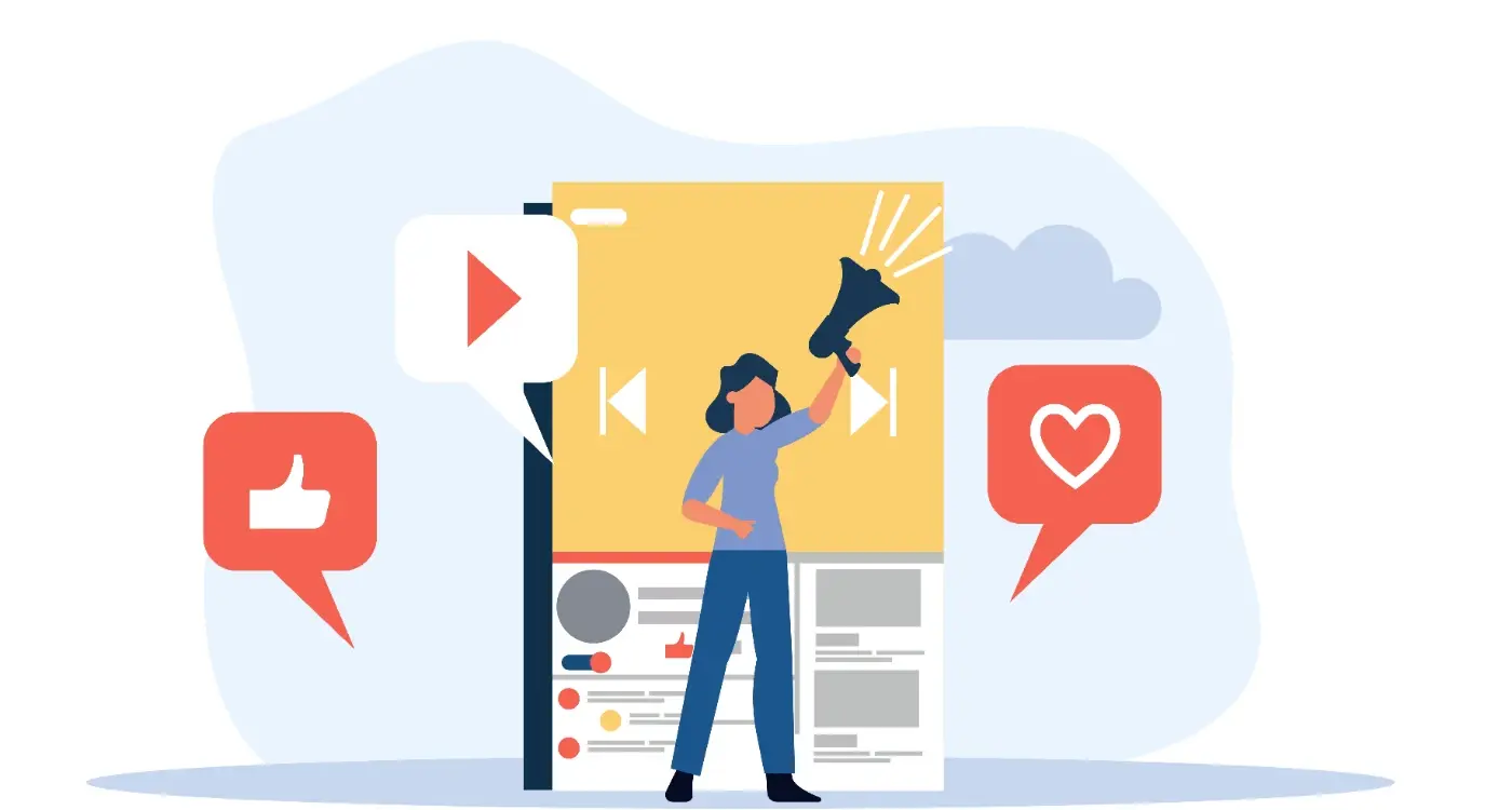
What Should My App's First Screenshot Actually Show?
You spend months building your app, get it approved by Apple and Google, write what you think is a decent store listing...and then watch as your conversion rate sits at 12% when the industry benchmark is closer to 30%. The problem isn't your app, and it's probably not even your icon or title, it's that first screenshot sitting there at the top of your listing doing absolutely nothing to convince someone they need what you've built.
Over the years of working with app developers and business owners at Glance, I've seen this same issue come up time and time again, where teams put so much effort into building something genuinely useful and then completely miss the mark when it comes to showing people why they should care. The first screenshot in your app store listing is where most potential users decide whether to keep scrolling or tap that install button, and getting it wrong can mean the difference between steady growth and wondering why nobody's downloading your app despite having better functionality than your competitors.
Your first screenshot needs to answer the question "what's in this for me" in under three seconds, which means you can't afford to waste that space on anything that doesn't immediately speak to what your user wants to achieve or a problem they need solved.
The data tells us that roughly 65% of people who view your app store listing will look at your screenshots before reading any of your description text, and most of them will make their decision based on what they see in those first two or three images. This isn't about making something pretty (though design quality does matter), it's about strategic communication that connects with what brought someone to your listing in the first place.
Why Your First Screenshot is Make or Break
The app stores have changed quite a bit since the early days when you could show off your interface and call it a day. These days, someone looking at your app listing has probably already seen five other apps that do something similar, which means your first screenshot needs to work much harder to stand out from what they've already scrolled past.
I worked with a fitness tracking app a few years back that was getting downloads but terrible conversion rates on their listing. They had beautiful screenshots showing their clean interface with all the tracking features visible, charts and graphs nicely displayed, navigation clearly marked...and nobody was installing it. The problem was that their first screenshot showed the home screen of the app, which looked like every other fitness app out there, instead of showing the one thing that made them different which was their approach to building sustainable habits rather than just tracking numbers.
When we changed their first screenshot to show a simple before and after comparison of someone's fitness journey with text that said "Build habits that actually stick", their conversion rate jumped from 18% to 34% within two weeks. Nothing else changed about the app or the listing, just that first image and the message it communicated. The fact is that people don't care about your interface until they care about what your app can do for them, and you've got one chance to make that connection before they move on to the next option.
App store algorithms pay attention to conversion rates too, so when your first screenshot does its job properly and more people install after viewing your listing, you start to get better placement in search results and recommendations. It becomes a positive cycle where better screenshots lead to better conversions which lead to better visibility which lead to more opportunities to convert. This is particularly important when you're positioning your app across multiple markets where competition may vary significantly.
What Users Actually Look At in App Stores
Eye tracking studies done on app store browsing behaviour show that people look at your icon first (obviously, since that's what they tapped on to get to your listing), then their eyes move to your first screenshot, then to your app name and subtitle if you're on iOS, and only after all of that do some people start to read your description text. The journey from first glance to decision takes about 7 seconds on average, which means most of your persuasion needs to happen through visuals.
The shape of the screenshots matters too because people naturally read from left to right and top to bottom, so the top left portion of your first screenshot gets looked at more than any other part of any of your images. This is where you want your most compelling message or visual to live, not buried in the bottom right corner where someone might not even see it before they've already decided whether your app is for them.
Test your first screenshot by showing it to someone for exactly three seconds, then ask them what the app does and who it's for...if they can't tell you with reasonable accuracy, your screenshot isn't doing its job and needs to be reworked before you worry about anything else in your listing.
Mobile screens are small, which seems obvious but gets forgotten when teams design screenshots on big desktop monitors. Text that looks perfectly readable at desktop size becomes impossible to parse on a phone screen in the app store, especially for people browsing on older devices or anyone with less than perfect vision. I've seen gorgeous screenshots that were completely ineffective because the text was too small to read without opening the full image view, and most people won't bother doing that.
The Three-Second Rule for Screenshots
The three-second rule is simple...someone looking at your first screenshot should be able to understand what your app does, who it's for, and why they might want it in three seconds or less. Not three seconds of careful study, three seconds of the glance they're actually going to give it while scrolling through search results or browsing a category.
This means your first screenshot probably shouldn't be a straight screenshot of your app interface at all. It needs graphic design, text overlay, visual hierarchy that guides the eye to the most important information first. The apps that convert best use their first screenshot as a mini billboard that communicates a clear benefit or outcome, not a window into what the app looks like when you open it. This approach is similar to how anchoring effects influence feature presentation, where the first impression sets the context for everything that follows.
| Element | Purpose | Best Placement |
|---|---|---|
| Main headline | Core benefit in 3-5 words | Top third, large text |
| Supporting visual | Show the result or outcome | Centre, takes up most space |
| Subtext | Add context or specificity | Bottom third, smaller text |
| UI elements | Prove it's a real app | Background or sides |
A meditation app I worked with last summer was showing their timer interface in the first screenshot with various meditation options visible. Clean, simple, showed what the app did. Their conversion rate was stuck at 22%. We redesigned the first screenshot to show someone looking peaceful with their eyes closed, overlaid with the text "Fall asleep in under 10 minutes" and a subtle view of their interface in the background. Conversion jumped to 41% because people could immediately see the outcome they wanted rather than needing to imagine it.
Leading With Benefits vs Features
This is where most apps get it wrong...they lead with features because features are easy to list and show, but benefits are what people actually care about and what drives them to install. A feature is "AI-powered meal planning", a benefit is "Never wonder what's for dinner again". One describes what the app has, the other describes what changes in the user's life.
Your first screenshot should almost always lead with benefits because that's what gets people interested enough to look at your other screenshots where you can show features. The exception might be if you're in a crowded category where a specific feature genuinely sets you apart from everyone else, but even then you want to frame that feature in terms of what it enables the user to do rather than just naming it. Before launching, it's worth considering how to build an email list of interested users who can provide feedback on which benefits resonate most strongly.
People don't want a budgeting app, they want to stop worrying about money...people don't want a fitness tracker, they want to feel better about their body...your first screenshot needs to connect with that deeper motivation, not just list what buttons your app has.
I see this play out differently across industries. Finance apps that lead with "Track every expense" convert worse than ones that lead with "Know exactly where your money goes". E-commerce apps that show "Easy checkout process" get beaten by ones showing "Get it tomorrow, ordered today". The words matter, but more than that, the framing from the user's perspective rather than the app's perspective matters.
Testing this yourself is straightforward...try writing your first screenshot headline from two angles, one that describes a feature and one that describes the outcome that feature enables, then show both versions to people who fit your target user profile. The benefit-led version will almost always resonate more strongly because it speaks to what they're trying to accomplish rather than what your app contains.
Common First Screenshot Mistakes to Avoid
The most common mistake I see is showing the home screen or dashboard of the app in that first screenshot position. Home screens are usually designed to give access to multiple features, which means they're inherently busy and unfocused, and unfocused doesn't work when you need to communicate one clear message in three seconds. Save your home screen for the third or fourth screenshot position after you've already convinced someone to keep looking.
Another frequent problem is using text that's too small or too much text overall. If you need more than about ten words on your first screenshot, you're probably trying to say too much at once. Your app description is where detailed information lives, your first screenshot is where one powerful idea lives. The apps with the best conversion rates typically use between five and eight words on their first screenshot, sized large enough to be instantly readable on any device. This is especially crucial if you haven't done proper competitor analysis to understand how your app positioning differs from existing solutions.
- Showing features before establishing benefits or outcomes
- Using interface screenshots without any context or overlay text
- Creating screenshots on desktop that become unreadable on mobile
- Trying to show too many things instead of one clear message
- Using generic stock photos that don't connect to your actual app
- Forgetting that your screenshot competes with others in search results
- Not updating screenshots when app positioning or messaging changes
A healthcare app we consulted for was making the mistake of showing their symptom checker interface in the first screenshot, which looked medical and slightly intimidating. People weren't connecting with it because nobody wakes up excited about checking symptoms, they wake up worried about feeling unwell and wanting reassurance. When we shifted to showing a relieved-looking person with text saying "Get answers about your health today", the whole tone changed and conversion improved by 28 percentage points.
Different Industries Need Different Approaches
Finance apps need to build trust quickly, so your first screenshot should probably include visual cues about security, established user numbers, or outcomes like "Join 500,000 people saving money smarter". People are cautious about money apps, which means your first screenshot needs to overcome that hesitation while still showing the benefit.
E-commerce and marketplace apps should show products or results, not empty interfaces. Someone considering a furniture shopping app wants to see furniture they might buy, someone looking at a food delivery app wants to see food that makes them hungry. The first screenshot is where you create desire, not where you explain navigation. This principle applies whether you're building last-mile delivery technology or a simple retail app.
Look at the top three apps in your category and analyse what their first screenshots show...not to copy them, but to understand what's already been seen by your potential users so you can decide whether to follow convention or break from it deliberately.
| Industry | First Screenshot Priority | What to Avoid |
|---|---|---|
| Healthcare | Trust signals and clear outcomes | Medical jargon or complex interfaces |
| Finance | Security cues and money benefits | Graphs without context |
| E-commerce | Desirable products or deals | Empty shopping carts |
| Productivity | Time saved or stress reduced | Feature lists without outcomes |
| Entertainment | Content preview or social proof | Generic app interfaces |
Games are their own beast where the first screenshot might show gameplay, but even then it should show exciting gameplay not tutorial screens. Social apps need to suggest the connections or content people will find, and for apps with complex matching systems, it's important to create algorithms that actually work behind the scenes while keeping the first impression simple. Productivity apps should show the end result (a cleared task list, a finished project) rather than empty templates waiting to be filled in.
Testing What Actually Works
You can't know what works without testing, and testing screenshots is more accessible than most people think. The app stores themselves offer tools for A/B testing your product page on both iOS and Android, letting you run experiments where different users see different versions of your screenshots and you can measure which version converts better.
Beyond official store testing, you can run quick informal tests by showing screenshots to people who match your target user profile and watching their reactions. Time how long it takes them to understand what your app does, ask them to repeat back what they think the benefit is, watch whether they seem interested or indifferent. Real human reactions tell you more than any theory about what should work. This testing approach should be part of your broader mobile app marketing strategy.
- Create 2-3 variations of your first screenshot with different messages
- Keep everything else about your listing identical during testing
- Run each variation for at least a week to gather meaningful data
- Look at conversion rate as primary metric, not just impressions
- Consider testing different approaches for different user segments
- Document what you learn to inform future screenshot updates
The apps that do this best treat their store listing as something that evolves based on data rather than something that gets set once and forgotten. A small change to your first screenshot can improve conversion by 15-40%, which translates directly to more downloads and users without spending anything on additional marketing. That's a return on investment that's hard to beat for a few hours of design work and testing. Understanding which competitor moves should worry you most can also inform your screenshot strategy and help you stay ahead of market changes.
Conclusion
Your first screenshot exists in that brief moment between someone noticing your app and deciding whether to learn more or move on, and making the most of that moment means putting your user's desired outcome front and centre rather than showing them your interface or listing your features. The apps that convert best understand that people are looking for solutions to problems or ways to achieve goals, not looking for software to learn, and everything about that first image needs to speak to those motivations in a way that's immediately clear and personally relevant.
Getting this right isn't about following a rigid formula, it's about understanding what your users care about and communicating that you can deliver it through a combination of smart copy, thoughtful design, and genuine insight into what problem you're solving. Test different approaches, measure what happens, and be willing to change course when the data tells you something isn't working...because at the end of the day, your conversion rate is the only metric that matters when it comes to whether your first screenshot is doing its job.
If you're working on an app and want some help figuring out what your first screenshot should actually show, get in touch with us at Glance and we can look at your specific situation together.
Frequently Asked Questions
You have roughly three seconds to convey what your app does, who it's for, and why someone might want it. This isn't three seconds of careful study, but the quick glance people give while scrolling through search results. If someone can't understand your app's core benefit in that timeframe, they'll move on to the next option.
Your first screenshot should rarely be a straight interface shot from your app. The highest converting apps use their first screenshot as a designed billboard that communicates clear benefits, often with text overlay and visual hierarchy. Save actual interface shots for your third or fourth screenshot position after you've convinced people to keep looking.
Features describe what your app has (like "AI-powered meal planning"), while benefits describe what changes in the user's life (like "Never wonder what's for dinner again"). Always lead with benefits because that's what motivates people to install, then show features in later screenshots once they're already interested.
Keep text to between five and eight words maximum, sized large enough to read instantly on any mobile device. If you need more than about ten words total, you're probably trying to communicate too much at once. Remember that text needs to be readable on small screens, not just desktop monitors.
Absolutely. Finance apps need trust signals and security cues, e-commerce apps should show desirable products rather than empty interfaces, healthcare apps need to focus on outcomes rather than medical terminology, and games should show exciting gameplay rather than tutorial screens. Each industry has different user motivations and concerns.
Use the app stores' built-in A/B testing tools to compare different versions, or run informal tests by showing your screenshot to target users for three seconds and asking them what the app does. Track conversion rates rather than just impressions, and be prepared to iterate based on real data rather than assumptions.
The most common mistake is showing the home screen or dashboard, which is usually busy and unfocused because it's designed to access multiple features. This doesn't work when you need to communicate one clear message quickly. Focus on one powerful benefit instead of trying to show everything your app can do.
Treat your app store listing as something that evolves based on performance data rather than something you set once and forget. Small changes to your first screenshot can improve conversion rates by 15-40%, so it's worth testing new approaches periodically, especially if your app's positioning or core features change.
Share this
Subscribe To Our Learning Centre
You May Also Like
These Related Guides

How Do I Get More Downloads From My App Store Page?
Which Languages Should I Prioritise For My App's International Launch?