
Why Do Rounded Corners Make Apps Feel Safer to Use?
Have you ever wondered why almost every app on your phone has rounded corners? It's not just about looking nice—there's actually something deeper going on here. After years of building apps and testing different designs with real users, I've noticed something interesting; people feel more comfortable using apps with softer, rounded edges compared to harsh angular ones. And I mean, it makes sense when you think about it, but the reasons why are a bit more complex than you might expect.
When I first started in mobile design, I'll be honest, I didn't pay much attention to corner radius. A corner was a corner, right? But then I started noticing patterns in user testing sessions—people would hesitate slightly when interacting with sharp-cornered buttons, whilst rounded ones seemed to invite clicks more naturally. Its one of those tiny details that your conscious brain doesn't register, but your subconscious absolutely does.
The shape of an interface element communicates something about its purpose and safety before a user ever touches it
Design psychology plays a massive role in how people perceive and interact with mobile apps. Every shape, every curve, every angle sends a signal to the user's brain about what to expect. Rounded corners specifically have become so common in mobile design that they're practically invisible now—but that invisibility is actually the point. They create a sense of approachability and safety without drawing attention to themselves.
Throughout this guide, we'll explore why rounded corners have this effect on user perception, how our brains process different interface shapes, and yes, when sharp corners actually work better (because they do have their place). You'll understand the connection between the physical world and digital design, and how major companies have shaped what users expect from mobile interfaces. By the end, you'll look at your phone screen differently.
The Science Behind Shapes and Human Perception
Right, lets talk about why your brain reacts differently to shapes. Its not just preference or style—theres actual science happening in your head when you look at rounded corners versus sharp ones.
When your eyes scan an interface, your brain is doing something called "contour detection." Sharp corners create what researchers call "high spatial frequency" information, which basically means your brain has to work harder to process them. Rounded corners? They're lower frequency. Easier to process. Less mental effort required; and that matters more than you might think when someone's using your app for the tenth time that day.
Here's where it gets interesting—studies have shown that sharp angles actually trigger a tiny stress response in the amygdala, the part of your brain that handles emotions and threat detection. I mean, its subtle, not like you're running from a tiger or anything! But sharp points do register as potential threats on some level. Our ancestors who paid attention to sharp things (thorns, teeth, spears) tended to survive longer than those who didn't.
Rounded shapes, by contrast, get processed by the brain as safe and approachable. They dont trigger that little alert system. And when you're designing an app that handles peoples money, health data, or personal information? Making users feel safe isnt just good design—its bloody essential to whether they'll actually use what you've built.
The visual cortex can process rounded shapes faster too, which contributes to that feeling of ease and fluidity when navigating an interface. Every millisecond counts in mobile design; users make snap judgements about apps in under a second, and shape processing is part of that instant reaction.
How Our Brains Process Sharp Corners vs Rounded Edges
Right, so here's where it gets interesting—our brains actually process different shapes in completely different ways. When you look at a sharp corner, your brain has to work a bit harder to process it. Pointed edges trigger what researchers call the "threat detection" part of your visual system; basically the same bit that helped our ancestors avoid stepping on sharp rocks or getting poked by thorny plants. It's ancient stuff, hardwired into how we see the world.
Sharp corners require more visual attention because your brain needs to track multiple direction changes at once. Think about it: at a 90-degree corner, your eye has to suddenly change direction completely. That's a lot of visual information to process quickly. Rounded corners, on the other hand, let your eyes flow smoothly around the shape without that jarring direction change—its just easier for your brain to handle, which is why rounded designs feel more relaxed.
There's also this fascinating thing called the "contour bias" where humans naturally prefer curved lines over straight ones. When people look at rounded shapes, brain imaging shows increased activity in areas associated with reward and pleasure. Sharp angles? They light up areas linked to fear and avoidance. Mad, isn't it? You're not consciously thinking "oh that corner might hurt me" but your brain is quietly making that assessment anyway.
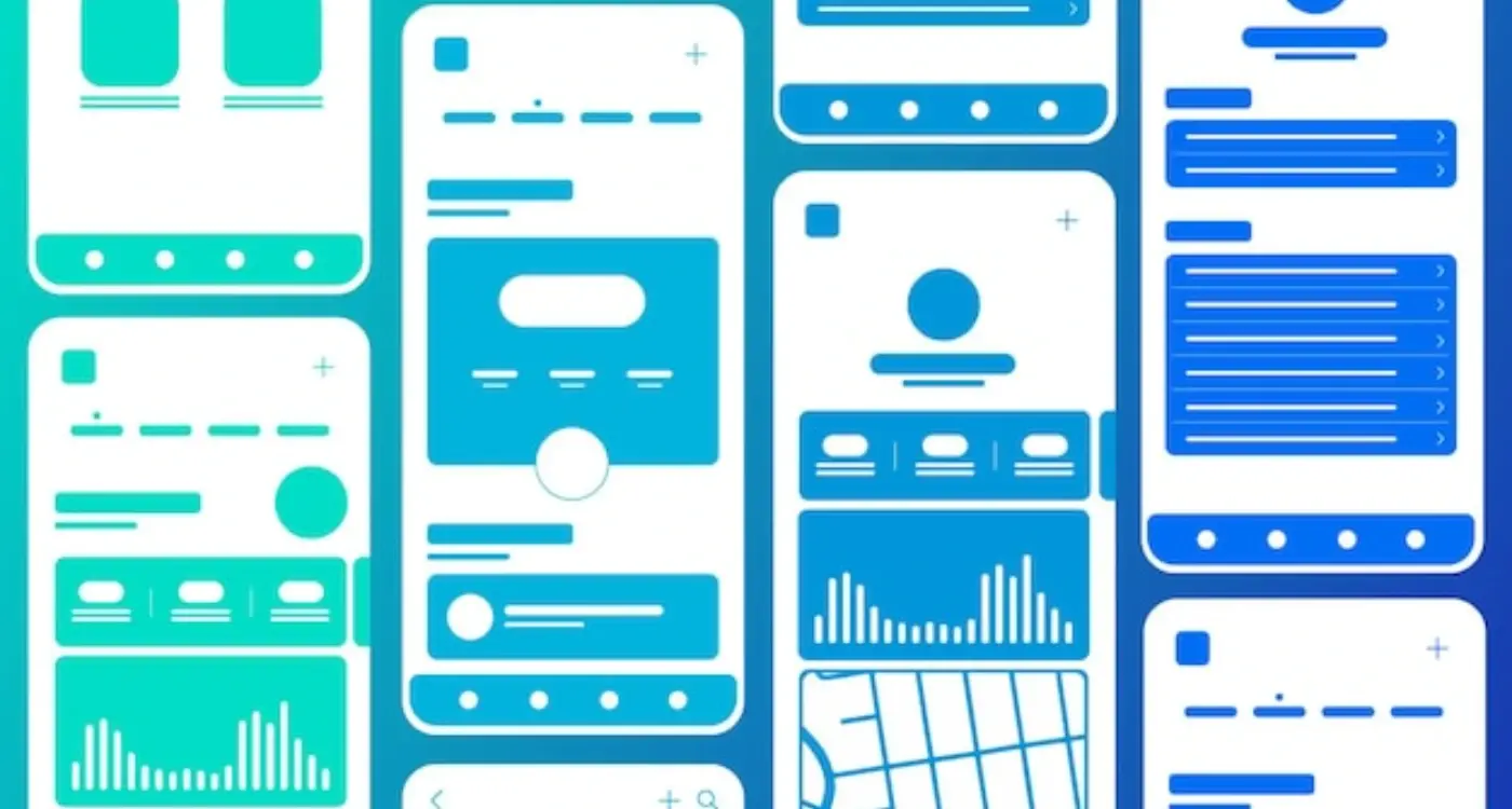
When designing buttons or interactive elements, round the corners by at least 8-12 pixels—this creates enough curvature for your users' brains to register the shape as "safe" without making the design look childish or unprofessional.
This is why rounded corners work so well in mobile design psychology. We're creating interfaces that literally feel safer at a neurological level, reducing the cognitive load on users who are already dealing with hundreds of decisions every time they open an app. Less mental effort means happier users, and happier users stick around longer.
The Physical World Connection: Why Soft Edges Feel Familiar
Here's something I've noticed after years of building apps—users bring their entire lifetime of physical experiences into every digital interaction. They don't leave that at the door when they pick up their phone. And this is where rounded corners become really interesting, because we've spent our whole lives learning that sharp edges can hurt us whilst rounded ones are safe.
Think about every object you interact with daily. Your coffee mug has a rounded rim. Your car's dashboard is full of soft curves. Even the corners of your credit cards are rounded, and thats not by accident—it stops them from poking holes in your wallet or scratching your phone screen. We've designed the physical world around us with soft edges because they're simply better for humans to interact with.
When we bring this into app design, we're tapping into something deeply familiar. A button with rounded corners doesn't just look nicer; it feels like something you could actually press in the real world. Sharp corners, on the other hand? They create this subtle tension that most users can't even articulate—they just know something feels a bit off.
I mean, look at nature too. You won't find many sharp 90-degree angles in the natural world. Rivers have smooth bends. Stones are worn smooth by water. Even leaves and petals curve gently. Our brains have evolved over millions of years in an environment where soft edges are the norm, so when we see them in our apps, it just clicks.
Common Objects With Rounded Edges
- Smartphones and tablets themselves have rounded corners
- Keyboards, both physical and on-screen
- Remote controls and game controllers
- Furniture edges (especially in homes with children)
- Packaging for products we handle daily
- Door handles and light switches
This connection between physical and digital design is something I always explain to clients who question why we spend time refining corner radius values. Its not just aesthetic fussiness—we're building interfaces that feel like they belong in the same world as everything else people touch and interact with throughout their day.
Rounded Corners and Trust in Digital Interfaces
Here's where things get really interesting for us as app developers—rounded corners aren't just about making things look nice, they actually change how users feel about trusting your interface. I've tested this countless times with different clients and the results are pretty consistent; users are more likely to tap buttons, fill in forms, and share personal information when the interface uses softer, rounded shapes.
The psychology behind this is fascinating. When people see sharp corners in a digital interface, their brain processes them the same way it would process sharp objects in the real world. There's a tiny moment of hesitation—barely noticeable but measurable in user testing. That split-second pause can be the difference between someone completing a purchase or abandoning their cart. Its particularly important in apps that handle sensitive information like banking apps or healthcare platforms.
Rounded corners create what researchers call a comfort zone around interactive elements, making users feel more confident about engaging with them
I always tell clients that rounded corners work like a visual handshake. They're inviting. They say "go ahead, its safe to interact with me." Sharp corners? They're more like a warning sign—not aggressive exactly but definitely less welcoming. This matters most on mobile devices where people are making quick decisions with their thumbs hovering over the screen.
But here's something that surprised me early on—the radius of the corner matters too. A 2-pixel radius feels barely different from a sharp corner. An 8-12 pixel radius? That's the sweet spot where users report feeling most comfortable. Go beyond 20 pixels and buttons start looking like pills or toys, which can undermine the professional feel you're trying to create. Getting this balance right takes experience and honestly, quite a bit of A/B testing to see what works for your specific audience.
The Apple Effect: How Design Leaders Shaped User Expectations
Apple didn't invent rounded corners—but bloody hell, they made them mainstream. When the first iPhone launched, its entire interface was built around soft, rounded edges; from the app icons to the screen corners themselves. It wasn't just a design choice, it was a statement about how digital interfaces should feel. And people loved it.
Here's the thing—Apple's influence on mobile design cant be overstated. They created a design language that told users "this is how good apps should look" and everyone else had to follow suit or risk looking outdated. I mean, try launching an app with sharp-cornered icons these days...users will think somethings broken! Its a bit mad really, how one company's design decisions became the standard that millions of apps now follow.
The Ripple Effect Across the Industry
Once Apple established rounded corners as the norm, other platforms had to adapt. Google's Material Design embraced them. Microsoft softened Windows Phone's sharp metro tiles. Even apps that wanted to look "edgy" or "different" still used rounded corners—they just made them slightly less rounded to stand out.
This created what I call the expectation baseline; users now subconsciously associate rounded corners with quality, trustworthiness and polish. When we build apps at Glance, we have to work within these expectations. Fighting against them is possible, but you need a really good reason. Because users have spent years—thousands of hours—interacting with rounded interfaces, and their brains have learned that this is what "safe" looks like in digital spaces.
Why Design Leadership Matters
The lesson here isnt just about rounded corners. It's about how design leaders set expectations that shape entire industries. When you're building your app, you need to decide: are you following established patterns that users already trust, or are you breaking them for a specific purpose? Both approaches can work, but only if you understand why those patterns exist in the first place.
- Apple's rounded design language became the industry standard almost overnight
- Users now expect rounded corners as a sign of quality and trustworthiness
- Google and Microsoft adapted their design systems to include softer edges
- Breaking from rounded corners requires strong justification and purpose
- Design patterns create user expectations that influence app success
Making Touch Targets Feel More Approachable
Here's something I've noticed over the years—when you're designing buttons or interactive elements in an app, the shape you choose actually changes how confident people feel about tapping them. It's a bit mad really, but rounded corners make users more willing to press something. Sharp cornered buttons? They create this tiny moment of hesitation.
I mean, think about the primary action buttons in the apps you use every day; they're almost always rounded to some degree. That's not an accident. When we present users with a rounded button, their brain processes it as something friendly and safe to interact with. Sharp corners though—they subconsciously signal something that needs more careful consideration. It's subtle but its there.
Touch targets need to feel inviting because mobile screens are small and people are often using apps while doing other things (walking, commuting, you know the drill). If your buttons look harsh or uninviting, users will second-guess themselves before tapping. That split-second hesitation adds friction to the entire experience—and in mobile design, friction is what kills conversion rates and engagement.
The ideal touch target size is at least 44x44 pixels (Apple's guideline) or 48x48dp (Google's recommendation). Combine this with rounded corners and you've got buttons that not only feel approachable but are also easier to tap accurately.
Design Choices That Make Touch Targets Work
Different corner radii create different emotional responses. Here's what I've learned works best across various button types:
- Primary action buttons: 8-12px radius feels confident and friendly
- Secondary buttons: 6-8px radius maintains approachability while feeling less prominent
- Destructive actions (like delete): 4-6px radius—slightly sharper to signal caution
- Pill-shaped buttons (fully rounded): Work brilliantly for tags and filters but can feel too casual for important actions
The interesting thing is that rounded corners also help define the actual tappable area more clearly. Users can see exactly where the button begins and ends, which reduces mis-taps and makes the whole interface feel more predictable. Sharp corners blur that boundary a bit—your eye has to work harder to understand the exact size of the interactive element.
When Sharp Corners Actually Work Better
Right, so we've spent all this time talking about how lovely rounded corners are—but here's where things get interesting. Sharp corners aren't always the villain in our design story. Actually, there are specific situations where sharp edges work better than rounded ones, and knowing when to use them is what separates decent designers from really good ones.
Tables and data grids are a perfect example. When you're looking at spreadsheets or complex data displays, sharp corners help create clear boundaries between cells and columns. The crisp edges make it easier to scan information quickly; your eye can follow straight lines more efficiently when you're trying to read across rows of numbers or text. Financial apps, analytics dashboards, and productivity tools often stick with sharper designs for exactly this reason—its about function over feelings here.
Professional and technical interfaces benefit from sharp corners too. Banking apps, enterprise software, and business tools sometimes use angular designs to communicate precision and accuracy. There's a psychological association there—sharp equals precise, which can be exactly what you want users to feel when they're managing their money or making important business decisions. I mean, you wouldn't want your accounting software to feel too soft and cuddly, would you?
Alert boxes and error messages also work well with sharper edges. When something needs immediate attention or there's a problem, the slight visual tension created by sharp corners can actually help grab attention. It creates a subtle sense of urgency without being aggressive. But here's the thing—you've still got to balance this with readability and not make your entire interface feel harsh. The best apps mix both approaches depending on what each element needs to communicate.
So what's the takeaway from all this? Well, its pretty straightforward really—rounded corners aren't just some trendy design choice that looks nice. They're rooted in how our brains actually work, how we've evolved to process the world around us, and honestly, that makes them a bloody powerful tool in app design.
I mean, sure, you could build an entire app with sharp angles everywhere and it might look distinctive. Might even work for certain brands or specific purposes. But here's the thing—you'd be fighting against thousands of years of human psychology, and that's a battle most apps just don't need to pick. When users open your app for the first time, you want them to feel comfortable, not on edge; you want them to explore, not hesitate.
Throughout my years building apps for all kinds of clients, I've seen design psychology play out in user testing sessions time and time again. The small details matter more than people think. Rounded corners create that sense of approachability we talked about—they make buttons feel more touchable, interfaces feel friendlier, and the whole experience feel safer. And when users feel safe? They stick around longer, they trust your app more, and they're way more likely to actually use the features you've spent months building.
But you know what? Don't just take my word for it. Look at the apps on your phone right now. Notice the patterns. See how rounded corners show up everywhere from your banking app to your social media feeds. There's a reason for that consistency, and it goes way deeper than designers all copying each other—it works because it aligns with how we're wired to perceive and interact with the world around us.
Share this
Subscribe To Our Learning Centre
You May Also Like
These Related Guides

What Are the Top Mistakes Made in App Design?
How Do You Design Apps That Work for Both Kids and Adults?