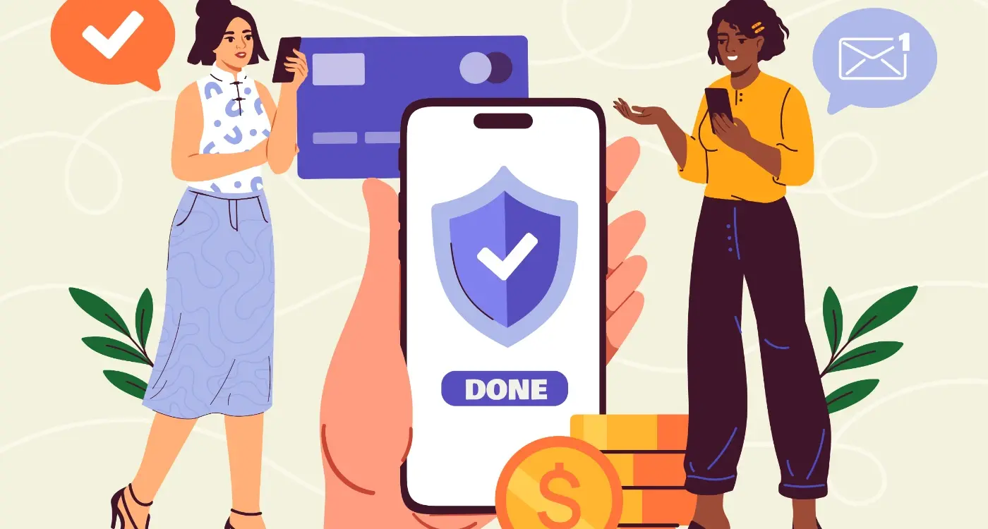
Why Do Some Apps Feel Easy While Others Feel Hard?
Most people will abandon an app within the first three minutes if they can't figure out how to use it. Three minutes—that's all you get to prove your app isn't going to waste their time. And honestly, its usually less than that in practice. I've watched countless user testing sessions where someone opens an app, stares at the screen for maybe thirty seconds, then closes it and never comes back. Gone. Just like that.
Here's the thing though—those apps that got deleted? They weren't necessarily bad apps. They had good features, solid code, decent designs. But they felt hard to use, and thats all that mattered. Meanwhile, apps that people describe as "easy" or "simple" often have incredibly complex systems running behind the scenes; they just hide that complexity really well. The difference between an app that feels easy and one that feels hard usually has nothing to do with how many features it has or how powerful it is—it's all about how that app makes you think.
The best apps don't make you work to understand them. They work to understand you.
After building apps for startups and major brands across every industry you can think of, I've learned that app usability isn't some mysterious art form. Its actually quite predictable once you understand the patterns. Your brain processes information in specific ways, and when an app aligns with those natural patterns, it feels effortless. When it doesn't? Every tap becomes a puzzle, every screen becomes a barrier. In this guide, we're going to break down exactly why some apps feel like a breeze whilst others feel like hard work—and more importantly, what you can do about it if you're building an app yourself.
What Makes an App Feel Easy or Hard
Right, so here's the thing—apps that feel easy dont actually require less work from you; they just hide the complexity better. When you open an app like Uber or Spotify, you're not thinking about how many things are happening in the background. You're just tapping a button and getting what you want. Thats the difference between a well-designed app and one that makes you want to throw your phone across the room.
I've built apps for healthcare companies where patients need to book appointments, apps for banks where people manage their money, and e-commerce apps where users shop for everything from clothes to furniture. The pattern is always the same—when an app feels hard, its usually because the designer put their own logic ahead of the users logic. What makes sense to someone who built the app doesnt always make sense to someone using it for the first time.
The Core Elements That Affect Difficulty
Let me break down what actually makes an app feel easy or difficult to use:
- How many steps it takes to complete a task—every extra tap adds friction
- Whether buttons and links look like they do something when you press them
- If the app remembers your preferences instead of asking you the same questions repeatedly
- How quickly screens load and respond to your touches
- Whether error messages actually help you fix problems or just tell you something went wrong
- If the app uses words you understand rather than technical jargon
The Mental Load Problem
An app feels hard when it makes you think too much about how to use it rather than what you're trying to achieve. I mean, think about your banking app—if you need to transfer money to a friend, you shouldnt have to navigate through five different menus and read three screens of instructions. The best apps reduce what we call cognitive load, which is just a fancy way of saying they dont make your brain work harder than it needs to.
Speed matters too, obviously. If an app takes three seconds to load every screen, it feels sluggish and difficult even if the design is perfect. Users interpret slow performance as complexity, even when its just a technical issue on the backend.
How Your Brain Processes App Interfaces
Here's something that sounds a bit mad—your brain actually processes the layout of an app before you've even had a chance to read whats on the screen. I mean, within milliseconds of opening an app, your brain has already decided whether it looks trustworthy, complicated or easy to use. This happens in what scientists call "pre-attentive processing" and its completely automatic; you have no control over it whatsoever.
Your brain is constantly looking for patterns it recognises. When you open an app that follows familiar patterns—like having a navigation bar at the bottom or a back button in the top left—your brain relaxes because it knows what to expect. But when an app breaks these patterns without good reason, your cognitive load increases and suddenly the app feels harder to use even if its doing the exact same thing as a competitor.
The way information is grouped matters more than most people realise. Your brain naturally chunks information together based on proximity, similarity and alignment. If related items are scattered across the screen, your brain has to work overtime to connect them which creates friction. This is why good app design puts related functions near each other—it reduces the mental effort needed to understand whats going on.
Working memory can only hold about 3-4 items at once (sometimes people say 7 but thats been debunked), so when an app presents too many options or requires you to remember information from a previous screen, youre basically asking users brains to juggle more than they can handle. The result? The app feels difficult and people get frustrated.
Your brain processes visual hierarchy before reading text, so use size, colour and spacing to guide attention to the most important elements first—this reduces cognitive load significantly.
How Visual Processing Works in Apps
When you look at an app screen, your eyes don't scan everything equally. They follow what designers call the "F-pattern" or "Z-pattern" depending on how content is laid out. Understanding this means we can place important buttons and information where peoples eyes naturally go first, making the app feel easier without changing any functionality at all.
- Your brain processes images 60,000 times faster than text—which is why icons can speed up comprehension
- Colour affects processing speed; high contrast elements are spotted immediately while low contrast ones get missed
- White space isn't wasted space—it gives your brain time to process each element individually
- Familiar icons (like a house for home or a magnifying glass for search) are processed almost instantly
- Your peripheral vision picks up movement and colour changes even when youre focused elsewhere
The Role of Memory in App Usability
Every time you use an app, youre relying on two types of memory: recognition and recall. Recognition is easy—you see a button and know what it does. Recall is hard—you have to remember what something does without any visual cues. The best apps rely almost entirely on recognition rather than recall, which is why visible navigation bars work better than hidden gesture-based ones for most people.
After building apps for different industries over the years, I've seen how small changes in visual design can dramatically affect perceived difficulty. An e-commerce app we worked on was getting complaints about being "too complicated" even though it had fewer features than competitors. The problem? Poor information grouping and unclear visual hierarchy were making users brains work too hard. Once we reorganised the layout to follow natural processing patterns, satisfaction scores jumped without adding or removing a single feature.
The Hidden Cost of Too Many Choices
Here's something I see constantly when reviewing apps that aren't performing well—too many buttons, too many options, too many paths forward. Clients often think giving users more choices is generous, but its actually one of the fastest ways to make an app feel overwhelming and difficult to use.
Your brain can only handle so much decision-making before it starts to struggle. When you open an app and you're faced with ten different buttons or five different navigation options, your brain has to work harder to figure out what to do next. This creates what we call decision fatigue—and honestly, it's exhausting for users. They just want to get something done, not study a menu for twenty seconds trying to work out their next move.
I mean, think about the apps you use every day without thinking. They probably have very clear primary actions. Instagram opens to your feed with one main button at the bottom to post something. WhatsApp opens to your chats with one clear way to start a new conversation. These apps understand that people need obvious next steps, not a buffet of possibilities.
What Happens When You Offer Too Many Options
When users face too many choices, a few things happen that will hurt your apps success:
- They take longer to make decisions, which makes the app feel slow and clunky
- They second-guess themselves and worry they're choosing the wrong option
- They feel anxious about missing out on features they didn't explore
- They often just close the app and come back later (or never)
- They're less satisfied with their choice, even if it was the right one
How We Fix This Problem
The solution isn't to remove features—its to prioritise them properly. Every screen in your app should have one primary action that's immediately obvious. Secondary actions can exist, but they should be visually less prominent. I always tell clients to imagine their user is distracted, tired, and using the app whilst waiting for a bus. What's the one thing they need to see? That's your primary action, and everything else should fade into the background until its needed.
Why Some Buttons Feel More Clickable Than Others
There's something odd about buttons that makes them feel right or wrong—and its not always obvious what that something is. I've tested hundreds of interface designs over the years, and I can tell you that button design is one of those areas where tiny details make a massive difference to app usability.
Size matters, obviously. But here's the thing—it's not just about making buttons bigger. Apple recommends a minimum touch target of 44x44 pixels because that's roughly the size of an average fingertip; Android suggests 48x48 density-independent pixels. Go smaller than this and people will miss the button, tap the wrong thing, or just feel frustrated without knowing why. I mean, they won't sit there thinking "this button is too small"—they'll just think your app feels hard to use.
Colour plays a huge role too. Primary action buttons should stand out from everything else on the screen, which is why you see so many apps using bright blues, greens, or oranges for their main call-to-action buttons. The contrast between the button and its background needs to be strong enough that your brain immediately recognises it as something interactive. Flat design made this trickier, actually—without shadows and gradients, we lost some of the visual cues that scream "I'm a button, press me!"
The best buttons don't just look clickable; they look like they want to be clicked
But honestly? The most important factor is consistency. If your buttons look and behave the same way throughout your app, users build up mental patterns quickly. They know what to expect. Change the style or position of important buttons between screens and you'll increase cognitive load without even realising it—people have to stop and think about where things are instead of just using them naturally.
Learning Curves and User Expectations
Every app has a learning curve—that's just how it works. Some apps you pick up in seconds; others take weeks to figure out. But here's what's interesting: the difficulty isn't always about how complex the app actually is, its about how well the app matches what users already expect.
Think about it this way. When someone opens a new app, they bring years of experience with them. They've used dozens, maybe hundreds of other apps before yours. They expect certain things to work in certain ways—a back button in the top left corner, a menu icon with three lines, a shopping basket in the top right. When your app follows these patterns, the learning curve flattens out dramatically because users aren't really learning anything new; they're applying knowledge they already have.
The problems start when apps try to reinvent the wheel. I've seen apps with beautiful custom interfaces that completely confused users because they didn't work like anything else on their phone. Sure, the design looked nice in the portfolio, but the retention rates were terrible because people couldn't figure out how to do basic tasks.
What Users Expect Right Away
There are certain things users expect to understand immediately, without any explanation:
- How to go back to the previous screen
- Where to find their account settings
- How to search for something
- Where the main navigation lives
- How to close pop-ups or modals
- What happens when they tap a button
If any of these basic interactions feel unfamiliar, you've already made your app harder than it needs to be. The steeper your learning curve, the more users you'll lose in those first few minutes—and that's the most expensive time to lose them, right after they've just downloaded your app.
Common Mistakes That Make Apps Feel Difficult
Right, let's talk about the mistakes I see over and over again—the ones that make users feel like they're working too hard just to get something done. I've built enough apps to know that most of these problems aren't intentional; they happen when developers and designers get too close to their own work and forget what its like to open an app for the first time with zero context.
The biggest mistake? Asking for too much information upfront. I mean, honestly, nothing kills app usability faster than a sign-up form that demands your entire life story before you've even seen what the app does. Users need to understand the value first—show them why they should care, then ask for their email address. Banking apps are terrible for this (and I've worked on a few). They'll ask for your account number, sort code, date of birth, and your mothers maiden name before you can even see the interface. The cognitive load is massive right from the start.
Another common one is hiding important features behind unclear icons. Sure, that hamburger menu icon saves space, but if your core functionality is buried three levels deep in a menu nobody understands, you've got a problem. I see this particularly with e-commerce apps where the search function—literally the most important feature—is represented by a tiny magnifying glass tucked in the corner.
Things That Increase Perceived Difficulty
- Forcing people to create accounts before they can try anything
- Using technical jargon instead of plain language
- Not showing progress indicators during multi-step processes
- Making buttons too small to tap comfortably
- Using too many different fonts and colours that distract rather than guide
- Not providing clear feedback when something goes wrong
- Assuming users remember things from their last session
Here's the thing—apps feel difficult when they make users think too hard about what to do next. Every time someone has to pause and figure out where to tap or what something means, you're adding friction. And in mobile, friction kills conversion faster than anything else.
Test your app with someone who's never seen it before and watch where they hesitate or get confused; those moments of uncertainty are exactly where your app complexity is too high and ease of use suffers.
The Error Message Problem
Actually, one more thing that drives me mad—error messages that don't help anyone. "Error 404" means nothing to regular users. "We couldn't find that page, but here's how to get back on track" is so much better for user experience. I've seen apps crash and just display a code that only a developer would understand, leaving users frustrated and confused about what went wrong. Your error messages should reduce cognitive load, not add to it.
How to Test if Your App is Actually Easy to Use
Right, so you've built your app and you think its easy to use. But here's the thing—what feels obvious to you (the person who's been staring at it for months) might be completely confusing to someone who's just downloaded it. I've seen this happen more times than I can count, where developers are genuinely shocked that users can't figure out something that seems "so simple".
The best way to test usability? Watch real people use your app. Not your mum, not your best mate who already knows what it does—actual strangers from your target audience. Give them a specific task like "find the settings page" or "send a message to a friend" and then shut up. Don't help them. Don't explain anything. Just watch and take notes.
You know what happens? People will tap on things you never expected them to tap on; they'll miss buttons that seem obvious to you, and they'll get stuck in places you thought were perfectly clear. Its honestly a bit humbling the first time you do this! But these awkward silences and confused looks are gold—they show you exactly where your app is failing before thousands of people download it and leave bad reviews.
Another method I use is the five-second test. Show someone your app screen for five seconds, then hide it and ask them what they remember. If they can't tell you what the screen was for or what actions they could take, your design is probably too cluttered or unclear. Simple as that.
You can also track analytics once your app is live—look at where people drop off, which screens they spend ages on (usually means they're confused), and which features never get used. Numbers don't lie, even when we want them to.
Small Changes That Make Big Differences
You know what's mad? Sometimes the tiniest changes to an app can completely transform how easy it feels to use. I mean, we're talking about adjustments so small you might not even consciously notice them—but your brain definitely does.
Increasing button size by just 4 pixels can make the difference between users confidently tapping what they want and accidentally hitting the wrong thing. Its not about making everything huge; it's about giving people enough space that they dont feel anxious every time they reach for an action. The same goes for spacing between elements—add a bit more breathing room and suddenly the whole interface feels less cluttered, less demanding on your attention.
Colour contrast is another one of those things that seems minor but has a massive impact on perceived difficulty. If your text is slightly too light against its background, users have to work harder to read it (even if they can technically see it). That extra cognitive effort adds up quickly, making the entire experience feel more tiring than it should be.
The apps that feel easiest to use are often the ones that have obsessed over the details most users will never consciously notice.
Loading states matter too—a lot. Adding a simple animation or progress indicator during a 2-second wait can make that pause feel half as long. Without it? Those same two seconds feel like forever, and users start wondering if something's broken.
Reducing the number of form fields from seven to five might not sound like much, but it can double your completion rates. Every field you remove is one less decision, one less chance for someone to give up and close your app. And honestly, do you really need their middle name anyway?
These small adjustments compound. Change five little things and you haven't made your app 5% better—you've potentially made it twice as easy to use. That's the difference between an app people tolerate and one they actually enjoy opening.
Look, I could sit here and tell you that making apps feel easy is some kind of dark art that only a select few understand—but that would be rubbish. The truth is, it's about paying attention to the details most people overlook. Its about understanding that every single tap, every scroll, every moment someone spends in your app is either building trust or eroding it. And trust me, users are quick to make up their minds about whether your app is worth their time.
After years of building apps for all kinds of businesses, one thing has become crystal clear; the apps that feel easy are the ones that do the hard work behind the scenes so users dont have to. They anticipate needs. They remove friction. They make the right choice obvious without being patronising about it. Simple as that really.
The thing is, you don't need a massive budget or a team of fifty designers to create something that feels easy to use—you just need to care enough to test it properly, listen to what people are actually struggling with, and be willing to fix those problems even when it means throwing out work you're proud of. I've seen tiny startups create more intuitive experiences than multinational corporations simply because they were closer to their users and more willing to adapt.
So here's what I want you to take away from all this: making your app feel easy isn't a one-time job you tick off a checklist. Its an ongoing commitment to putting yourself in your users shoes and asking hard questions about every decision you make. Does this feature make sense? Is this screen asking too much? Could someone's grandmother figure this out without help? If the answer makes you uncomfortable, you've probably found something worth fixing. And honestly, that discomfort is where the best work begins.
Share this
Subscribe To Our Learning Centre
You May Also Like
These Related Guides

Why Do Some Apps Feel Addictive While Others Don't?

What Simple Game Tricks Make Boring Tasks Feel More Fun?