What Design Principles Create the Most Intuitive Mobile App Interfaces?
Have you ever picked up your mobile phone, opened a new app, and felt completely lost? That familiar sense of frustration when you can't find what you're looking for, or when simple tasks feel unnecessarily complicated? We understand - we've all been there.
Creating truly intuitive app design is both an art and a science. It's about understanding how people think, feel, and interact with their devices. As mobile interface specialists who've helped countless businesses transform their ideas into user-friendly applications, we've learned that successful app design isn't just about making things look pretty - it's about making them feel natural.
The best interface is the one you don't even notice you're using - it simply becomes an extension of your thoughts and actions
In this comprehensive guide to mobile UX best practices, we'll explore the fundamental principles that make apps feel effortless to use. Whether you're a designer seeking to enhance your craft or a business owner wanting to understand user-centered app design better, we'll break down complex concepts into digestible insights you can actually use.
From crafting clear visual hierarchies to implementing app usability guidelines, we'll share practical knowledge gained from years of real-world experience. Think of this guide as your friendly companion through the world of intuitive app design - where we'll help you understand not just the 'what' but also the crucial 'why' behind each principle.
Ready to discover how to create mobile interfaces that feel like second nature to your users? Let's begin this journey together, one tap at a time.
Understanding User Psychology in Mobile Design
When we design mobile apps, we're not just creating interfaces - we're crafting experiences that need to align with how people naturally think and behave. At Glance, we've learned that understanding user psychology isn't just helpful - it's essential for creating truly intuitive apps.
The Psychological Foundations of Mobile Interaction
Think about how you use your mobile phone. You probably don't consciously think about each tap or swipe - these actions feel as natural as turning a page in a book. This automaticity is what we aim for in design, and it's rooted in fundamental psychological principles.
- Mental Models: Users expect apps to work similarly to ones they've used before
- Cognitive Load: The brain can only process about 5-7 pieces of information at once
- Recognition over Recall: It's easier to recognise familiar elements than remember how things work
- Feedback Loops: Users need to know their actions have been acknowledged
- Emotional Design: Positive emotional responses create memorable experiences
Remember that time you tried using a relative's phone and everything felt... wrong? That's because it didn't match your mental model of how phones should work. We've seen countless users struggle with apps that ignore these psychological principles, leading to frustration and abandonment.
Applying Psychology to Design
The key is to design with these psychological principles in mind. For instance, we place important actions where thumbs naturally rest on screens, use familiar icons that users already understand (like the hamburger menu), and ensure every interaction provides clear feedback. Think of it as creating a digital environment where everything feels natural and nothing requires conscious thought.
Core Principles of Intuitive App Navigation
When it comes to mobile app design, navigation is like creating a roadmap for your users. Through our years of experience at Glance, we've discovered that even the most beautiful apps fail if users can't find their way around easily. Let's explore how to make your app's navigation feel as natural as finding your way around your own home.
The Three-Tap Rule
Think about how frustrating it is when you're trying to find something in a shop with poorly organised aisles. The same applies to mobile interfaces. One of our core mobile UX best practices is the three-tap rule: users should be able to find what they're looking for within three taps. This principle of user-centered app design ensures people don't get lost or frustrated.
Just as you'd expect to find milk in the dairy section of a supermarket, app usability guidelines suggest keeping navigation predictable and logical. Here are the essential elements of intuitive app design:
- Clear, descriptive labels for all navigation elements
- Consistent placement of menus and buttons
- Visible back buttons and home shortcuts
- Breadcrumb trails for complex journeys
- Search functionality for direct access
When designing navigation, imagine explaining directions to a friend over the phone. If you can't describe how to get somewhere in your app simply, the navigation needs simplifying.
Remember that intuitive navigation isn't about following trends – it's about matching users' mental models. Just as we naturally reach for a door handle to open a door, your app's navigation should feel equally natural and instinctive. This approach to mobile interface principles ensures users feel confident and in control while using your app.
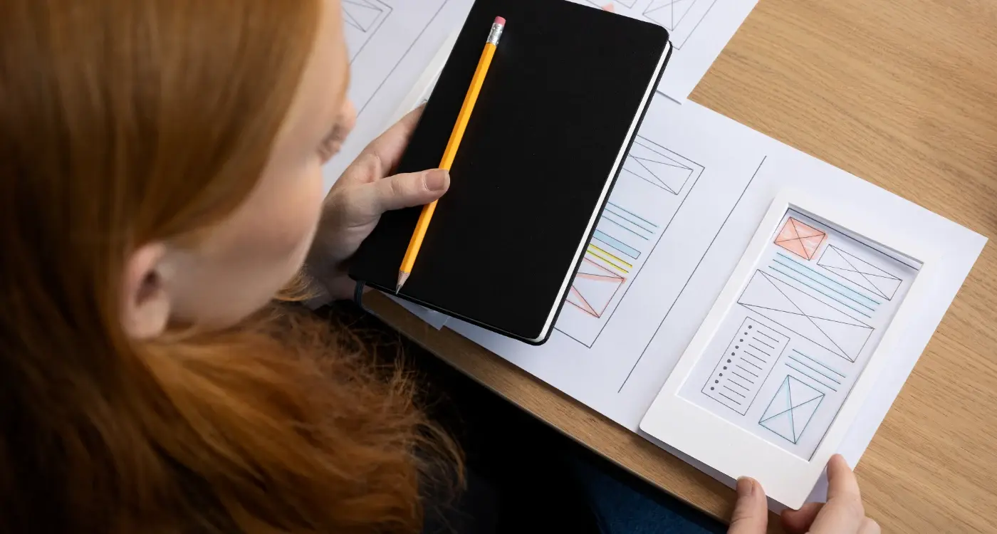
Crafting Clear Visual Hierarchies
Think about how you read a newspaper - your eyes naturally gravitate towards the big headlines first, then smaller subheadings, and finally the body text. This natural way of processing information is exactly what we need to recreate in mobile app interfaces.
Understanding the Building Blocks
Visual hierarchy isn't just about making some elements bigger than others. It's about creating a clear path for users' eyes to follow, much like how a well-designed shop guides customers through its aisles. We achieve this through careful manipulation of size, colour, contrast, spacing, and positioning.
At Glance, we've found that the most successful apps use no more than three levels of hierarchy - primary, secondary, and tertiary. Think of it like a family photo album: you have the main photo (your primary element), supporting details like the date and location (secondary elements), and additional information like photo tags (tertiary elements).
Making It Work in Practice
The trick is to be subtle yet effective. For instance, instead of making a button enormous to show its importance, you might use a combination of slightly larger size, contrasting colour, and strategic white space. It's like how a tennis player doesn't need to shout "I'm serving now!" - their stance and positioning naturally draw attention to the upcoming action.
Remember that different cultures read in different ways. While Western users typically scan in an F-pattern (left to right, top to bottom), other cultures might have different reading patterns. That's why we always test our visual hierarchies with diverse user groups - ensuring our apps feel intuitive regardless of cultural background.
Designing Touch-Friendly Interface Elements
When it comes to mobile app design, we must remember that our fingers aren't nearly as precise as mouse cursors. Through our years of experience crafting intuitive app designs, we've learned that touch-friendly interfaces can make or break the user experience.
The success of mobile interface design isn't measured by how many elements you can fit on a screen, but by how naturally users can interact with each element using their fingers.
Understanding Touch Targets
Think about trying to tap a tiny button while walking or riding the bus - frustrating, isn't it? That's why we always ensure touch targets are at least 44x44 pixels, about the size of a thumbnail. It's similar to trying to thread a needle - the larger the eye, the easier it becomes.
When implementing user-centred app design, we pay special attention to spacing between interactive elements. Just as you wouldn't place two light switches right next to each other, we maintain adequate padding between buttons and links to prevent accidental taps.
Positioning for Natural Interaction
Consider how you hold your mobile phone. Most people use their thumbs to interact with apps, creating natural 'comfort zones' on the screen. Following mobile UX best practices, we position frequently used controls within thumb-reach, typically in the lower two-thirds of the screen. It's like arranging items in your kitchen - you want the most-used tools within easy reach.
To enhance app usability, we implement touch feedback through subtle animations or colour changes. This reassures users their interaction was registered, much like the satisfying click of a well-designed physical button. Remember, the most intuitive app design is one that feels natural and responds predictably to touch.
The Role of Consistency in User-Centred Design
When you pick up your favourite apps - perhaps BBC iPlayer or Deliveroo - have you noticed how naturally you move through them? That's no accident. It's the power of consistency at work, something we've seen make or break countless apps over our years of development.
Think of consistency as the invisible glue that holds your app together. Just as you'd expect the light switch in your bedroom to work the same way as the one in your kitchen, users expect similar elements in your app to behave predictably.
Key Elements of Design Consistency
- Visual consistency: Maintain uniform colours, typography, and button styles
- Behavioural consistency: Ensure similar actions produce similar results
- Functional consistency: Keep navigation patterns and gestures uniform
- External consistency: Follow platform conventions (iOS or Android guidelines)
We've found that consistent design reduces cognitive load - the mental effort users need to navigate your app. It's like walking into your local Tesco; even if it's not your usual branch, you roughly know where everything is because of consistent store layouts.
Maintaining Consistency Across Your App
The secret to maintaining consistency is creating a robust design system. Think of it as your app's rulebook - documenting everything from button styles to spacing rules. This ensures everyone on your team follows the same patterns, whether they're designing a new feature today or six months from now.
Remember, consistency doesn't mean boring. You can still be creative while maintaining familiar patterns. It's about finding the right balance between innovation and user comfort - like adding a twist to a favourite recipe without making it unrecognisable.
Using Feedback and Micro-interactions Effectively
Have you ever wondered why some mobile apps feel more alive and responsive than others? It's all down to thoughtful feedback and micro-interactions - those tiny moments that make using an app feel more natural and satisfying.
Understanding the Power of Visual Feedback
Think about pressing a lift button - you expect it to light up, right? Mobile apps work the same way. When designing intuitive app interfaces, we need to show users their actions have been recognised. Whether it's a subtle colour change when tapping a button or a gentle animation when refreshing content, these visual cues are essential for user-centred app design.
Remember those satisfying bubbles that appear when you're typing a message on your mobile? That's feedback done right - it's helping without getting in the way.
Crafting Meaningful Micro-interactions
Following mobile UX best practices, we've learned that micro-interactions should serve a purpose beyond just looking pretty. They should guide users, confirm actions, and even inject a bit of personality into your app.
- Loading indicators that show genuine progress
- Success animations that feel rewarding
- Error messages that explain what went wrong
- Subtle transitions between screens
- Haptic feedback for important actions
When designing feedback, remember the 400ms rule: any interaction lasting longer than this needs a visual indicator to keep users engaged and informed.
The key to effective app usability guidelines is finding the sweet spot between too much and too little feedback. Like a good friend, your app should be helpful and responsive without being overwhelming. Remember, the best micro-interactions are those that users barely notice but would miss if they weren't there.
Simplifying Complex Tasks Through Progressive Disclosure
Remember the feeling of walking into a room full of switches and buttons, not knowing where to start? That's exactly how users feel when faced with an overwhelming mobile interface. At Glance, we've learned that breaking complex tasks into digestible chunks - a technique called progressive disclosure - is like having a friendly guide walk you through a new experience.
Why Progressive Disclosure Matters
Think of progressive disclosure like teaching someone to bake a cake. You wouldn't hand them all the ingredients and instructions at once - you'd guide them step by step. In mobile apps, this means showing users only what they need at each stage of their journey, much like how a GPS reveals directions as you drive along rather than showing your entire route at once.
Implementing Progressive Disclosure Effectively
We've found that the most successful approach involves creating what we call 'information layers'. Start with the essential elements - like how the BBC News app shows headlines first, then reveals article summaries, and finally the full story when you're ready. This prevents cognitive overload while maintaining user confidence.
Some practical ways to implement this include:
- Using expandable sections that reveal more details on tap - Implementing 'learn more' buttons for optional information - Creating step-by-step wizards for complex processes like account setup - Employing contextual help that appears only when needed
The key is finding the sweet spot between simplicity and functionality. Just as you wouldn't want to overwhelm a new driver with advanced techniques on their first lesson, your app shouldn't bombard users with every feature at once. By thoughtfully revealing complexity as users grow more comfortable, you create an interface that feels both welcoming and powerful.
Accessibility Guidelines for Inclusive Mobile Interfaces
Technology should empower everyone, regardless of their abilities. True intuitive app design means ensuring no user is left behind.
Why Accessibility Matters in Mobile Design
Creating truly intuitive app design means considering every user's needs. At Glance, we've learned that accessibility isn't just about compliance – it's about crafting mobile interfaces that welcome everyone, regardless of their abilities. Think about how frustrating it feels when you can't use an app because the text is too small or the contrast is poor. Now imagine facing these challenges every day.
Essential Accessibility Guidelines
When implementing mobile UX best practices, start with proper colour contrast ratios. Remember how challenging it was to read your phone in bright sunlight? That's a daily reality for many users with visual impairments. Ensure text elements maintain at least a 4.5:1 contrast ratio with their backgrounds.
Touch targets are another crucial element of user-centred app design. Ever tried tapping a tiny button while on the bus? Now imagine doing that with limited motor control. We recommend making interactive elements at least 44x44 pixels, with ample spacing between them.
Don't forget about screen readers! Label all interactive elements clearly and maintain a logical navigation flow. Those using assistive technologies should be able to understand your app's structure as easily as visual users. Consider how your gran might navigate your app – if she'd struggle, your app usability guidelines need adjustment.
Remember, supporting accessibility doesn't mean compromising on design. The most elegant mobile interface principles often align perfectly with accessibility needs, creating better experiences for everyone.
Making Apps Feel Natural Through Gestural Design
Remember the first time you used a smartphone? That magical moment when you discovered you could pinch to zoom or swipe to scroll? These natural gestures have become second nature to us, much like turning the pages of a book or waving hello to a friend. At Glance, we've learned that the most intuitive apps are those that mirror these real-world interactions.
Understanding Natural Movement Patterns
Think about how you naturally interact with physical objects. You might push something away, pull it closer, or swipe it aside. These same principles should guide your app's gestural design. For instance, when browsing photos, users instinctively expect to swipe left or right, just as they would flip through a photo album.
Making Gestures Discoverable
The tricky part about gestural interfaces is making them discoverable without overwhelming users. We've found that subtle visual hints, like a slight peek of the next screen or a gentle bouncing animation, can guide users without the need for lengthy tutorials. It's similar to how a partially opened door naturally invites you to push it further.
One approach we often recommend is the 'progressive revelation' of gestures. Start with basic, familiar gestures like tapping and swiping, then gradually introduce more complex interactions as users become more comfortable. Think of it like teaching someone to dance - you start with the basic steps before moving on to the fancy moves.
Remember, the goal isn't to create clever new gestures just because we can. Instead, focus on movements that feel natural and familiar to your users. After all, the best interface is one that feels so natural, users hardly notice it's there at all.
Conclusion
Throughout this guide, we've explored the essential principles that make mobile apps feel natural and effortless to use. Creating truly intuitive app design isn't just about following a set of rules—it's about understanding how people think, feel, and interact with their devices in their everyday lives.
From crafting clear visual hierarchies to implementing touch-friendly interface elements, each aspect of mobile UX best practices works together to create a seamless experience. Think of it like orchestrating a symphony: when all elements harmonise perfectly, users don't notice the individual components—they simply enjoy the experience.
Remember that user-centred app design isn't a one-time achievement but an ongoing journey. As technology evolves and user expectations shift, the principles of mobile interface design adapt accordingly. However, the fundamental goal remains constant: to create apps that feel like natural extensions of human thought and behaviour.
Whether you're designing a simple weather app or a complex banking platform, these app usability guidelines serve as your compass. By prioritising clarity, consistency, and accessibility, while thoughtfully implementing feedback and gestural interactions, you're well-equipped to create interfaces that users will find both delightful and intuitive.
Above all, never lose sight of the human element in mobile design. Behind every tap, swipe, and interaction is a real person trying to accomplish a real task. By keeping this perspective at the forefront of your design process, you'll naturally create more empathetic, user-friendly experiences that truly resonate with your audience.
Share this
Subscribe To Our Learning Centre
You May Also Like
These Related Guides

How Do I Make My Mobile App UI Effective?
How Do I Create a User-Centered Design for My Mobile App?