How Can You Spot User Satisfaction Red Flags Before Launch?
Building mobile apps has taught me one hard truth—users are unforgivably honest. They won't give you a second chance if your app frustrates them in the first thirty seconds. I've watched brilliant app concepts fail spectacularly because the development team skipped proper user testing, thinking they knew what users wanted. Spoiler alert: they didn't.
User satisfaction isn't something you can fix after launch with a few updates and crossed fingers. By then, you've already lost the battle. The one-star reviews are live, your app store ranking has tanked, and users have moved on to your competitors. It's brutal out there, and the mobile app graveyard is littered with products that seemed perfect in the development studio but crashed and burned in real users' hands.
The thing is, most user satisfaction problems are completely preventable if you know what to look for. Users give you warning signs long before launch—during testing sessions, in their facial expressions, in the pauses between taps, in what they don't say as much as what they do. But you need to know how to spot these red flags and, more importantly, what to do about them.
The biggest mistake I see developers make is assuming they can think like their users. You can't. You've been living and breathing this app for months—users are seeing it with fresh, often confused eyes.
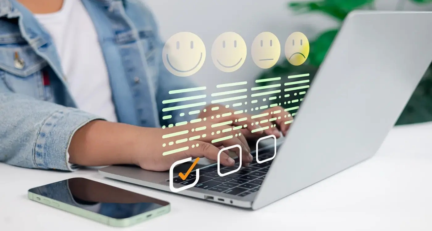
Pre-launch testing isn't just about finding bugs; it's about understanding whether people actually want to use what you've built. And trust me, there's a massive difference between an app that works and an app that people genuinely enjoy using.
Why Early User Testing Saves Your App
Right, let's get straight to the point—most apps fail because their creators think they know what users want. I've seen this happen more times than I can count; someone builds an app based on their own assumptions, skips proper testing, and then wonders why nobody's using it after launch. It's honestly one of the biggest mistakes you can make in app development.
Early user testing isn't just about finding bugs (though that's part of it). It's about discovering whether people actually understand your app, whether they can complete basic tasks without getting frustrated, and whether they see any value in what you've built. You know what? Sometimes the feedback is brutal—but that's exactly what you need to hear before you've spent months polishing something nobody wants.
I always tell clients to start testing as early as possible, even with rough wireframes or basic prototypes. Sure, it feels scary showing unfinished work to strangers, but the alternative is much worse. Finding out your navigation is confusing during development costs maybe a few days to fix; discovering it after launch when your app store ratings are tanking? That could kill your app entirely.
The thing is, you're too close to your own product. You know exactly how everything works because you built it—but your users don't have that advantage. They'll try to use your app in ways you never expected, and they'll get stuck on things that seem obvious to you. Early testing reveals these blind spots before they become expensive problems, and honestly, that alone makes it worth doing.
Common Pre-Launch Testing Mistakes
Right, let's talk about the testing mistakes that keep me up at night—well, not literally, but you know what I mean! After years of watching apps crash and burn because of shoddy pre-launch testing, I've seen the same errors pop up again and again. The worst part? They're all completely avoidable.
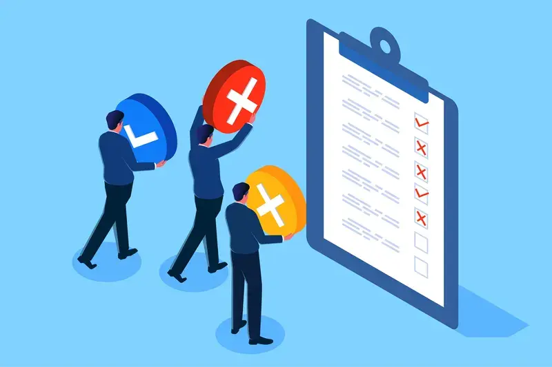
The biggest mistake I see is testing with the wrong people. I can't tell you how many times a client has said "oh, we tested it with our team" or "my nephew who's really good with phones had a look." That's not user testing—thats just asking for trouble. Your internal team knows the app inside out, they know where everything is supposed to be. Real users don't have that luxury; they're coming to your app completely fresh.
Another classic error is testing too late in the process. By the time you've built 90% of your app, making changes is expensive and time-consuming. I always tell clients to start testing wireframes and prototypes early on—when its still cheap to change things around.
Testing in Perfect Conditions
Here's something that drives me mad: testing only in perfect conditions. Your users aren't sitting in a quiet office with perfect WiFi—they're on the bus, walking down the street, or multitasking while watching TV. Test your app in real-world conditions with distractions, poor internet, and different devices.
And please, don't just test the happy path. Test what happens when users make mistakes, when they can't find what they're looking for, or when they use the app in ways you never intended.
Test with at least 5-8 users who match your target audience, and always test on actual devices—not just simulators or your development machine.
Setting Up Effective User Testing Sessions
Right, so you've decided to test your app before launch—good choice! But here's where most people mess up: they think user testing is just putting their app in front of random people and watching what happens. It's not. There's actually a proper way to set up these sessions that'll give you the insights you need to spot those satisfaction red flags early.
First thing—and I can't stress this enough—is getting the right people in the room. Your mum, your best mate, your colleagues? They don't count. You need people who genuinely represent your target users. I've seen too many apps fail because they tested with the wrong crowd and missed obvious problems. If you're building a fintech app for busy professionals, test with busy professionals, not university students who have all day to figure out confusing interfaces.
Create Real-World Testing Scenarios
Here's what works: give your testers actual tasks they'd want to complete, not artificial ones you've made up. Instead of "can you find the settings menu," try "you want to change your notification preferences because you're getting too many alerts." See the difference? One feels natural, the other feels like homework.
Keep your testing sessions focused—about 30-45 minutes max. People get tired, and tired users don't give you genuine reactions. Also, resist the urge to jump in and help when they're struggling; that struggle is exactly what you need to see. Those moments of confusion? They're pure gold for identifying problems before your app goes live.
Reading Between the Lines of User Feedback
User feedback during testing isn't always what it seems on the surface. I've learned that people are generally polite—they'll say "it's fine" when they really mean "this is confusing as hell but I don't want to hurt your feelings." The real insights come from watching what users actually do, not just what they say they'll do.
Pay attention to those little pauses and hesitations. When someone stops for more than three seconds trying to figure out where to tap next, that's your app failing them. They might not mention it in their verbal feedback, but their behaviour is screaming that something's wrong. I've seen apps where users would say the interface was "intuitive" while taking twice as long as expected to complete basic tasks.
What Silence Really Means
The most dangerous feedback isn't negative comments—it's the absence of any strong reaction at all. If your testers seem indifferent or give lukewarm responses like "yeah, I guess I'd use this," you've got a problem. Apps that succeed create some kind of emotional response, whether that's excitement, relief, or satisfaction.
The best user feedback often comes from what people don't say rather than what they do say
Watch for phrases like "I suppose," "maybe," or "it's okay I guess"—these are red flags disguised as neutral feedback. Also notice when people ask questions about basic functionality; if multiple testers are confused about the same feature, it needs reworking regardless of how obvious it seems to you. Remember, you've been living with this app for months—fresh eyes see things differently.
Technical Red Flags That Kill User Experience
I mean, you can have the most beautiful design in the world, but if your app's technical foundation is dodgy? Users will notice immediately. And they won't stick around to give you a second chance.
The worst part is, many of these technical issues are completely avoidable if you know what to look for during testing. I've seen apps with months of development work behind them crash and burn because of basic technical oversights that could have been caught early.
Memory Leaks and Performance Killers
Here's something that drives me mad—apps that slowly consume more and more memory until the user's phone starts stuttering. Memory leaks are silent killers; they don't cause immediate crashes, but they make the entire device feel sluggish over time. Users might not understand what's happening technically, but they know your app makes their phone feel "slow".
Another massive red flag? Poor database queries that weren't optimised for mobile. I've seen apps that worked fine with 100 test records completely fall apart when faced with real-world data volumes. Your search function might work perfectly in testing, then take 30 seconds to load results in production.
Critical Technical Warning Signs
- App crashes when switching between apps frequently
- Battery drain that's noticeably higher than similar apps
- Slow response times on older devices (not just the latest flagship phones)
- Inconsistent behaviour between different device models
- Network requests that fail silently without user feedback
- Images or content that don't load properly on slower connections
The key is testing on real devices, not just simulators. And I mean proper stress testing—leave the app running for hours, switch between apps, test on 3G connections. Because that's what real users do.
Design Elements That Frustrate Users
You know what drives me mad? When I see an app with brilliant functionality completely ruined by poor design choices. After years of watching user testing sessions, I can spot the design elements that make users want to throw their phones across the room—and trust me, these patterns show up again and again.
Tiny tap targets are probably the biggest culprit I see. If your buttons are smaller than 44 pixels, you're basically asking users to play a frustrating game of precision tapping. I've watched perfectly capable people struggle with apps because the designer thought microscopic icons looked "clean." Clean doesn't matter if nobody can bloody use it! The same goes for text that's too small to read without squinting—if your users are over 40, they'll delete your app faster than you can say "user experience."
Poor contrast is another killer. Sure, that light grey text on white background might look sophisticated to you, but your users will hate trying to read it. I've seen apps fail user testing purely because people couldn't make out the content in different lighting conditions.
Then there's the classic mistake of hiding important actions behind obscure icons. That hamburger menu might be standard now, but if you're burying key features three taps deep with no clear visual cues, you're losing users. And don't get me started on auto-playing videos or animations that drain battery life—users notice this stuff immediately during testing sessions.
Test your app in bright sunlight and dim lighting conditions. If users can't read your content or find your buttons in different environments, you need to fix your contrast and sizing before launch.
Navigation and Flow Problems to Watch For
Navigation is where most apps either win or lose their users in the first thirty seconds. I mean, you can have the most beautiful design in the world, but if people can't figure out how to get around your app? They're gone. And they're not coming back.
The biggest mistake I see is when developers build navigation that makes sense to them but confuses everyone else. You know your app inside and out—of course you can find everything! But your users don't have that luxury. They're coming in cold, probably distracted, and definitely impatient.
Critical Navigation Issues That Kill Apps
There are specific flow problems that will destroy user satisfaction before your app even has a chance to prove its worth. Understanding how memory science affects mobile navigation can help you avoid these common pitfalls during your testing:
- Back buttons that don't work as expected or disappear entirely
- Menu items buried more than three taps deep
- Search functions that return confusing or irrelevant results
- Modal windows or popups that users can't easily close
- Tab bars that change unexpectedly or don't clearly indicate the current section
- Onboarding flows that take more than two minutes to complete
- Forms that don't save progress when users navigate away
Here's the thing about navigation—users form mental maps of your app within the first few interactions. If you break those expectations later, you've lost their trust. I've seen apps with genuinely useful features fail completely because the navigation was inconsistent between screens.
Testing Your App's Flow
Give someone your app and ask them to complete a simple task without any guidance. Watch their face. If they look confused or frustrated within the first minute, you've got navigation problems that need fixing before launch. Don't explain how it works—just observe where they get stuck.
Performance Issues Users Won't Forgive
Here's something I've learned the hard way—users will give you exactly one chance to make a good first impression, and if your app performs poorly, they're gone. Not "I'll try again later" gone. Actually gone. Deleted from their phone, negative review left behind, telling their mates to avoid it kind of gone.
The three performance killers I see most often? Slow loading times, crashes, and battery drain. If your app takes more than three seconds to load its main screen, you've already lost about 40% of users. I mean, people have the attention span of goldfish these days—and honestly, who can blame them when there's literally millions of other apps they could try instead.
Load Times That Kill Conversions
During user testing sessions, I watch people's faces when apps load slowly. You can actually see the exact moment they mentally check out. Their thumb starts hovering over the back button, they start fidgeting with their phone. It's like watching someone decide whether to queue for a busy restaurant—except with apps, there's always another option that loads faster.
The difference between a 2-second load time and a 5-second load time isn't just 3 seconds—it's the difference between user engagement and user abandonment
Crashes and Memory Issues
But slow loading is nothing compared to crashes. A crash during user testing is like a slap in the face—it immediately breaks trust and makes users question the quality of everything else you've built. Memory leaks, background processes that won't quit, apps that make phones hot enough to fry an egg... these aren't just technical problems, they're reputation killers. Your pre-launch testing needs to push your app hard, test it on older devices, and simulate real-world usage patterns where people have dozens of other apps running simultaneously.
Conclusion
After years of launching apps and watching some succeed whilst others crash and burn, I can tell you that spotting user satisfaction red flags before launch isn't just helpful—it's absolutely critical for your app's survival. The mobile app market is brutal these days; users will delete your app faster than you can say "one star review" if it doesn't meet their expectations.
The thing is, most red flags are completely avoidable if you know what to look for. When users struggle with your navigation, can't figure out your onboarding, or face crashes during key interactions, they're telling you exactly what needs fixing. But here's the catch—they won't always tell you directly. You need to watch their behaviour, not just listen to their words.
I've seen too many developers ignore the warning signs because they were too close to their project or too eager to launch. Trust me, an extra month of testing and refinement will save you months of trying to win back users who've already moved on to your competitors. The cost of fixing problems post-launch isn't just financial—it's your reputation in the app stores that takes the real hit, which is why regular app maintenance and updates become so crucial for long-term success.
Your app's success depends on getting these details right before real users start downloading it. Every frustrating tap, every confusing screen, every moment of lag adds up to user dissatisfaction. By the time you see poor reviews and declining downloads, it's often too late to recover that initial momentum. So test early, test often, and actually listen to what your users are telling you. Your future self will thank you for it.
Share this
Subscribe To Our Learning Centre
You May Also Like
These Related Guides
What Is User Acceptance Testing And Do You Really Need It?
What Are The Best Tools For Remote User Testing Of Mobile Apps?