When was the last time you tried to navigate through a complex menu on your smartwatch and found yourself tapping frantically at tiny buttons that barely register your touch? If you're nodding along, you've experienced firsthand why wearable navigation demands a completely different approach than traditional mobile apps.
After years of building apps for everything from smartphones to Apple Watches, I can tell you that designing for wearables isn't just about shrinking your mobile interface down to fit a smaller screen—that's a recipe for disaster. The constraints are so different that we basically need to throw out most of what we know about mobile UX and start fresh. We're talking about screens that are sometimes just 1.2 inches across, users who might be running whilst trying to interact with your app, and battery life that can make or break the entire user experience.
The best wearable apps are those that users can navigate without even looking at the screen
The thing is, wearable navigation isn't just about making things smaller—it's about fundamentally rethinking how people interact with technology when their hands might be busy, their attention is divided, and they need information quickly. Whether you're building for Apple Watch, Wear OS, or any other wearable platform, understanding these unique navigation challenges is what separates apps that people actually use from those that get deleted after the first frustrating experience. Let's dive into what makes wearable app navigation so different and how you can design interfaces that actually work in the real world.
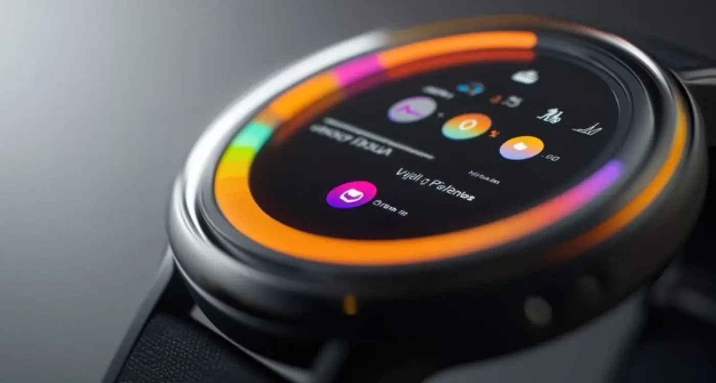
The biggest shock when you first start designing for wearables? The screen is absolutely tiny. I'm talking about displays that are often less than 2 inches across—sometimes much smaller. When you've spent years building mobile apps for phones with 5, 6, even 7-inch screens, this constraint hits you like a brick wall.
This size limitation changes everything about how users interact with your app. On a phone, you can display multiple navigation options, show detailed menus, and give users several paths to accomplish their goals. On a smartwatch? You're lucky if you can fit three menu items without making them impossible to tap accurately.
Single-Focus Design Becomes Critical
Here's what I've learned from building wearable apps: each screen needs to do one thing really well. That's it. You can't cram multiple functions onto a tiny display and expect it to work. Users should be able to glance at the screen and immediately understand what they're looking at and what they can do next.
Navigation becomes much more linear on wearables. Instead of the complex menu structures we use on phones, wearable apps work better with simple, sequential flows. Think of it like stepping stones—each screen leads naturally to the next one, with minimal branching paths.
The 5-Second Rule
Most wearable interactions need to happen in 5 seconds or less. People aren't going to stand around with their wrist raised, navigating through multiple screens. This time constraint forces you to prioritise ruthlessly—only the most important features make it into the final app. Everything else gets pushed to the companion mobile app, where there's more room to breathe.
The small screen size also means your touch targets need to be much larger relative to the display. What looks like a massive button on a watch screen would seem comically oversized on a phone.
Touch vs Gesture-Based Interactions
When I first started working on wearable apps, I made the mistake of thinking touch interactions would work the same way they do on phones. Bloody hell, was I wrong! The difference between tapping on a 6-inch phone screen and a 1.5-inch watch face is like night and day—your finger basically covers half the display.
Traditional touch interactions that work brilliantly on mobile become clunky nightmares on wearables. Think about it: when you tap a button on your phone, you can see exactly what you're pressing. On a smartwatch? Your finger obscures most of the interface, making precise tapping genuinely frustrating. That's why successful wearable navigation relies heavily on gestures instead.
Common Wearable Gesture Patterns
The most effective wearable UX patterns I've implemented focus on simple, natural movements. Swiping works beautifully—left and right for navigation, up and down for scrolling. The Apple Watch's digital crown is genius for this reason; it gives users precise control without blocking the screen.
- Horizontal swipes for moving between main sections
- Vertical swipes for scrolling through content
- Long press for context menus or shortcuts
- Pinch gestures for zooming (where screen size allows)
- Shake or raise-to-wake for quick access
Design your wearable touch targets to be at least 44x44 pixels—even larger if possible. Users will thank you for making interactions feel less like a finger gymnastics routine.
The key difference in mobile vs wearable interactions is intent. Mobile users often browse and explore; wearable users want quick, specific actions. Your navigation should reflect this—fewer options, bigger targets, and gestures that feel natural rather than learned. I've found that the best wearable navigation feels almost invisible to users, letting them complete tasks without thinking about the interface at all.
Information Hierarchy for Small Displays
When you're working with a screen that's smaller than a postage stamp, every pixel matters. I mean, seriously—we're talking about displays that are roughly 1.5 inches across. That's not much real estate to work with, is it?
The biggest mistake I see developers make is trying to cram too much information onto these tiny screens. You know what happens? Users get overwhelmed and stop using the app altogether. Instead, you need to be ruthless about what information actually deserves screen time.
The Three-Second Rule
Here's something I've learned from building dozens of wearable apps—if a user can't understand what they're looking at within three seconds, you've failed. That glance needs to give them exactly what they came for, nothing more.
Think about it this way: someone checks their watch whilst walking, in a meeting, or during a conversation. They're not going to spend time deciphering your interface. The information hierarchy needs to be absolutely crystal clear.
Progressive Disclosure is Your Best Friend
I always structure wearable app information like this:
- Primary information (the one thing they need most)
- Secondary actions (swipe or tap to access)
- Detailed information (only if absolutely necessary)
- Settings and configuration (buried deepest)
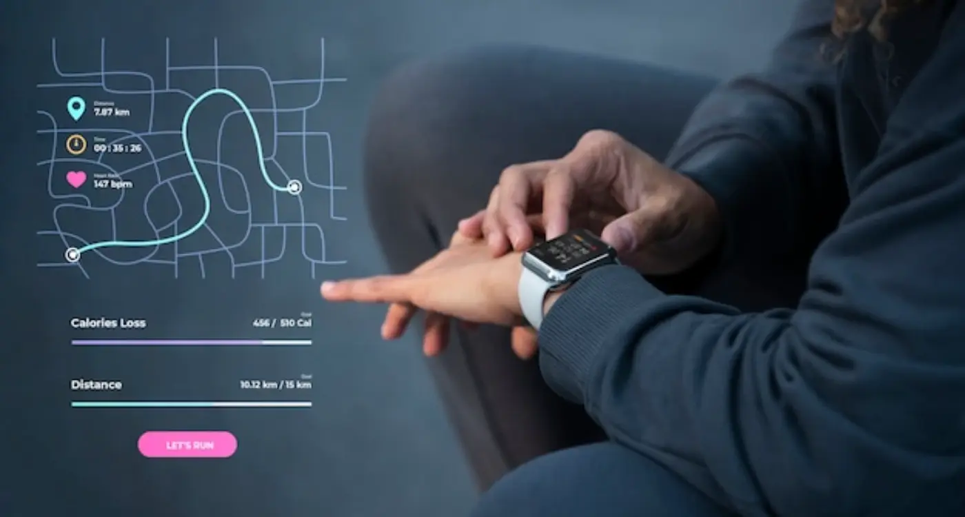
For example, in a fitness app, the primary screen shows current heart rate—that's it. Swipe for workout controls. Tap for detailed stats. Everything else lives in a separate section entirely.
The key is accepting that wearables aren't miniature smartphones. They're glanceable devices that should surface the right information at the right moment, then get out of the way. Once you embrace that limitation, designing for small displays becomes much clearer.
Voice and Haptic Feedback Integration
Here's where wearable navigation gets really interesting—and honestly, where most developers get it wrong. Voice and haptic feedback aren't just nice additions to your wearable app; they're absolutely fundamental to creating navigation that actually works on these tiny screens.
I've seen countless wearable apps that treat voice commands as an afterthought. Big mistake. When you're dealing with a screen thats barely an inch across, voice becomes your primary navigation tool, not a secondary one. Users need to be able to say "show messages" or "start workout" without fumbling around trying to tap microscopic buttons. But here's the thing—voice commands need to be dead simple and contextual to the current screen.
Getting Haptic Feedback Right
Haptic feedback is where wearable navigation really shines compared to mobile apps. On a phone, haptic feedback is nice to have; on a smartwatch, its essential for confirming actions when users cant always look at the screen. Different vibration patterns should mean different things—a gentle tap for notifications, a stronger pulse for successful actions, and a distinct pattern for errors.
The best wearable navigation feels invisible because users can navigate through touch, voice, and vibration without constantly staring at their wrist
I always tell my clients to think of haptic patterns like a language. One short vibration might mean "message received," while two quick pulses could mean "action completed." Users learn these patterns quickly, and once they do, navigation becomes almost instinctive. The key is consistency—if a double-tap means "go back" on one screen, it should mean the same thing everywhere in your app. Too many wearable apps change their haptic language between screens, which confuses users and breaks the navigation flow.
Performance and Battery Considerations
Right, let's talk about something that'll make or break your wearable app—battery life and performance. I've seen brilliant wearable apps completely fail because they drained the user's watch in a few hours. It's honestly one of the biggest challenges we face when building for these tiny devices.
Wearable devices have processors that are maybe 5% as powerful as a smartphone, and batteries that are even smaller. Your Apple Watch has about 300mAh of battery capacity compared to 3000mAh+ in most phones. That's a tenth of the power, which means every animation, every background process, every unnecessary calculation is going to hurt you.
Battery-Conscious Design Choices
The navigation patterns you choose directly impact battery drain. Complex animations look lovely but they're battery killers. I've learned to favour simple transitions—fade in/out, basic slides, nothing fancy. Also, keeping the screen on longer than necessary is a big no. Design your navigation so users can get in, find what they need, and get out quickly.
Here's what really impacts battery life in wearable navigation:
- Complex animations and transitions (avoid if possible)
- Frequent screen wake-ups from notifications
- Background location tracking and GPS usage
- Continuous heart rate monitoring during app use
- Heavy use of haptic feedback patterns
- Loading too many UI elements at once
Smart navigation design means being selective about what deserves the user's attention. If your fitness app is constantly buzzing and lighting up the screen for minor updates, users will uninstall it faster than you can say "low battery." The goal is creating navigation that feels responsive but doesn't constantly demand the device's limited resources.
Platform-Specific Navigation Patterns
When I first started working on wearable apps, I made the classic mistake of thinking Apple Watch and Wear OS were basically the same thing. Wrong! Each platform has its own navigation DNA, and fighting against it is like swimming upstream—exhausting and pointless.
Apple Watch users expect the Digital Crown to be their best friend. It's not just for scrolling; it's how users naturally navigate through content without covering the tiny screen with their fingers. The side button brings up the dock, and force touch (on older models) reveals contextual menus. Apple's whole philosophy is about reducing cognitive load—they want users to accomplish tasks quickly and get back to their lives.
Wear OS Takes a Different Approach
Wear OS is more about gestures and swipes. Users swipe down for notifications, up for app drawer, and sideways to navigate between screens. The rotating bezel on Samsung watches adds another layer—users can twist to scroll through content, which feels surprisingly natural once you get used to it.
But here's where it gets interesting: each platform has different expectations for app structure. Apple Watch apps work best with hierarchical navigation—you drill down into specific tasks then return to the main screen. Wear OS users are more comfortable with lateral navigation, swiping between different sections of your app.
Always design for the platform's native gestures first, then add secondary navigation options. Users already know how their device works—don't make them learn new patterns.
The Context Switching Challenge
Here's something most developers miss: wearable users are constantly context-switching. They might start a task on their watch, continue on their phone, then finish on their tablet. Your navigation needs to support this flow, not fight it. Quick actions should happen entirely on the watch, while complex tasks should gracefully hand off to the paired device.
Testing Wearable Navigation Experiences
Testing wearable apps is honestly a completely different beast from testing regular mobile apps. I mean, you can't just hand someone a smartwatch and expect them to sit at a desk for an hour—that's not how people use these devices. The entire testing process needs to mirror real-world scenarios where users are actually moving around, doing other things, and often interacting with their wearable while distracted.
The biggest challenge? Context switching. Users might glance at their watch mid-conversation, check notifications while walking, or try to complete a task with one hand busy. Your testing environment needs to account for these realities. I've found that the best results come from having testers actually wear the device for extended periods—not just during formal testing sessions.
Key Testing Scenarios for Wearables
- Single-handed interaction while carrying objects
- Quick glances lasting 2-3 seconds maximum
- Navigation while walking or exercising
- Use in bright sunlight and low-light conditions
- Interaction with wet or gloved hands
- Battery drain during typical daily usage patterns
Response time is absolutely critical for wearables—if your navigation takes more than a second to respond, users will give up. They're not going to stand there waiting like they might with a phone. Every tap, swipe, or voice command needs to feel instant.
Voice testing is particularly tricky because you need to test in noisy environments, quiet spaces where people feel self-conscious speaking to their wrist, and everything in between. Don't forget to test haptic feedback too—what feels subtle in a quiet room might be completely missed during a workout or while driving.
The key insight I've learned over the years? Test early, test often, and test in the messiest, most realistic conditions possible. Your users won't be gentle with wearable navigation, so your testing shouldn't be either.
Conclusion
After years of building both mobile apps and wearable experiences, I can tell you that treating wearable navigation like a shrunk-down mobile app is one of the biggest mistakes you can make. And honestly? I've seen way too many teams make this exact mistake.
The differences we've covered—from tiny screen constraints to gesture-based interactions—aren't just technical considerations. They're fundamental shifts in how people interact with technology. When someone glances at their watch, they want information fast; when they're using their phone, they might browse for ages. That's a completely different mindset, and your wearable navigation needs to respect that.
What really gets me excited about wearable UX patterns is how they force us to strip away the unnecessary stuff. No room for cluttered menus or complex hierarchies—just the core actions people actually need. It's like mobile design on steroids, where every pixel matters and every interaction has to earn its place.
Voice integration and haptic feedback aren't just nice-to-haves anymore; they're becoming the backbone of good wearable navigation design. Users expect their devices to communicate through multiple channels, and frankly, a buzzing notification often works better than any visual cue on a two-inch screen.
The mobile vs wearable debate isn't going anywhere. As smartwatches get more powerful and new wearable categories emerge, the navigation patterns will keep evolving. But the core principle stays the same: respect the context, understand the constraints, and design for the moment when someone needs your app most. That's what separates successful wearable apps from the ones that get deleted after a week.