How Can You Stop Users Overthinking Their Purchases?
Have you ever watched someone add something to their cart, stare at their phone for a minute, then close the app without buying? It happens all the time—and I mean all the time. In my years building e-commerce and booking apps, I've seen this pattern play out in analytics dashboards so often it's almost predictable. Users get right to the edge of purchasing and then... nothing. They bail.
The thing is, its not that they don't want what you're selling. They do. But something in that final moment makes them hesitate, second-guess themselves, and ultimately decide to "think about it" (which usually means never coming back). This is decision paralysis in action, and it's costing businesses millions in lost revenue every single day.
When users have too much time to think during checkout, they start inventing reasons not to buy.
What I've learned from years of testing and optimising mobile apps is that purchase anxiety isn't really about the product or the price—well, not entirely anyway. It's about how the experience makes people feel in that crucial moment. Are they confident? Overwhelmed? Confused about what happens next? Mobile screens make this worse because everything feels more isolated; users cant easily compare options or validate their choices the way they might on a desktop with multiple tabs open.
The good news? Small changes to your app's design and flow can dramatically reduce overthinking and boost conversions. We're talking about understanding choice architecture, building buying confidence through smart UX decisions, and knowing a bit about user psychology. And no, you don't need to manipulate people or use dodgy tactics to make this work. Actually, the most effective approaches are the ones that genuinely help users make decisions they feel good about.
Understanding Why People Freeze When Making Decisions
I've watched thousands of users interact with mobile apps over the years, and one pattern shows up again and again—people get stuck right before they're about to buy something. They add items to their basket, they browse through product pages, they even start filling out payment forms...and then they just stop. Its not that they've lost interest exactly; they're frozen.
This happens because our brains are actually trying to protect us from making mistakes. When you're about to spend money, your mind starts running through all these little questions: Is this the right colour? Could I find it cheaper somewhere else? Do I really need this? What if I regret it later? And on a mobile screen—where you cant see everything at once and theres this tiny window into whats being offered—those doubts get amplified.
The psychology behind this is pretty straightforward, actually. When people face uncertainty, their default response is to do nothing. Think about it; if you're not 100% sure about a decision, the safest option feels like waiting, researching more, or just closing the app and "thinking about it" (which usually means never coming back). We call this decision paralysis, and it kills conversions faster than anything else. Understanding the psychology of effective app pricing pages can help address some of these concerns before they even arise.
What makes mobile shopping particularly tricky is that users are often multitasking—they might be on the bus, waiting in a queue, or half-watching TV. Their attention is split, which means any friction in the buying process becomes an easy excuse to abandon the purchase. I mean, if something requires too much mental energy when you're already distracted, you'll just...stop. And the app loses a sale.
The Hidden Costs of Giving Users Too Many Choices
Here's something I see all the time—businesses think more options equals more sales. Makes sense on paper, right? Give people everything they could possibly want and surely they'll find something to buy. But here's the thing: it doesn't work like that at all, and I've seen this mistake cost businesses thousands in lost conversions.
When you put too many choices in front of someone, their brain actually starts working against you. They cant decide which option is best. They worry about making the wrong choice. And you know what they do? Nothing. They just leave. I've watched this happen in user testing sessions and its genuinely painful to see—someone who came to buy something ends up closing the app because deciding felt like too much work. This is where behavioural economics in mobile app design becomes crucial for guiding user decisions.
The research backs this up too; when people face too many options they experience what psychologists call decision paralysis (or choice overload if you want to get technical about it). Their confidence drops. Purchase anxiety goes up. And your conversion rates? They tank. One study showed that having 24 options instead of 6 reduced purchase rates by nearly 90%. Bloody hell, right?
What Counts as Too Many Choices
On mobile screens, where space is already limited, the problem gets worse. You might think you're only offering five product variants, but if each has three colour options, two size categories, and four material choices—well, that's suddenly 120 possible combinations your users brain needs to process. Actually, most people wont even try; they'll just bounce to a competitor with a simpler offering.
I mean, sure, some industries need variety. Fashion apps cant just sell one style in one colour. But theres a difference between necessary variety and overwhelming people with options they dont actually care about. The trick is understanding which choices matter to your users and which ones are just adding cognitive load.
The Real Business Impact
Let me break down what too many choices actually costs you:
- Higher cart abandonment rates—people add items but cant commit to buying
- Longer decision times which means more people drop off before completing checkout
- Increased return rates because people make hasty choices just to escape the decision
- Lower average order values as overwhelmed users pick the safest, cheapest option
- More customer service enquiries from confused buyers who need help deciding
One client I worked with was selling premium headphones through their app. They had 47 different models listed on their main shop page. When we reduced it to 12 carefully curated options with clear use cases (gym, commute, home office, etc), their conversion rate jumped by 34%. Same products, same prices—just better choice architecture that didnt overwhelm people.
The psychology behind this is pretty straightforward actually. Every choice requires mental energy. When you force users to make dozens of micro-decisions (which colour? which size? which shipping speed? add warranty? create account?), you're draining that energy before they even get to the final purchase decision. By the time they reach checkout, theyve got nothing left and any tiny friction point becomes an excuse to bail.
Start by identifying your three best-selling products and make those the hero options on your main pages—most users don't need to see your entire catalogue, they need guidance on what's right for them.
How Mobile Screens Change the Way People Think About Buying
Here's something I've noticed after building apps for e-commerce clients over the years—people make decisions differently on their phones than they do on desktop. Like, genuinely differently. It's not just about screen size; it's about context, attention, and how our brains work when we're holding a small device in our hands.
When someone's on their mobile, they're usually doing something else too. Waiting for a bus, sitting in a meeting (don't tell their boss!), or half-watching TV. Their attention is split. This means you've got maybe 3-5 seconds to convince them that what you're showing them is worth their full focus—anything more complex than that and they'll just close the app.
The physical act of scrolling changes things too. On desktop people scan pages in an F-pattern, but on mobile its all vertical; they scroll and scroll until something catches their eye. This means your most important information needs to be visible without requiring horizontal movement or complex navigation. I mean, have you ever tried filling out a complicated form on your phone? Its painful, right? Every extra field feels like a massive barrier.
There's also this weird thing with mobile where people are more impulsive but also more cautious at the same time. They'll make quick decisions about small purchases (under £20 or so) without thinking too much, but anything bigger and they suddenly want to switch to desktop where they can "see it properly" and open 47 tabs comparing prices. Understanding this behaviour helps you design experiences that match how people actually want to buy—quick checkouts for impulse purchases, easy save-for-later options for bigger decisions.
The thumb zone matters more than most people realise. Your users cant reach the top corners of their screen comfortably, so putting your main call-to-action button up there is basically asking them to use two hands or give up entirely. Keep the important buttons in the bottom third of the screen where thumbs naturally rest.
Simple Design Changes That Build Confidence
Right, let's talk about the small things that make a massive difference—because honestly, sometimes its the tiniest design tweaks that stop people from overthinking and actually make them feel good about buying. I've watched conversion rates jump by 30% just from changing how we display information on a product screen, and it wasn't some fancy redesign either. It was about making people feel safe.
First up: show progress. When someone's making a purchase, they need to see where they are in the journey. A simple progress indicator at the top (Step 2 of 3, for example) does wonders for purchase anxiety because it removes the fear of endless forms and unknown commitment. People are far more likely to complete something when they know exactly how much is left to do. And here's the thing—make sure each step feels achievable; three big steps work better than seven small ones, even if the actual information you're collecting is identical.
Visual Cues That Actually Work
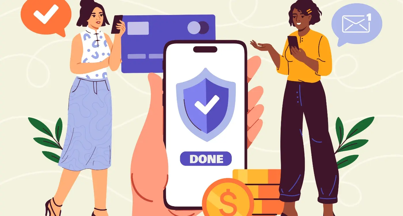
Security badges matter more than you'd think. That little padlock icon or "Secure checkout" text near your payment fields? It directly addresses the subconscious worry about safety. I mean, we all know the checkout is secure, but seeing it confirmed removes that nagging doubt. Trust signals like "30-day money-back guarantee" or "Free returns" should be visible during the decision moment, not hidden in your terms and conditions where nobody's going to bloody well find them.
The best conversion optimisation often comes from removing friction rather than adding features
Default selections can guide people through choice architecture without feeling pushy. If you're offering three subscription tiers, visually highlight the most popular one—it gives people an anchor point and reduces decision paralysis. Same goes for pre-filling forms with sensible defaults (like their country based on IP) or remembering preferences from earlier in the session. Every field someone doesn't have to think about is one less chance for buying confidence to wobble. Actually, the fewer decisions people need to make during checkout, the better; save customisation options for after the purchase when they're already committed. Effective mobile app conversion optimisation focuses on these subtle psychological triggers.
Using Time and Scarcity Without Being Manipulative
Right, lets talk about countdown timers and "only 2 left in stock" messages—because honestly, most apps get this completely wrong. I've built purchase flows for e-commerce clients where we tested scarcity messaging, and here's what I learned: people aren't stupid. They know when you're trying to trick them.
The thing is, real scarcity actually works. But fake urgency? That destroys trust faster than anything else in your app. When users see a countdown timer that resets every time they visit, or stock numbers that never change, they spot it immediately. And once they've caught you being dishonest, you've lost them—probably forever.
Here's how to use time and scarcity in a way that actually helps users make decisions rather than manipulating them: only show these elements when they're genuinely true. If you've got a flash sale ending at midnight, show a timer. If you really do have limited stock because its a physical product, display that number. But if your digital course has unlimited spaces? Don't pretend otherwise.
When Scarcity Actually Makes Sense
There are legitimate situations where time pressure exists, and hiding that information from users would actually be doing them a disservice. Event tickets sell out. Hotel rooms get booked. Limited edition products run out. In these cases, showing scarcity helps users make informed decisions quickly.
I've seen conversion rates improve by 15-20% when we added real stock indicators to product pages—not because we were creating false urgency, but because we were giving users information they needed to decide whether to buy now or risk missing out. The key difference? We showed the same numbers to everyone, and they actually went down as people purchased.
Making It Work in Your App
- Use specific numbers rather than vague phrases like "selling fast"—tell users exactly how many are left
- Show genuine deadlines for offers or shipping cutoffs that actually exist in your business
- Display real-time booking information for services or appointments
- Be transparent about why scarcity exists (limited production run, time-sensitive offer, actual inventory levels)
- Never reset timers or fake stock numbers—users will notice and you'll lose their trust completely
The best approach I've found is to think about scarcity messaging as helpful information rather than a sales tactic. If knowing something is limited would genuinely help someone make a better decision, show it. If you're just trying to create panic? Skip it. Your users will thank you, and your conversion rates will improve because people trust what your app tells them.
What Happens After Someone Clicks Buy
Right, so someone's actually clicked the buy button—brilliant. Job done, yeah? Not quite. This is where most apps completely drop the ball, and its honestly one of the biggest mistakes I see in mobile commerce. The moment after purchase is when buyer's remorse kicks in hardest; that little voice in someones head starts asking if they made the right choice. Did they really need this? Could they have found it cheaper somewhere else?
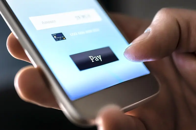
I've built checkout flows for e-commerce apps that process millions in transactions, and the pattern is always the same—purchase anxiety doesn't end when someone enters their card details, it actually peaks right after. Your job isn't finished until you've reassured that person they made a smart decision. And on mobile screens where attention spans are already short, you've got maybe 10-15 seconds to do this before they close your app and start googling reviews or checking competitor prices.
The confirmation screen needs to do more than just say "Order confirmed" with a tick mark. Sure, confirm the purchase clearly—but also remind them why they bought it in the first place. What problem does this solve for them? When will it arrive? What can they expect next? The best confirmation experiences I've designed include these elements in a specific order:
- Clear visual confirmation (not just text, but something that feels like a reward)
- Immediate next steps—what happens now and when
- Social proof reminder—"Join 50,000+ happy customers" works wonders here
- Easy access to support if they need to change something
- A small surprise or bonus that exceeds expectations
That last point is something I learned from working with subscription apps. Adding something unexpected—a small discount on their next purchase, early access to a new feature, a thank you message from the founder—it shifts the psychological state from "Did I make a mistake?" to "Oh, this was actually a good decision". You know what? Its not about manipulation; its about reinforcing buying confidence at exactly the moment when doubt creeps in.
Send a follow-up email within 5 minutes of purchase that includes tracking info, support contact, and a simple message thanking them. This tiny touchpoint massively reduces refund requests and support tickets—I've seen it cut post-purchase anxiety complaints by nearly 40% in apps I've worked on.
The Psychology of Post-Purchase Behaviour
Here's the thing—decision paralysis doesn't magically disappear after someone completes a transaction. Actually, it can get worse because now theres money involved. On mobile especially, where people might be making quick decisions during a commute or while waiting in a queue, the post-purchase period is when rational thinking catches up with impulse. They start second-guessing themselves, and if your app doesn't address this immediately, they'll abandon future purchases or worse, request a refund.
What I've noticed over years of testing checkout flows is that users need progressive reassurance. The confirmation screen is step one, but you also need to think about the next few hours and days. Push notifications at the right moments—"Your order is being prepared", "Your item has shipped"—these aren't just logistics updates, they're psychological reassurance points. Each notification reminds the user that things are moving forward, that their decision was valid, that the process is working as it should.
Common Mistakes That Increase Buyer's Remorse
I mean, I've seen apps make some really strange choices after the purchase is complete. The worst offender? Immediately asking for a review or rating. Bloody hell, they haven't even received their product yet! How can they review something they don't have? This creates a negative association because you're asking for something before delivering value. Wait at least until the product arrives or the service is experienced before requesting feedback.
Another mistake is making the post-purchase experience feel like an afterthought. Generic confirmation emails that look like they came from a robot, no personalisation, no sense that a real company is behind this transaction. Users need to feel like theres a human on the other end who cares about their experience. Even small touches—using their name, referencing what they bought specifically, offering personalised recommendations based on their purchase—these build connection and reduce anxiety.
Testing Your Way to Better Conversions
Here's something most app owners get wrong—they think they know what their users want. I mean, I've done it myself plenty of times over the years! But the truth is, unless you're actually testing different approaches and measuring whats working, you're basically guessing. And guessing is expensive when you've spent months building an app.
The beauty of mobile apps is that everything can be measured; every tap, every scroll, every abandoned checkout. But here's the thing—data without action is just numbers on a screen. You need to actually use that information to make changes, then test those changes to see if they improve conversions. Its called A/B testing, and honestly it should be happening continuously once your app is live.
What You Should Be Testing
Start with the obvious stuff first. Your checkout button colour might seem trivial but I've seen conversion rates jump 15% just from changing a button from grey to green. Test your copy too—does "Buy Now" work better than "Get Started" or "Continue"? What about the order of your form fields, or whether you ask for email first or last? Small changes can have big impacts.
But don't just test random things. Focus on the parts of your app where people are dropping off. If 60% of users abandon their cart at the payment screen, thats where you need to focus your testing efforts. Maybe its the payment options you offer, maybe its how you display shipping costs, maybe its something else entirely. You won't know until you test. The principles behind effective app pricing page psychology often apply to other conversion touchpoints too.
Running Tests That Actually Tell You Something
The mistake people make is running too many tests at once or not running them long enough. You need a decent sample size—at least a few hundred users per variation—and you need to run the test for at least a week to account for different user behaviours throughout the week. Weekend shoppers behave differently to midweek ones, after all.
Keep a testing log of everything you try. What worked, what didnt, and more importantly why you think it worked or failed. Over time you'll start to see patterns in your users behaviour that inform future decisions. Testing isnt a one-time thing, its an ongoing process of understanding your users better and giving them what they actually want—not what you think they want.
Conclusion
Look, I'll be honest with you—reducing purchase anxiety and decision paralysis in your mobile app isn't something you fix once and forget about. Its an ongoing process that requires you to really understand your users and what makes them hesitate. And here's the thing; every app is different, every audience is different, so what works for one might completely flop for another.
What I've learned from building apps across different industries is that confidence comes from clarity. When users understand exactly what they're getting, why it matters to them, and what happens next, they stop overthinking. Simple as that. But getting to that level of clarity? That takes work—removing unnecessary choices, designing interfaces that guide rather than confuse, and making sure every element on the screen has a purpose.
The mobile screen is small, which means every decision you make about what to show (and what to hide) has a massive impact on whether someone completes their purchase or abandons their cart. You've got to be ruthless about removing friction whilst simultaneously building trust. It's a balancing act really.
Testing is your best friend here. I mean, you can make educated guesses based on psychology and best practices, but real user behaviour will surprise you every time. What you think is helpful might actually be causing anxiety. What seems obvious to you might be confusing to your users. The only way to know for sure is to test, measure, and iterate.
Start with one area of your app where you're seeing drop-offs—maybe its the checkout flow, maybe it's a pricing page—and apply what you've learned here. Make small changes, measure the impact, and build from there. You don't need to overhaul everything at once.
Share this
Subscribe To Our Learning Centre
You May Also Like
These Related Guides
What Makes People Feel Safe Buying Things in Apps?
How Can Psychology Increase In-App Conversion?