How Can You Teach App Features Without Boring Users?
Have you ever downloaded an app that looked brilliant in the screenshots, only to open it and feel completely lost about what to do next? You're not alone—and if you're building an app right now, your users are probably feeling exactly the same way about your creation. Its a problem I've seen sink more apps than I care to count.
The thing is, you've spent months (maybe years) building this app. You know every feature inside and out. But your users? They've got about 30 seconds of patience before they decide whether your app is worth their time or just another icon taking up space on their home screen. And here's what really keeps me up sometimes—most apps lose the majority of their users within the first three days, not because the app is rubbish, but because people simply don't understand how to use it properly.
I've worked on apps for healthcare providers, financial services companies, and everything in between; the pattern is always the same. Developers pour their hearts into building features that solve real problems, then watch helplessly as users bounce away without ever discovering what makes the app special. Why? Because teaching people how to use your app is often treated as an afterthought—something you slap together right before launch when you realise users might need a bit of help.
The best feature in the world is completely worthless if your users don't know it exists or can't figure out how to use it
But here's the thing—there's a better way to do this. You can teach users about your apps features without making them sit through boring tutorials or overwhelming them with information they don't need yet. Throughout this guide, I'm going to show you how successful apps handle feature education, based on what actually works in the real world (not just what sounds good in theory). We'll look at the psychology behind how people learn new things, when to show features and when to hide them, and most importantly, how to measure whether your training is actually helping or just annoying people.
Why Most Apps Lose Users During Feature Discovery
Here's the uncomfortable truth—most apps lose around 77% of their daily active users within the first three days after install. And its not because the app is rubbish or doesn't work properly; it's usually because people simply can't figure out what to do with it. They open it, they poke around for a minute or two, and then they're gone forever. I've seen this happen countless times with perfectly good apps that had solid development behind them.
The problem is what I call "feature dumping"—where you throw everything at users the moment they open your app. They get hit with a carousel of screens explaining features they haven't even needed yet, popups asking for permissions they don't understand, and tutorials for things that won't matter to them until much later. It's overwhelming, honestly. Think about it like this: when you buy a new microwave, you don't read the entire manual before heating up your first cup of tea, do you? You press the buttons that make sense and learn the rest as you go.
But here's where most apps go wrong—they don't let users discover features naturally. Instead, they front-load everything during onboarding, creating what feels like homework before you can even use the thing. And people hate that. They downloaded your app to solve a specific problem right now, not to complete a training course.
The Most Common Mistakes Apps Make
- Showing every single feature in a 7-screen tutorial before users can do anything
- Asking for permissions (notifications, location, camera) before explaining why they're needed
- Using vague labels like "Discover" or "Explore" without showing what's actually there
- Hiding the most useful features behind menus or tabs that users never open
- Assuming people will remember information from screens they saw 30 seconds ago
The apps that succeed at feature discovery do something different—they show you one thing, let you use it, and then gradually reveal more as you need it. They don't try to teach you everything at once because they understand how people actually learn.
The Psychology Behind How People Learn New Things
Right, so here's something I've learned after building apps for nearly a decade—people are terrible at learning things when they're forced to do it all at once. I mean, honestly, we're just not wired that way. Your brain processes new information best when its given in small chunks, not massive walls of instructions that make people want to close your app and never come back.
There's this thing called cognitive load, which basically means how much mental effort your brain needs to process information. When you overload someone with too many features too quickly, their brain just... gives up? It's like trying to drink from a fire hose—you end up wet and confused but not actually refreshed. And that's exactly what happens when you show users 15 different features on their first session.
But here's the thing—people learn best by doing, not by reading or watching. This is why interactive tutorials work so much better than video walkthroughs or text instructions. When someone actually performs an action in your app, they're creating a memory thats tied to that physical interaction. They'll remember how to do it again because their brain associates the feature with the action they took.
How Memory Actually Works in Apps
Your users brain has basically three types of memory you need to care about when teaching app features. Theres working memory (what they're focusing on right now), short-term memory (what they learned in the last few minutes), and long-term memory (what sticks around). The trick is getting information from working memory into long-term memory, and that happens through repetition and meaningful context.
I've seen so many apps fail at feature education because they ignore this basic fact. They show users a feature once, assume job done, and then wonder why nobody uses it. People need to encounter a feature multiple times, in different contexts, before it really sticks. This is why progressive disclosure works so well—you introduce features when users actually need them, not just because you want to show off everything your app can do.
The Role of Motivation in Learning
Motivation matters more than you might think. If someone doesnt understand why they should learn a feature, they simply won't bother. This is where onboarding engagement falls apart for most apps—they focus on the 'how' without explaining the 'why'. Users need to see the value before they'll invest the mental energy to learn something new.
Show users the benefit of a feature before you teach them how to use it; people learn faster when they understand whats in it for them.
Another psychological principle that really matters is called the 'spacing effect'. This means people remember things better when learning sessions are spaced out over time rather than crammed into one session. For app training, this means you shouldn't try to teach everything on day one. Spread feature education across the first week or even month of usage, introducing new capabilities as users become comfortable with the basics. I've tested this approach across dozens of apps and the difference in user retention is honestly quite significant—we're talking 20-30% improvements in some cases.
Recognition is also easier than recall. This is why visual cues and icons work better than making users remember text commands or hidden gestures. When designing engaging tutorials, always give users something to recognise rather than asking them to recall information from memory. Show them the button they need to tap; don't just tell them where it is.
| Learning Principle | What It Means | How to Use It |
|---|---|---|
| Cognitive Load | Brain capacity is limited | Show 1-2 features at a time maximum |
| Learning by Doing | Actions create stronger memories | Make tutorials interactive, not passive |
| Spacing Effect | Spaced learning beats cramming | Spread feature education over days/weeks |
| Recognition vs Recall | Seeing is easier than remembering | Use visual cues and contextual hints |
One more thing about user learning that really matters—emotions play a huge role in memory formation. When someone feels frustrated or confused whilst learning your app, they'll remember that negative emotion and associate it with your entire product. But if they feel successful and accomplished? That positive emotion gets locked in too. This is why quick wins matter so much in feature education—you want users to feel smart and capable, not stupid and lost.
Making Your First User Experience Count
Right, lets talk about first impressions—because in the mobile world you really only get one shot at this. I've watched apps with brilliant features completely tank because they messed up those first few minutes. Its a bit mad really, when you think about how much effort goes into building the actual product and then so little thought goes into how someone experiences it for the first time.
The data I've seen across dozens of projects shows that most users decide whether to keep an app within the first three sessions. Three sessions! That's maybe 10-15 minutes of actual usage before they've made up their mind about you. And here's the thing—they aren't looking for perfection. They're looking for confidence that your app will solve their problem without making them work too hard to figure it out.
Don't Throw Everything at Them
When someone opens your app for the first time they dont need to know about every feature you've built. They need to know one thing: can this app do what I downloaded it for? I mean, think about it from their perspective. They've got a specific problem or need, theyve searched the app store, read some reviews maybe, and now they're giving you a chance. Show them how to solve that one problem first. The rest can wait.
Create a Clear Path Forward
Your onboarding should feel less like a tour and more like a helpful guide. Strip away anything that doesnt directly help them achieve their first goal; save account creation for later if you can, skip the lengthy explanations, and definitely dont ask for permissions you dont immediately need. I've seen retention rates jump by 30-40% just by simplifying what happens in those first two minutes. Simple works. Always has done.
Interactive Tutorials That People Actually Finish
Here's what I've learned after building dozens of apps with various tutorial approaches—most people will abandon a tutorial if it takes longer than about 90 seconds. That's it. Ninety seconds is all you've got before they start thinking "I'll figure this out later" and skip the whole thing.
The tutorials that actually work are the ones that let users do real things straight away. Not fake practice exercises or simulated actions, but actual tasks that accomplish something meaningful in the app. When someone downloads a fitness app, they dont want to spend five minutes learning how the interface works; they want to log their first workout or set their first goal. The tutorial should happen while they're doing that.
I always recommend breaking tutorials into tiny, bite-sized moments rather than one long walkthrough. Show people how to complete one action, let them do it, then move on. Each step should take no more than 10-15 seconds to explain and another 10-15 seconds to complete. And here's the thing—make it skippable. Always. Nothing frustrates users more than being forced through a tutorial when they just want to explore on their own.
The best tutorials teach by doing, not by showing. Every tap should feel like progress, not practice.
Progress indicators help massively too. When people can see they're on step 2 of 4, they're much more likely to stick with it than if they have no idea how long this is going to take. And honestly? If your tutorial needs more than 5 steps, its probably trying to teach too much at once. Save some features for later—users will discover them naturally as they use the app, or you can introduce them through contextual hints when they become relevant.
Using Progressive Disclosure to Prevent Overwhelm
Right, so here's something I see time and time again—apps that try to show everything at once. Its like opening a manual and having all 200 pages hit you in the face. Not pleasant, is it? Progressive disclosure is basically the art of revealing features bit by bit, only when users actually need them. And honestly, it's one of the most powerful techniques we have for keeping people engaged without scaring them off.
The principle is dead simple; show people what they need now, hide what they'll need later. When someone first opens your app, they don't need to know about every advanced setting or feature you've built. They need to accomplish one thing—usually the core action that made them download your app in the first place. Everything else? That can wait.
How to Structure Your Feature Reveals
I've found that successful progressive disclosure follows a pretty clear pattern. You start with the absolute basics, the stuff that gets someone their first win. Then, as they demonstrate understanding (by actually using those features), you gradually introduce more complex options. The key is timing—reveal too early and you overwhelm, too late and they've already given up or found a workaround.
Here's how I typically structure feature reveals in the apps we build:
- Show core functionality immediately—the one thing your app does best
- Introduce secondary features after 2-3 successful uses of the primary feature
- Reveal advanced settings only when users hit limitations of basic features
- Use contextual prompts rather than scheduled tutorials (show editing options when they create their first item, not before)
- Hide features behind simple gestures or menu options that users can discover naturally
The beauty of this approach is that it keeps your interface clean while still offering depth for power users. New users aren't intimidated, experienced users aren't held back. But here's the thing—you need to balance discoverability with simplicity, which means leaving subtle hints that more exists without making it obvious or intrusive.
When to Show Features and When to Hide Them
Here's something I've learned the hard way—showing someone every feature your app has to offer is like dumping all the pieces of a jigsaw puzzle on their lap and expecting them to be excited. It's overwhelming. And overwhelmed users? They leave. I've seen apps with genuinely useful features fail because they tried to teach everything at once; the irony is that hiding some features initially can actually make people discover more in the long run.
The trick is understanding context. When someone first opens your app, they have a specific goal in mind—usually the reason they downloaded it in the first place. Show them how to accomplish that goal. Nothing else matters yet. If someone downloads a fitness app to track their runs, dont immediately explain meal planning, social features, and achievement badges. Let them track a run first. Once theyve done that successfully? Thats when you can introduce the next layer.
Priority-Based Feature Disclosure
I always tell clients to map their features into three categories: must-know, should-know, and nice-to-know. Must-know features are the ones required to get basic value from your app—these get explained during onboarding. Should-know features enhance the experience but aren't immediately necessary; introduce these after someone's completed their first core action. Nice-to-know features? Hide them until users are actively looking for more, or surface them contextually when they're most relevant.
Use empty states as teaching moments. When someone visits a section of your app for the first time, that blank screen is the perfect opportunity to explain what that feature does and why they might want to use it—but only when they've chosen to go there themselves.
Context-Triggered Education
The best feature education happens when people need it, not when you want to tell them about it. If someone tries to share something from your app but hasn't set up sharing yet, thats the moment to explain it. If they're struggling with a task that a hidden feature could solve, surface it then. This is called progressive disclosure and its one of the most powerful patterns in feature education because it respects the users immediate needs whilst building their knowledge over time.
- Show core features during initial onboarding when users need them to get started
- Introduce secondary features after the first successful completion of a primary task
- Hide advanced features until users demonstrate behaviour that suggests they're ready
- Use contextual tooltips when someone's action triggers a relevant feature opportunity
- Display feature hints in empty states when users naturally navigate to unused sections
One mistake I see constantly is apps that gate-keep their best features, making users hunt for them or stumble upon them by accident. That's not strategic hiding—that's just poor design. The goal isn't to make features hard to find; its to reveal them at the right moment when someone's actually ready to use them and can understand why they matter.
Measuring Whether Your Training Actually Works
Right, so you've built your onboarding flow and you think its pretty good—but how do you actually know if people are learning anything? This is where a lot of app teams fall down, because they assume that if users complete the tutorial, job done. But completion doesn't equal understanding; and understanding doesn't always equal retention either.
I measure training effectiveness across three key areas—and you should too. First up is immediate completion rates. Are people actually finishing your tutorial or are they bailing halfway through? If 60% of users are dropping out on screen three, that screen is the problem. Fix it. Second, I look at feature adoption rates within the first week. Did users who completed training actually use the features you taught them? If not, your training isn't translating to real-world behaviour. And third—this ones crucial—I track error rates and support tickets. If people keep asking about features you "taught" them, your training failed.
The metrics you need to watch are pretty straightforward. Track tutorial completion percentage, time spent in each tutorial step, first-use success rate (did they successfully use the feature on their first attempt?), and seven-day feature retention. That last one tells you if the learning stuck or if they've already forgotten.
Key Metrics to Monitor
- Tutorial completion rate (aim for 75% or higher)
- Average time per tutorial step
- First attempt success rate for each feature
- Feature usage at days 1, 3, and 7
- Support ticket volume related to taught features
- User return rate after completing onboarding
But here's the thing—don't just collect data, act on it. Run A/B tests on different tutorial approaches. Try shorter explanations versus longer ones. Test video versus text versus interactive walkthroughs. I've seen tutorial completion rates jump from 45% to 78% just by cutting unnecessary steps and making the copy more conversational. The data tells you what to fix, but you've got to actually fix it.
Keeping Users Engaged as You Add New Features
Here's something that catches a lot of teams off guard—your existing users need just as much attention as new ones when you roll out features. Actually, sometimes more. I've seen really good apps alienate their loyal user base by dumping new functionality on them without proper introduction, and its a costly mistake. These are people who already love your app; don't make them feel lost in their own familiar space.
The tricky bit is that existing users have built habits around how your app works. They know where everything is. They've got their routines. When you introduce something new, you're asking them to break those habits—and people hate that, even when the new feature is objectively better. So you need to be gentle about it; show them what's changed without forcing them through the same full tutorial a brand new user would see.
Contextual Nudges Work Better Than Big Announcements
I'm a big fan of what I call "just in time" feature education. Instead of showing users everything that's new the moment they open the app (which honestly just feels like an interruption), show them when it matters. If you've added a new sharing option, wait until they go to share something—then show a small tooltip or subtle highlight. This way the feature introduction happens exactly when they might actually use it, which means they're more likely to pay attention and remember it.
The best feature announcements feel like helpful suggestions, not mandatory training sessions that block you from getting on with what you wanted to do.
One approach that works really well is the changelog or "what's new" section that users can access if they want to, but don't have to read. Some people genuinely enjoy seeing what's changed; others just want to get on with their day. Give both groups what they need. And for bigger changes? A quick, skippable modal that highlights the key benefit—not the technical details—usually does the job without annoying anyone.
Look, teaching people how to use your app doesn't have to be this massive production that feels like homework. I've built enough apps to know that the ones that succeed are the ones that make learning feel natural—like you're discovering things yourself rather than being lectured to. And honestly? That's what users want too.
The approaches we've covered aren't revolutionary (sorry, not sorry) but they work because they respect one simple truth: people download apps to solve problems, not to become students. When you design your onboarding and feature discovery around this reality, everything else falls into place. Keep tutorials short. Show features when they're relevant. Let people skip things if they want to. Measure what actually matters—which is retention, not completion rates.
Here's what I want you to take away from all this: your app's features are only as good as your users ability to find and use them. You could have the most brilliant functionality in the world but if people don't understand it within the first few minutes, they'll delete your app and move on to something else. Its that simple really.
The mobile space is crowded now, more crowded than when I started in this industry, and users have zero patience for apps that waste their time. But that doesn't mean you need to panic or over-complicate your onboarding;it just means you need to be thoughtful about how you introduce your app to new users. Use progressive disclosure. Make tutorials interactive. Test everything with real people, not just your team.
And remember—teaching users about your features is an ongoing job, not something you do once during onboarding and forget about. As your app grows and evolves, so should your approach to helping people get the most out of it. Keep it simple, keep it relevant, and always put the user first.
Share this
Subscribe To Our Learning Centre
You May Also Like
These Related Guides

Mastering Mobile App Gamification [The Feel Factor Podcast Ep. 2]
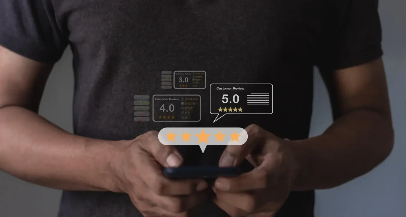
What App Features Make Users Write Positive Reviews?