Did you know that 94% of users form their first impression of a brand based on visual design alone? That single statistic tells us everything we need to know about app branding—it's not just nice to have, it's make or break. I've watched countless brilliant app ideas fail simply because they looked like they belonged to someone else's company, confusing users and diluting brand recognition in the process.
When your mobile app doesn't match your brand, you're essentially asking customers to trust two different companies instead of one cohesive experience. This disconnect can seriously damage user confidence and make your business appear unprofessional or scattered. The good news? Getting brand consistency right across your mobile app isn't rocket science—it just requires a methodical approach and attention to detail.
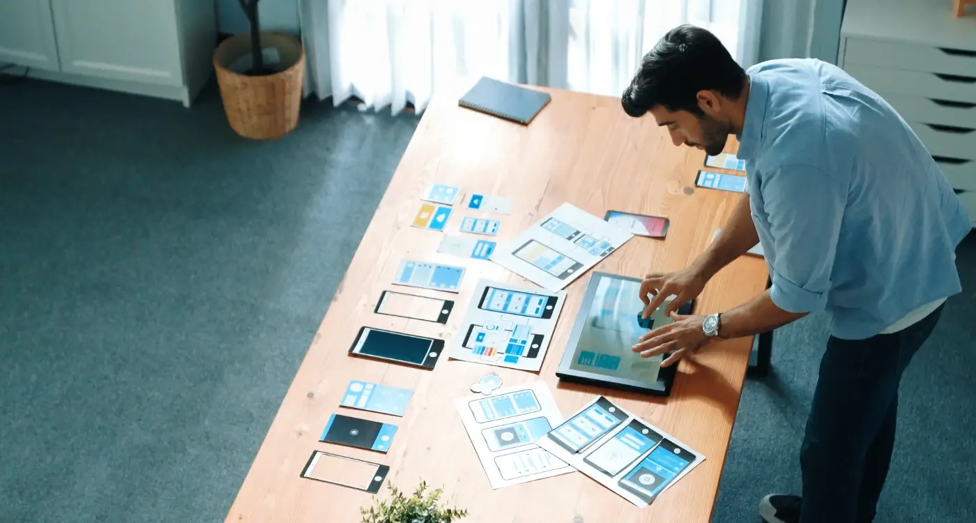
Your app is often the most intimate touchpoint between your brand and your customers, living right there on their home screen alongside their most trusted applications
Throughout this guide, we'll walk through the practical steps needed to create seamless brand consistency across your mobile application. From understanding your core brand identity to implementing those elements in ways that feel natural on mobile devices, you'll learn how to build an app that strengthens rather than weakens your overall brand presence. Whether you're launching your first corporate app or redesigning an existing one, these strategies will help you create a mobile experience that feels authentically yours.
Understanding Your Brand Identity
Before you even think about colours, fonts, or button styles, you need to get crystal clear on what your brand actually is. I see so many clients skip this step—they're excited to jump straight into the visual stuff, but that's like trying to paint a house before you've built the foundation.
Your brand identity isn't just your logo or company colours. It's the personality of your business, the feelings you want people to have when they interact with you, and the promises you make to your customers. Think about it this way: if your brand was a person, what would they be like? Would they be friendly and chatty, or professional and serious? Would they crack jokes or stick to the facts?
Core Elements That Define Your Brand
- Your mission and values—what you stand for
- Your target audience—who you're actually talking to
- Your brand personality—how you communicate
- Your unique selling point—what makes you different
- Your brand voice—the tone you use in all communications
Once you've mapped these out clearly, everything else becomes much easier. Your app design decisions will have a solid foundation to build on, and you'll avoid that scattered, inconsistent feel that screams "we didn't think this through properly." Understanding your target audience is particularly crucial here, which is why many successful companies invest time in learning how to create detailed user personas before making any design decisions.
Defining Your App's Visual Language
Your app's visual language is the way it communicates without words—through colours, shapes, icons, and imagery. Think of it as your brand's personality showing through every screen and button. Getting this right is what separates professional corporate app design from something that looks like it was thrown together over a weekend.
I've worked with companies who thought they could skip this step and jump straight into development. Big mistake! Without a clear visual language, you end up with an app that feels disconnected from your brand. Users open it and think "who made this?" instead of recognising your company straight away.
Key Elements of Your Visual Language
- Colour palette that matches your brand guidelines
- Icon style and visual treatment
- Photography and illustration approach
- Button styles and interactive elements
- Spacing and layout principles
The trick is making sure everything feels connected. Your app shouldn't look like a completely different company made it. Every visual choice should reinforce your brand identity and help users feel at home with your business app branding. This is particularly important when considering elements like your app name, which should align with your overall brand strategy to maintain consistency across all touchpoints.
Create a visual mood board before you start designing. Collect examples of colours, textures, and styles that represent your brand—this becomes your north star for all design decisions.
Creating Consistent User Interface Elements
The difference between a professional app and one that looks homemade often comes down to consistency—and I can spot the difference within seconds of opening an app. When buttons look different on every screen, or when some icons are rounded whilst others are sharp and angular, users notice. They might not say anything, but trust me, they feel it.
Establishing Your Element Library
Start by creating a library of your core interface elements before you build anything else. This means deciding how your buttons will look, what style your input fields will have, and how your navigation elements will behave. Will your buttons have rounded corners or sharp edges? Are they flat or do they have shadows? These decisions need to be made once and then stuck to religiously across every single screen.
The Power of Repetition
Once you've defined these elements, use them everywhere—don't create new variations just because you fancy a change. Your users learn how your app works through repetition. When they see a blue button, they should know exactly what will happen when they tap it. When every screen follows the same patterns, people can focus on using your app rather than figuring out how it works. That's when your brand really starts to shine through. Avoiding these inconsistencies is just one way to sidestep the most common pitfalls in branded app development.
Aligning Typography and Colour Schemes
Getting your typography and colours to work together is where the magic happens in app branding. I've seen brilliant apps fall flat because their font choices clashed with their colour palette—it's like wearing a striped shirt with polished dots, technically possible but not advisable! Your typography needs to complement your brand colours, not fight against them.
Choosing Fonts That Support Your Brand
Start with your existing brand fonts if you have them. Most companies already have typography guidelines from their website or marketing materials. The trick is adapting these for mobile screens where readability becomes even more critical. Sans-serif fonts typically work better on smaller screens, but don't abandon your brand's personality for the sake of convention.
Creating Colour Harmony
Your colour scheme should create a visual hierarchy that guides users through your app naturally. Primary colours for main actions, secondary colours for supporting elements, and neutral tones for backgrounds and text—this creates a cohesive system that reinforces your corporate app design.
The best brand consistency mobile app designs feel effortless because every colour and font choice works together like a well-rehearsed team
Test your colour and typography combinations across different devices and lighting conditions. What looks perfect on your computer screen might be unreadable on a phone in bright sunlight. Business app branding succeeds when users can engage with your content comfortably in any environment.
Building Brand Recognition Through User Experience
Here's something I've learnt after years of building apps—people don't just remember what your app looks like, they remember how it made them feel. That feeling? That's your brand doing its job through user experience. When someone opens your app and everything just works the way they expect it to, that's not luck; that's good UX design working hand in hand with your brand identity.
Think about the apps you love using. I bet they all have something in common—they feel consistent every time you use them. The buttons respond the same way, the navigation makes sense, and you never feel lost or confused. This consistency builds trust, and trust builds brand recognition. Understanding why user experience takes precedence over visual interface design is crucial for creating this kind of meaningful brand connection.
Key UX Elements That Strengthen Brand Recognition
- Smooth animations that match your brand personality—playful brands use bouncy transitions, professional brands keep things subtle
- Consistent feedback when users tap buttons or complete actions
- Error messages written in your brand voice
- Loading screens that use your brand colours and style
- Onboarding flows that introduce your brand values naturally
The magic happens when users can recognise your app just from how it behaves, not just how it looks. When your UX patterns become familiar—when people know exactly where to find what they need—you've created something much more valuable than a pretty interface. You've created a branded experience that sticks in their minds long after they've closed the app.
Maintaining Brand Standards Across Different Devices
Your app branding looks brilliant on your iPhone during testing, but what happens when someone opens it on their massive Android tablet? Or their tiny smartwatch? This is where many business app branding efforts fall apart—what works on one screen doesn't automatically work on another.
The challenge isn't just about size; it's about context. People use phones while walking, tablets while lounging, and wearables while exercising. Your brand needs to adapt without losing its identity. I've seen too many apps that look professional on phones but become cluttered messes on tablets, or worse, completely unreadable on smaller screens.
Device-Specific Brand Adaptations
Different devices need different approaches to maintain brand consistency mobile app users expect:
- Phones: Focus on single-handed use and thumb-friendly navigation
- Tablets: Utilise extra space for enhanced brand elements and detailed layouts
- Wearables: Strip back to brand essentials—colour and simple iconography
- Desktop: Expand your brand presence with larger imagery and comprehensive layouts
Create a brand scaling guide that shows how your logo, colours, and key elements should adapt at different sizes. This saves time and prevents inconsistencies across your development team.
Testing Your Brand Across Platforms
Corporate app design requires rigorous testing on actual devices, not just simulators. Your brand's blue might look perfect on one screen but appear purple on another due to different display technologies. Regular testing across multiple devices and operating systems helps catch these issues before your users do.
Testing and Refining Your Brand Implementation
Getting your brand right in an app isn't a one-and-done job—it's something you need to test and tweak over time. I've worked with clients who thought their branding was perfect, only to discover through user testing that people weren't connecting with it at all. That's why testing your brand implementation is just as important as getting the functionality right.
User Feedback and Real-World Testing
Start by showing your app to real people who match your target audience. Watch how they interact with it and ask specific questions about what they think your brand represents. Do they understand what your company does? Does the app feel trustworthy to them? Their answers might surprise you—and that's a good thing because it means you're learning something valuable.
Making Data-Driven Improvements
Look at your app analytics to see where people are dropping off or getting confused. Sometimes a colour that looks great to you might be hard for users to see, or your logo might be too small on certain screens. The beauty of digital products is that you can make changes relatively quickly. I always tell my clients that launching is just the beginning—the real work starts when people begin using your app and giving you feedback about how well your brand comes through. This ongoing refinement process is essential for building long-term brand value and maximising your app's ROI.
Conclusion
Getting your app branding right isn't just about making things look pretty—it's about creating something that feels unmistakably yours. I've watched countless businesses struggle with this over the years, and the ones that succeed are those who treat their app as an extension of their brand, not a separate entity entirely.
The work doesn't stop once your app launches either. Brand consistency mobile app development is an ongoing process that requires regular attention and refinement. Your brand will evolve, your users' expectations will change, and your app needs to keep pace with both. What matters most is that you've built a solid foundation that can adapt whilst maintaining its core identity.
Corporate app design success comes down to paying attention to the details that others might overlook. The micro-interactions, the loading screens, the error messages—these seemingly small moments are where your brand really lives. They're the touchpoints that either reinforce your brand values or undermine them completely.
Business app branding isn't rocket science, but it does require commitment and consistency. If you've followed the steps we've covered, you're well on your way to creating an app that doesn't just function well—it represents your brand authentically and memorably.