Have you ever wondered why some brands feel completely disconnected when you switch from their website to their mobile app? After eight years of designing and developing mobile apps, I can tell you this question comes up in almost every client meeting. Business owners are torn between creating something fresh for mobile users and maintaining that familiar brand feeling people know and love.
The short answer is: it depends. I know that's not what you wanted to hear, but stick with me because the long answer is much more useful. Your mobile app and website don't need to be identical twins, but they shouldn't be complete strangers either. There's a sweet spot where your visual identity stays strong whilst your mobile app gets to be its own thing.
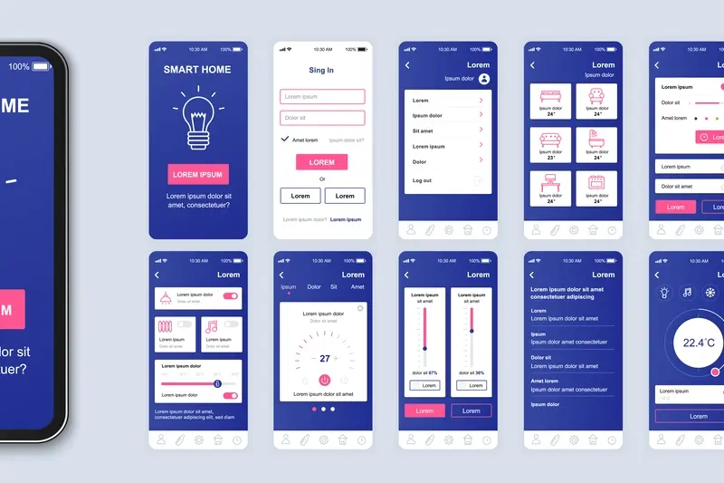
The best apps feel like a natural extension of the brand, not a completely different company
Throughout this guide, we'll explore when matching designs makes perfect sense for your business and when breaking away actually strengthens your brand. We'll look at which elements absolutely must stay consistent to maintain that all-important brand alignment, and which ones you can safely change to create a better mobile experience. By the end, you'll know exactly how to approach your mobile app design decisions with confidence.
Understanding Brand Alignment Between Apps and Websites
Brand alignment is basically making sure your app and website feel like they belong to the same company. Think of it like wearing a school uniform—everyone knows which school you attend just by looking at you. Your brand works the same way across different platforms.
When someone visits your website and then downloads your app, they should instantly recognise it's yours. This doesn't mean everything has to look identical, but there should be clear connections. Your logo, colours, fonts, and overall personality need to shine through on both platforms.
Why Brand Consistency Matters
Users build trust through familiarity. If your app looks completely different from your website, people might think they've downloaded the wrong thing—or worse, something dodgy. I've seen businesses lose customers simply because their app felt like it came from a different company entirely.
Strong brand alignment also makes your business look professional and established. When everything feels connected, users are more likely to trust you with their time, money, and personal information.
The Reality of Different Platforms
Here's the thing though—apps and websites work differently. Your website might need detailed navigation menus, whilst your app should prioritise quick actions. The platforms have different strengths, different user expectations, and different technical limitations. Smart brand alignment recognises these differences whilst maintaining that recognisable thread throughout.
The Psychology of User Experience Across Platforms
People's brains work differently when they're using a phone compared to a laptop or desktop computer. I know this sounds obvious, but you'd be surprised how many businesses don't account for this when designing their mobile app. When someone opens your app, they're usually in a different mindset than when they visit your website—they might be walking, waiting for a bus, or lying in bed.
The psychology behind this is quite straightforward. Mobile users expect things to happen quickly and with minimal effort. They're often multitasking or have limited attention spans. Your website visitors, on the other hand, might be sitting at their desk doing proper research or making careful comparisons between different options.
Different Expectations, Same Brand Values
This doesn't mean your mobile app should feel like a completely different company though. Your visual identity and brand alignment need to remain strong across both platforms. The colours, fonts, and overall feeling should be recognisable—but the way people interact with these elements will be different.
Think about how someone holds their phone versus how they use a mouse. Thumbs work differently than fingers clicking. The screen is smaller. The context is more personal and immediate.
Users form an opinion about your app within the first 10 seconds of use, so make sure your brand feels familiar whilst being optimised for mobile behaviour.
When Matching Makes Sense for Your Business
Right, let's talk about when keeping your app and website designs consistent makes absolute business sense. I've worked with plenty of companies over the years—from tech startups to high street retailers—and there are definitely patterns that emerge.
Brand Recognition Is Your Priority
If you've spent years building brand recognition through your website, throwing that away with a completely different app design is frankly daft. Think about banks, insurance companies, or any service where trust matters. People need to instantly recognise your brand when they open your app; that familiarity breeds confidence and reduces friction.
Your existing customers already know how to navigate your website—they understand your visual language, your button styles, your colour scheme. When they download your app and see the same design elements, they don't have to learn a new system. They can jump straight in and get things done.
When Consistency Drives Conversions
Here's what I've noticed: businesses with complex customer journeys benefit massively from matched designs. If someone starts shopping on your website during lunch break, then finishes the purchase on your app during their commute home, that seamless visual transition keeps them in the buying mindset.
- E-commerce platforms with frequent cross-platform usage
- Financial services where trust and security matter most
- Subscription services with ongoing customer relationships
- B2B platforms where users switch between devices regularly
The key question is simple: does your business rely on customers moving between your website and app regularly? If yes, matching designs will serve you well.
When Different Designs Work Better
Sometimes the best thing you can do for your mobile app is make it look completely different from your website. I know that sounds counterintuitive when we're talking about brand alignment, but hear me out—there are times when breaking away from your website design is the smartest move you can make.
If your website is cluttered or designed for desktop-first experiences, copying that design onto a mobile app would be a disaster. Mobile screens are tiny; they need clean, simple interfaces that work with thumbs, not mouse cursors. Your visual identity can stay intact whilst the actual design gets a complete makeover.
When Your Industry Demands It
Banking apps are a perfect example. Most bank websites look formal and corporate—lots of text, complex navigation, multiple columns. But their mobile apps? Clean, minimal, focused on quick tasks. The branding stays consistent through colours and logos, but the design approach is completely different.
Different doesn't mean disconnected—your app can have its own personality whilst still being part of the family
Gaming companies do this brilliantly too. Their websites might be promotional and flashy, but their actual game interfaces are designed purely for gameplay. The brand comes through in subtle ways rather than dominating the screen.
Core Elements That Should Stay Consistent
Right, let's talk about the elements that absolutely must stay the same across your app and website—no matter what design direction you choose. These are the building blocks of your brand that users rely on to recognise you instantly.
Your Brand Identity Foundation
Your logo comes first, obviously. It should look the same everywhere, though you might need different sizes or simplified versions for small app icons. Your colour palette is next—and I mean the exact hex codes, not just "sort of blue". People notice when colours are off, even if they can't put their finger on why something feels wrong.
Typography matters more than most people think. You don't need identical fonts everywhere (mobile has different requirements) but they should feel related. If your website uses a bold, modern typeface, your app shouldn't suddenly go serif and traditional.
Voice and Messaging
This one's huge. Your brand personality—whether you're friendly and casual or professional and authoritative—needs to come through in both places. The way you write button text, error messages, and help content should sound like it's coming from the same company.
Brand values and positioning stay consistent too. If you're the "simple solution" on your website, don't become the "feature-packed powerhouse" in your app store listing. Users get confused, and confused users don't convert.
What Can Be Different Without Breaking Brand Trust
Now this is where things get interesting—and where I see a lot of businesses get nervous for no good reason. The truth is, quite a lot can be different between your mobile app and website without damaging your brand. Navigation is the big one; mobile screens are tiny compared to desktop monitors, so your app needs a completely different approach to moving users around. Nobody expects the same menu system on their phone as they use on their laptop.
Layout flexibility is another area where you have loads of room to play. Your website might have a three-column layout that works brilliantly on desktop, but your mobile app will need everything stacked vertically. That's not breaking brand trust—that's smart design. Content hierarchy can shift too; what's most important on your website might not be the priority in your app, and that's perfectly fine.
Interactive Elements That Can Change
Buttons, forms, and interactive features can look and behave quite differently without confusing users. Mobile apps have gestures like swiping and pinching that websites don't use. Your visual identity stays strong through colours and typography, not through identical button shapes.
Focus on keeping your brand colours, fonts, and logo treatment consistent—everything else can adapt to work better on mobile without losing brand recognition.
Making the Right Choice for Your Mobile App
After working with hundreds of businesses over the years, I've noticed that the companies who make this decision thoughtfully—rather than rushing into it—almost always end up happier with the results. The truth is, there's no universal right answer that works for every business.
Start With Your Users
Your users should be at the centre of this decision. Think about how they interact with your brand across different platforms. Do they switch between your website and app frequently during the same task? If yes, keeping designs closely matched will make their experience smoother. But if your app serves a completely different purpose—like a gaming app for a news website—then different designs might work better.
Consider Your Resources
Let's be realistic about budgets and timelines. Matching designs exactly often costs more upfront because you're adapting elements that weren't designed for mobile. Creating a custom app design that follows your brand guidelines might actually be more cost-effective and deliver better user experience.
My advice? Don't get caught up in what other companies are doing. Focus on what makes sense for your specific situation, your users, and your business goals. The best choice is the one that serves your users well whilst staying true to your brand identity—whether that means matching your website exactly or taking a different approach entirely.
Conclusion
After working with countless brands on their mobile app projects, I can tell you there's no one-size-fits-all answer to whether your app design should match your website design. Some of our most successful projects have been perfect twins of their websites, whilst others have taken completely different visual paths—and both approaches worked brilliantly.
What matters most is understanding your users and your business goals. If your customers expect seamless consistency when they move from your website to your mobile app, then matching designs will strengthen that trust. But if your app serves a different purpose or your mobile users have different needs, then breaking away from your website design might be the smarter choice.
The key is maintaining your core visual identity elements—your colours, fonts, and logo—whilst being flexible with everything else. Your mobile app doesn't need to be a carbon copy of your website to maintain brand alignment; it just needs to feel like it belongs to the same family.
At the end of the day, your users should never question whether they're using the right brand's app. Whether you choose matching designs or different ones, that sense of brand recognition should always be crystal clear.
