How Do You Design for Different Wearable Form Factors?
Have you ever tried using an app designed for your phone on a smartwatch? It's bloody awful, isn't it? Text that's impossibly small, buttons you can't actually press, and navigation that makes you want to throw the thing across the room. Yet somehow, we're still seeing developers treat wearable design like it's just a tiny version of mobile—and that's where everything goes wrong.
I've been working on wearable applications since the early days when everyone thought smartwatches would just be miniature smartphones strapped to our wrists. What a mistake that was! Each wearable form factor comes with its own unique challenges, constraints, and opportunities. A fitness band isn't just a small smartwatch; it's a completely different beast with different usage patterns, screen limitations, and user expectations.
The thing is, designing for wearables requires you to throw out most of what you know about traditional app design. We're talking about devices with screens smaller than a postage stamp, battery life measured in days not hours, and users who might be running, driving, or doing something else entirely when they interact with your interface. And that's just smartwatches—wait until we get into smart rings with their microscopic displays or AR glasses where the entire world becomes your canvas.
The best wearable interfaces are the ones you barely notice—they deliver exactly what you need, exactly when you need it, without making you think twice about how to use them
Each form factor demands its own approach to layout, interaction, and information hierarchy. What works on a 44mm Apple Watch will be completely useless on a fitness band with a 0.96-inch display. Understanding these differences—and designing for them from the ground up—is what separates successful wearable apps from the ones that get deleted after the first frustrating experience.
Understanding Wearable Form Factor Basics
Right, let's talk about wearables—and I mean properly talk about them. After designing apps for everything from tiny fitness bands to chunky VR headsets, I can tell you that the biggest mistake developers make is treating wearables like miniature phones. They're not. They're completely different beasts with their own rules.
Each wearable form factor comes with its own constraints and opportunities. A smartwatch screen might give you 1.4 inches to work with, whilst a smart ring has basically no visual interface at all. The key is understanding what each device does best and designing around those strengths rather than fighting against the limitations.
Screen Real Estate Realities
When you're working with wearables, screen space becomes your most precious resource. I've seen brilliant app ideas completely fail because developers tried to cram too much information onto a watch face. The golden rule? If users need to squint or tap multiple times to complete a basic task, you've already lost them.
Different wearables have vastly different interaction models too. Smartwatches rely heavily on touch and voice; fitness bands often use simple button presses and swipes; whilst smart rings depend entirely on gestures and haptic feedback. Understanding these interaction patterns early in your design process will save you weeks of painful revisions later.
- Smartwatches: 1-3 inches, touch and voice primary
- Fitness bands: 0.5-1 inch, limited touch interaction
- Smart rings: No screen, gesture and haptic only
- AR glasses: Overlay interface, eye tracking potential
- Smart clothing: Integrated sensors, minimal direct interface
The battery life constraints on wearables are also much more severe than phones. Users expect their watch to last at least a day, preferably longer. This means every animation, every background process, every notification needs to be optimised for power efficiency from day one.
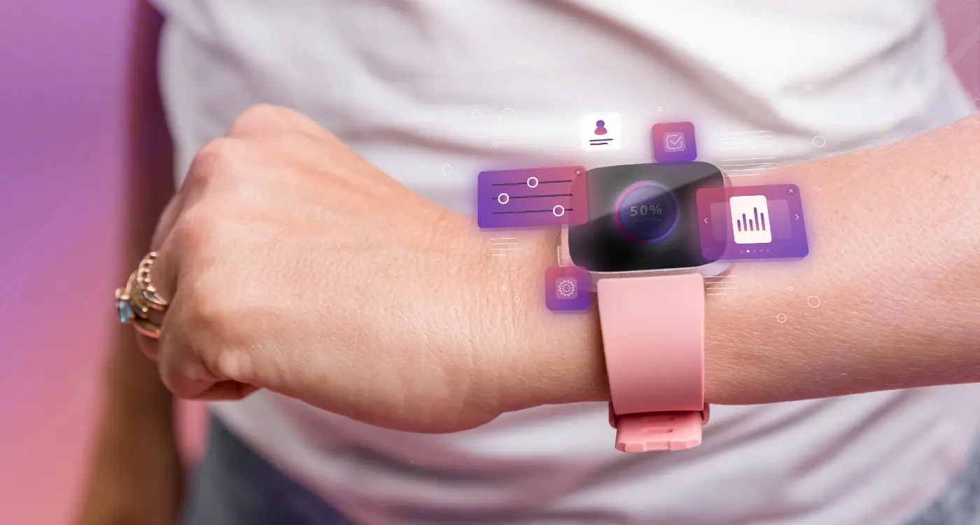
Smartwatch Design Principles
Right, let's talk about smartwatches—they're probably the most complex wearable form factors you'll design for. I've worked on dozens of smartwatch apps over the years, and honestly? They'll test every design principle you think you know. The screen real estate is tiny, users interact with them differently than phones, and battery life constraints mean every design decision has consequences.
The biggest mistake I see is designers trying to shrink down their phone app interface. That's like trying to fit a sofa through a letterbox—it just doesn't work! Smartwatches need their own design language. Users glance at them for 2-3 seconds max, so your interface needs to communicate information instantly. No scrolling through menus or hunting for buttons.
Design for the "glance test"—if users can't get what they need in under 3 seconds, your interface is too complex for a smartwatch.
Navigation That Actually Works
Forget complex navigation structures. Smartwatches work best with these patterns:
- Single-screen apps that show one key piece of information
- Simple swipe gestures—left, right, up, down
- Large touch targets (minimum 44px) because fingers are clumsy on tiny screens
- Crown or bezel input for scrolling without covering the screen
- Voice commands for quick actions
Battery life is always a concern with wearables, so design with power efficiency in mind. Dark themes save battery on OLED screens, and reducing screen wake-ups helps too. I always recommend using the watch's built-in complications and notifications rather than forcing users to open your full app—that's where the real value lies for most smartwatch experiences.
Device compatibility across different smartwatch platforms means understanding each ecosystem's strengths. Apple Watch excels at health integration, Wear OS gives you more flexibility, and Fitbit focuses on fitness tracking. Design for the platform's strengths, not against them.
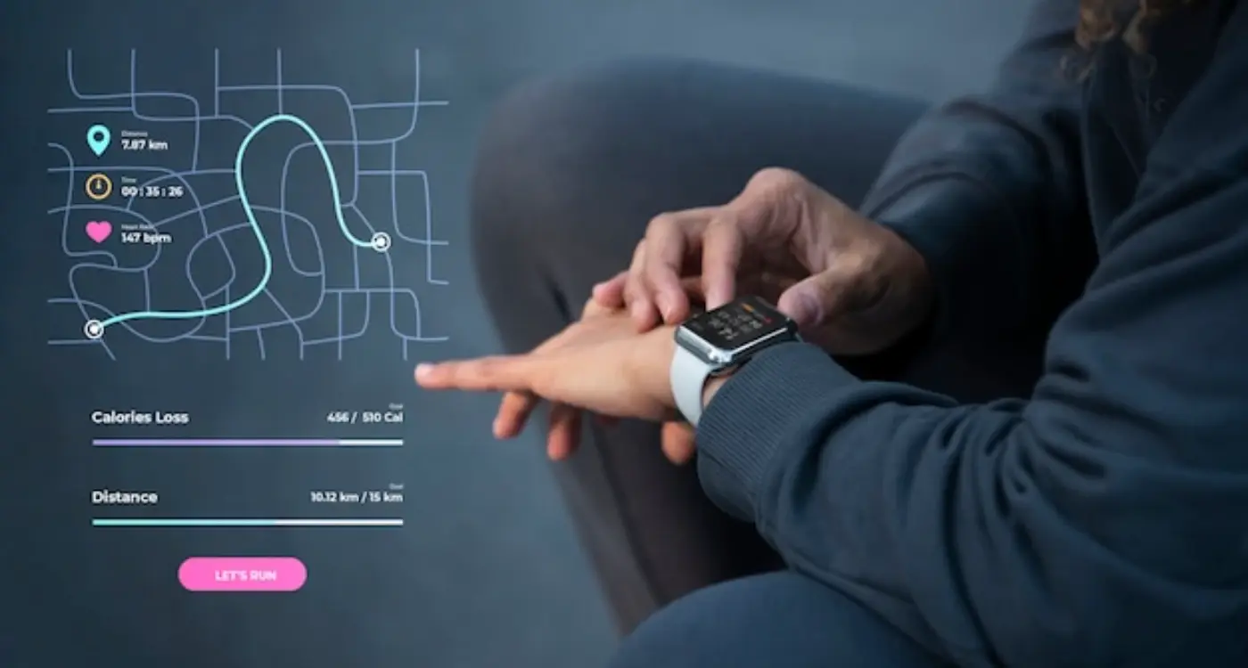
Fitness Band Interface Challenges
Fitness bands are probably the most challenging wearables to design for—and I mean that in the best possible way. You've got this tiny rectangular screen, maybe 1.4 inches if you're lucky, and users expect to do everything from checking messages to tracking workouts. It's a bit mad really, but that's what makes it interesting.
The main issue with fitness bands is screen real estate. You can't just shrink down a phone interface and expect it to work; trust me, I've seen teams try this approach and it never ends well. Instead, you need to think in terms of glanceable information. Users are typically moving when they check their band—running, cycling, or just walking between meetings. They need information fast and they need it clear.
Priority-Based Information Hierarchy
Here's what I've learned works best for fitness band interfaces: create a strict information hierarchy based on user context. When someone's mid-workout, they don't care about their calendar—they want heart rate, time elapsed, and maybe pace. But during normal daily use? Step count, notifications, and time become priority.
- Primary data: Time, steps, heart rate (context dependent)
- Secondary data: Notifications, calories, distance
- Tertiary data: Weather, calendar, settings
- Emergency access: Always-available back/home gesture
The navigation needs to be dead simple too. Most fitness bands rely on swipe gestures and maybe one or two physical buttons. You can't have complex menu systems—users will get frustrated and give up. I usually recommend a horizontal swipe for main functions and vertical swipe for details within each function. Keep it consistent across all screens; muscle memory is your friend here.
Smart Ring and Tiny Screen Solutions
Smart rings represent one of the most challenging form factors I've ever worked with—and honestly, they push you to rethink everything you know about interface design. We're talking about screens that are sometimes smaller than your fingernail, which means every single pixel matters. The key thing to understand is that smart rings aren't trying to be tiny smartphones; they're notification devices that need to communicate information instantly and clearly.
When designing for smart rings, I focus on three core elements: single-purpose interactions, high contrast visuals, and gesture-based navigation. You simply can't fit complex menus on these devices. Instead, each screen should communicate one piece of information clearly—whether that's a heart rate reading, a text notification, or a simple yes/no prompt. The user interface needs to be readable at a glance, which means large fonts, bold colours, and minimal text.
Making Micro-Interactions Work
The interaction model for smart rings is completely different from other wearables. Users typically interact through taps, swipes, or even rotating the ring itself. I've found that haptic feedback becomes crucial here—users need to feel when they've successfully triggered an action because the visual feedback space is so limited. The device needs to communicate through touch as much as through sight.
The constraint of tiny screens forces you to focus on what truly matters to users, stripping away everything that isn't essential to the core experience.
Battery life considerations also heavily influence design decisions with smart rings. Since these devices are so small, every animation and screen activation drains precious power. This means designing interfaces that can communicate effectively with static displays and minimal screen time—but that doesn't mean they have to be boring or ineffective.
AR and VR Headset Considerations
Designing for AR and VR headsets is completely different from any other wearable I work with. We're talking about immersive environments where traditional UI rules don't just bend—they break entirely. The user isn't looking at a screen; they're inside your interface.
The biggest challenge? Spatial design thinking. Users can look up, down, behind them, anywhere really. Your interface elements need to work in 3D space, which means considering depth, distance, and how objects behave when users move their heads. I've seen so many VR apps fail because designers treated them like flat mobile interfaces floating in space—it's bloody uncomfortable to use.
Key Design Considerations
- Text legibility at different distances and angles
- Eye strain prevention through proper contrast and sizing
- Hand tracking accuracy and gesture recognition
- Audio spatial design for directional feedback
- Motion sickness prevention through smooth transitions
- Battery life impact of graphics-heavy interfaces
For AR specifically, you're overlaying digital content onto the real world. This means your interface needs to adapt to different lighting conditions, surface textures, and environmental factors. A button that looks perfect in your studio might be invisible outdoors on a sunny day.
VR gives you complete control over the environment, but with that comes the responsibility to create comfortable experiences. Users can't just glance away like they would with their phones—they're committed to your world until they physically remove the headset.
Performance and Comfort
The technical constraints are serious here. Frame rates below 60fps cause nausea, and headsets have limited processing power compared to desktop computers. Every visual element needs to be optimised without sacrificing the immersive experience that makes AR and VR compelling in the first place.
Smart Clothing and Textile Integration
Smart clothing is where things get really interesting—and honestly, a bit mental when you think about it. We're literally embedding technology into the fabric we wear, which opens up completely new possibilities for wearable form factors. But it also creates some unique design challenges that traditional app developers haven't had to think about before.
The main thing with smart textiles is that your interface might not have a screen at all. Instead, you're working with haptic feedback, LED patterns woven into fabric, or conductive threads that respond to touch. I've worked on projects where the "interface" was literally a sleeve that users could swipe or tap, with feedback coming through gentle vibrations or colour changes in the material itself.
Always design smart clothing interfaces with washing and wear in mind—your beautiful LED pattern means nothing if it breaks after the first trip through the washing machine.
Device compatibility becomes really complex here because you're not just dealing with different screen sizes; you're dealing with completely different input methods. A smart jacket might communicate through gesture recognition, while smart socks might only provide data output through connected apps on phones or watches.
Key Design Considerations for Smart Textiles
- Durability during normal clothing care (washing, drying, ironing)
- Comfort and breathability alongside electronic components
- Power management and charging solutions that don't interfere with wearing
- Intuitive interaction methods that feel natural to clothing
- Clear feedback systems when traditional visual cues aren't available
The responsive design principles we use for wearable layouts need to be completely rethought for textiles. You're designing for body movement, fabric stretch, and the fact that your "device" might be folded, twisted, or compressed during normal use. It's quite mad really, but that's what makes it so exciting to work on.
Cross-Device Compatibility Strategies
Getting your wearable app to work properly across different devices? It's honestly one of the trickiest parts of wearable development. I mean, you're dealing with smartwatches, fitness bands, smart rings—each with completely different screen sizes, processing power, and user expectations. But here's the thing: users don't care about your technical challenges; they just want things to work smoothly.
The key is building what I call a "flexible core"—basically a central system that can adapt its interface and features based on what device its running on. Think of it like having one brain that can speak different languages depending on who it's talking to. Your fitness tracking app might show detailed charts on a smartwatch, simple progress bars on a fitness band, and just haptic feedback on a smart ring.
Universal Design Principles That Actually Work
I've learned that certain design approaches work across almost all wearable form factors. Keep your core functions simple and consistent—if someone can pause their workout on their watch, they should be able to do the same gesture on their band. Use progressive disclosure too; show the most important info first, then let users dig deeper if their device supports it.
- Design for the smallest screen first, then scale up
- Use consistent gesture patterns across all devices
- Keep core functions identical—only vary the interface
- Test data sync between devices religiously
- Build fallback options for limited-capability devices
The biggest mistake I see? Trying to cram the same interface onto every device. A smart ring doesn't need the same visual complexity as a smartwatch, and thats perfectly fine. Embrace each device's strengths instead of fighting against their limitations.
Testing Across Multiple Wearables
Right, let's talk about the bit that nobody really wants to do but absolutely has to happen—testing your wearable app across different devices. And bloody hell, there are a lot of them these days. From tiny fitness bands with screens smaller than a postage stamp to full-blown AR headsets that cost more than most people's cars.
The thing is, you can't just build for one device and hope it works everywhere else. I mean, you could try, but you'll end up with some pretty angry users. Each wearable form factor brings its own quirks and limitations that you need to account for during testing.
Device Compatibility Testing Strategy
Start with the most popular devices in your target market—usually that means the latest Apple Watch and a couple of Samsung Galaxy Watch models. But don't stop there. Your responsive design needs to work on older devices too, because not everyone upgrades every year. Test on devices with different screen sizes, processing power, and operating system versions.
For fitness bands, the challenge is completely different. These devices often have monochrome displays and limited input methods. What looks great on a smartwatch might be completely unusable on a Fitbit Charge. You need to test your wearable layouts on actual hardware, not just simulators.
Testing on real devices reveals issues that emulators simply can't replicate—from battery drain patterns to how your interface performs under bright sunlight during a morning run.
The key is building a comprehensive testing matrix that covers different screen sizes, interaction methods, and performance capabilities. Yes, it's time-consuming and yes, it means buying or borrowing a lot of devices. But it's the only way to ensure your app actually works in the real world across multiple wearable form factors.
After working with countless wearable projects—from basic fitness trackers to complex AR interfaces—I can tell you that designing for different form factors isn't just about shrinking your phone app. It's about completely rethinking how people interact with technology when its right there on their body.
The biggest mistake I see developers make? Treating all wearables the same way. A smartwatch interface that works beautifully might be completely useless on a fitness band; what makes sense on smart glasses could be impossible on a smart ring. Each form factor has its own personality, its own constraints, and honestly, its own temperamental users who expect very specific things.
You know what really matters though? Understanding that wearable design is fundamentally about context. People aren't sitting down with focused attention like they do with their phones—they're running, cooking, in meetings, or half asleep checking their morning stats. Your interface needs to work in all these messy, real-world situations.
The technical stuff—battery life, processing power, connectivity—these are just the starting points. The real challenge is creating experiences that feel natural when someone's wearing your device for 16 hours a day. That means getting the interaction models right, making sure everything works across different devices, and testing with actual humans doing actual things.
But here's the thing that keeps me excited about wearable design: we're still figuring this out. The technology keeps evolving, user expectations keep shifting, and there's still so much room for genuinely clever solutions. Whether you're working on your first fitness app or designing the next generation of smart clothing, remember that great wearable design starts with understanding people, not just technology.
Share this
Subscribe To Our Learning Centre
You May Also Like
These Related Guides
How Do You Design User Interfaces for Tiny Wearable Screens?
How Should You Approach Typography in Wearable App Design?