
How Do You Design User Interfaces for Tiny Wearable Screens?
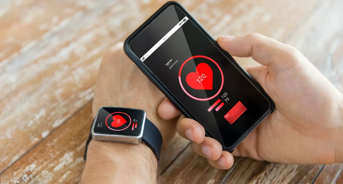
A surgeon glances at her smartwatch between procedures to check a patient's real-time vitals. The interface displays heart rate, blood pressure, and oxygen levels in a single, clear view. No scrolling needed. No confusion about what's urgent versus what can wait. This isn't science fiction—it's how wearable UI design can genuinely save lives when done properly.
But here's the thing: designing for smartwatches and fitness trackers isn't just about shrinking your mobile app interface. That's actually one of the biggest mistakes I see teams make when they first tackle wearable projects. The constraints are completely different, the user context has changed, and honestly? The rules we've learned from mobile design sometimes work against us on these tiny screens.
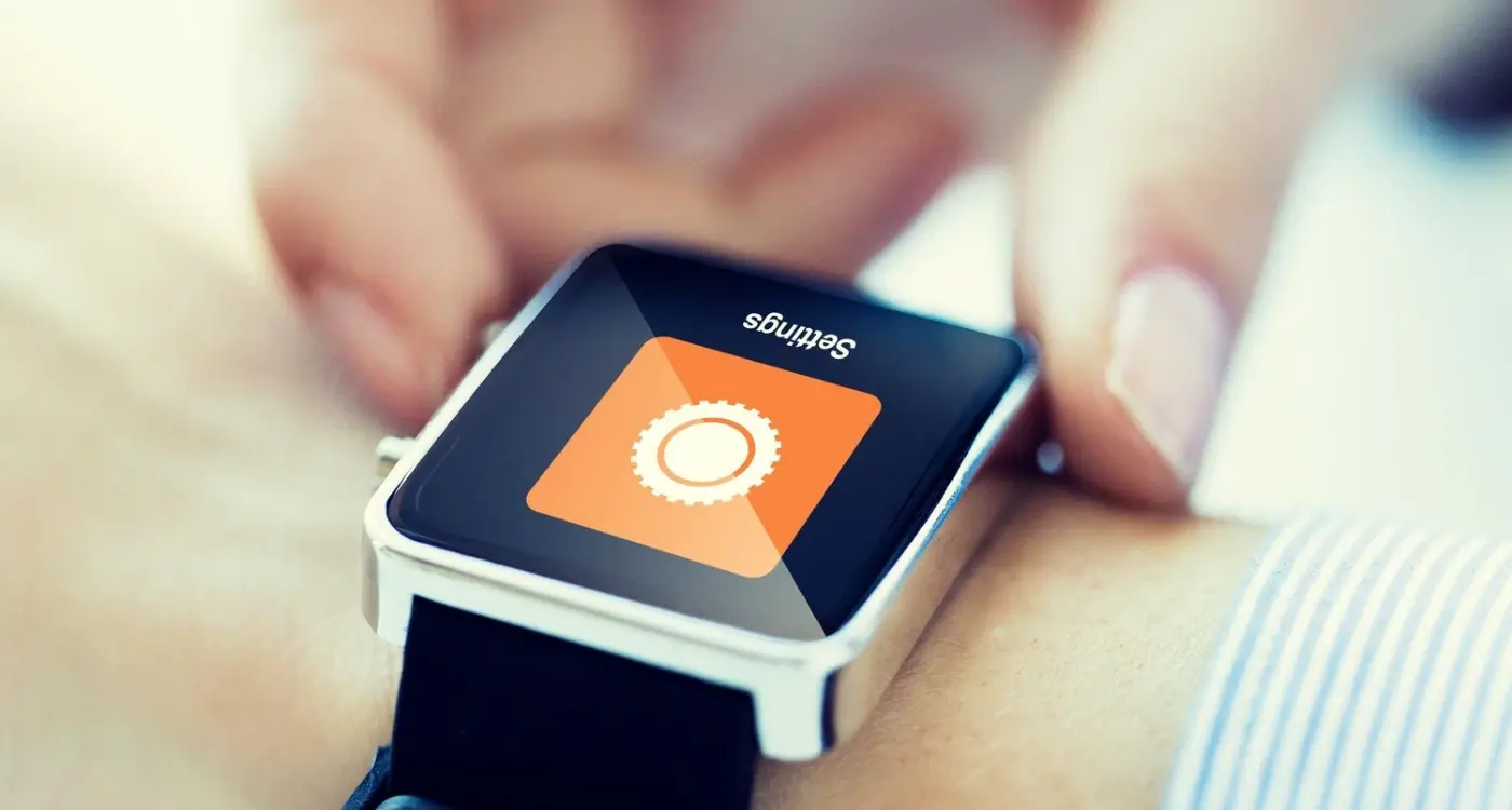
Wearable UI design requires a complete shift in thinking. We're talking about screens that might be smaller than a postage stamp, users who are often moving or distracted, and interactions that need to happen in seconds rather than minutes. Every pixel counts. Every tap needs to be deliberate. And if someone has to squint or struggle to understand your interface, you've already lost them.
The best wearable interfaces feel invisible—they deliver exactly what users need without making them think about how to get it
Over the years, I've worked on wearable projects across healthcare, fitness, and enterprise sectors. Each one taught me that successful small screen interface design isn't about technical limitations—it's about understanding human behaviour at a fundamental level. Users interact with wearables differently than they do with phones. The context matters. The urgency matters. And getting this right means rethinking everything we know about creating digital experiences.
When I first started working on wearable interfaces, I genuinely thought it would be like designing for mobile phones but just... smaller. Bloody hell, was I wrong! Working with screens that are sometimes less than 2 inches wide brings challenges that'll make you rethink everything you know about interface design.
The biggest shock? Screen real estate isn't just limited—it's practically non-existent. You're working with displays where every single pixel matters; where a button that's perfectly clickable on a phone becomes impossible to tap accurately on a watch. I mean, try hitting a 10-pixel target with your finger when you're walking down the street—it's not happening.
The Context Problem
But here's what really gets tricky: wearables are used in completely different contexts than phones. People glance at their smartwatch whilst jogging, check notifications during meetings, or try to read messages while carrying shopping bags. The lighting conditions change constantly, their hands might be shaking from exercise, and they've got maybe 3-5 seconds of attention to give you.
Battery life adds another layer of complexity that mobile designers don't usually worry about. Every animation, every bright colour, every second the screen stays on drains precious power. I've seen beautifully designed watch faces that users loved... until they realised it killed their battery by lunchtime.
Physical Constraints
Then there's the physical side—wearables need to work when your wrist is twisted at odd angles, when you're wearing gloves, or when the device is slightly loose on your wrist. The curved screens on some smartwatches mean content can literally disappear around the edges if you're not careful with your layout.
These constraints might sound limiting, but they actually force you to focus on what truly matters. No room for unnecessary features or complicated workflows—just pure, focused functionality.
The Foundation Principles of Small Screen Design
Designing for wearable screens isn't just about shrinking your mobile app down—it's a completely different beast. I mean, we're talking about screens that are sometimes smaller than a postage stamp! Over the years working on smartwatch interfaces, I've learned that the old rules of mobile design don't apply here. You need to throw out everything you think you know about UI design and start fresh.
The first principle? Less is absolutely more. And I can't stress this enough—every pixel counts on a wearable screen. When you've only got a tiny display to work with, you can't afford to waste space on decorative elements or unnecessary buttons. Your interface needs to be ruthlessly focused on the core action the user wants to take. Think about it—when someone glances at their smartwatch, they're usually looking for one specific piece of information, not browsing through menus.
Core Design Principles for Wearable UI
- Prioritise single-action interfaces over complex multi-step processes
- Use bold, high-contrast colours that remain visible in different lighting conditions
- Design for thumb interaction—buttons need to be large enough for finger taps
- Keep text minimal and scannable in under 3 seconds
- Leverage haptic feedback to confirm user actions without visual clutter
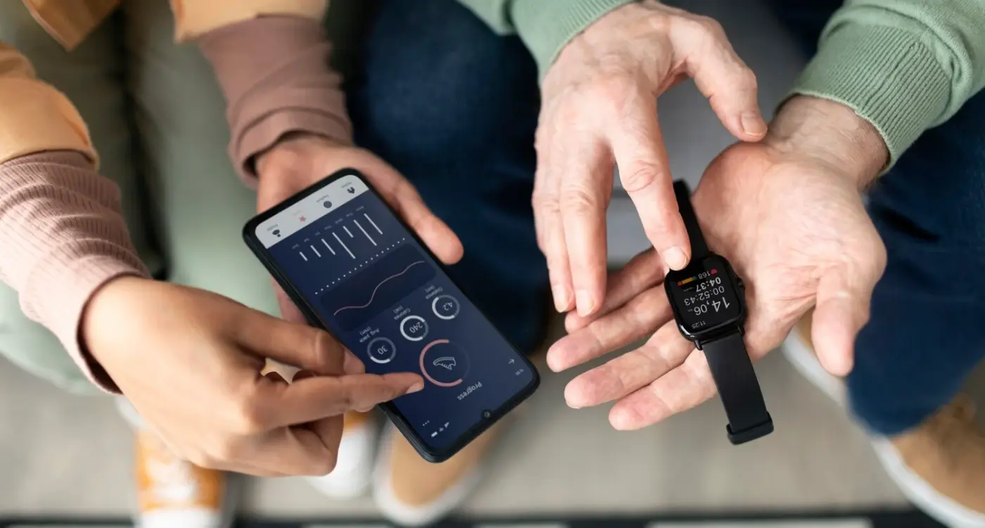
Another thing I've noticed working on wearable UX projects is that context becomes everything. Unlike phones where users might have time to explore, wearable interactions are often happening whilst people are walking, exercising, or driving. Your interface needs to work in these real-world scenarios, not just when someone's sitting at a desk testing it.
Always design your wearable interface assuming the user has just 2-3 seconds to complete their task—any longer and you've lost them.
The bottom line? Wearable UI design forces you to become incredibly disciplined about what really matters to your users. It's actually quite liberating once you get the hang of it.
Navigation That Works on Your Wrist
Right, let's talk about the elephant in the room—how do you create navigation that actually works on a screen thats barely bigger than a postage stamp? After years of building interfaces for smartwatches and fitness trackers, I can tell you that traditional navigation patterns simply don't translate to wearables. You cant just shrink down your mobile app's navigation bar and call it a day.
The key is to think in layers, not menus. Users shouldn't have to hunt through complex hierarchies on their wrist; they want to get in, get what they need, and get out. I've found that the most successful wearable apps use a maximum of three navigation levels—any deeper and users start getting frustrated with all the tapping and swiping.
The Three Navigation Patterns That Actually Work
- Swipe-based navigation for moving between main sections
- Crown or button scrolling for vertical lists
- Force touch or long press for contextual actions
- Voice commands for quick shortcuts
One thing I've learned (sometimes the hard way) is that wearable navigation needs to be predictable. Users aren't looking at their watch for minutes at a time like they do with phones—they're glancing for seconds. If they can't figure out how to navigate within those first few seconds, they'll give up.
Context is everything on wearables. The navigation should adapt based on when and how the user is interacting with the device. A fitness app might prioritise workout controls during exercise but switch to progress tracking when the user is stationary. Its about anticipating what the user needs before they even know they need it.
Content Hierarchy for Tiny Displays
Getting content hierarchy right on wearable screens is honestly one of the trickiest parts of small screen interface design. When you've only got about 40mm of real estate to work with, every pixel counts—and I mean that literally.
The biggest mistake I see in wearable UX design is trying to cram too much information onto one screen. It's tempting, I get it. You want to show everything at once because you think it's more convenient for users. But here's the thing: on a smartwatch interface, less really is more. Way more.
The Three-Level Rule
I've developed what I call the three-level rule for wearable UI design. Your content should never go deeper than three levels of information on a single screen. Primary information (like the time or main action), secondary details (notifications or quick stats), and tertiary elements (settings icons or minor actions). That's it.
Take a fitness tracking screen as an example. Your primary content is the current activity data—steps, heart rate, whatever. Secondary might be your daily goal progress. Tertiary could be a small settings cog in the corner. Anything beyond that? Save it for another screen entirely.
The key to successful wearable interfaces isn't showing more information—it's showing the right information at exactly the right moment
Visual weight becomes absolutely critical on these tiny displays. Your primary content needs to dominate the screen space, using larger fonts and high contrast. Secondary elements should be noticeably smaller but still readable. And those tertiary elements? Make them small enough that they don't distract but large enough that they're still tappable.
Remember, people glance at wearables for seconds, not minutes. Your content hierarchy needs to communicate its message in that brief moment when someone lifts their wrist.
Typography and Readability on Miniature Screens
Getting text right on a wearable screen is probably one of the trickiest parts of the whole design process. I mean, you're working with maybe 30-40mm of screen real estate and trying to display information that people can actually read without squinting like they're trying to spot a distant ship! The rules that work for mobile phones? Yeah, forget most of them.
Here's the thing—your font choices become absolutely critical when every pixel matters. Sans-serif fonts are your best friends here; serif fonts just turn into illegible blobs at tiny sizes. I always recommend sticking to system fonts whenever possible because they're optimised for each platform's screen characteristics. Apple Watch uses San Francisco, which was specifically designed for small displays, and it shows.
Size and Weight Considerations
Font weight becomes more important than size in many cases. A slightly smaller but bolder font will often be more readable than a larger regular weight one. The minimum I'd go is 12pt for body text, but honestly? 14pt feels much more comfortable for most users. And please, no more than two font sizes per screen—any more and it becomes visual chaos.
Line height is another thing people get wrong. You need slightly more spacing between lines than you'd use on mobile because the screen is so close to the user's eye. About 1.3x the font size usually works well.
Colour and Contrast
Contrast ratios need to be higher than standard mobile guidelines. What looks fine on your phone will disappear in bright sunlight on a watch. I always test designs outdoors because that's where most wearables get used. Dark backgrounds with light text often work better than the reverse—it saves battery life too, which users definitely appreciate.
Touch Gestures and Input Methods for Wearables
Here's where things get properly tricky with wearable UI design—your fingers haven't shrunk, but the screen certainly has! I've watched countless users struggle with interfaces that were clearly designed by someone who never actually wore the device for more than five minutes. The reality is harsh: traditional tap-based interfaces just don't work when your target area is smaller than a fingernail.
Swipe gestures are your best friend on tiny screens. They're forgiving, natural, and don't require precision targeting. I always tell my team to think big movements, not precise pokes. A swipe down for notifications, swipe up for quick actions, swipe left and right for navigation—these become muscle memory fast. But here's the thing about gestures: you can't go mad with them. Three or four core gestures maximum, or users will forget what does what.
Beyond Touch: Alternative Input Methods
Smart wearable design means knowing when touch isn't the answer. Voice commands work brilliantly for quick actions—"set timer for 10 minutes" beats fumbling through menus every time. Crown controls, like Apple's Digital Crown, give users precise control without blocking the screen with their finger. Even simple button combinations can be more effective than tiny touch targets.
Test your touch targets with actual fingers, not styluses. If you can't hit it consistently while walking or with one hand, neither can your users.
The secret sauce? Combine multiple input methods intelligently. Let users swipe to navigate, tap for quick actions, and use voice for complex commands. Each method should feel natural for its specific use case, not forced into every interaction just because you can.
Designing for Different Wearable Form Factors
Right, let's talk about the elephant in the room—not all wearables are created equal. I've worked on interfaces for round smartwatches, square fitness trackers, and even those odd rectangular ones that look like tiny phones strapped to your wrist. Each one brings its own design headaches, honestly.
Round displays are probably the trickiest. You've got this circular canvas, but most of our content naturally wants to be rectangular. Text flows in lines, buttons are typically square or rounded rectangles, and lists stack vertically. The key is embracing the circle rather than fighting it—radial menus work brilliantly here, and curved text can actually look quite elegant when done right.
Square and Rectangular Displays
Square displays like the Apple Watch are more forgiving because they mirror traditional screen layouts. But here's the thing—just because you can fit more content doesn't mean you should. I still see designers cramming way too much information onto these screens. The bigger challenge with square displays is making sure your touch targets are large enough, especially near the edges where the watch band can interfere with gestures.
Specialised Form Factors
Then you have the fitness bands with their narrow, elongated screens. These are brilliant for specific tasks but terrible for complex interfaces. Here's what works well on different form factors:
- Round displays: Radial navigation, circular progress indicators, curved text paths
- Square displays: Traditional grid layouts, card-based designs, stacked content
- Rectangular bands: Single-column layouts, large typography, swipe-based navigation
- Curved displays: Content that follows the curve, edge-to-edge designs
The biggest mistake I see is designing for one form factor and trying to squeeze it onto another. Each shape has its strengths—work with them, not against them. Your users will thank you for it.
Testing and Refining Your Wearable Interface
Right, let's talk about testing—because honestly, this is where most wearable projects either shine or completely fall apart. I've seen brilliant smartwatch interfaces that looked perfect on desktop mockups but were absolutely unusable when people actually strapped them to their wrists. The thing is, testing wearable UI design isn't like testing a phone app where someone can sit comfortably and focus; you're dealing with people who are walking, running, or trying to check their watch whilst carrying shopping bags.
Start with what I call "real world testing" rather than lab conditions. Get your prototype on actual wrists and watch how people interact with it during their normal day. You'll quickly discover that your beautifully designed small screen interface might be impossible to use when someone's heart rate is elevated after climbing stairs, or when they're wearing gloves in winter. I always tell clients that the best wearable UX happens when users forget they're even interacting with technology.
Focus on the Critical Moments
Pay special attention to those split-second interactions. Someone checking their smartwatch interface during a meeting needs information instantly—they can't afford to hunt around your navigation. Test specifically for these micro-interactions because they're what determine whether your app gets used or ignored. This is where understanding cross-device testing becomes crucial for ensuring consistent user experiences. And here's something most people miss: test with different wrist positions. The way someone holds their arm when they're driving versus when they're lying in bed completely changes how they can interact with your interface.
The best wearable interfaces are the ones users can navigate successfully without even looking at them twice
Keep refining based on actual usage patterns, not assumptions. Sometimes the feature you thought was most important turns out to be completely irrelevant in real-world scenarios. That's not failure—that's just good product development for wearables.
Designing for wearable screens isn't just about shrinking down your phone app—it's a completely different way of thinking about user interaction. After years of working on smartwatch interfaces and fitness trackers, I can tell you that the constraints of tiny screens actually make you a better designer. They force you to strip away everything that isn't absolutely necessary and focus on what truly matters to your users.
The principles we've covered aren't just theoretical guidelines; they're battle-tested approaches that work in the real world. When you prioritise glanceable information, design for thumb-friendly interactions, and keep your content hierarchy razor-sharp, you create experiences that people genuinely want to use. And that's the goal, isn't it?
I've seen too many wearable apps fail because they tried to cram desktop-sized functionality into a postage stamp display. The successful ones—the ones that users actually keep on their wrists—understand that wearables are about quick, contextual interactions. They complement the phone experience rather than trying to replace it. And when you're ready to bring your design to market, understanding the approval process for wearable app stores becomes essential for a successful launch.
Testing remains absolutely critical. What looks perfect on your design mockups might be completely unusable when someone's jogging or trying to check their watch during a meeting. Get your designs on actual devices as early as possible, and test them with real people doing real activities.
The wearable space is still evolving rapidly. Screen technology keeps improving, interaction methods are getting more sophisticated, and user expectations continue to grow. But the fundamentals of good small-screen design—clarity, simplicity, and respect for context—will always apply. Master these principles, and you'll be ready for whatever comes next in wearable technology.
Share this
Subscribe To Our Learning Centre
You May Also Like
These Related Guides
How Do You Design Wearable Apps That Don't Annoy Users?
How Do You Create Effective Notifications for Wearable Devices?