What Are the Key Principles of Wearable App Information Architecture?
How do you design an app interface for a screen that's barely larger than a postage stamp? It's a question that keeps many app developers scratching their heads, and honestly, it should. Wearable devices have completely changed the rules of information architecture—what works brilliantly on a smartphone can be absolutely useless on a smartwatch.
I've spent years working on wearable apps for clients across different industries, and let me tell you, it's a whole different ball game. The principles that govern how we organise and structure information on these tiny screens are fundamentally different from what we know about mobile or desktop design. We're not just shrinking down existing interfaces; we're rethinking how people actually consume information when they're on the move.
The thing is, wearables aren't just smaller phones strapped to your wrist. They're designed for entirely different usage patterns—quick glances while you're walking, voice commands when your hands are busy, haptic feedback when you can't look at the screen at all. This means our approach to content hierarchy and app organisation needs to be completely reimagined.
The best wearable apps don't try to do everything; they do one thing exceptionally well in under three seconds
What I've learned through building these applications is that successful wearable information architecture starts with understanding constraints as features, not limitations. When you only have a few square centimetres of screen real estate, every pixel matters. Every interaction needs to be purposeful. And every piece of information needs to earn its place on that screen—because there simply isn't room for anything that doesn't serve the user's immediate needs.
Understanding Wearable Constraints and User Context
Right, let's talk about the elephant in the room—wearables are nothing like phones. I mean, obviously they're different, but the constraints go way deeper than just screen size. After building apps for smartwatches and fitness trackers for years, I can tell you that understanding these limitations isn't just helpful, its absolutely critical to creating something people will actually use.
First up: battery life. Your Apple Watch or Wear OS device has maybe 18 hours of juice on a good day. Compare that to a phone which can easily last 24-48 hours with moderate use. This means every animation, every background sync, every little feature you add is stealing precious battery time from your users. I've seen apps that look beautiful but drain 20% battery in an hour—they get deleted faster than you can say "low power mode".
Screen Real Estate is Sacred
You're working with roughly 1.5 inches of screen space. That's smaller than a postage stamp! Every pixel matters, and I genuinely mean that. Where you might have room for a full navigation menu on mobile, you've got space for maybe two buttons. Maybe. This forces you to be ruthless about what information really matters to users in that exact moment.
Context is Everything
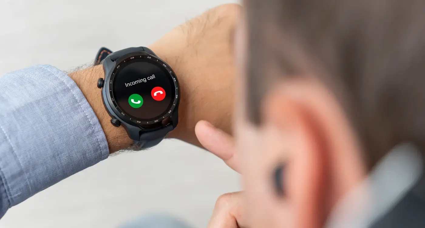
Here's where it gets interesting—wearable users aren't browsing leisurely like they do on phones. They're checking their watch while walking, during meetings, or at the gym. The interaction window is typically 2-5 seconds. If your app can't deliver value in that timeframe, you've lost them. This isn't about making things faster; it's about completely rethinking what your app should do when someone's wrist is raised.
The most successful wearable apps I've built focus on one primary action per screen, use large touch targets, and anticipate what users need before they even open the app. That's the real challenge—and the real opportunity.
Content Hierarchy for Small Screens
Working with wearable screens is like trying to fit a full conversation into a text message—every word counts. I've learned the hard way that content hierarchy on these tiny displays isn't just about making things smaller; its about completely rethinking what information deserves precious screen real estate.
The golden rule? Show one primary action or piece of information per screen. That's it. I know it sounds limiting, but trust me on this one. When you've got maybe 30-40mm of screen space to work with, trying to cram multiple elements together just creates a confusing mess that nobody can actually use while they're walking down the street.
The Three-Second Rule
Users glance at wearables for roughly three seconds—sometimes less. This means your most important content needs to be visible immediately, without any scrolling or tapping. Think of it as information triage: what does the user absolutely need to know right now? Everything else can wait for their phone.
I structure wearable content using what I call the "priority pyramid." At the top sits your primary information—time, heart rate, next calendar event. Below that, secondary details that provide context but aren't mission-critical. And at the bottom? Actions the user might want to take, but only after they've absorbed the key information.
Use progressive disclosure—start with the most critical information and let users drill down for details only if they need them. A weather app should show temperature first, then reveal hourly forecasts on demand.
Typography size matters more than you think. If users need to squint or stop walking to read your text, you've already lost them. I typically use nothing smaller than 16pt for body text on wearables, and thats being generous.
When it comes to wearable navigation, everything we know about mobile design gets thrown out the window. Sure, the basic principles still apply, but the execution? That's a completely different beast altogether.
I've watched countless teams try to squeeze traditional mobile navigation patterns onto smartwatch screens—and honestly, it's painful to watch. Tab bars become microscopic; hamburger menus require a magnifying glass. The reality is that wearable screens demand their own language of navigation, one that's built for quick interactions and fat fingers.
The Three Navigation Patterns That Actually Work
After years of building wearable apps, I've found that only three navigation patterns consistently deliver good user experiences. Everything else is just fighting against the medium.
- Scrolling lists - The bread and butter of wearable navigation; users can quickly scroll through options with their finger or crown
- Card-based flows - Perfect for step-by-step processes; users swipe between cards to progress through tasks
- Hub and spoke - A central screen with direct access to key functions; no deep navigation trees allowed
The scrolling list is your best friend on wearables. It's natural, it works with the device's crown controls, and users understand it immediately. But here's the thing—your list items need to be chunky. I'm talking minimum 44 pixels tall, with plenty of visual breathing room.
Card-based navigation works brilliantly for workflows. Think of it like a wizard interface; each card represents one step in a process. Users can swipe forward to progress or back to revise. It's simple, it's intuitive, and it doesn't overwhelm that tiny screen with too many options at once.
The hub and spoke model keeps things flat. One central screen, maximum three levels deep. Any deeper and you've lost your users in a maze they can't see their way out of.
Designing for Glanceable Information
The whole point of wearable apps is that people should be able to get what they need in about three seconds or less. I mean, that's literally why they're called "glanceable" interfaces—you glance at your watch, get the info, and move on with your life. But here's the thing that many developers get wrong: they try to cram way too much information onto that tiny screen.
When I'm working on wearable app structure, I always start with this simple question: what's the one piece of information that matters most right now? Not five pieces, not even three. One. Everything else should either disappear or be accessible with a single tap or swipe. Its about ruthless prioritisation, really.
The Three-Layer Rule
I've developed what I call the three-layer rule for content hierarchy on wearables. First layer: the most critical information that appears immediately—your primary data point. Second layer: supporting context that helps users understand that data better. Third layer: everything else that users might want to access but doesn't need to be visible by default.
The best wearable interfaces show you exactly what you need to know without making you think about what you're looking at
Progressive Disclosure Works
Progressive disclosure is your best friend when organising information on small screens. Start with the headline, then let users drill down if they need more detail. A fitness app might show "2,847 steps" prominently, then reveal daily goals and weekly progress with a tap. This approach respects both the constraints of the device and the user's attention span—because honestly, nobody wants to squint at paragraphs of text on their wrist while they're trying to catch a train.
Voice and Gesture Integration Strategies
Right, let's talk about voice and gesture controls in wearables—because honestly, nobody wants to tap tiny buttons all day on their smartwatch. I've built apps where clients insisted on cramming everything into touch interfaces, and the user feedback was... well, let's just say it wasn't pretty.
Voice commands work best for simple, predictable actions. Think "start workout," "set timer for 5 minutes," or "call mum." But here's the thing—you can't just throw Siri integration at your app and call it done. Users need to know what voice commands actually work; otherwise they'll try saying "please make my coffee stronger" to their fitness tracker and get frustrated when nothing happens.
The trick is designing your information architecture around natural speech patterns. When someone's mid-run and breathless, they're not going to say "navigate to workout statistics submenu." They'll grunt "stats" or "how fast?" Your app needs to understand this context and respond accordingly.
Gesture Controls That Don't Drive People Mad
Gestures are trickier than most people think. Sure, a simple wrist twist to wake the screen works brilliantly. But asking users to remember that a double-tap-then-swirl opens their calendar? That's just cruel.
I always stick to gestures that feel natural—swipe left for "back," swipe right for "forward," crown rotation for scrolling. The moment you start inventing your own gesture language, you've lost half your users. And please, for the love of all that's good, don't make critical functions depend on gestures alone. Always provide alternative ways to access the same information, because sometimes people are wearing gloves or their wrists are positioned awkwardly.
Data Organisation and Prioritisation
Right, let's talk about something that'll make or break your wearable app—how you organise and prioritise your data. I've seen brilliant app concepts fall flat because developers tried to cram everything onto a tiny screen. It's honestly one of the biggest mistakes I see in wearable development.
The golden rule here is brutal simplicity. Your smartwatch screen is roughly the size of a postage stamp, which means every pixel counts. You need to be ruthless about what makes it onto that screen and what gets buried in secondary views. I always tell clients to think about the 3-second rule: if someone can't get the key information they need in 3 seconds or less, your information architecture needs work.
The Information Pyramid
When organising data for wearables, I use what I call the information pyramid. At the top—taking up the most visual real estate—goes your primary data. This is the stuff people absolutely must see first. Think heart rate on a fitness tracker or the next turn on a navigation app.
Secondary information gets smaller treatment or lives one tap away. Tertiary data? That might need to live on the phone app entirely. It's harsh, but necessary.
- Primary data: Large, immediately visible, glanceable
- Secondary data: Smaller text, single tap access
- Tertiary data: Multiple taps or phone-based only
- Historical data: Archive view or phone companion
Use progressive disclosure—show the minimum viable information first, then let users drill down if they want more detail. Most wearable interactions should be complete without any drilling down at all.
Context-Driven Prioritisation
Here's where it gets interesting. Your data prioritisation shouldn't be static. A running app should prioritise pace and distance during a workout, but switch to summary stats when the session ends. Time of day, user activity, and even biometric data should influence what appears on screen first. This kind of smart prioritisation is what separates good wearable apps from great ones.
Cross-Device Continuity Planning
Here's where most wearable projects fall flat on their face—they treat the watch or fitness tracker like its own little island. But that's not how people actually use these devices, is it? Your users switch between their phone, tablet, laptop, and wearable throughout the day without thinking about it. They start reading an email on their watch, continue on their phone, then finish replying on their computer.
I've seen too many apps that work brilliantly on a smartwatch but create this jarring experience when users try to pick up where they left off on another device. The data doesn't sync properly, or worse—it's completely different information presented in totally different ways. That's bloody frustrating for users.
State Synchronisation That Makes Sense
Your wearable app needs to know what the user was doing on other devices and vice versa. If they're halfway through a workout on their watch, their phone should show the same progress. If they dismiss a notification on their wearable, it should disappear from their phone too. This sounds simple but requires proper backend planning from day one.
Progressive Information Disclosure
Think about how information flows between devices based on screen real estate. Your watch might show "Meeting in 15 mins" but your phone displays the full agenda, location, and attendee list. Each device shows what makes sense for that context, but the core information stays consistent.
The key is designing your information architecture so it scales naturally across devices. Start with your smallest screen constraints and build up. When users move from their watch to phone, they should feel like they're getting more detail about the same thing, not switching to a completely different experience altogether.
Testing Your Wearable Information Architecture
Right, so you've designed what you think is a brilliant wearable app structure—but here's the thing, what makes sense on paper doesn't always work in the real world. Testing your wearable information architecture is where theory meets reality, and trust me, reality can be a bit brutal sometimes!
The biggest mistake I see developers make is testing their wearable apps while sitting at a desk, staring intently at the screen. That's not how people actually use these devices. Your users are walking, jogging, cooking, or trying to check something quickly during a meeting. You need to test in these real scenarios, not in perfect conditions.
Start With the Five-Second Rule
Can someone accomplish their main task within five seconds of opening your app? If not, your content hierarchy needs work. I always test this by giving someone a specific goal—like checking their heart rate or starting a workout—and timing how long it takes. Anything over five seconds means your app organisation is too complex for a wearable device.
The best wearable apps are the ones that users forget they're using because the information architecture feels so natural
Movement testing is absolutely crucial. Get people to use your app while they're actually moving around. Walking changes how people interact with tiny screens—their finger accuracy drops, they need bigger touch targets, and they want fewer navigation steps. I've seen perfectly good apps become unusable simply because the developer never tested them during actual movement.
Don't forget about different wrist positions either. People wear their devices differently, and what's easy to tap when your wrist is straight becomes impossible when it's bent. Test your app organisation across various real-world positions and contexts—your users will thank you for it.
Building successful wearable apps isn't just about shrinking your mobile interface down to fit a tiny screen—that's honestly one of the biggest mistakes I see companies make. After working on dozens of wearable projects, from fitness trackers to smartwatch apps, I can tell you that the principles we've covered in this guide make the difference between an app people actually use and one that gets deleted after a week.
The constraints of wearable devices force you to be ruthless about what matters most. You can't include everything; you have to choose what deserves those precious few seconds of attention. This limitation is actually a gift because it makes you focus on genuine user value rather than feature bloat. I've seen apps succeed with just three core functions done brilliantly, while competitors failed trying to cram twenty mediocre features into the same space.
Your information architecture needs to respect the reality of how people interact with wearables—quick glances, contextual moments, and split-second decisions. The hierarchy should feel obvious, the navigation should be muscle memory, and the most important information should be visible immediately. No hunting, no confusion, no unnecessary taps.
Testing remains absolutely crucial because wearable user behaviour is still evolving. What works on paper often fails in real-world usage, especially when people are walking, exercising, or multitasking. The good news? When you get wearable information architecture right, users develop genuine habits around your app—and that's where the real business value lives.
Remember, wearable apps that succeed understand they're not the main event in someone's day; they're helpful moments that make everything else a bit easier. Design for that reality, and you'll build something people actually keep using.
Share this
Subscribe To Our Learning Centre
You May Also Like
These Related Guides
How Do You Design Voice Interactions for Wearable Applications?
How Do You Design for Different Wearable Form Factors?