How Do You Make Wearable Apps Simple Enough for Anyone?
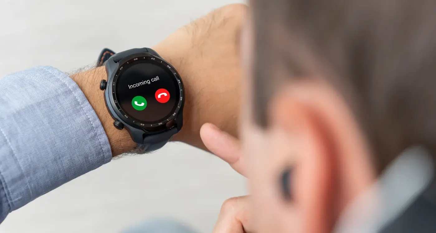
An event planner stands in a busy conference hall, juggling conversations with caterers whilst trying to check the schedule on her smartwatch. She glances down for a split second—but the app shows three overlapping buttons, tiny text, and a menu system that requires scrolling. She gives up and pulls out her phone instead. Your wearable app just failed its most basic test; it wasn't simple enough for a real moment.
I've built apps for smartwatches, fitness bands, and all sorts of wearable devices, and honestly? Most teams get it completely wrong from the start. They try to cram everything from their mobile app onto a screen thats barely bigger than a postage stamp. It's a bit mad really, because wearables aren't just tiny phones—they're a completely different category of device that needs its own design thinking.
The thing is, people interact with wearables whilst they're doing other things. Running. Cooking. Walking down the street. Sitting in meetings. Your user has maybe two or three seconds to get what they need before their attention shifts back to whatever they were actually doing. That's not a limitation to work around—that's the entire point of wearable technology.
Simple wearable design isn't about removing features until you're left with something basic; its about understanding what information matters most in a three-second interaction and presenting only that
Making wearable apps accessible to everyone means rethinking everything you know about mobile design. The principles that work brilliantly on a 6-inch phone screen will absolutely sink a wearable app. We need to talk about constraints, about glanceable information, about intuitive interfaces that don't require any learning curve whatsoever. Because if someone needs to read a tutorial to use your smartwatch app? You've already lost them.
Why Wearable Apps Need Different Design Rules
Right, so here's the thing—I've built apps for smartwatches and fitness bands over the years, and honestly? The rules you use for phone apps just dont work. They really don't. You cant just shrink down your mobile interface and call it done; that's a recipe for a terrible user experience and loads of confused users.
The biggest mistake I see is designers treating wearables like tiny phones. But they're not tiny phones—they're something else entirely. People use their phones for focused tasks that might take several minutes; they use their watch for quick glances that last maybe 3-5 seconds. That's it. If someone has to stare at their wrist for longer than that, you've probably designed it wrong.
Think about how people actually wear these devices. Your wrist moves constantly, the screen might be covered by a sleeve, and raising your arm to look at it for too long gets tiring (try holding your arm up for 30 seconds and you'll see what I mean). This means everything about your design needs to account for these physical limitations. Quick glances. Minimal interaction. Information that's immediately understandable without any thinking required.
And buttons? Forget about having lots of buttons or complex tap patterns. The screen is too small for precise tapping, and users hands might be sweaty from exercise or wet from washing up. I've seen apps that require users to tap on elements that are barely 5mm wide—its madness really. Your hit targets need to be generous, your interactions need to be simple, and ideally you should be using things like swipes and scrolls rather than tiny tap targets.
The context matters too. People use wearable apps while they're doing other things—running, cooking, driving, sitting in meetings. Your app needs to work when someone cant give it their full attention because they're busy living their actual life.
Understanding the Constraints of Small Screens
Right, let's talk about the elephant in the room—or rather, the elephant on your wrist. When you're designing for a smartwatch, you're working with a screen that's maybe 40mm across. That's tiny. And I mean properly tiny. It's roughly the size of a large postage stamp, which sounds mental when you think about fitting an entire app interface into that space.
Here's the thing though; small screens aren't just shrunken-down versions of phone screens. They're a completely different beast. You cant just take your mobile app and squeeze it down—trust me, I've seen people try and its never pretty. The rules change entirely when you're working with this little real estate. Every pixel matters. Every element needs to justify its existence on that screen or it shouldnt be there at all.
The biggest mistake I see developers make? Trying to cram too much information onto the screen at once. You know what happens then? The text becomes unreadable, buttons become impossible to tap accurately, and users get frustrated within about five seconds of opening your app. Not ideal.
What Actually Fits on a Wearable Screen
Let's break down what you can realistically display on a typical smartwatch screen without making users squint like they're trying to read fine print:
- One primary piece of information (like a heart rate number or step count)
- Two to three supporting data points at most
- One or two action buttons—three if they're really well spaced
- A simple progress indicator or graph
- Short text labels, usually no more than 2-3 words each
Touch targets are another massive consideration. On a phone, you can get away with smaller buttons because people have more precision. On a watch? Your finger is covering a huge portion of the screen when you tap. Apple recommends touch targets of at least 44x44 points, but honestly I'd go even bigger on a watch if you can manage it—around 48x48 points feels more comfortable for most users.
Working Within Physical Limitations
The screen shape matters too. Are you designing for a round watch face or a square one; it changes everything about your layout. Round screens waste more space in the corners but they look more like traditional watches, which some users prefer. Square screens give you more usable area but require different visual thinking.
And dont forget about the viewing angle. People dont hold their wrist perfectly straight in front of their face like they do with a phone—they glance at it from various angles throughout the day. Your interface needs to be readable even when its tilted or viewed from the side. High contrast is your friend here; subtle colour differences that look fine on a phone can become completely invisible on a small watch screen viewed at an angle.
Start your design process by identifying the single most important thing your user needs to see on their wrist, then build everything else around that one element—if you cant justify why something is there, remove it without hesitation.
Battery life creates another constraint that affects your design choices. Bright white backgrounds drain battery faster than dark ones, especially on OLED screens. Complex animations might look nice but they consume power. You need to balance visual appeal with practical considerations because a dead watch is a useless watch, no matter how beautiful your interface is. I've learned this the hard way—designing something gorgeous that kills the battery by lunchtime doesnt win you any fans.
Making Navigation Work Without Complicated Menus
Right, so here's where things get a bit tricky—designing navigation for a wearable is nothing like designing it for a phone. On a phone you've got space for hamburger menus, tab bars, navigation drawers...all the usual stuff. But on a watch? You've got maybe an inch of screen space and users who are probably doing something else at the same time. Walking, cooking, exercising. They cant spend time hunting through menus.
The biggest mistake I see is developers trying to replicate their phone apps navigation structure on a watch. It just doesn't work. What you need instead is a flat information architecture—basically everything should be one or two taps away from the main screen. Three taps maximum if you absolutely have to, but honestly? If someone needs to tap three times to get to something, they probably won't bother.
Keep It Linear and Predictable
Watches work best with linear navigation patterns. Swipe left for one thing, swipe right to go back. Scroll down to see more details. Simple movements that don't require thinking. I mean, the best wearable apps feel almost automatic to use, like the interface just melts away and you're interacting directly with the information you need.
Heres what actually works on small screens:
- Card-based interfaces where each screen shows one piece of information
- Vertical scrolling for lists and details (much easier than horizontal on a tiny screen)
- Swipe gestures for moving between main sections
- Long press for accessing secondary actions without cluttering the interface
- Voice commands as an alternative to tapping altogether
Design for Quick Decision Making
Users shouldn't need to remember where things are in your app—the path should be obvious every time they open it. This is where visual hierarchy becomes really important. Big buttons for primary actions, clear labels, high contrast between elements. And whatever you do, dont make people pinch to zoom or do any fiddly gestures. Its just frustrating on something this small.
Choosing What Features Actually Matter on a Wrist
Here's the thing—most app features that work brilliantly on a phone will absolutely bomb on a smartwatch. I mean, you cant just shrink everything down and hope it works. It doesn't. The screen is tiny, people are moving around, and they're probably trying to check something whilst doing something else entirely. This is where feature selection becomes absolutely critical for simple wearable design.
When I'm working with clients on wearable apps, I make them do an exercise that they usually hate at first. I tell them to pick only three features. Three. That's it. Not five, not "just one more", three maximum. Why? Because every additional feature on a wearable makes the interface more complicated, slows down the experience, and reduces the chances someone will actually use your app. The best intuitive wearables I've built focus on doing one thing really well rather than ten things poorly.
The features that belong on a wrist are the ones people need in five seconds or less—everything else should stay on the phone
Think about what people actually need when they glance at their watch. Quick information. Simple actions. Immediate feedback. If a feature requires more than two taps or any typing at all, it probably doesnt belong on the wearable version. I've seen so many apps try to cram in every possible function from their phone app, and users just get overwhelmed and delete it. Payment confirmations? Perfect for a watch. Detailed transaction history? That belongs on your phone. Fitness tracking alerts? Brilliant. Changing your workout plan? Do that on a bigger screen. This kind of minimalist app design thinking is what separates user-friendly interfaces from cluttered messes that nobody wants to use.
Designing for Glances Instead of Extended Use
Here's the thing—nobody wants to stare at their watch for more than a few seconds. I mean, its just not comfortable is it? When we design wearable apps, we need to accept that people will glance at their device, grab the information they need, and move on with their lives. That's the whole point really.
The way I approach wearable design is completely different to how I'd tackle a phone app; with a phone, you might have someone's attention for minutes at a time, but with a smartwatch you've got maybe 2-3 seconds before their arm gets tired or they lose interest. That changes everything about how we present information.
What Makes a Good Glanceable Interface
The best wearable screens communicate their core message instantly. No scrolling required. No reading paragraphs of text. Just the essential information presented clearly enough that you understand it in that brief moment when you raise your wrist. I've found that this means being ruthless about what you include—if it's not immediately useful, it doesn't belong on that screen.
Think about it this way: when you check your watch to see the time, you don't want to read an essay about timekeeping. You want big, clear numbers. Same principle applies to any wearable app.
Key Elements of Glance-Friendly Design
- Use large text that can be read at arm's length without squinting
- Prioritise the most important information at the top of the screen
- Stick to one primary action per screen—don't make people choose between multiple options
- Use icons and symbols instead of words whenever possible
- Make sure key information updates automatically without requiring user input
- Design for outdoor visibility, not just perfect indoor lighting conditions
What I've learned over the years is that less really is more when it comes to wearables. Every extra word, every additional button, every bit of complexity makes your app harder to use in that crucial 2-second window. Strip it back to the absolute basics and you'll create something people actually want to use.
How to Handle Notifications Without Annoying Users
Right, so notifications are probably the trickiest part of wearable design—and I say this after watching countless apps get deleted because they buzzed people's wrists one too many times. The thing is, a notification on a watch feels way more intrusive than one on your phone. It's literally tapping you on the arm demanding attention, and if you abuse that privilege, users will turn off your notifications faster than you can say "engagement metrics".
Here's the thing; not every notification deserves wrist time. I've seen apps that send a notification for every single update, every like, every comment, every bloody thing that happens in their system. And you know what? Those apps don't stay on peoples wrists for long. When designing for wearables, you need to be brutal about what actually matters. Ask yourself: would I want my wrist to buzz for this? If there's even a moment of hesitation, the answer is probably no.
Priority Levels That Actually Make Sense
The best wearable apps I've built use a clear hierarchy for notifications. Not everything gets the same treatment, and users need to understand why their watch is buzzing at them.
- Critical notifications—things like payment confirmations, security alerts, or time-sensitive reminders that genuinely need immediate attention
- Important updates—messages from real people, calendar reminders, or information thats useful but not urgent
- Optional notifications—social media likes, news updates, promotional content that users can choose to receive but should be off by default
And here's something people often get wrong: the default settings matter more than you think. Too many apps turn everything on by default and expect users to dig through settings to turn stuff off. That's backwards. Start with minimal notifications enabled and let users opt in to more if they want them. Its better to have someone wish they got more notifications than to annoy them from day one.
Timing and Frequency Controls
I always build in "quiet hours" functionality for wearable apps. Letting users set times when they don't want non-urgent notifications is basic respect for their attention. Some apps even use smart timing—like not sending promotional notifications during typical work hours or not buzzing peoples wrists at 3am unless its actually an emergency.
The notification grouping feature on wearables is your friend too. If your app sends multiple notifications about related things, group them together rather than making someones watch vibrate five times in a row. That's just common sense, but you'd be surprised how many apps still get this wrong.
Give users granular control over notification types in your app settings, but make the defaults sensible. Most people won't customise their settings, so whatever you ship as default is what most users will experience.
Remember that wearables are about glanceable information. Your notification should communicate the key point in the first line—users shouldn't need to tap through to understand what's happening. Keep the text short, make the action clear, and respect that peoples wrists aren't billboards for your app to constantly advertise itself.
Testing Your Wearable App with Real People
Right, so you've built your wearable app. It works perfectly when you test it. But here's the thing—you know exactly what every button does, what every gesture means, because you designed it. Real users? They haven't got a clue what's coming.
I always tell people that testing a wearable app is different from testing a phone app; the context matters so much more. You cant just sit someone down at a desk and ask them to tap through screens. That's not how people use watches. They're walking to catch a bus, they're at the gym with sweaty fingers, theyre pushing a pram with one hand whilst trying to check a notification with the other. You need to test in real situations or your feedback will be basically useless.
Watch People Actually Use It
Get your app on real wrists as early as possible. And I mean really watch what happens—don't just ask people if they like it afterwards. Sit with them (or walk with them, honestly) and see where they get stuck. You'll spot things you never expected. Maybe they're tapping when they should be swiping, or maybe that text is too small when there's bright sunlight hitting the screen.
Test With Different Types of People
Your mum, your tech-savvy mate, someone who's never worn a smartwatch before—they all need to try it. Age matters too because older users might have different eyesight needs or less familiarity with gesture controls. Its no good if your app only works for people exactly like you.
Ask specific questions: Could you see that notification clearly? Did you understand what that icon meant? How quickly could you complete that action? Time them if you can—if it takes more than a few seconds to do something on a watch, that's probably too long. Make notes about everything that confuses people, even tiny things, because those tiny things add up to someone deleting your app.
Making Your App Work for Everyone Who Wears It
Here's something that doesn't get talked about enough—wearable apps need to work for people with different abilities, different tech skills, and different physical needs. I mean, if someone cant use your watch app because the text is too small or the buttons are too fiddly, you've lost them completely. And on a device strapped to someone's wrist? There's no second chance to make it work.
The good news is that designing for accessibility on wearables actually makes your app better for everyone. Larger tap targets? Everyone appreciates those when they're trying to hit a button whilst walking. Clear contrast between text and background? Makes the screen readable in bright sunlight for all users. Simple, straightforward navigation? Literally every person benefits from that.
Design Choices That Help Everyone
Start with font sizes that people can actually read without squinting—and I'm talking about in real-world conditions, not just on your desk under perfect lighting. Use haptic feedback (that little vibration) to confirm actions; not everyone will be looking at the screen when they tap something. Avoid relying solely on colour to communicate information because some users wont be able to distinguish between certain colours.
The best wearable apps work just as well for a 70-year-old with shaky hands as they do for a 25-year-old tech enthusiast
Testing Beyond Your Usual Group
This is where things get real—you need to test with people who aren't like you. Different ages, different abilities, different comfort levels with technology. I've seen apps that worked perfectly for the development team but were completely unusable for the actual target audience. Its a bit frustrating when that happens, but it's easily avoided if you expand your testing group early enough. Watch how people with arthritis interact with your buttons. See if someone with limited vision can read your text. These insights will shape a better app for literally everyone who uses it.
Conclusion
Building apps for wearables is—honestly—one of the most challenging things you'll do as a developer. I mean it. You've got tiny screens, limited interaction methods, and users who literally glance at your app for two or three seconds. But here's the thing; when you get it right, when you really nail that simplicity, the result is something people use every single day without even thinking about it.
Throughout this guide we've covered a lot—from understanding screen constraints to handling notifications properly to testing with actual humans (not just your development team). And if theres one thing I want you to take away from all of this, its that simplicity isn't about removing features. It's about choosing the right features and presenting them in a way that feels natural on someone's wrist.
The wearable space keeps evolving. New devices come out, screens get slightly bigger, sensors get more accurate. But the fundamental truth remains the same: people don't want to spend time fiddling with their watch. They want information quickly and they want to get on with their day. Every design decision you make should serve that goal.
I've seen plenty of wearable apps fail because developers tried to cram too much in; tried to replicate the phone experience on a watch. Don't make that mistake. Your wearable app should do one thing brilliantly rather than ten things poorly. Focus on what actually matters to your users in those quick moments when they check their wrist—everything else is just noise that'll get your app deleted.
Start small, test often, and always ask yourself: can this be simpler? Usually the answer is yes.
Share this
Subscribe To Our Learning Centre
You May Also Like
These Related Guides

How Do I Design for Such a Small Smartwatch Screen?
How Do You Design Wearable Apps That Don't Annoy Users?