How Do You Design Wearable Apps That Don't Annoy Users?
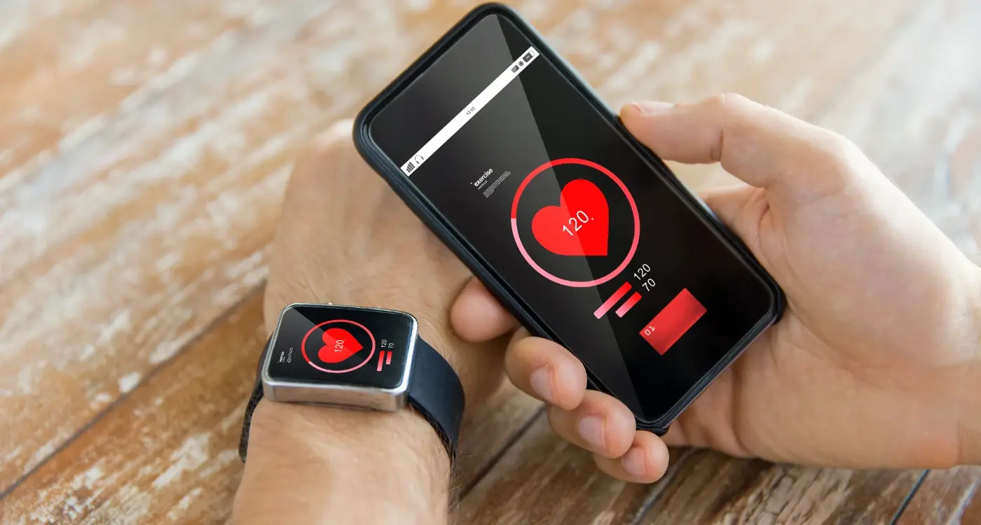
An event coordinator is setting up for a wedding when her smartwatch buzzes. Then it buzzes again. And again. By the time she's checked her wrist for the fifth time in ten minutes—each notification less urgent than the last—she's missed an actual important message from the venue manager and the bride is getting frustrated. This happens every single day to millions of people wearing smartwatches, fitness trackers and other wearable devices; we've created technology that's supposed to help us stay connected but instead it just interrupts us constantly.
I've been designing apps for wearables since the early days when everyone thought we could just shrink down our phone apps and slap them on a watch. Spoiler alert: that doesn't work. Not even close. Wearable app design is fundamentally different from designing for phones or tablets because these devices live on your body—they're always there, always on, and they demand your attention in the most personal way possible. Get it wrong and users will simply turn off notifications or stop wearing the device altogether.
The best wearable apps are the ones you barely notice until the exact moment you need them
Here's the thing about wearables that most developers miss: they're not meant for long interactions. Nobody wants to spend five minutes tapping through menus on their watch. People glance at their wrist for maybe two or three seconds, process information, and move on. That's it. If your wearable app requires more attention than that, you've already lost. The challenge isn't just making apps that work on small screens—its making apps that respect peoples time, attention and the context in which they're being used. And honestly? Most wearable apps get this completely wrong, which is why so many people have smartwatches collecting dust in their drawers.
Understanding the Wearable Challenge
Here's what most developers get wrong about wearables—they treat them like tiny phones strapped to your wrist. And honestly? That's where everything falls apart. I've watched countless apps fail because teams didn't understand this basic truth; a smartwatch isn't just a smaller screen, it's an entirely different device with different rules and different user expectations.
Wearables live on your body. Think about that for a second. Your phone sits in your pocket or bag, but your watch is with you every single moment—when you're in meetings, when you're sleeping, when you're exercising. This constant presence means users develop a completely different relationship with wearable devices compared to their phones. They become much more sensitive to interruptions, much more aware of battery drain, and far less tolerant of apps that demand too much attention.
The screen size is the obvious challenge, sure, but its actually not the biggest problem we face. The real challenge is context. People glance at their watch for 2-3 seconds maximum in most situations. They're not going to sit there scrolling through menus or reading paragraphs of text. They want information now, they want to take action quickly, and then they want to get on with their lives. If your app cant deliver value in that tiny window of time, it wont get used—simple as that.
Another thing people dont realise is that wearables have much stricter technical limitations than phones. The processors are slower, the memory is limited, and the battery is tiny. You can't just port your phone app to a watch and expect it to work well. Trust me, I've seen too many teams try this approach and end up with apps that drain battery in hours, lag when you tap them, or crash at the worst possible moments.
Keeping Notifications Under Control
Right, here's where most wearable apps completely mess things up. They bombard users with every single notification imaginable and wonder why people disable the app within days. I've seen it happen time and time again—developers spend months building a brilliant wearable experience, then ruin it by being too eager to stay in front of users. The wrist is sacred territory; people wear watches and fitness trackers all day, which means every buzz or vibration interrupts their actual life.
The golden rule? Only send notifications that require immediate attention or action. Does the user really need to know that someone liked their photo right this second? Probably not. Do they need to know their meeting starts in five minutes? Yes, absolutely. The difference is urgency and relevance—notifications on a wearable should pass a much higher bar than those on a phone because the interruption is more personal and immediate.
I always tell clients to start with zero notifications enabled by default, then let users opt in to what they actually want. Sure, it's counterintuitive when you're trying to drive engagement, but trust me on this one—users will appreciate the respect for their attention. And here's the thing; happy users who aren't annoyed are far more likely to keep your app installed and actually use it when they need it.
Notification Frequency Matters More Than You Think
You know what? Even important notifications can become annoying if they're too frequent. I learned this the hard way working on a health app that sent hourly reminders to drink water—technically useful information, but users found it patronising after day two. We scaled it back to three reminders per day and user satisfaction shot up immediately. Sometimes less really is more, especially on devices that live on peoples wrists all day long.
Give users granular control over notification types and frequency from day one; it shows respect for their time and drastically reduces the chance they'll disable all notifications or uninstall your app entirely.
Smart Filtering Makes All the Difference
Context-aware notifications are where wearable design gets really interesting. Your app should understand when its appropriate to interrupt someone and when it isnt. If a user has dismissed three notifications in a row without interacting, maybe back off for a while? If they typically don't check notifications during certain hours, learn from that pattern. The smartwatches that succeed are the ones that feel like they understand their users habits—not the ones that treat every notification with equal importance regardless of timing or situation.
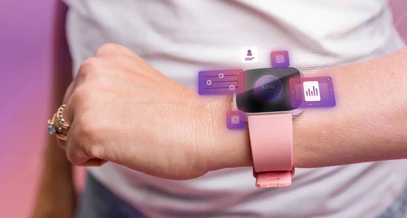
Designing for Tiny Screens
Right, so you've got maybe 40mm of screen real estate to work with on most watches—that's absolutely tiny compared to even the smallest smartphone. And here's the thing, people arent holding these devices up close to their faces like they do with phones; they're glancing at their wrists while they're doing something else. Walking to a meeting. Running on a treadmill. Cooking dinner. This changes everything about how we design interfaces.
I've seen so many wearable apps try to cram full smartphone experiences onto watch screens and it just doesn't work. The text becomes unreadable, buttons become impossible to tap accurately, and users get frustrated within seconds. We need to strip everything back to its absolute core—what's the one piece of information this person needs right now? That's it. That's all we show.
Typography becomes bloody critical at this scale. You need fonts that are legible at small sizes, which usually means sticking with system fonts that Apple and Google have specifically designed for their wearable platforms. I know clients sometimes want to use their brand fonts everywhere, but trust me, its not worth sacrificing readability. Your users won't care about brand consistency if they cant read what's on the screen.
Colour contrast matters more than ever too—what looks fine on a phone screen might be completely invisible on a watch in bright sunlight. I always test designs outdoors in different lighting conditions because that's where people actually use these things. And buttons? Make them big. Bigger than you think they need to be. People's fingers haven't shrunk just because the screen has, and there's nothing more annoying than trying to tap a tiny target on your wrist whilst you're on the move.
Making Interactions Quick and Simple
Here's what I tell every client who wants to build a wearable app—if the interaction takes more than three seconds, you've already lost. I mean it. When someone glances at their smartwatch, they're usually mid-conversation, mid-workout, or literally mid-step. They don't have time for complex menus or multi-step processes; they need answers or actions right now.
The best wearable app design treats every interaction like its precious. And it is! You've got maybe two or three taps before people give up and just pull out their phone instead. That's why I always design with the "two tap rule" in mind—any critical action should be achievable in two taps maximum. Checking your heart rate? One tap. Starting a timer? Two taps. Anything more than that and you're asking too much from someone with a three inch screen strapped to their wrist.
The golden rule of wearable UX best practices is this: every extra tap you add reduces your completion rate by roughly 40%
Keep Actions Focused and Obvious
I've seen so many wearable apps try to cram in features that belong on a phone. Its honestly a waste of everyones time. Your smartwatch app should do one or two things brilliantly, not twenty things poorly. If someone needs to read paragraphs of text or fill out a form? That's a phone task. But checking if their taxi is 2 minutes away or skipping to the next song? Perfect for a wearable.
Use Large, Finger-Friendly Targets
Touch targets on wearables need to be bigger than you think—at least 44 pixels minimum, but I usually go larger. People are tapping with their finger on a tiny screen, often while moving, so precision is tricky. Space out your buttons too, nobody likes accidentally hitting "delete" when they meant "save". The key to non-intrusive design is making sure people can interact quickly without second-guessing themselves or needing to concentrate too hard on hitting the right spot.
Respecting Battery Life and Performance
Right, lets talk about the elephant in the room—battery life. I've seen so many wearable apps that are technically brilliant but completely useless because they drain the battery in three hours. And you know what? Users will uninstall your app faster than you can say "background refresh" if it kills their device before lunchtime.
Wearables have tiny batteries compared to phones. That's just physics, there's no way around it. A typical smartwatch has maybe 300-400 mAh whilst your phone probably has 3000-4000 mAh;that's a tenth of the capacity. So when you're designing your app, every single feature needs to justify its battery cost. I mean it, every animation, every sensor read, every network request—they all add up.
What Drains Battery Fast
Here's what I've learned from building wearable apps that actually last through the day. GPS is your biggest enemy, it'll murder a battery in under two hours if you leave it running constantly. Continuous heart rate monitoring comes next, followed by screen wake-ups and haptic feedback. Background syncing can be sneaky too—if you're polling a server every 30 seconds, you're going to have problems.
- Turn off sensors when they aren't actively needed
- Batch your network requests instead of making constant calls
- Use the wearable's built-in optimisations for workouts and activity tracking
- Let the screen sleep properly, don't force it to stay awake
- Test your app's battery impact over a full day, not just an hour
But here's the thing—performance isn't just about battery life. Laggy animations and slow load times make wearables feel terrible because people expect them to be instant. If someone raises their wrist to check something, they want the answer now, not after a loading spinner. Keep your UI simple, preload what you can, and test on actual hardware because emulators lie about performance. Always have done.
Building Useful Glances Not Full Experiences
Here's where most wearable app design goes wrong—developers try to recreate the full mobile experience on a tiny screen. I've seen it happen so many times. A client comes to us wanting their entire app squeezed onto a watch face and we have to explain that its just not how wearables work. The whole point of a smartwatch is to give you quick information without pulling your phone from your pocket; if people wanted a full app experience they'd use their phone wouldn't they?
Think about what information your users actually need in the moment. Not what would be nice to have or what looks impressive in a demo—what do they genuinely need when they glance at their wrist? For a fitness app, that might be current heart rate and distance covered. For a delivery app its the next turn and ETA. For a messaging app it's who sent the message and the first line of text. That's it. Nothing more.
The best wearable app design follows what I call the 2-second rule: users should be able to get the information they need in 2 seconds or less. If they're staring at their watch any longer than that it means you've put too much on the screen or made them work too hard to find what they need. And here's the thing—people don't want to navigate through menus on a watch, they don't want to scroll through lists, they don't want to fill in forms. They want information now.
What Makes a Good Glance
A glance should answer one specific question really well. What time is my next meeting? How many steps have I taken today? When does my train arrive? Each glance should have a single clear purpose, not try to be everything to everyone. I mean, you wouldn't try to read an entire email on your watch would you? Of course not. You'd read the subject line and first sentence then decide if its worth getting your phone out.
Prioritise information based on urgency and relevance. The most important thing should be the biggest and most prominent—this isn't the time for subtle design choices or artistic layouts. Put the key information front and centre where it can't be missed. Secondary information can be smaller or lower down but honestly if somethings not important enough to show prominently maybe it doesn't belong on the watch at all?
Design your wearable interface so users can understand it in a single glance without any interaction; if they need to tap or swipe to see the main information you've already lost them.
Keeping Actions Minimal
When you do need users to take action on a wearable the options should be dead simple. Yes or no. Snooze or dismiss. Accept or decline. Binary choices work brilliantly on small screens because they're easy to understand and easy to tap. The moment you introduce three or more options people start having to think about what to choose and that defeats the whole purpose of quick interactions.
I've built apps where clients insisted on adding 5 or 6 action buttons to a watch interface. It looked terrible and it performed even worse in testing—people couldn't hit the right button half the time and gave up using the watch features altogether. We scaled it back to just two primary actions and suddenly the engagement went through the roof. Less really is more when it comes to wearable UX best practices.
Here are the key elements every good wearable glance should have:
- One primary piece of information that's immediately visible
- Clear visual hierarchy that guides the eye naturally
- High contrast text and icons that work in sunlight
- Minimal or no scrolling required
- Maximum of two action buttons if any are needed
- Contextual information that updates automatically
Remember that smartwatch notifications aren't just smaller versions of phone notifications; they serve a completely different purpose in the user journey. People check their watches dozens of times per day but each interaction lasts just seconds. Your job is to make those seconds count by giving them exactly what they need and nothing they don't. Every extra word, every additional button, every piece of decorative design that doesn't serve a functional purpose is getting in the way of a good user experience.
Testing With Real Wrists Not Just Emulators
Here's something I tell every client who comes to us with a wearable app project—your computer screen lies to you. I mean it. You can run your Apple Watch app in the simulator all day long, click around with your mouse, and think everything looks brilliant... but the moment you strap it on your wrist? Completely different story. The way light hits that tiny screen, the angle your wrist naturally sits at, how your thumb actually reaches certain buttons—none of that shows up in an emulator.
I've seen apps that looked perfect in testing fall apart within seconds of real-world use. Buttons that seemed fine suddenly become impossible to tap when you're walking. Text that was readable on your 27-inch monitor becomes a blurry mess on an actual wrist. And don't even get me started on notifications that vibrate at completely the wrong intensity; some are so weak you miss them entirely, others feel like your wrist is having a seizure.
The biggest issues we catch during real wrist testing are:
- Touch targets that are too small or too close together—what works with a mouse pointer doesn't work with an actual finger
- Text size that seemed reasonable but is actually unreadable when your arm is at a normal position
- Interactions that require too much precision while you're moving around
- Haptic feedback that's either too subtle or way too aggressive
- Performance issues that only show up on actual hardware, not in the simulator
You need to test your wearable app while doing everyday activities. Wear it while you're cooking, walking, exercising, even just sitting at your desk typing. Does the screen stay on long enough? Can you actually complete tasks one-handed? Does it work when your wrist is bent at weird angles? These are questions an emulator simply cannot answer, and honestly, skipping this step is one of the biggest mistakes I see teams make.
Conclusion
Look, designing wearable apps isn't rocket science—but it does require you to think differently about what makes a good user experience. Everything we've talked about comes down to one simple principle: respect your users time and attention. Because honestly, if your app is annoying people whilst they're trying to get through their day, they'll just turn off notifications or delete it entirely.
The best wearable app design happens when you strip away everything that isn't absolutely necessary; when you focus on delivering quick, useful information at exactly the right moment. Its not about cramming your entire mobile app onto a tiny screen. That's a mistake I see time and time again, and it never works out well. Instead, think about what your users actually need when they glance at their wrist—usually its something they can consume in under three seconds.
Smartwatch notifications need to earn their place on someone's wrist. Every buzz, every tap, every alert should provide genuine value. If it doesn't? Cut it. Your users will thank you for it by actually keeping your app installed and engaged with it over time. And that's what matters for long-term success, not just initial downloads.
The wearable UX best practices we've covered aren't just theory—they're lessons learned from building apps that people actually use every day. Design for glances not stares. Keep interactions simple. Be mindful of battery life. Test on real devices. These things matter more than flashy features or trying to do too much.
At the end of the day, a good wearable app should feel like a helpful assistant that knows when to speak up and when to stay quiet. Get that balance right, and you'll create something people genuinely appreciate having on their wrist.
Share this
Subscribe To Our Learning Centre
You May Also Like
These Related Guides
How Do You Create Effective Notifications for Wearable Devices?
How Do You Design User Interfaces for Tiny Wearable Screens?