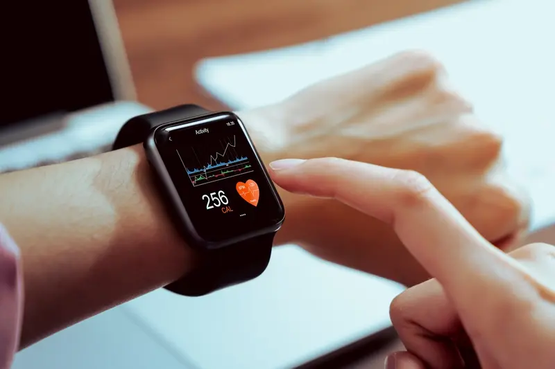
You've spent months perfecting your mobile app design. The interface looks brilliant on your phone, users love the experience, and everything works beautifully. Then someone asks: "What about the smartwatch version?" Suddenly, you're staring at a screen that's roughly the size of a postage stamp, wondering how on earth you're going to fit anything meaningful onto it.
This isn't just a scaling problem—it's a complete rethink of how people interact with technology. When I first started working on smartwatch interfaces, I made the classic mistake of trying to shrink everything down. The result? Tiny buttons that nobody could press, text so small it required a magnifying glass, and frustrated users who gave up before they even got started.
Designing for a smartwatch isn't about making things smaller; it's about making them smarter
The truth is, designing for such a small screen forces you to strip away everything unnecessary and focus on what truly matters. It's one of the most challenging design exercises you'll ever face, but also one of the most rewarding. Every pixel counts, every interaction must be deliberate, and every piece of content needs to earn its place on that tiny display. Throughout this guide, we'll explore the specific techniques and strategies that make smartwatch UI design not just possible, but genuinely useful for the people wearing them on their wrists every day.
Understanding the Unique Challenges of Small Screen Design
Designing for a smartwatch isn't just about making things smaller—it's a completely different beast altogether. I've worked on countless mobile interfaces over the years, and when smartwatch projects first started landing on my desk, I made the mistake of thinking I could simply shrink down existing designs. Boy, was I wrong!
The first challenge you'll face is screen real estate. We're talking about displays that are often less than 2 inches diagonal—that's roughly the size of a large coin. Every pixel counts, and there's no room for unnecessary elements. What might look perfectly fine on a phone becomes completely unusable when squeezed onto a watch face.
Physical Limitations Shape Everything
Your users will be looking at these screens in all sorts of lighting conditions—bright sunlight, dimly lit rooms, you name it. The viewing angles are often awkward too; people don't hold their wrist at the perfect angle like they do with their phones. This means your contrast needs to be spot-on and your text needs to be much larger than you might initially think.
Context Changes Everything
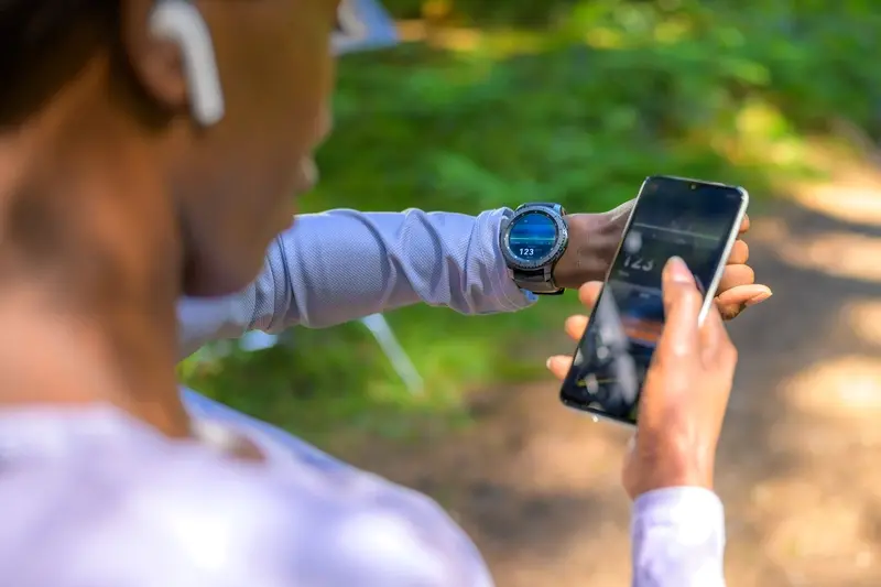
People interact with smartwatches differently than phones. They're often doing something else—walking, exercising, cooking—and they want information quickly. We call this "glanceable" design, and it's at the heart of good smartwatch interfaces. Users typically look at their watch for just a few seconds; if they can't get what they need in that time, your design has failed.
The biggest shift in thinking is accepting that less really is more. Your smartwatch app shouldn't try to replicate your phone app's functionality—it should complement it with the most critical features only. Understanding your long-term mobile app strategy is crucial to determining which features truly belong on the wrist.
Prioritising Content and Features for Limited Space
When you're designing for a smartwatch, every pixel counts. The screen is so tiny that you can't just squeeze everything from a phone app onto it—that's a recipe for disaster. You need to be ruthless about what makes the cut and what gets left behind.
Start by asking yourself what your users actually need to do on their wrist. They're not going to write emails or browse through endless menus whilst walking down the street. They want quick, glanceable information and simple actions. Think notifications, time checks, fitness tracking, or maybe controlling music. That's your core content right there.
The Three-Second Rule
If users can't understand or complete their task within three seconds, your smartwatch UI is probably too complex. This means showing only the most important information upfront. Secondary features can live a tap away, but your main screen should be crystal clear.
Group related features together and create a clear hierarchy. Your weather app doesn't need to show humidity, UV index, and wind speed all at once—just the temperature and current conditions will do. Users can drill down for more details if they really need them.
Use progressive disclosure: show the bare minimum first, then let users access additional details through simple taps or swipes. This keeps your small screen interface clean whilst still providing depth when needed.
Content That Works on Small Screens
Text should be kept to an absolute minimum. Use icons, colours, and visual indicators wherever possible. A red heart rate zone indicator tells the story much faster than "Heart rate: 156 BPM - High intensity zone". Numbers work better than words, and symbols work better than both.
Remember that people interact with smartwatches differently than phones. They're often moving, distracted, or in a hurry. Your smartwatch UI needs to respect this reality by being simple, focused, and immediately useful.
Typography and Text Strategies for Tiny Displays
Text on a smartwatch screen is tricky business. I've seen countless projects where developers treat smartwatch text like they would mobile text—just smaller. That's a recipe for disaster right there. Your users will squint, strain their eyes, and probably give up using your app altogether.
The golden rule for smartwatch typography is this: bigger is better, and less is more. You want font sizes that are at least 16 pixels, but honestly, 18-20 pixels works much better for readability. I know it sounds massive for such a small screen, but trust me on this one. Your users' eyes will thank you.
Font Choices That Actually Work
System fonts are your best friend here. They're designed specifically for the device and they render beautifully at small sizes. San Francisco on Apple Watch, Roboto on Wear OS—stick with what the platform gives you. Custom fonts might look lovely on your laptop screen, but they often turn into blurry messes on tiny displays.
Weight matters too. Regular weight is perfect for body text, but don't be afraid to use medium or semi-bold for important information. Light weights? Forget about them—they disappear on small screens.
Text Hierarchy and Organisation
Your text hierarchy needs to be crystal clear. Use these sizing guidelines to create proper contrast between different text levels:
- Headlines: 22-24 pixels, medium or bold weight
- Body text: 18-20 pixels, regular weight
- Secondary text: 16 pixels, regular weight
- Small text: 14 pixels minimum (use sparingly)
Keep your sentences short and punchy. Long paragraphs are impossible to read on smartwatch screens. Break everything into bite-sized chunks that users can digest quickly. Remember, people glance at smartwatches—they don't sit down and read novels on them.
Navigation Patterns That Work on Smartwatches
When you're designing for such a small screen, traditional navigation menus simply don't work. There's no room for hamburger menus or tab bars—you need to think completely differently about how users move around your smartwatch UI.
The most successful smartwatch apps use simple, gesture-based navigation. Swiping left and right between screens works brilliantly because it feels natural and doesn't take up any precious screen space. Users can quickly flick through different sections without needing to see navigation buttons cluttering up the display.
Keep It Linear and Shallow
Your app's structure should be as flat as possible. Think of it like a straight line rather than a complex tree with lots of branches. Users should be able to get to any major function within two taps or swipes maximum. Deep navigation hierarchies that work fine on phones become absolute nightmares on small screens.
The best smartwatch navigation is the kind users don't even notice—it just feels like part of the natural flow
Digital crowns and rotating bezels (where available) offer another smart navigation option. They let users scroll through lists or zoom in and out without their fingers blocking the tiny display. But don't rely on these features exclusively—not all smartwatches have them.
Use Context Wisely
Context-aware navigation can be your secret weapon. If someone's checking their fitness app after a workout, show them their stats first rather than making them navigate to find them. The smartwatch UI should predict what users want based on time, location, or recent activity. This removes navigation steps entirely, which is exactly what you want on such a constrained device.
Visual Hierarchy and Layout Principles for Small Screens
When you're designing for a smartwatch, every pixel counts—and I mean that literally. With such limited screen space, creating a clear visual hierarchy becomes absolutely critical. You can't rely on the same techniques that work on phones or tablets; you need to be much more surgical about what gets attention and what doesn't.
The most important element on your screen should be impossible to miss. This means using size, colour, and positioning to guide the user's eye exactly where you want it to go. Think bold, high-contrast colours for primary actions and muted tones for secondary information. White space isn't wasted space on a smartwatch—it's your best friend for creating breathing room and preventing that cluttered, overwhelming feeling.
Size and Spacing Rules
Text hierarchy becomes even more important on tiny screens. Your primary text needs to be large enough to read at a glance, whilst secondary information should be noticeably smaller but still legible. Don't try to squeeze three different text sizes onto one screen; two is usually your limit. Spacing between elements needs to be generous enough to prevent accidental taps—remember, fingers are much larger than the screen you're working with.
Layout Patterns That Work
Stick to single-column layouts wherever possible. Side-by-side elements rarely work well on smartwatch screens and often create confusion. Vertical scrolling is your friend; horizontal scrolling is not. Centre-aligned content typically works better than left-aligned, as it creates better balance on such small displays. Keep your most important content in the top half of the screen—that's where users look first and where their thumb can reach most easily.
Interaction Design for Touch and Gesture Input
Designing interactions for a smartwatch screen means working with fingers that are roughly the same size as the entire display. That's the reality we face when creating smartwatch UI elements—and it changes everything about how users can interact with our apps.
Touch targets need to be at least 7-9mm in physical size, which translates to around 44 pixels on most smartwatch displays. This might seem generous until you realise that a typical smartwatch screen is only 240-320 pixels wide. Suddenly you're looking at buttons that take up a significant chunk of your available space.
Making the Most of Limited Touch Areas
The secret lies in understanding that precision isn't your friend on such a small screen. Instead of asking users to tap tiny buttons with pixel-perfect accuracy, design for broad gestures and obvious touch zones. Implementing interactive rich text elements becomes even more critical when working with limited screen space.
Keep primary actions along the edges of your screen where thumbs naturally rest, and avoid placing interactive elements in the centre where fingers will obscure content.
Consider these interaction patterns that work well on smartwatch displays:
- Full-screen swipes for navigation between screens
- Long press for context menus instead of tiny dropdown arrows
- Edge-based gestures that don't require precise targeting
- Large, finger-friendly buttons that span the full width of the screen
- Scroll wheels or rotating crown inputs where available
Gesture Feedback and Visual Cues
Because users can't see what they're touching while their finger is on the screen, immediate feedback becomes critical. Haptic vibration, colour changes, or subtle animations help confirm that an interaction has been registered—before the user lifts their finger and can see the result.
Testing and Optimising Your Smartwatch UI
Testing a smartwatch interface isn't like testing a phone app—you can't just hand someone a prototype and ask them to tap around. The tiny screen, unique interactions, and constant movement of the user's wrist create testing challenges that require a different approach altogether.
Real-world testing is absolutely necessary here. I mean proper testing where people wear the device whilst walking, running, or doing their daily activities. Testing whilst sitting at a desk will only tell you so much; wearable technology is used on the move, often when the user is distracted or in a hurry.
Key Areas to Focus Your Testing On
- Text readability under different lighting conditions—sunlight, dim indoor lighting, and complete darkness
- Touch accuracy when the user is moving or wearing gloves
- Response time for critical actions like dismissing notifications
- Battery drain from your interface elements and animations
- Accessibility for users with limited mobility or vision
Pay close attention to how quickly users can complete basic tasks. If someone can't dismiss a notification or check the time within two seconds, you've got a problem. Understanding how to make your app faster matters more on smartwatches than any other device.
Don't forget to test with different wrist sizes and wearing positions—what works perfectly on a slim wrist might be impossible to use on a larger one. The angle at which people naturally hold their wrist varies enormously, and this affects how they see and interact with your interface.
Optimisation Tips That Actually Work
Use your testing data to make targeted improvements. Increase button sizes if users are missing taps; simplify workflows if tasks take too long; adjust contrast if text isn't readable outdoors. Small changes can make huge differences on such a constrained device. When optimising, remember that having the right development team structure can help streamline your testing and deployment process.
Conclusion
Designing for smartwatch screens isn't as scary as it first appears. Yes, you're working with incredibly limited real estate—but that constraint can actually make you a better designer. When every pixel counts, you learn to be ruthless about what matters most.
The key principles we've covered throughout this guide all work together. Your typography choices affect your visual hierarchy; your navigation patterns influence how people interact with your interface; your content prioritisation determines what users can actually accomplish. None of these elements exist in isolation—they're all connected pieces of the same small screen puzzle.
What I find most interesting about smartwatch UI design is how it forces you to think differently about user needs. People aren't settling in for a long browsing session on their wrist. They want quick answers, fast actions, and minimal fuss. This means your smartwatch interface often needs to be more focused than your mobile app—and that's a good thing.
The testing phase becomes even more important when you're designing for such constrained environments. What looks clear on your laptop screen might be completely illegible on an actual device. Real-world testing with actual users wearing actual smartwatches will teach you things that no design principle ever could.
Small screen design challenges you to strip away everything unnecessary and focus on what truly matters. Master these techniques, and you'll find yourself designing better interfaces across all screen sizes—not just smartwatches.
