You've spent months perfecting your app, working late nights to get every feature just right, and now you're ready to launch. You upload it to the app store, sit back, and wait for the downloads to roll in. But they don't. Days pass, maybe weeks, and your download numbers are disappointing. Sound familiar? You're not alone—thousands of app developers face this exact problem every day.
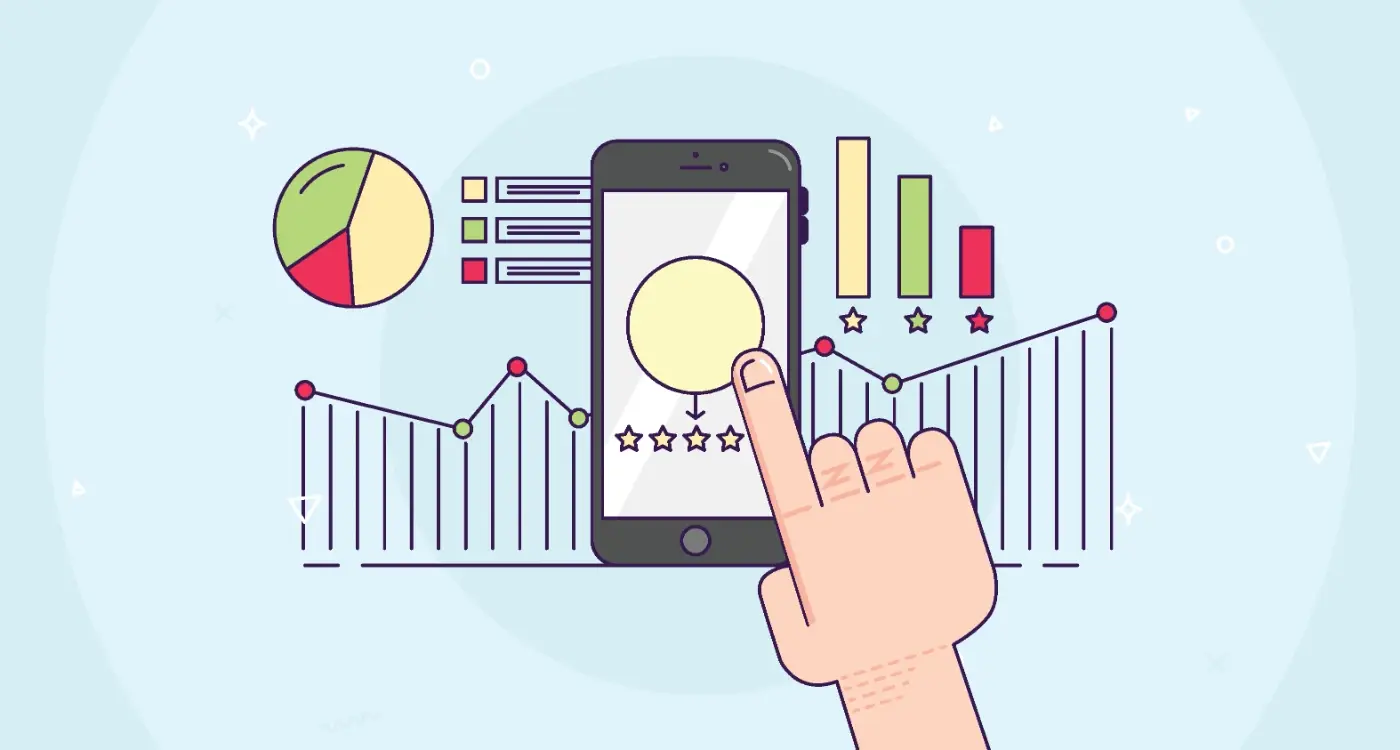
Here's what many developers miss: before anyone even reads your app description or watches your demo video, they make a split-second decision about your app based purely on its visual appearance. That tiny icon sitting amongst hundreds of others needs to grab attention, communicate trust, and persuade someone to tap that download button. And colour psychology plays a massive role in making that happen.
The human brain processes visual information 60,000 times faster than text, which means your app's colour choices are working for or against you before users even realise they're making a judgement
Most app developers focus entirely on functionality and user experience—which are important, don't get me wrong—but they completely overlook how colour psychology impacts app store performance. The thing is, different colours trigger different emotional responses in people. Red creates urgency, blue builds trust, green suggests growth. When you understand these psychological triggers and apply them strategically to your app icon and store listing, you can significantly improve your download rates and overall ASO performance. That's exactly what we're going to explore in this guide.
The Science Behind Colour and Human Behaviour
Your brain processes colours before you even realise you're looking at something. In fact, the human eye can distinguish roughly ten million different colour variations, and each one triggers a specific response in your mind within milliseconds. This isn't just marketing fluff—it's neuroscience.
When light hits your retina, it sends signals directly to your brain's limbic system, which controls emotions and decision-making. Red increases heart rate and creates urgency. Blue lowers blood pressure and builds trust. Green feels balanced and natural, whilst yellow grabs attention but can cause anxiety in large doses. These reactions happen whether you want them to or not.
The Physical Response to Colour
Your body actually changes when you see certain colours. Studies using brain imaging show that warm colours like red and orange activate the sympathetic nervous system—the same response you get from stress or excitement. Cool colours like blue and purple do the opposite, triggering your parasympathetic system and helping you relax.
This matters more than you might think for app performance. When someone scrolls through an app store, they're making split-second judgements based on these unconscious reactions.
The Memory Connection
Colours don't just affect how you feel right now—they influence how well you remember things. The Von Restorff effect shows that items in colour are 65% more likely to be remembered than those in black and white. Your app icon has roughly three seconds to make an impression, and colour is doing most of the heavy lifting.
- Red: Creates urgency and excitement, increases appetite
- Blue: Builds trust and security, used by 57% of Fortune 500 companies
- Green: Suggests growth and harmony, easiest colour for eyes to process
- Purple: Implies luxury and creativity, historically associated with royalty
- Orange: Combines red's energy with yellow's happiness, encourages action
How App Store Algorithms Respond to Visual Design
App store algorithms are constantly scanning for visual cues that indicate quality and user appeal. They don't just look at download numbers—they examine how users interact with your app's visual elements before they even install it. This includes time spent viewing your app listing, click-through rates from search results, and conversion rates from views to downloads.
The algorithms pay particular attention to your app icon because it's the first thing users see. Icons with strong colour contrast and clear visual hierarchy tend to perform better in search rankings. When users scroll through search results quickly, apps with distinctive colour schemes are more likely to catch their eye and earn that precious tap.
Test your app icon at thumbnail size on different device screens—if the colours blur together or become hard to distinguish, the algorithm will likely penalise your visibility in search results.
Visual Performance Signals
App stores track several visual engagement metrics that directly impact your ranking position. These signals tell the algorithm whether your visual design is working or falling flat with real users.
- Screenshot viewing time and scroll behaviour
- Icon tap rates from search and category browsing
- Conversion rates from listing views to downloads
- User retention after viewing app previews
Colour Psychology Meets Machine Learning
Modern app store algorithms use machine learning to identify patterns between colour choices and user behaviour. They've learned that certain colour combinations correlate with higher engagement rates and better user retention. Apps using colours that align with their category expectations—like green for finance or blue for productivity—often receive algorithmic boosts because users find them more trustworthy and relevant to their needs.
Icon Colour Choices That Drive Downloads
Your app icon sits there on the store page like a tiny billboard—and just like any good advertising, colour makes or breaks whether someone stops to look. I've watched perfectly good apps struggle because their icon got lost in a sea of similar colours, whilst others with smart colour choices shot straight to the top of download charts.
Red icons grab attention faster than any other colour; studies show our brains process red quicker than blues or greens. That's why so many successful apps—from YouTube to Pinterest—use red as their primary icon colour. But here's the catch: red also triggers caution in some users, so it works best for entertainment or social apps rather than banking or security applications.
Standing Out in the App Store
Blue dominates app stores because it feels trustworthy and professional. Facebook, Twitter, LinkedIn—they all chose blue for good reason. But this creates an opportunity. When everyone zigs with blue, you can zag with orange or purple and immediately stand out. Orange suggests creativity and energy, which explains why apps like VLC Media Player perform so well.
The Dark Mode Factor
Here's something many developers miss: your icon needs to work in both light and dark modes. A bright yellow icon might look cheerful on a white background but disappears completely in dark mode. Green works brilliantly in both—it's calming, suggests growth, and maintains visibility regardless of the user's display settings.
The smartest approach? Look at your app category's top performers and identify which colours are oversaturated. Then choose something that complements but doesn't copy. Your icon has roughly three seconds to convince someone to tap—make those seconds count with the right colour choice.
The Psychology of Trust Through App Colours
Trust is probably the most important factor in getting someone to download your app—and keeping them using it. People won't hand over their personal data, payment details, or time to something that feels dodgy. This is where colour psychology becomes your secret weapon for building instant credibility.
Blue dominates the trust conversation for good reason. Banks, social media platforms, and productivity apps all lean heavily on blue because it triggers feelings of reliability and professionalism in users' minds. But here's what's interesting—it's not just any blue that works. Darker blues suggest authority and security, whilst lighter blues feel more approachable and friendly.
Building Authority With Strategic Colour Choices
Green works differently but just as powerfully. It signals safety, growth, and positive outcomes—which explains why financial apps and health platforms use it so effectively. White and grey play supporting roles by creating clean, uncluttered interfaces that feel professional and trustworthy.
Research shows that users make judgements about an app's trustworthiness within 50 milliseconds of seeing the interface—before they've even read a single word
What Colours Actually Damage Trust
Bright reds, oranges, and yellows can work against you when trust is the goal. These colours create urgency and excitement, which can feel pushy or aggressive in the wrong context. That doesn't mean avoiding them completely—just use them strategically for action buttons rather than primary branding.
The key is matching your colour choices to user expectations. A banking app in hot pink will struggle regardless of how well it functions; a fitness app in corporate navy might feel too serious. Understanding these psychological triggers helps you build the right first impression—and in app stores, first impressions often determine whether someone downloads or scrolls past.
Cultural Differences in Colour Perception
When I'm working on apps that need to perform well globally, one thing that catches people off guard is how differently colours are perceived across cultures. What works brilliantly in London might completely miss the mark in Tokyo or Lagos. It's not just about personal preference—it's about deeply ingrained cultural associations that have developed over centuries.
Red is a perfect example of this complexity. In Western markets, red often signals danger, urgency, or aggression; think stop signs and warning messages. But in China, red represents good fortune, prosperity, and celebration. An app using red for error messages in the Chinese market could confuse users who associate that colour with positive outcomes. White presents another interesting case—whilst it symbolises purity and cleanliness in Western cultures, it's traditionally associated with mourning and death in many Asian countries.
The Business Impact of Getting Colours Wrong
These cultural differences aren't just academic—they directly affect your app store performance. I've seen apps struggle in certain markets simply because their colour choices felt 'off' to local users. When someone opens your app store listing and the colours feel culturally inappropriate or confusing, they're likely to scroll past without downloading.
Green might seem like a safe choice (it represents nature and growth almost universally), but even then you need to be careful. Different shades of green carry different meanings; whilst forest green might suggest stability, neon green could appear cheap or untrustworthy in some markets. The key is researching your target markets thoroughly and testing your colour choices with local users before launch.
Testing and Measuring Colour Impact on Performance
Right, let's talk about the bit that actually matters—proving whether your colour choices are helping or hurting your app store performance. You can read all the colour psychology studies you like, but if you're not testing your designs, you're basically guessing.
A/B testing is your best friend here. Most app store platforms let you test different icon versions against each other, and the results can be eye-opening. I've seen apps boost their conversion rates by 20% just by switching from a blue icon to an orange one. The tricky part is knowing what to measure and how long to run your tests.
Key Metrics to Track
- Icon impression-to-install conversion rate
- Click-through rate from search results
- App store page bounce rate
- Install completion rate
- User retention after first open
Run your colour tests for at least two weeks to account for weekend versus weekday user behaviour differences—shopping patterns change dramatically between Tuesday and Saturday!
Don't just test random colours though. Start with your current icon, then test variations that align with your target audience's preferences and cultural background. If you're targeting a global market, consider running separate tests in different regions since colour perception varies significantly across cultures.
Tools and Platforms for Testing
Google Play Console offers built-in store listing experiments, whilst Apple's App Store Connect provides similar A/B testing capabilities. Third-party tools like StoreMaven and SplitMetrics give you more detailed analytics, but they come with a price tag.
The golden rule? Test one element at a time. If you change both your icon colour and your background simultaneously, you won't know which change drove the performance improvement. Keep it simple, measure everything, and let the data guide your ASO design decisions.
Conclusion
After eight years of helping brands navigate app store success, I can tell you that colour psychology isn't just marketing fluff—it's a real force that shapes how people interact with your app before they even download it. The data doesn't lie; apps that understand their audience's colour preferences consistently outperform those that don't.
We've covered a lot of ground here. From understanding how different colours trigger specific emotions in users, to seeing how app store algorithms actually respond to visual design choices. The truth is, your icon colour can make or break your first impression—and in app stores where you have seconds to capture attention, that matters more than most developers realise.
What strikes me most about working in this space is how cultural differences play such a massive role in colour perception. Red might signal excitement in Western markets, but it carries completely different meanings elsewhere. This is why testing isn't optional—it's the only way to know what actually works for your specific audience.
The psychology of trust through colour choices runs deeper than surface aesthetics too. Users make split-second judgements about app credibility based on colour combinations, and these decisions directly impact download rates and user retention.
Moving forward, remember that colour psychology works best when it's part of a broader strategy, not a quick fix. Test your choices, measure the results, and be prepared to adapt based on what your users tell you through their behaviour. Your app's success depends on understanding that every colour decision is really a decision about human psychology.