What Makes People Install an App From the App Store?
A plumbing company launches their new app—they've spent months building it, invested thousands in development, and created features their customers actually need like emergency booking and real-time engineer tracking. They submit it to the App Store, wait for approval, and then... nothing happens. Downloads trickle in at maybe five or ten per week. The app works brilliantly, but nobody's installing it. Sound familiar? I see this happen all the time, and its not because the app is bad—its because the company focused entirely on what the app does rather than why someone would choose to download it in the first place.
Here's the thing - getting someone to install your app is completely different from building a good app. You could have the best-designed, most useful app in your category, but if you cant convince people to tap that install button? Well, it might as well not exist. The App Store is crowded. Really crowded. And people make their decision about whether to download your app in literally seconds, not minutes. They're scrolling, judging, comparing... and they'll move on to the next option without a second thought if something doesnt grab them immediately.
The average person spends less than seven seconds looking at an app before deciding whether to download it or keep scrolling.
What we're going to look at in this guide is what actually makes people stop scrolling and start downloading. Not theory or guesswork—actual psychological triggers and proven techniques that affect app store conversion rates. I've helped dozens of clients turn their app store presence from an afterthought into a proper acquisition channel, and honestly? The patterns are pretty clear once you know what to look for. Some of it might surprise you, some of it will seem obvious in hindsight, but all of it works when you get the execution right.
Why First Impressions Matter in the App Store
You've got about three seconds. Maybe four if you're lucky. That's how long you have to convince someone scrolling through the App Store that your app is worth their time. I mean, think about how you browse the app store yourself—you're swiping through dozens of options, probably distracted by something else, and you make split-second judgments about what looks interesting and what doesn't. Your potential users do exactly the same thing.
Here's the thing—most people never even make it past your app icon and title before deciding whether to tap through for a closer look. It's a bit mad really, because you might have spent months building the perfect app with brilliant features and flawless performance, but if your store listing doesn't capture attention immediately, none of that matters. The app store is a crowded place; there are over two million apps on iOS alone, and your app is competing with all of them for those precious few seconds of attention.
What makes this even trickier is that first impressions aren't just about looking pretty—they need to communicate value instantly. Users are asking themselves "what does this do?" and "is this for me?" without even realising they're asking those questions. Your icon needs to hint at your apps purpose, your screenshots need to tell a story, and your first line of description needs to hook them before they scroll past. Miss any of these elements and you've lost them, probably forever because they won't come back to give you a second chance. The data backs this up too; most apps that don't convert a store visit into a download within those first few seconds never get another opportunity with that user.
The Psychology Behind Download Decisions
When someone's scrolling through the App Store looking at your app, their brain is making split-second judgements that happen way faster than they even realise. I've spent years watching how people interact with app listings (through heatmaps, user testing sessions, and good old-fashioned observation) and the patterns are pretty consistent. People dont think about whether to download your app in a logical, step-by-step way—they feel it first, then justify it later.
The decision to tap that install button usually happens within the first 3-7 seconds of landing on your app page. That's barely enough time to read a sentence, let alone understand what your app does. So what's actually going on in those crucial moments? Your potential user is asking themselves three questions without even knowing it: "What is this?", "Can I trust it?", and "Is it for someone like me?" If your app listing doesn't answer these questions immediately, they're gone.
Here's the thing—most people approach the App Store with their guard up. They've been burned before by apps that looked great but turned out to be rubbish or worse, scammy. This means we're fighting against natural scepticism from the very first second. The brain is looking for shortcuts, what psychologists call heuristics, to make a quick decision without having to think too hard about it. Understanding these patterns is crucial for avoiding common research pitfalls when analyzing user behavior. Star ratings? That's a shortcut. Download numbers? Another one. A professional-looking icon? Yet another mental shortcut that tells them "this might be legitimate."
The Six Key Psychological Triggers
Over the years I've identified six main psychological triggers that influence whether someone taps install or keeps scrolling, and honestly, understanding these has transformed how I approach App Store listings for clients:
- Social validation—people look at what others have done before them; if your app has 50,000 downloads and 4.5 stars, that's powerful proof that others found it worthwhile
- Loss aversion—humans hate missing out on something good more than they enjoy gaining something new; phrases like "join millions of users" tap into this fear
- Cognitive fluency—if your app listing is easy to understand quickly, people assume the app itself will be easy to use (whether that's true or not!)
- Authority signals—things like "Featured by Apple" or "As seen in TechCrunch" tell the brain this app has been vetted by someone important
- Visual appeal—attractive screenshots trigger positive emotions that get associated with your app before they've even used it
- Scarcity or urgency—limited-time offers or exclusive features make people act faster than they normally would
The Role of Emotion vs Logic
I mean, we like to think we make rational decisions, but when it comes to app downloads? Its almost entirely emotional at first. Someone sees your icon, feels something (interest, curiosity, maybe even delight), and then their logical brain kicks in to justify why they should proceed. This is why apps with strong visual identities and clear value propositions perform so much better than those with generic designs—they trigger that initial emotional response that opens the door to consideration.
The really interesting part is what happens next. After that initial emotional hook, people start scanning for reasons to confirm their gut feeling was right. They'll glance at your rating, maybe read the first line of your description, check how many MB the download is, and look at your first screenshot. If everything aligns with their initial positive emotion, they install. If something feels off—maybe your screenshots look outdated or your description is too vague—they'll back out, even if they were interested just seconds before.
Track where users drop off in your app listing by using tools like Apple's Product Page Optimisation feature or third-party analytics; knowing whether people leave after seeing your icon versus after reading your description tells you exactly where your conversion problem lies and what needs fixing first.
One mistake I see constantly is apps trying to appeal to everyone, which ends up appealing to no one. The human brain needs to categorise things quickly—it wants to know "is this for me or not?" Your app listing needs to make that categorisation easy. If you're building a fitness app for beginners, own that. Don't try to also appeal to professional athletes in the same listing because you'll just confuse both audiences and convert neither of them.
Another thing that affects download decisions more than people realise is timing and context. Someone browsing the App Store on their commute home is in a different mindset than someone actively searching for a solution to a specific problem at work. The psychology changes based on whether they found your app through search (high intent) or through browsing categories (low intent, just exploring). High-intent users need less convincing but want very specific information; low-intent users need more emotional hooks and inspiration to even consider downloading.
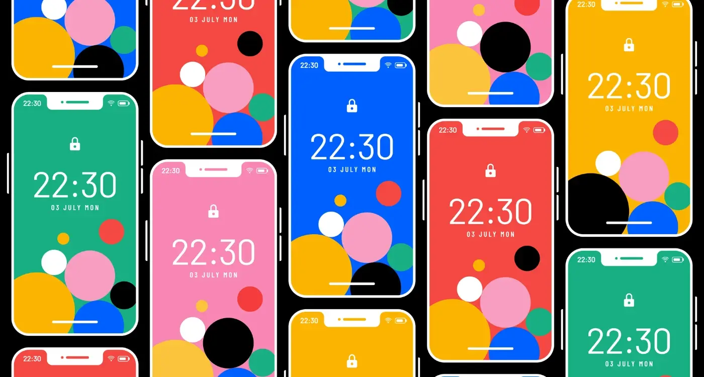
App Icons and Screenshots That Get Noticed
Right, let's talk about the stuff that actually gets people to tap that download button. Your app icon and screenshots are doing the heavy lifting here—they're working 24/7 in the App Store, trying to convince complete strangers that your app is worth their time and storage space. And trust me, its not an easy job!
Your app icon needs to work at tiny sizes. I mean really small. Like the size of a fingernail on most phones. If I squint at your icon and cant tell what it is, you've already lost. The best icons use bold shapes and limited colours;usually no more than two or three. Text in icons? Almost always a mistake. It becomes unreadable at small sizes and just looks cluttered. But here's the thing—your icon also needs to stand out among dozens of other apps on someone's home screen, which means you need to think about contrast and uniqueness too.
Screenshots are where you tell your story. You've got about three seconds before someone swipes past, so your first screenshot better show the most compelling feature of your app. Not the login screen. Not the onboarding. The actual value. What does your app do that makes peoples lives better? Show that immediately.
What Makes Screenshots Actually Work
- Put your best feature first—don't make people scroll to find out why they should care
- Add text overlays that explain what they're looking at (the UI alone isn't always obvious)
- Show the app in use, not just empty states or placeholder content
- Use real data and real scenarios that your target audience will recognise
- Keep text minimal and readable—you're not writing an essay here
- Test different orders and combinations to see what converts better
One mistake I see constantly is treating screenshots like a product tour. They're not. They're a sales pitch. Each image should answer the question "why should I download this?" If a screenshot doesn't do that job, replace it with one that does. Its really that simple.
Writing App Descriptions That Convert
Your app description is probably the most underused tool in your conversion arsenal. I mean, how many times have you seen descriptions that just list features in bullet points or ramble on about technical specifications? Its honestly a waste of prime real estate.
Here's the thing—most people don't read your entire description. They skim it. Maybe 3-4 seconds max. So the first few lines need to hook them immediately with a benefit they actually care about. Not "Our app uses advanced algorithms to process data" but "Find what you need in half the time." See the difference? One talks about the app, the other talks about what the user gets.
I always structure descriptions with the most important information at the top—the core benefit, the main problem it solves, why someone should care right now. Then I add supporting details below for people who want to dig deeper. Think of it like a newspaper article; the headline and first paragraph should tell you everything you need to know.
The best app descriptions answer three questions in the first 30 words: What does this do? Why do I need it? How will it make my life better?
And please, for the love of all things holy, dont stuff your description with keywords. Yes, the App Store algorithms look at your text, but they're smart enough now to spot keyword stuffing. Write for humans first. Use natural language. Tell a story about how your app fits into someones day. A banking app isn't just "secure transactions and account management"—its "Check your balance while queuing for coffee, pay friends back instantly, never miss a bill payment again."
Keep sentences short. Use simple words. Break up text so it doesnt look like a wall of boring corporate speak. And test different versions; you'd be surprised how changing just the opening sentence can shift your conversion rate by 10-15%.
Ratings and Reviews That Build Trust
Here's the thing—people trust other people more than they trust your marketing copy. I've seen brilliant apps struggle because they had a 3-star rating, and I've seen mediocre apps succeed with a solid 4.5 stars. Its just how human psychology works; we look to others to validate our decisions before we commit to downloading something that'll take up space on our phones.
The star rating is often the first thing people notice after your app icon. Research shows that apps with ratings below 3 stars get almost no downloads at all, regardless of how good the screenshots or description might be. But here's what's interesting—there's not a massive difference in conversion between 4 stars and 5 stars. Actually, sometimes a perfect 5-star rating can look suspicious, like you've paid for fake reviews or only launched yesterday with three downloads from your mates.
What Makes a Review Actually Useful
When users scroll through reviews, they're looking for specific information. They want to know if the app actually does what it claims to do, whether its easy to use, and if there are any dealbreaker bugs or issues. Generic five-star reviews saying "great app!" don't carry much weight anymore—people want detail, they want authenticity, and honestly they want to see that you respond to feedback.
I always tell clients that responding to reviews is one of the most underused tools in the App Store toolkit. When potential users see a developer actively engaging with feedback, addressing problems, and thanking people for positive reviews, it builds confidence. It shows theres a real team behind the app who cares about the user experience. This kind of engagement can help you identify genuine user insights versus superficial feedback patterns.
The Power of Recent Reviews
The App Store algorithms give more weight to recent reviews than old ones, which is actually quite fair when you think about it. An app that was buggy two years ago might be brilliant now after countless updates. Users instinctively scroll to the most recent reviews to get a current picture of what they're getting into.
- Apps with 4+ star ratings see significantly higher download rates than those below this threshold
- Response rates to reviews can improve your app's perceived quality by up to 30%
- Recent reviews (from the last few months) carry more weight than older feedback in user decision-making
- Detailed reviews with specific use cases are more trusted than generic praise
- A mix of ratings looks more authentic than perfect scores across the board
One mistake I see all the time is developers who only ask happy users to leave reviews. This can backfire because it creates an unrealistic picture—and when someone downloads expecting perfection based on glowing reviews, even minor issues feel like major disappointments. Better to have honest, balanced feedback that sets realistic expectations from the start.
Social Proof and Download Numbers
Right, lets talk about something that honestly makes a huge difference to your app store conversion—those download numbers you see under an app. You know the ones: "10,000+ downloads" or "1M+ downloads". They matter more than most people think. Actually, they can be the deciding factor between someone choosing your app or your competitors.
Here's the thing—people are naturally drawn to what other people are doing. Its just human nature, isn't it? When someone sees that an app has been downloaded millions of times, their brain immediately thinks "well, all these people can't be wrong" and that creates a sense of safety around the decision to download. Its like choosing a restaurant; you're more likely to go into the one thats busy rather than the empty one next door.
But here's where it gets tricky for new apps. Breaking through that initial barrier when you don't have big numbers yet? Bloody difficult. I've seen brilliant apps struggle simply because they couldn't build that initial momentum. The App Store on iOS doesn't even show download counts, which actually levels the playing field a bit—you can compete based on other factors like ratings and reviews rather than pure numbers.
Google Play is different though. It shows those download ranges prominently, and people absolutely use them as a trust signal. An app with 100+ downloads will naturally lose out to one with 50,000+ downloads, even if the smaller app is technically better. It's not fair, but its the reality we work with.
If you're launching a new app, focus your initial marketing efforts on getting to that first milestone as quickly as possible. Even reaching 1,000 downloads creates a much stronger impression than staying under 100. Consider running targeted ads or reaching out to your existing customer base to kickstart your numbers.
How Download Numbers Influence Decision Making
The psychology behind this is pretty straightforward. When people see high download numbers, they make several assumptions—usually that the app works well, that its been tested by lots of users, and that the company behind it is legitimate. These assumptions happen in seconds, often without conscious thought. I mean, people don't sit there analyzing it; they just feel more confident.
Download velocity matters too, not just total numbers. Apps that are trending or growing quickly get preferential treatment in app store algorithms, which then leads to more visibility, which leads to more downloads. It's a cycle that either works for you or against you. Getting that initial momentum is key, which is why launch strategies matter so much for new apps.
Making the Most of Your Download Numbers
When your numbers aren't impressive yet, you need to compensate with other trust signals. Focus heavily on getting quality ratings and reviews quickly. A new app with 500 downloads but 50 five-star reviews can actually outperform an older app with 10,000 downloads and a 3.5 rating. People look at the whole picture, and sometimes that social proof from engaged users matters more than raw download counts.
Also worth noting—fake downloads don't work anymore. The app stores have gotten really good at detecting artificial inflation, and the penalties aren't worth it. I've seen apps get suspended for trying to game the system. Just don't do it; build your numbers organically even if its slower.
| Download Range | User Perception | Conversion Impact |
|---|---|---|
| 0-100 | Brand new or untested | Very Low |
| 100-1,000 | Early stage but viable | Low |
| 1,000-10,000 | Established presence | Moderate |
| 10,000-100,000 | Popular and trusted | High |
| 100,000+ | Market leader | Very High |
The reality is that download numbers create a self-reinforcing cycle. More downloads lead to better visibility, which leads to more downloads. Breaking into that cycle requires a solid launch strategy, targeted marketing, and patience. But once you get there, the numbers start working for you rather than against you.
Price Points and Monetisation Models
Here's the thing—your price tag sends a message before anyone even reads your description. I've seen brilliant apps fail because they got their pricing wrong, and I've seen fairly average ones succeed because they nailed their monetisation strategy. It's a bit mad really, but people make snap judgements about an app's value based on whether it costs £0.99, £4.99, or nothing at all.
Free apps get downloaded more, obviously. But here's what most people don't realise: a free app with in-app purchases often performs better in the store rankings than a paid app, simply because it removes that initial barrier to entry. Users will take a punt on something that costs them nothing, even if they're sceptical about whether its any good. Once they've downloaded and started using your app, that's when you can win them over and introduce premium features or subscriptions. Getting your mobile app pricing strategy right can make the difference between success and failure in the App Store.
The Main Monetisation Models
There are basically four ways to make money from your app, and each one affects how people perceive it in the store:
- Completely free (you're either building an audience or planning to monetise later)
- Paid upfront (users pay once to download; works best for utility apps and games with strong brand recognition)
- Freemium (free to download with premium features locked behind purchases—this is what most successful apps use now)
- Subscription-based (monthly or yearly payments; perfect for apps that provide ongoing value like meditation tools or fitness trackers)
The model you choose affects everything from your conversion rate to your App Store category performance. A £9.99 productivity app better have screenshots that prove it's worth that investment, whilst a free app needs to clearly communicate what you'll get without paying and what's locked behind a paywall. Users hate feeling tricked, and if your free app is basically unusable without buying something, your reviews will reflect that—and tank your download rate. I mean, transparency really is key here; people will pay for quality if they understand what they're getting. Understanding competitive pricing strategies in your market segment can help you position your app more effectively.
Testing and Improving Your Conversion Rate
Right, so you've got your icon designed, your screenshots looking good, and your description written—but here's the thing, you can't just publish everything and hope for the best. The apps that perform well in the store are the ones that test different variations and actually measure what works. I mean, you wouldn't launch a business without checking if people wanted to buy your product, would you?
App store conversion testing is basically about showing different versions of your listing to real users and seeing which one gets more downloads. Most people call this A/B testing; its pretty straightforward once you get started. You might test two different icon designs, or maybe three variations of your first screenshot. The tricky bit is only changing one thing at a time—otherwise you won't know what made the difference.
Google Play has built-in A/B testing tools that let you test your icon, feature graphic, and screenshots directly in the console. Apple doesn't offer native testing (bit annoying really), but you can use third-party tools or run tests on your website or ad campaigns before committing to changes in the App Store. What I've found over the years is that small changes can make surprisingly big differences—sometimes a 20-30% increase in conversion just from tweaking your first screenshot.
The difference between a 3% conversion rate and a 5% conversion rate might not sound like much, but when you're driving thousands of visitors to your listing, that extra 2% represents hundreds of additional users every month
You also need to track where your visitors are coming from. Users who find you through search behave differently than users who click through from an ad or a social media post. Search traffic usually converts better because people are actively looking for what you offer—they've got intent already. Paid traffic can be trickier; these users might need more convincing because they weren't necessarily looking for your app when they saw your ad.
One mistake I see constantly is people making changes based on gut feeling rather than data. Sure, you might think a bright red icon looks better than a blue one, but if the blue one converts 15% better in testing, who cares what you personally prefer? Your opinion doesn't matter here—only what gets downloads matters. And honestly, users will surprise you. The variations I think will win often don't, which is exactly why testing is so important.
Keep testing regularly too. What worked six months ago might not work now—user expectations change, competitors update their listings, and seasonal factors can affect what resonates with people. The best performing apps treat their store listing like a living thing that needs constant attention and improvement, not something you set up once and forget about.
Conclusion
So there you have it—everything I've learned over the years about what actually makes people tap that install button. It's not rocket science, but its definitely not as simple as just building a good app and hoping for the best either. The App Store is crowded these days, bloody hell, there are millions of apps all competing for attention, and if you want yours to stand out you need to get all of these elements working together.
The thing is, none of this exists in isolation. Your app icon needs to work with your screenshots, your screenshots need to support what your description promises, and your ratings need to back up everything you're saying. When someone lands on your app store page, they're making a snap judgement in about 7 seconds—maybe less if they're in a rush. That's all the time you've got to convince them that your app is worth their storage space, their time, and potentially their money.
I mean, look—building an app is the easy part these days. We've got better tools, better frameworks, and more resources than ever before. But getting people to actually install it? That requires understanding human psychology, respecting users intelligence, and being honest about what you're offering. The apps that succeed long-term are the ones that dont try to trick people into downloading; they're the ones that clearly communicate their value and then deliver on that promise once someone's installed.
Test everything, iterate constantly, and always keep your users needs at the centre of every decision you make. Because at the end of the day, a successful app isnt just about downloads—its about creating something people genuinely want to use.
Share this
Subscribe To Our Learning Centre
You May Also Like
These Related Guides
How Do App Ratings Create Trust in the App Store?

How Do I Improve App Store Rankings Using Psychology?