How Does Screenshot Storytelling Guide Download Decisions?
Your app could be the most useful thing ever made, solving a real problem that people genuinely need fixing—but if your screenshots don't tell that story in the first few seconds, nobody's going to download it. I mean, you can have the best app in the world sitting there in the store, and it won't matter one bit if those preview images don't grab someone's attention immediately. Its a harsh truth that I've watched play out hundreds of times over the years; great apps with terrible screenshots getting ignored whilst mediocre ones with brilliant visual stories rack up thousands of downloads.
The thing is, most people don't read your app description. They just don't. They scroll through your screenshots, maybe glance at your icon, check the star rating, and then they make their decision right there and then. You've got maybe five seconds to convince them—probably less if we're being honest—and those screenshots are doing all the heavy lifting. They're not just pretty pictures to fill up space in your app store listing; they're your sales pitch, your product demo, and your brand message all rolled into one.
Your screenshots aren't decoration for your app store listing, they're the reason someone decides to tap that download button or keep scrolling past you to your competitor
What I've learned from years of testing different screenshot strategies is that there's a proper way to build a visual narrative that guides people through understanding what your app does and why they need it. But here's the thing—most developers get it completely wrong. They either show random screens with no context, or they try to cram every single feature into five images and end up confusing everyone. Understanding how to build a proper screenshot sequence that tells your apps story and maps to how users actually think about solving their problem? That's what separates apps that convert browsers into users from those that just sit there gathering digital dust.
Why Screenshots Matter More Than You Think
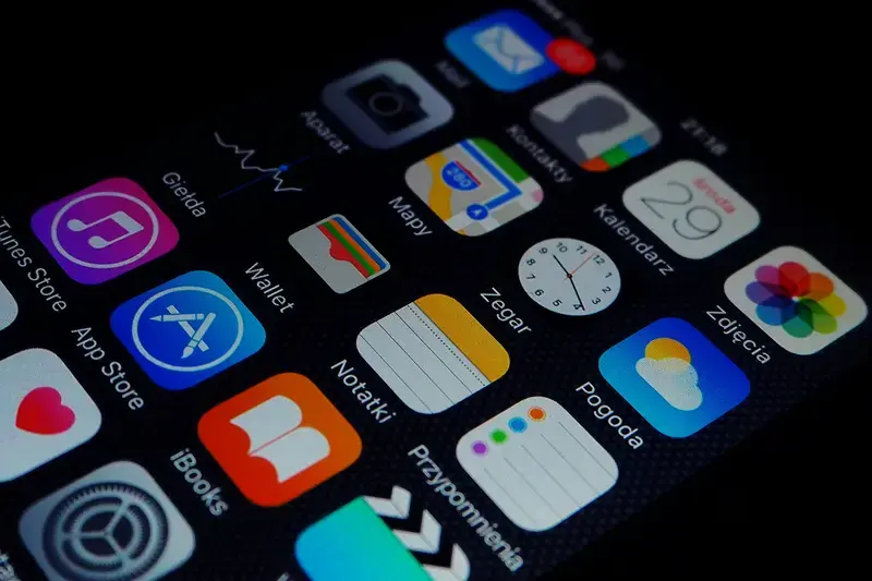
When someone lands on your app store page, they're not reading your carefully crafted description first—they're scrolling through your screenshots. It's just how people work, isn't it? We're visual creatures and we want to see what we're getting before we commit to downloading anything.
Here's what most app developers get wrong: they treat screenshots like an afterthought. Something to throw together quickly once the app is done. But honestly? Your screenshots are doing more heavy lifting than almost any other part of your app store presence. They're your shop window, your first impression, and often your only chance to convince someone to hit that download button.
I've watched countless download rates change—sometimes doubling or even tripling—just by getting the screenshots right. Because whilst you might have spent months perfecting your app, users are giving you maybe five seconds to prove its worth looking at. That's it. Five seconds of scrolling through your images before they move on to the next app in the search results.
The data backs this up too; most people decide whether to download an app based purely on what they see in those screenshots. They might not even read your description or check your ratings until after the screenshots have already sold them on the idea. And if your screenshots don't immediately show the value of your app? Well, they're gone—theres no second chance to make that first impression.
Your screenshots need to tell a story about what your app does and why someone should care. They need to show actual value, not just pretty interfaces. Because at the end of the day, people download apps to solve problems or fulfil needs, and your screenshots should make that solution crystal clear within seconds.
The Five-Second Rule for App Screenshots
Right—here's something I learned the hard way after watching thousands of potential users scroll past perfectly good apps. You've got five seconds. That's it. Five seconds to communicate what your app does, why it matters, and why someone should stop scrolling and actually read more. Its not a lot of time, is it? But that's the reality of app store browsing behaviour; people are moving fast, their attention is split, and theres a million other apps competing for their eyeballs.
When I review app store listings for clients, I always start with the five-second test. I pull up their screenshots on my phone and literally count to five whilst looking at the first image. If I cant tell you what the app does and who its for by the time I hit five, we've got a problem. And honestly? Most apps fail this test. They lead with beautiful interface shots that show off their design skills but dont actually communicate value. Or they start with a feature that only makes sense if you already understand the app. Its a bit mad really, because fixing this one thing can double your conversion rate.
The key is to treat your first screenshot like a billboard on a motorway—drivers (or in this case, scrollers) are moving past quickly and they need to grasp your message instantly. Your visual narrative starts here; everything that follows builds on this crucial first impression. This is where your app screenshot strategy either wins or loses the download decision.
What Makes a Screenshot Work in Five Seconds
Your opening screenshot needs to answer these questions immediately, and I mean in a single glance:
- What does this app actually do?
- Who is it for?
- What problem does it solve?
- Why should I care right now?
I've tested this across different industries—fintech apps, fitness trackers, productivity tools, you name it—and the pattern holds true. Apps that nail the five-second rule see conversion rates that are consistently higher than those that dont. Sometimes we're talking 30-40% improvement just from reworking that first image. The best performing screenshots combine a clear visual of the app in action with text overlay that states the core benefit. Not a feature list, mind you. A benefit. "Track your spending without thinking about it" beats "Automatic transaction categorisation" every single time.
Test your first screenshot by showing it to someone whos never seen your app before. Give them exactly five seconds, then ask them to explain what the app does. If they cant tell you, your screenshot isnt working hard enough.
The Scroll-Stop Moment
Creating that scroll-stop moment is part art, part science. You need visual contrast that catches the eye—this is where colour psychology and design hierarchy come into play. But you also need clarity. I've seen gorgeous screenshots that look like works of art but communicate absolutely nothing about the apps purpose. Meanwhile, simpler designs with clear messaging consistently outperform them in app store conversion metrics. Your screenshot sequence needs to start with impact; the prettiest interface shot means nothing if users scroll past it without stopping.
Building Your Visual Story Sequence
Right then—lets talk about how to actually arrange your screenshots so they tell a proper story. Because that's what this is all about really; creating a narrative that takes someone from "what's this app?" to "I need to download this right now" in just a few swipes.
Your first screenshot needs to answer the most basic question: what does your app do? Not what features it has or how clever your technology is, but what problem it solves for the person looking at it. I see so many apps lead with their settings screen or some random feature nobody cares about yet. Start with the core value—the main thing people will actually use your app for.
The second and third screenshots should show the key features that support that main value. If your app is a fitness tracker, show the workout tracking interface, then maybe the progress graphs people love. Its about building momentum; each screenshot should make someone think "oh, and it does that too?" The order matters more than most people realise.
Your Screenshot Sequence Should Flow Like This
- The main screen or primary function—what people will see most often
- The standout feature that makes you different from competitors
- A secondary feature that adds value and shows depth
- Social proof or results (if applicable to your app type)
- A final "wow" moment or comprehensive view of capabilities
Here's the thing though—you don't always need all five screenshots. Sometimes three is enough if they're really strong. Quality beats quantity every single time, and cluttering your story with mediocre screenshots just dilutes the impact of your best ones. I've seen apps with just three brilliant screenshots outperform competitors who used all ten available slots with forgettable images.
Think about the flow between screenshots too; they should feel connected, not like random screens grabbed from different parts of your app. If your design uses a red accent colour, make sure its visible and consistent across the sequence. People process visual information fast, and anything that feels disjointed or confusing will cost you downloads.
Common Screenshot Mistakes That Kill Downloads
Right, lets talk about the mistakes I see all the time—mistakes that are honestly costing businesses thousands in lost downloads. First up is trying to show everything in one screenshot. I get it, you've built this amazing app with loads of features and you want people to see them all. But cramming everything into a single image just creates visual noise; users cant focus on anything specific and they just scroll past.
Another big one? Using screenshots that are basically just raw app interfaces with no context. I mean, yes, people want to see what your app looks like, but a plain screenshot of a settings page or a blank form doesn't tell them anything about the value they'll get. Its boring. Give them context—show the app being used in a way that makes sense for their life.
The Text Overlay Trap
Here's something that drives me mad: when people add so much text to their screenshots that you can barely see the actual app underneath. Remember, these images are tiny on mobile devices and if your text is too small or theres too much of it, nobody will read it anyway. Keep your text short and punchy or dont use it at all.
The biggest mistake isn't having bad screenshots—its having screenshots that don't tell any story at all.
Starting With the Wrong Screen
Your first screenshot needs to grab attention immediately but so many apps lead with their login screen or onboarding flow. Why would anyone care about logging in before they even know what your app does? Start with your best feature, the thing that makes people think "I need this right now". Save the technical stuff for later in the sequence when you've already hooked them in.
Text Overlays and When to Use Them
Right, let me be really clear about this—text overlays on screenshots can either be brilliant or absolutely ruin your conversion rate. There's no middle ground here. I've seen so many apps lose downloads because they slapped text all over their screenshots without thinking about whether it actually helps or just creates noise.
The big question you need to ask yourself is this: does the screenshot tell the story on its own? If yes, then you probably don't need text. If no, then text can fill in those gaps. But here's where most people get it wrong—they use text to describe what's already obvious in the image. That's just wasting space and making things cluttered.
Text works best when it highlights a benefit that isn't immediately visible. Maybe your app saves people time, or it's got a feature that competitors don't have, or theres some complex functionality that needs a bit of context. That's when text overlays earn their place. I mean, if you've built a scheduling app that uses AI to suggest the best meeting times, that's not something users can see just by looking at a calendar interface—you need to tell them.
When Text Overlays Make Sense
- Explaining unique features that aren't visually obvious
- Highlighting specific benefits or time savings
- Adding social proof like "Used by 2 million people"
- Clarifying complex interfaces that might confuse first-time viewers
- Emphasizing security or privacy features
Keep Your Text Simple
If you do use text, keep it short. Really short. Five to seven words maximum per screenshot. People are scrolling fast through your app store listing, they aren't going to read paragraphs. Use large, readable fonts—nothing fancy that sacrifices legibility for style. And make sure theres enough contrast between your text and the background; I've seen too many apps use white text on light backgrounds and it's just impossible to read.
One more thing—don't put text over important UI elements in your screenshots. You want people to see how your app actually looks and works. The text should complement the visual, not hide it. Position your text in empty spaces or use semi-transparent overlays that don't completely obscure whats underneath.
Testing What Actually Works
Right, so you've created your screenshots and you think they look decent. But here's the thing—what you think works and what actually converts users are often two completely different things. I've seen gorgeous screenshot sets that performed terribly, and I've seen ones that broke every design rule in the book but drove downloads through the roof. Mad, isn't it?
The only way to know what really works is to test. And I mean proper testing, not just asking your mates what they think or showing them to your team. You need real users making real decisions about whether to download your app or scroll past it.
A/B testing your screenshots is probably the single most valuable thing you can do for your conversion rate; most app stores now let you run experiments where different users see different versions of your screenshots. The data you get from this is gold. I've seen changes as simple as swapping the order of two screenshots increase downloads by 15-20%. Sometimes the first screenshot you thought was perfect performs worse than your third or fourth choice.
Test one variable at a time though. If you change the screenshot order, the text overlays, and the colour scheme all at once, you wont know which change actually made the difference. Start with testing your first screenshot—its the most important one by far. Try different feature highlights, different visual styles, maybe one with text overlay versus one without.
Run your tests for at least a week to account for different user behaviour patterns throughout the week—weekend users often behave differently than weekday users, and you need enough data to make informed decisions.
Look beyond just download numbers too. Check if users who downloaded after seeing version A of your screenshots have better retention rates than those who saw version B. Sometimes a screenshot set that drives more downloads actually attracts the wrong users who churn quickly. Quality matters as much as quantity when it comes to user acquisition.
Platform Differences Between iOS and Android
Right—so you've built your perfect screenshot sequence and you're ready to upload it to both app stores. But here's the thing; what works brilliantly on iOS doesn't always translate to Android. I mean, the platforms have different technical requirements, sure, but its more than that—the audiences actually behave differently too.
Let me break down what really matters. iOS users tend to be more design-focused; they expect that polished Apple aesthetic in everything they download. Your screenshots need to feel clean, minimal, and premium. Android users (and I've tested this across dozens of apps) are often more feature-focused—they want to see what your app can do, not just how pretty it looks. It's a subtle difference but it makes a real impact on conversion rates.
Screen Sizes and Orientations
The technical side gets a bit mad really. iOS has maybe 10-15 screen sizes you need to worry about. Android? There are literally thousands of device configurations out there. The good news is both stores let you upload one set of screenshots that get scaled, but you need to design with this in mind—text that's readable on an iPhone 14 Pro Max might be tiny on a budget Android device.
Placement and Priority
Android gives you more room to work with—you can upload up to eight screenshots versus five on iOS. But actually, most users on Android scroll even less than iOS users do (weird, I know). Your first three screenshots need to do basically all the heavy lifting. And on Google Play, your feature graphic sits right at the top of your listing—that's prime real estate that doesn't exist on the App Store, so don't waste it with generic branding when you could be telling your story.
Making Screenshots Work With Your App Store Listing
Right, so you've got your screenshots sorted—but here's where a lot of developers mess things up. Your screenshots don't exist in isolation; they need to work together with every other element on your listing. I mean, what's the point of having beautiful screenshots if they contradict your app description or confuse people when they read your title?
The biggest mistake I see is when the screenshots tell one story and the app description tells another. If your first screenshot is showing off a premium feature but your description leads with "free forever", you're creating friction in peoples minds. They don't know what to believe. And when users are confused? They just move on to the next app.
Your app icon needs to match the visual style of your screenshots too—same colour palette, same design language, same overall vibe. Its all part of building trust with potential users before they even download. Think about it like this: if someone sees your icon, gets interested, scrolls to your screenshots, and suddenly feels like they're looking at a completely different app... that's jarring.
The best app store listings feel like a cohesive conversation where every element supports the others, not a collection of random marketing materials thrown together
Another thing—make sure your screenshot sequence aligns with the benefits you're highlighting in your short description. If you're calling yourself "the fastest way to track expenses" then your screenshots better show speed and simplicity, not complex dashboards with fifty different features. The whole listing needs to reinforce the same core message. Otherwise you're just confusing people and killing your conversion rate for no good reason.
Conclusion
Right then—we've covered quite a bit about how screenshots actually influence whether someone downloads your app or scrolls right past it. And honestly, its probably the most underestimated part of the whole app store optimisation process. I've seen brilliant apps fail because they had terrible screenshots, and I've seen mediocre apps succeed because they nailed their visual story.
The thing is, your screenshots aren't just pretty pictures; they're your sales team working 24/7 to convince people your app is worth their time and storage space. Every single screenshot needs to earn its place in that sequence. You get five—maybe six if you're lucky—chances to communicate what makes your app special, and you need to make every one count.
Start with your strongest benefit. Show real value within five seconds. Keep your text overlays simple and readable. Test different approaches to see what actually moves the needle on your conversion rates. And please, don't make the mistake of thinking your iOS screenshots will work perfectly on Android or vice versa—the platforms have different expectations and different user behaviours.
The apps that succeed in today's crowded marketplace are the ones that understand this isn't a one-time task. Your screenshots should evolve as your app evolves, as you learn more about what resonates with your audience, and as the competition changes their approach. I update screenshot sets for my clients regularly based on what the data tells us, not what we think looks nice.
Your screenshots are making promises about what users will experience when they open your app. Make sure you can actually deliver on those promises—because if you can't, no amount of beautiful screenshots will save you from poor reviews and quick uninstalls.
Share this
Subscribe To Our Learning Centre
You May Also Like
These Related Guides

What Makes App Store Screenshots Convert Better?
How Do I Make the Best App Screenshots for the Store?