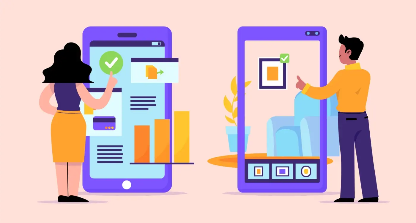
Which App Store Screenshots Beat Your Competitors Every Time?
How many times have you scrolled through the App Store and watched a potentially brilliant app get completely ignored? The harsh reality is that most users spend less than seven seconds deciding whether to download your app or keep scrolling. In those precious few seconds, your app store screenshots are doing all the heavy lifting—they're your sales team, your marketing department, and your first impression all rolled into one.
I've been developing mobile apps for over eight years now, and I can tell you that screenshots are the single most underestimated aspect of app marketing. Sure, everyone talks about ASO and keyword optimisation, but honestly? Your screenshots are what actually convert browsers into downloaders. They're what separate the apps that get buried on page twelve from the ones that climb the charts.
In app store optimisation, your screenshots aren't just showing what your app looks like—they're proving why someone's life will be better with your app in it
The thing is, most developers get this completely wrong. They treat screenshots like technical documentation instead of visual marketing. They show every feature instead of focusing on user benefits. And they completely ignore what their competitors are doing—which is mental, really, because competitive positioning through screenshots can make or break your app's success.
What you're about to learn isn't just theory. These are battle-tested strategies I've used to help apps go from zero downloads to chart-toppers. We'll cover everything from the psychology behind why certain screenshots convert better, to advanced tactics for different markets and user segments. By the end of this guide, you'll have a complete framework for creating app store screenshots that don't just look good—they sell.
Understanding Screenshot Psychology and User Behaviour
Right, let's talk about what actually happens in someone's head when they stumble across your app in the store. I've analysed thousands of app store conversion rates over the years, and honestly? Most developers get this completely wrong.
Users spend about 7 seconds looking at your app store page before deciding whether to download or move on. That's it—7 seconds! And guess what they're looking at during those precious moments? Your screenshots. Not your description, not your reviews (well, maybe a quick glance at the star rating), but those visual previews of what your app actually does.
The 3-Second Screenshot Scan
Here's what I've learned from working with apps that convert at 25%+ versus those struggling at 2-3%: people don't read screenshots, they scan them. Their eyes move in a predictable pattern—left to right, top to bottom, focusing on faces, text, and bright colours in that order.
Your first screenshot needs to answer one question immediately: "What does this app do for me?" Not what it does generally, but specifically what problem it solves for that person standing in a queue, scrolling through the app store on their lunch break.
Emotional Triggers That Actually Work
The apps I've built that perform best tap into one of three emotional drivers: fear of missing out, desire for control, or need for social connection. A fitness app showing "You vs Yesterday" hits that control trigger. A social app displaying "3 friends are online now" plays on connection.
But here's the thing—you can't just throw these concepts at your screenshots and hope for the best. You need to understand which emotional trigger resonates with your specific audience first.
Researching Your Competitors' Visual Strategy
Right, let's talk about one of my favourite parts of the ASO process—basically becoming a detective and figuring out what your competitors are doing with their app store screenshots. I mean, why would you start from scratch when you can learn from what's already working (or failing miserably) in your category?
The first thing I do when working with clients is grab their phone and start scrolling through their app category. Not just looking at the top apps, but really studying them. What story are they telling with their screenshots? What features are they highlighting first? How much text are they using? It's honestly like having a masterclass in visual marketing right there in the App Store.
But here's what most people get wrong—they only look at the market leaders and try to copy them. That's missing half the picture. You also need to look at apps ranked 10-20 in your category because these are the ones fighting for the same users you are. The top apps have massive budgets and brand recognition; the middle-tier apps are where you'll find the real insights about what works for smaller players who need effective competitive positioning strategies to succeed.
What to Look For
Pay attention to which features competitors are showcasing in their first screenshot. Are they all leading with the same functionality? If everyone's showing their main dashboard, maybe there's an opportunity to highlight something different that sets you apart. Also notice their colour schemes—if everyone's using blue, perhaps a warm colour palette could help you stand out.
Screenshot each competitor's full set of images and create a simple spreadsheet noting their key messages, visual style, and which features they prioritise. This gives you a clear map of the competitive landscape.
Don't forget to check out apps in related categories too. Sometimes the best inspiration comes from apps that solve similar problems in different industries. A fitness app might learn something valuable from how productivity apps showcase their features.
The First Screenshot Rule That Changes Everything
Right, here's the thing that most people get completely wrong about app store screenshots—your first screenshot isn't about showing your app's interface. I know that sounds mental, but hear me out.
Your first screenshot has one job: to communicate the core value proposition in under three seconds. That's it. Users are scrolling through dozens of apps, and they're making split-second decisions about whether to tap through to see more. If your first screenshot is just a pretty login screen or your main dashboard, you've already lost them.
I've tested this approach with clients across different industries, and the results are always the same—apps that lead with value instead of features see higher conversion rates. One e-commerce client saw their install rate jump by 40% when we switched from showing their homepage to demonstrating the actual shopping experience with real products and savings.
The Three-Second Value Test
Here's what I call the three-second value test: show your first screenshot to someone who's never seen your app before. Can they tell you what problem it solves within three seconds? If not, you need to rethink your approach.
The best first screenshots answer the question "what's in it for me?" immediately. Show the end result, the transformation, the benefit—not the process of getting there. A fitness app shouldn't show its tracking interface; it should show someone achieving their goals. A productivity app shouldn't display its features list; it should demonstrate the organised, stress-free life users will have.
This rule alone has transformed more app store performance than any other single change I've implemented. It's that powerful when you get it right.
Designing Screenshots That Tell Your Story
Your app store screenshots aren't just pretty pictures—they're your app's story told in visual chapters. I see this mistake all the time; developers treat screenshots like a feature checklist instead of a narrative that guides users through their journey. It's mad how many brilliant apps get overlooked because their screenshots don't tell a compelling story.
Think about it like this: your first screenshot is the opening scene, your second builds intrigue, and by the third you should be showing transformation or results. But here's the thing—most apps jump straight to showing every single feature without any logical flow. Users get confused and move on to the next app.
Creating Your Visual Narrative
Start with your user's biggest pain point in screenshot one. Don't show your login screen or welcome message; show the moment where your app makes someone's life better. I've seen download rates double just by swapping out a generic home screen with a problem-solving moment. Your second screenshot should demonstrate how easy the solution is, whilst your third shows the outcome or benefit.
The most successful app store screenshots don't just show features, they show transformation from problem to solution in a way that makes users think 'I need this right now'
Order matters more than you might think. Users typically look at 2-3 screenshots before deciding, so your story needs to hook them fast and show value immediately. Each screenshot should flow naturally into the next, building momentum towards that download button. And honestly? Most apps get this completely wrong by treating screenshots as individual marketing materials instead of connected story beats.
Text Overlays and Captions That Actually Convert
Right, let's talk about the text on your screenshots—because honestly, this is where most apps completely mess things up. I've seen gorgeous screenshots ruined by terrible copy, and I've seen average designs saved by brilliant text overlays. The words you choose matter more than you think.
Here's the thing most developers get wrong: they write features instead of benefits. Nobody cares that you have "Advanced AI-Powered Analytics Dashboard." They care that they can "See which content your audience loves most." See the difference? One's technical jargon, the other solves a real problem.
Text Placement That Actually Works
Your text needs breathing room—cramming words everywhere makes screenshots look desperate. I always place the most important message in the top third of the screenshot where users' eyes naturally go first. And please, for the love of all that's holy, make sure your text is readable on mobile screens. What looks perfect on your laptop might be completely illegible on a phone.
Keep your captions short and punchy. Six words or less is the sweet spot. Users are scrolling fast through the App Store; they're not stopping to read your novel about how amazing your app is.
Testing Your Text Strategy
Different markets respond to different messaging styles. Business apps need professional, benefit-focused copy. Gaming apps can be more playful and emotional. Social apps should focus on community and connection.
- Test emotional vs logical messaging
- Try questions vs statements
- Compare feature-focused vs benefit-focused copy
- Experiment with urgency vs calm messaging
- Test personalised vs generic language
Remember, your screenshots work as a team—each caption should build on the last to tell your complete story. Don't repeat the same message five times hoping it'll stick better.
Testing Screenshot Combinations That Work
Here's the thing about screenshot testing—most developers get it completely wrong. They'll change one screenshot and expect to see massive results overnight. But that's not how it works, is it? You need to think about your screenshots as a complete set, not individual images that happen to sit next to each other.
I always tell my clients to test combinations, not just single screenshots. Your first screenshot might be perfect, but if your second one doesn't flow naturally from it, you've lost the user's attention. It's like telling a story where chapter two has nothing to do with chapter one—people just stop reading.
The A/B Testing Approach That Actually Works
Start with your first three screenshots because honestly, that's all most users will see. Create two completely different combinations and test them for at least two weeks. I've seen apps get a 40% boost in conversions just by rearranging their screenshot order—no new images, just a different sequence.
One combination I tested recently put the main feature first, followed by social proof, then a benefits screen. The alternative started with a problem/solution approach, showed the interface, then ended with results. The problem/solution version performed 23% better, but we wouldn't have known without proper testing.
What to Measure (And What to Ignore)
Don't get obsessed with impression numbers—focus on your conversion rate from impression to install. That's what really matters. If your conversion rate drops but downloads stay the same, you're probably reaching more people but convincing fewer of them. That's not necessarily bad, but it tells you something about your positioning.
Test screenshot combinations during different times of the year. User behaviour changes dramatically during holidays, back-to-school periods, and even different days of the week. What works in January might flop in July.
Common Screenshot Mistakes That Kill Downloads
Right, let's talk about the mistakes that are absolutely killing your download rates. I've seen these same errors time and time again, and honestly, they're so easy to fix once you know what you're looking for.
The biggest mistake? Cramming too much information into one screenshot. I get it—you want to show off every feature your app has. But here's the thing: users spend about three seconds looking at your screenshots. Three seconds! If they can't understand what they're looking at immediately, they're moving on to the next app.
The Most Damaging Screenshot Errors
- Using tiny text that nobody can read on mobile devices
- Showing empty states or placeholder content instead of real data
- Including outdated UI elements or old design patterns
- Forgetting to show the actual problem your app solves
- Using the same background colour as the App Store (white or light grey)
- Displaying error messages or loading screens
- Not optimising for different device sizes and orientations
Another killer mistake is not considering your app's context. If you're building a fitness app, don't just show menus and settings pages—show the workout tracking in action, the progress charts, the stuff people actually care about.
And please, for the love of all that's good in mobile development, test your screenshots on actual devices. What looks brilliant on your laptop screen might be completely unreadable on a phone. I've seen apps lose thousands of downloads because their text overlays were illegible on mobile.
The good news? These mistakes are straightforward to fix. Focus on one clear message per screenshot, use readable fonts, and always show your app doing something useful rather than just sitting there looking pretty.
Advanced Screenshot Tactics for Different Markets
Here's something I've learned after working with apps across dozens of industries—what works for a fitness app will absolutely destroy conversion rates for a fintech product. Each market has its own visual language, and understanding these nuances can give you a massive competitive advantage.
Gaming apps need to show action, excitement, and immediate fun. Your screenshots should practically bounce off the screen with vibrant colours and dynamic gameplay moments. But fintech? That's a completely different beast. Users want to see security, professionalism, and clear data presentation. Too much excitement actually makes people nervous about trusting you with their money.
Healthcare Apps Need Trust Signals
For healthcare and wellness apps, credibility is everything. I always include screenshots that show certifications, medical professionals, or clinical data. Users need to feel safe before they feel excited. And honestly, this applies to any app dealing with sensitive personal information.
E-commerce Apps Should Focus on Social Proof
Shopping apps perform best when screenshots showcase real user reviews, popular products, and social engagement. People want to see that others are buying and loving the experience. I've seen conversion rates jump 40% just by adding customer testimonials to screenshot overlays.
The most successful apps don't just show features—they show outcomes that matter to their specific audience
B2B apps need a completely different approach. Show productivity gains, time savings, and professional interfaces. Skip the flashy animations and focus on clear workflows and measurable benefits. Your audience is thinking about ROI, not entertainment. This approach is particularly crucial when you're developing niche market solutions where understanding your market's psychological triggers is the difference between screenshots that convert and screenshots that confuse potential users into scrolling past your app entirely.
Conclusion
Right, let's wrap this up. After years of testing screenshots for clients across every industry you can think of, I can tell you that getting your App Store visuals right isn't just about making things look pretty—it's about understanding what makes people tick when they're scrolling through the app store at breakneck speed.
The truth is, most app developers get screenshots completely wrong. They focus on showing off every single feature instead of solving the user's problem in the first few seconds. But here's what I've learned: your screenshots need to work like a good conversation. Start with the biggest benefit, keep people interested with clear visuals, and always remember that people are scanning, not studying.
Your first screenshot is your make-or-break moment—treat it like the most important piece of marketing you'll ever create. Because honestly? It probably is. Everything else we've covered—the competitor research, the psychology tricks, the testing methods—they all support that one goal of getting someone to actually download your app.
Look, the App Store isn't getting any less competitive. User acquisition costs keep climbing, and attention spans keep shrinking. But if you follow the strategies we've covered here, test different approaches, and actually pay attention to what your users are telling you through their behaviour, you'll have screenshots that don't just look good—they convert.
Now stop reading guides and start testing your screenshots. Your download numbers will thank you for it.
Share this
Subscribe To Our Learning Centre
You May Also Like
These Related Guides

What Screenshots Make Your App Store Listing Shine?
Which Google Play Store Optimisation Techniques Drive Downloads?