Nearly 90% of smartphone users have dark mode enabled on their devices right now. That's a staggering number when you consider that dark mode only became mainstream about five years ago. But here's the thing that catches most app developers off guard—just because someone has dark mode turned on doesn't mean they want every single app to automatically switch to dark mode.
This creates a proper headache for anyone building a mobile app. Do you respect what the user's phone is telling you and automatically switch your app to dark mode? Or do you give people the power to choose for themselves? It's one of those UX design decisions that seems simple on the surface but gets complicated fast.
The best user preference systems don't make users think about preferences at all—they just work the way people expect them to work
After building mobile apps for countless clients, I've seen this choice go both ways. Sometimes automatic switching creates a seamless experience that users love. Other times it frustrates people who want more control over their app experience. The truth is, there's no universal right answer—but there are definitely wrong ways to handle it. Getting dark mode wrong can make your app feel clunky and drive users away faster than you'd think.
What Is Dark Mode And Why Do People Use It
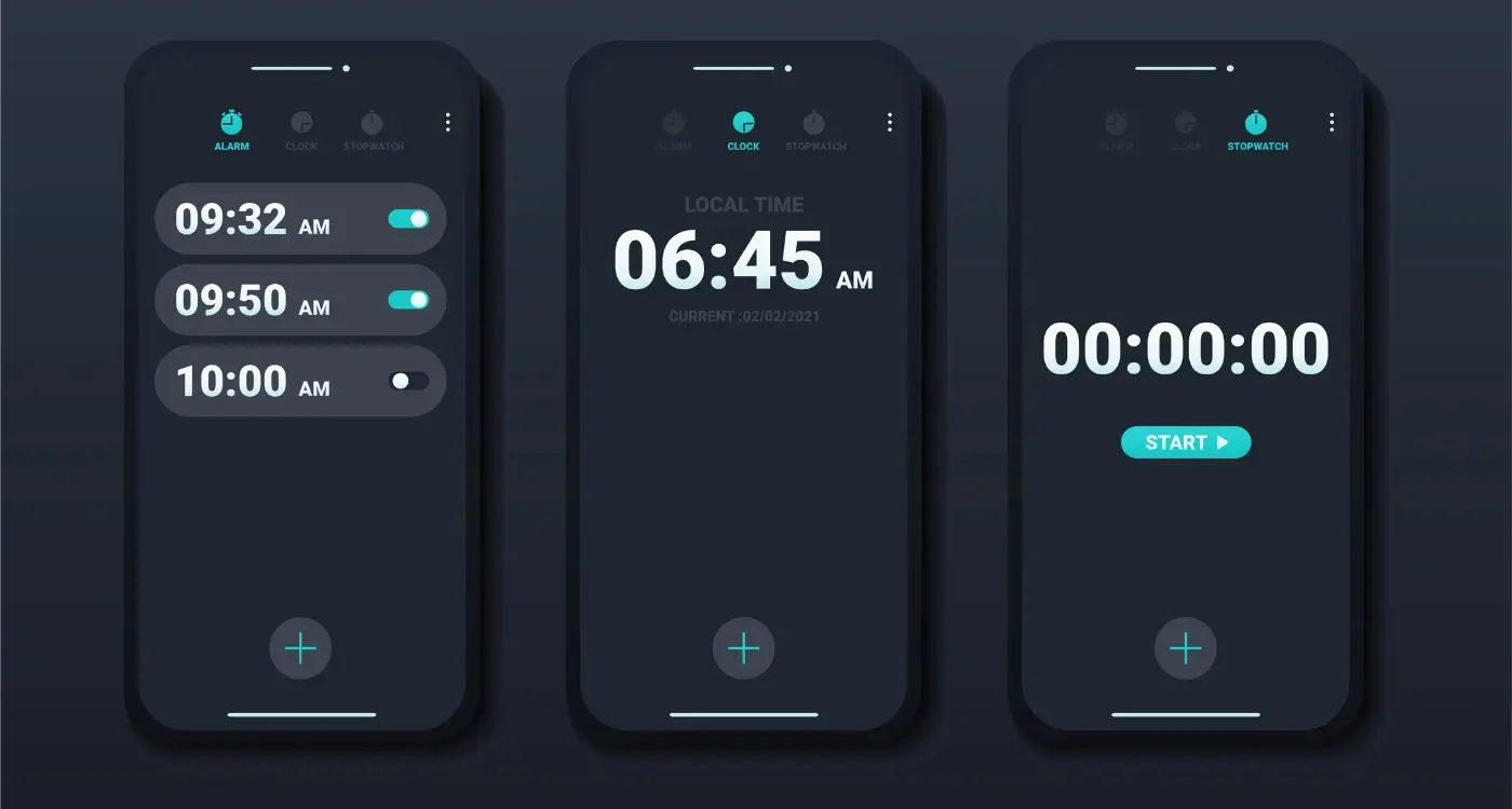
Dark mode is exactly what it sounds like—instead of having a white or light background with dark text, everything gets flipped around. You get a dark background with light text and elements. It's been around in some form for years, but it really took off when Apple and Google started building it into their operating systems.
People love dark mode for several reasons, and trust me, once you start using it you'll understand why. Your eyes feel less strained, especially when you're scrolling through your phone late at night. The bright white screens that used to feel normal suddenly seem harsh and uncomfortable.
The Main Benefits People Notice
- Reduced eye strain during long usage sessions
- Better battery life on phones with OLED screens
- Easier viewing in low-light environments
- A more modern, sleek appearance
- Less light pollution when using devices at night
There's also a practical side to this—dark mode can actually save battery life on newer phones. OLED screens don't need to light up black pixels, so displaying more dark colours uses less power. It's not a huge difference, but every bit helps when you're trying to make your phone last all day.
The thing is, dark mode isn't just a trend that'll disappear next year. It's become a standard feature that users expect, and there's real science behind why it works so well for many people.
How Your Phone Already Makes This Choice For You
Your phone is already making dark mode decisions without asking you. Both iOS and Android have system-wide dark mode settings that automatically switch apps between light and dark themes based on your preferences or the time of day. When users enable this at the system level, they're telling every app on their device what they want.
This creates an interesting situation for mobile app developers. Your app can simply follow whatever the phone's operating system decides—if the user has dark mode enabled system-wide, your app shows dark mode too. If they prefer light mode, that's what they get. No extra buttons, no complicated menus, just automatic behaviour that matches what they've already chosen.
Most users don't even realise they can change their system-wide dark mode settings. Check your phone's display settings right now—you might be surprised at what options are available.
What Happens Behind The Scenes
The technical side is straightforward. Your phone sends a signal to apps telling them which theme to use. Well-designed apps listen to this signal and switch their appearance accordingly. It's like having a universal remote control for how every app looks on your device.
The beauty of this approach is that it respects user preference without adding complexity to your app's interface. Users have already made their choice at the system level, and your app simply honours that decision. This creates a consistent experience across all apps on their device.
- System automatically switches based on sunrise/sunset times
- Users can manually override the automatic scheduling
- Apps receive instant notifications when preferences change
- No additional storage needed for user preference data
When Automatic Dark Mode Works Really Well
Automatic dark mode shines brightest when your app gets used throughout the day and night. Apps like messaging, social media, news readers, and productivity tools benefit massively from switching modes automatically—users don't want to fiddle with settings when they're trying to check messages at 2am or scroll through updates during their morning commute.
Gaming apps are another sweet spot for automatic switching. Players often have long sessions that stretch from afternoon into evening, and nobody wants to be blinded by a bright white interface when they're trying to beat the final boss at midnight. The automatic switch keeps them comfortable without breaking their flow.
Content-Heavy Apps Love Automatic Dark Mode
Reading apps, news platforms, and social media work brilliantly with automatic dark mode because people consume content at all hours. When someone's catching up on articles before bed or scrolling through their feed during a late-night wind-down, the automatic switch to dark mode feels natural and thoughtful.
The key is that these apps already follow natural usage patterns—people genuinely use them more in the evening when dark mode provides real benefits. When your app aligns with these natural rhythms, automatic switching feels like a helpful feature rather than something that's been forced upon users.
When Letting Users Choose Is Better
Some apps work better when you give people control over their dark mode settings. Social media apps are a perfect example—people use them throughout the day and night, often switching between different lighting conditions. Your user might be scrolling through posts in bright sunlight during lunch, then checking messages in a dimly lit restaurant later.
Gaming apps also benefit from manual controls. Players often have strong preferences about how their games should look, and many feel that dark mode can affect their performance. Some gamers swear by light mode for competitive play, whilst others prefer the drama of dark backgrounds.
When Your App Has Personality
If your mobile app has a strong visual identity or brand colours, letting users choose gives them more control over their experience. Fashion apps, photography apps, and creative tools often fall into this category. The user preference here isn't just about comfort—it's about how they want to interact with your content.
The best UX design decisions are the ones that make users feel like they're in control of their experience
Business apps and productivity tools also work well with manual controls. People using these apps often have specific workflows and preferences that automatic switching might disrupt. A designer working on a project might want consistent lighting regardless of the time of day.
The Problems With Getting Dark Mode Wrong
Getting dark mode wrong isn't just annoying—it can actually drive people away from your app. I've seen apps lose users simply because their dark mode was poorly implemented, and trust me, fixing these issues after launch is much harder than getting them right from the start.
The biggest problem happens when apps force dark mode on users who don't want it. Some developers think they're being clever by automatically switching to dark mode at sunset, but they forget that not everyone wants this. People working night shifts, those with certain vision conditions, or users who simply prefer light mode will find this frustrating.
Common Dark Mode Mistakes
Poor contrast is another major issue. Text becomes hard to read, buttons disappear into backgrounds, and important information gets lost. I've tested apps where users couldn't even see the "buy now" button in dark mode!
- Text that's too light against dark backgrounds
- Coloured elements that don't work in dark themes
- Images and graphics that look terrible on dark backgrounds
- Inconsistent switching between light and dark elements
- Battery drain from poorly optimised dark themes
The worst part? Users will often blame the entire app rather than just the dark mode implementation. They'll leave bad reviews, uninstall your app, and tell their friends to avoid it. Getting dark mode wrong doesn't just affect the feature itself—it damages your whole app's reputation.
How To Build Dark Mode That Actually Works
Right, let's get practical. After years of building mobile apps and watching teams mess this up, I've learned that implementing dark mode isn't just about inverting colours—it's about understanding how your users actually behave with your app.
The biggest mistake I see developers make is treating dark mode as an afterthought. They build the entire app in light mode, then try to slap on a dark theme at the end. This approach leads to poor contrast, unreadable text, and a user experience that feels broken. Start thinking about both modes from day one of your design process.
Getting The Technical Foundation Right
Your app needs to respect the system setting by default—this isn't negotiable anymore. When someone switches their phone to dark mode, they expect your app to follow suit automatically. But here's the thing: you also need to provide an override option within your app settings.
Test your dark mode implementation in different lighting conditions, not just at your desk. What looks good under office lighting might be completely unreadable in bright sunlight.
The Implementation Checklist
Here's what actually matters when building dark mode:
- Use proper contrast ratios—not just dark grey backgrounds
- Make sure all text remains readable in both modes
- Test with actual users, not just your development team
- Include a manual toggle in your app settings
- Remember to update your loading screens and error messages
The key is testing extensively with real users in real conditions. Your mobile app's success depends on getting these fundamental UX design decisions right, because poor dark mode implementation will drive users away faster than you think.
Conclusion
After building dark mode features into dozens of apps over the years, I've learned that there's no single right answer to whether you should automatically switch to dark mode or let users choose. Both approaches can work brilliantly—it all depends on your app and your users.
The key is understanding what your app actually does and when people use it. If you're building a reading app or something people use late at night, automatic dark mode tied to system settings makes perfect sense. Your users will thank you for not blinding them at midnight! But if your app relies heavily on colours, photos, or complex interfaces, giving users control might be the safer bet.
What I can tell you for certain is that getting dark mode wrong is worse than not having it at all. I've seen apps where text becomes unreadable, buttons disappear, or colours clash so badly they give users headaches. Don't rush it—test everything properly and make sure your dark mode actually improves the user experience.
The best approach? Start simple. Pick one method, implement it properly, and listen to your users. You can always add more options later, but you can't take back a poor first impression.