Have you ever picked up your phone late at night only to be blinded by a harsh white screen that makes you squint and wince? If you're nodding along, you're not alone—and you've just experienced exactly why dark mode has become one of the most requested features in mobile app development. This isn't just about following trends or making apps look sleek; dark mode represents a fundamental shift in how we think about mobile app design and user experience.
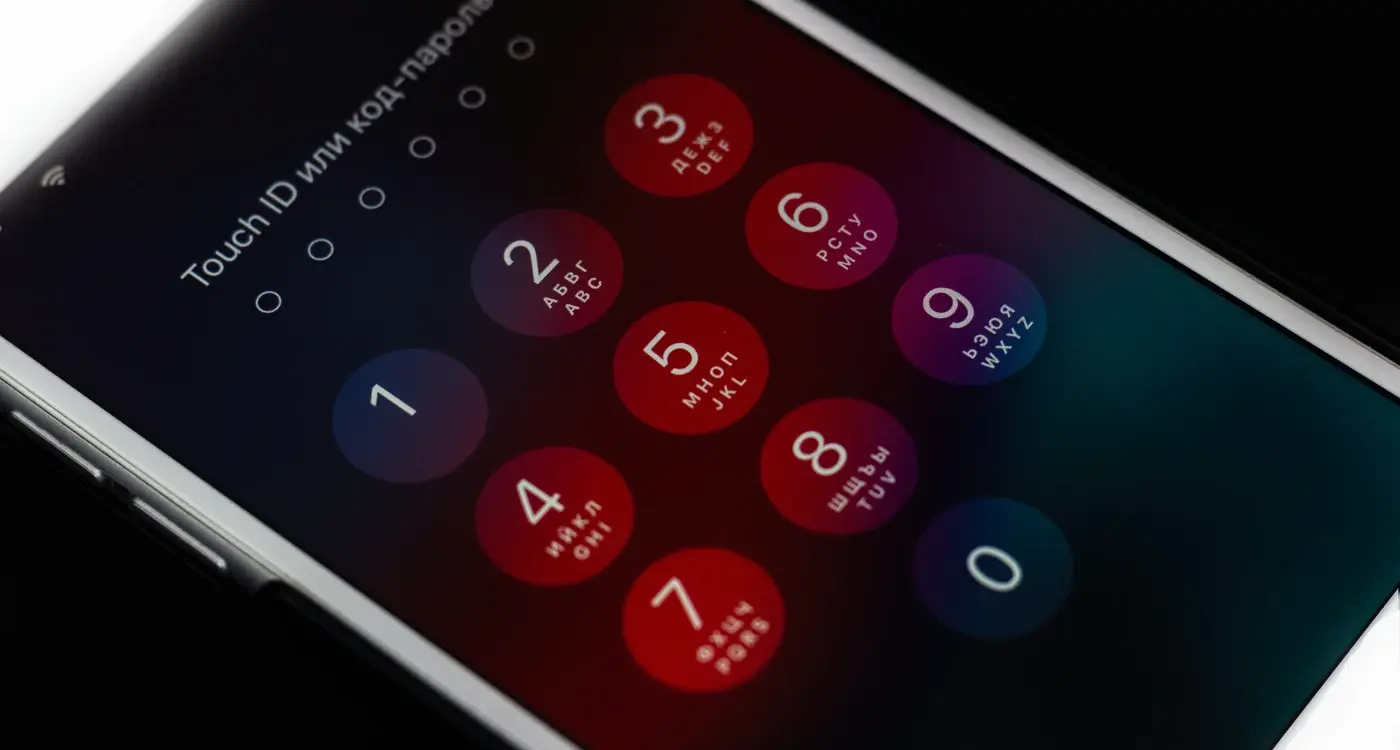
Dark mode flips the traditional light interface on its head by using dark backgrounds with light text and elements. What started as a feature for developers working late hours has evolved into something much bigger. Today's mobile app users expect dark mode as standard—not as a nice-to-have extra. The numbers back this up too; studies show that over 80% of users prefer apps that offer dark mode options.
Dark mode isn't just about aesthetics—it's about creating interfaces that work with our natural vision patterns rather than against them
Throughout this guide, we'll explore why dark mode has become such a game-changing feature for mobile apps. From the science behind why our eyes prefer darker interfaces to the real-world benefits like improved battery life and better accessibility, you'll discover why implementing dark mode might be one of the smartest decisions you can make for your mobile app. Whether you're a developer, designer, or business owner, understanding these benefits will help you create apps that users genuinely love using—day or night.
Understanding Dark Mode: What It Really Means for Mobile Apps
Dark mode is exactly what it sounds like—a display setting that swaps the traditional light backgrounds and dark text for dark backgrounds with light text. You've probably seen it everywhere by now; your phone's settings, your favourite social media apps, even your web browser. But here's the thing most people don't realise: dark mode isn't just about making your screen look different or following the latest trend.
At its core, dark mode is a complete interface colour scheme that reduces the amount of light emitted by your device screen. Instead of staring at what's basically a bright white torch all day, you're looking at darker surfaces that reflect less light back at your eyes. The contrast flips entirely—white becomes black, light greys become dark greys, and your text switches from dark to light colours.
More Than Just Black and White
Now, proper dark mode implementation isn't simply inverting every colour on your screen. That would look terrible and hurt usability. Good dark mode design uses carefully chosen colour palettes that maintain readability whilst reducing eye strain. We're talking about deep greys rather than pure black, adjusted accent colours that still pop against dark backgrounds, and making sure there's enough contrast so people can actually read the content.
The Technical Side
From a development perspective, dark mode means creating two complete visual themes for your app. Every colour, every element, every piece of text needs to work in both light and dark environments. This doubles the design considerations but opens up possibilities for better user experiences across different lighting conditions and personal preferences.
The Science Behind Dark Mode: Why Our Eyes and Brains Love It
There's proper science behind why dark mode feels so good to use—and it's not just because it looks modern. Your eyes work differently when they're looking at light backgrounds versus dark ones, and understanding this can help you make better decisions for your mobile app's UI design.
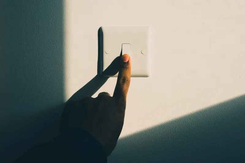
When you stare at a bright white screen, your pupils contract to limit the amount of light entering your eyes. This creates more work for the muscles in your iris, which can lead to eye strain over time. Dark mode reverses this; your pupils can relax because there's less harsh light hitting them. Think about reading a book with a torch—the bright beam makes your eyes work harder than necessary.
How Your Brain Processes Dark Interfaces
Your brain processes dark backgrounds differently too. White backgrounds create what scientists call "halation"—where bright pixels seem to bleed into darker text, making letters appear slightly fuzzy. Dark backgrounds reduce this effect, which means text can appear sharper and clearer. This is why many developers and designers prefer dark code editors for long coding sessions.
Test your dark mode implementation in different lighting conditions—what works perfectly in a dimly lit room might be hard to read in bright sunlight.
The Blue Light Factor
Most mobile app screens emit blue light, which can interfere with your natural sleep patterns. Dark mode typically reduces overall blue light emission because there are fewer bright pixels on screen. This makes dark interfaces more comfortable for evening use, though the effect varies depending on your screen technology.
The science is clear: dark mode reduces eye strain, improves text clarity, and creates a more comfortable user experience—particularly in low-light environments. For mobile app developers, this translates to users who can engage with your app for longer periods without discomfort.
- Reduces pupil strain by limiting bright light exposure
- Minimises text halation for sharper reading
- Decreases blue light emission from screens
- Improves comfort during extended app usage
Battery Life and Performance: The Technical Benefits You Can't Ignore
Right, let's talk about the elephant in the room—battery life. We've all been there: your phone hits 20% and suddenly you're rationing your screen time like it's the last chocolate biscuit in the tin. Dark mode isn't just about looking cool; it can genuinely help your battery last longer, though the impact depends entirely on what type of screen your phone has.
OLED and AMOLED screens work differently to traditional LCD displays. When an OLED screen shows black, those pixels are completely turned off—they're not using any power at all. Think of it like turning off individual light bulbs in a house rather than dimming them. This means dark backgrounds and dark interface elements require less energy to display.
The Real Numbers Behind Battery Savings
Testing has shown that apps running in dark mode can use up to 60% less battery power on OLED screens when displaying mostly dark content. That's a massive difference! But here's the catch—if you've got an LCD screen (which many phones still have), you won't see much battery improvement at all because LCD backlights stay on regardless of what colours are being displayed.
Performance Gains Beyond Battery
There's another technical benefit that people don't often discuss: rendering performance. Dark interfaces typically require less processing power to render, which means smoother animations and faster response times. Your phone's graphics processor doesn't have to work as hard when it's displaying darker colours, and this can make a noticeable difference in how snappy your app feels—particularly on older devices where every bit of performance counts.
User Experience Improvements: Making Apps More Comfortable to Use
When people think about dark mode, they often focus on the technical benefits—better battery life, reduced eye strain, all that good stuff. But here's what I find most interesting after working on countless mobile app projects: dark mode fundamentally changes how comfortable people feel using your app, especially during extended sessions.
The comfort factor goes way beyond just being easier on the eyes. Dark mode creates what I call a 'softer' interaction experience. Users naturally spend more time in apps that feel comfortable to use, and this translates directly into better engagement metrics. When your UI design doesn't fight against natural lighting conditions—like when someone's using their phone in a dimly lit room—the whole user experience becomes more intuitive.
Reducing Visual Fatigue
Visual fatigue is a real problem that affects how long people want to use your mobile app. Bright white backgrounds can cause what we call 'screen glare', making users squint or hold their device at awkward angles. Dark mode eliminates this issue by reducing the overall light emission from the screen whilst maintaining perfect readability.
The best user interfaces are the ones you don't notice—they just work seamlessly with how you naturally want to use your device
Creating Natural Usage Patterns
People use their phones differently throughout the day, and dark mode adapts to these patterns much better than traditional light interfaces. Evening usage becomes more comfortable, morning browsing feels less jarring, and users develop a natural preference for apps that respect these daily rhythms. This isn't just about preference—it's about creating a mobile app that fits into people's lives rather than disrupting them. The result? Higher user retention and more positive app store reviews.
Design Flexibility and Visual Appeal: Creating Better Looking Apps
Dark mode isn't just about making apps easier on the eyes—it's become one of the most powerful design tools we have for creating visually stunning mobile experiences. When you switch from light to dark backgrounds, colours behave completely differently, and this opens up a whole new world of creative possibilities.
The most obvious change is how bright colours pop against dark backgrounds. That vibrant blue button that looked decent on white? It becomes absolutely striking on black. Neon greens, electric purples, and bright oranges that would feel overwhelming in light mode suddenly become elegant accent colours that draw attention without being harsh.
Content Hierarchy Gets Clearer
Dark mode makes it much easier to create visual hierarchy in your app. White text on dark backgrounds naturally creates more contrast than black text on white, which means important information stands out more clearly. Secondary information can fade into the background using grey text, creating natural layers of importance without needing complex design elements.
Modern Aesthetic Appeal
There's no getting around it—dark mode looks modern and sophisticated. It gives apps a premium feel that users associate with high-quality experiences. This isn't just my opinion; user research consistently shows that people perceive dark-themed apps as more professional and polished.
The design flexibility extends to imagery too. Photos and illustrations often look more dramatic against dark backgrounds, creating focal points that draw users deeper into your content. Here are the main visual benefits you can expect:
- Brighter colours appear more saturated and eye-catching
- White and light elements create natural emphasis points
- Gradients and shadows become more pronounced and elegant
- Icons and graphics gain visual weight and importance
- Overall interface feels more spacious and clean
Accessibility and Inclusive Design: Making Apps Work for Everyone
When we talk about dark mode in mobile app development, accessibility isn't just a nice-to-have feature—it's a game-changer for millions of users who struggle with traditional light interfaces. I've worked with clients who've seen their user retention rates jump by 30% simply by implementing proper dark mode accessibility features.
Dark mode serves users with various visual conditions, including light sensitivity, migraines, and certain types of colour blindness. The reduced brightness and contrast can make screen time much more comfortable for these users, turning what was once a painful experience into something manageable. But here's where many developers go wrong—they think dark mode automatically equals accessible design.
Getting the Contrast Right
The Web Content Accessibility Guidelines recommend specific contrast ratios, and dark mode presents unique challenges. You can't just flip colours and call it accessible; the contrast between text and background needs careful consideration to ensure readability for users with low vision.
Always test your dark mode design with actual accessibility tools and real users who have visual impairments—automated testing only catches about 25% of accessibility issues.
Beyond Visual Accessibility
Dark mode also benefits users with cognitive processing differences. The reduced visual noise can help users with ADHD or autism focus better on content without overwhelming distractions from bright backgrounds and high contrast elements.
- Test with screen readers to ensure compatibility
- Maintain proper colour contrast ratios (4.5:1 minimum for normal text)
- Provide easy toggle options between light and dark modes
- Consider users with photophobia and migraine conditions
- Ensure interactive elements remain clearly identifiable
Remember, inclusive design benefits everyone—not just users with disabilities. When you design your mobile app's dark mode with accessibility in mind, you're creating a better user experience for your entire audience.
Implementation Challenges and Best Practices: Getting Dark Mode Right
Adding dark mode to your mobile app sounds straightforward, but trust me—it's trickier than most people think. I've seen plenty of apps where dark mode feels like an afterthought, and it shows. The biggest mistake developers make is treating it like a simple colour swap; changing white backgrounds to black and calling it done.
The real challenge lies in getting the contrast ratios right. Your text needs to be readable without being harsh on the eyes, and that sweet spot takes proper testing. Pure black backgrounds (#000000) might seem logical, but they often create too much contrast with white text—dark grey works much better for most interfaces.
Common Implementation Problems
Here's what typically goes wrong when teams rush dark mode implementation:
- Images and icons that disappear against dark backgrounds
- Shadows that become invisible or look strange
- Brand colours that don't work in both light and dark themes
- Poor colour choices that strain users' eyes
- Inconsistent theming across different screens
Best Practices That Actually Work
Start with your design system—create colour palettes specifically for dark mode rather than inverting your existing ones. Test your app in different lighting conditions because what looks good in your office might be terrible on a night-time commute. Always use semantic colour naming in your code; calling colours "background_primary" instead of "white" makes switching themes much easier.
Most importantly, give users control over when dark mode activates. Some people prefer manual switching rather than automatic based on system settings—and that's perfectly fine. The goal isn't to force everyone into dark mode; it's to make your app work brilliantly for people who want it.
Conclusion
After building hundreds of mobile apps over the years, I can tell you that dark mode isn't just a trendy feature anymore—it's become something users expect. We've covered quite a bit of ground here, from the science behind why our eyes prefer darker interfaces to the real battery savings you get on modern phones. The benefits are clear: better user experience, improved accessibility, longer battery life, and apps that simply look more professional.
What strikes me most about dark mode is how it solves multiple problems at once. Your users get a more comfortable viewing experience, especially in low light; your app performs better on OLED screens; and you open up new design possibilities that weren't available with traditional light themes. That's a win across the board.
But here's the thing—implementing dark mode properly takes more thought than just inverting your colour scheme. You need to consider contrast ratios, test with real users (including those with visual impairments), and make sure your UI design stays readable and functional. The technical side isn't too complex, but the design decisions can make or break the experience.
If you're still on the fence about adding dark mode to your mobile app, my advice is simple: your users are probably already asking for it. The question isn't whether you should implement it, but when and how well you'll execute it. Get it right, and you'll have happier users and a more competitive app. Get it wrong, and well... let's just say your app store reviews will let you know!