Have you ever wondered why some mobile apps feel magical to use while others leave you frustrated and ready to delete them within minutes? After eight years of designing and developing mobile apps, I can tell you the secret often lies in the smallest details—those tiny moments of interaction that happen between you and your phone screen.
When you pull down to refresh your Instagram feed and see that satisfying spinning animation, or when your phone gently vibrates as you slide a toggle switch—these aren't accidents. They're carefully crafted micro-interactions, and they're working behind the scenes to make your user experience smoother, more intuitive, and frankly, more enjoyable.
The best mobile apps don't just work—they feel alive and responsive to every touch, swipe, and tap
Most people don't even notice these tiny interactions when they're done well, but trust me, they'd definitely notice if they weren't there. Think about it: would typing on your phone feel the same without that little haptic feedback? Would scrolling through your favourite app be as satisfying without those smooth transitions? These micro-interactions are the difference between a mobile app that feels clunky and one that feels like it was built just for you. They're not just pretty animations—they're the bridge between human behaviour and digital technology, making our phones feel less like computers and more like natural extensions of ourselves.
What Are Micro-Interactions And Why Do They Matter
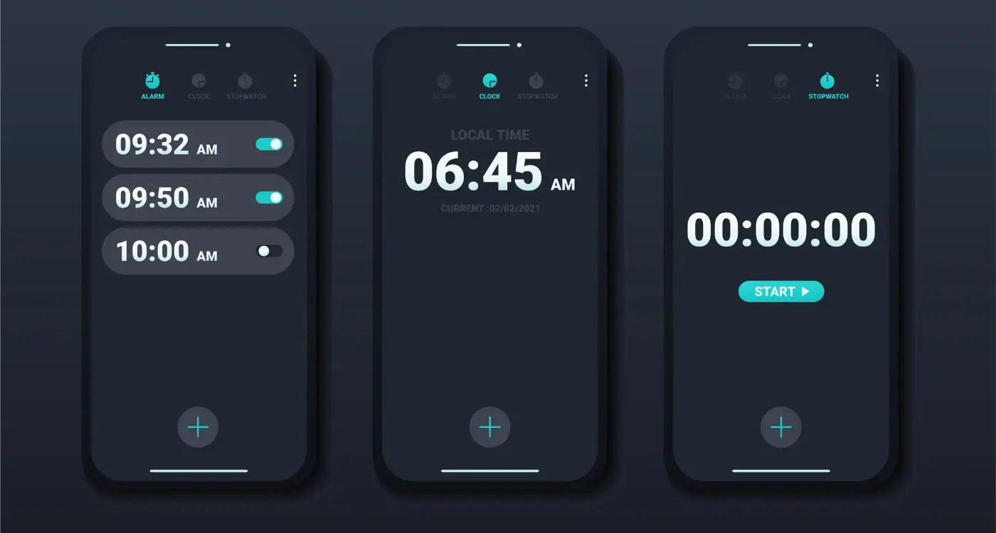
Right, let's start with the basics—what exactly are micro-interactions? They're those tiny moments when you interact with your phone and something happens. You know when you pull down to refresh your Instagram feed and see that little spinning animation? That's a micro-interaction. Or when you tap the heart on a photo and it fills with colour? Another one.
I've been working on mobile apps for years now, and I can tell you that these small details make a massive difference. Micro-interactions are the quiet workers of app design—they provide feedback, guide users through tasks, and make apps feel alive rather than static.
The Building Blocks of Great Apps
Think about your favourite app for a moment. What makes it feel good to use? I bet it's not just the main features—it's all those little touches that respond to your actions. When you toggle a switch and it slides smoothly, when you get a gentle vibration after sending a message, or when buttons change colour as you tap them.
Here are the main purposes micro-interactions serve:
- Show that something is happening (like a loading spinner)
- Confirm an action has been completed (like a checkmark appearing)
- Guide users to the next step (like highlighting the next button)
- Make boring tasks feel more engaging (like progress bars that actually move)
- Prevent user errors (like form fields that turn red when filled incorrectly)
Without these small interactions, apps would feel broken and unresponsive. They're what separate professional apps from amateur ones—and users definitely notice the difference, even if they can't quite put their finger on why.
The Psychology Behind Micro-Interactions
The human brain is wired to notice and respond to small changes in our environment—it's a survival mechanism that's been with us for thousands of years. When you tap a button on your mobile app and it responds immediately, your brain releases a tiny hit of dopamine. That's the same chemical that makes you feel good when you eat chocolate or receive a compliment.
This psychological response explains why micro-interactions are so powerful for user experience. They create what psychologists call a "feedback loop" between the user and the app. Every time someone performs an action and gets an immediate response, their brain interprets this as success. The app feels alive, responsive, and trustworthy.
The Science of Instant Gratification
People expect immediate responses from mobile apps—we're talking milliseconds here. When a user taps something and nothing happens for even half a second, doubt creeps in. Did I tap it properly? Is the app broken? This uncertainty creates stress, which damages the overall user experience.
Keep micro-interactions under 300 milliseconds for immediate actions like button presses. Any longer and users will notice the delay.
Building Emotional Connections
Micro-interactions tap into our emotions in subtle but powerful ways. A gentle bounce animation when completing a task makes users feel accomplished. A smooth swipe gesture creates a sense of control and mastery. These UX benefits might seem small individually, but they add up to create an emotional bond between the user and your mobile app.
- Visual feedback reduces user anxiety and uncertainty
- Smooth animations create feelings of control and mastery
- Immediate responses trigger positive psychological rewards
- Consistent interactions build trust and reliability
Common Types Of Micro-Interactions In Mobile Apps
Over the years I've worked on hundreds of mobile apps, and I can tell you that certain micro-interactions pop up again and again. There's a good reason for this—they work! Let's look at the most common ones you'll encounter in pretty much every app on your phone.
Button Feedback and Loading States
When you tap a button, something needs to happen straight away. The button might change colour, shrink slightly, or show a little animation. This tells you "yes, I received your tap" without any delay. Loading spinners are another classic—they keep you informed that the app is working on your request rather than leaving you wondering if anything happened at all.
Swipe Gestures and Pull-to-Refresh
Swiping has become second nature to most users. Whether you're dismissing a notification, deleting an email, or refreshing your social media feed, these gestures feel natural and responsive. The satisfying "snap" when you swipe far enough, or the gentle bounce when you pull down to refresh, makes interactions feel smooth and predictable.
Form validation is another big one—those little ticks that appear when you've entered your email correctly, or the gentle shake when you've got your password wrong. These micro-interactions guide users through tasks without making them feel frustrated or confused about what went wrong.
How Micro-Interactions Boost User Engagement And Retention
After working with hundreds of mobile apps over the years, I can tell you that micro-interactions are absolute magic when it comes to keeping users engaged. They're the secret sauce that transforms a boring, static app into something people actually want to use again and again. When done right, these tiny moments create an emotional connection between your user and your app—and that's pure gold in the mobile app world.
The data speaks for itself: apps with well-designed micro-interactions see significantly higher user retention rates. Why? Because these small interactions make users feel acknowledged and in control. Every tap, swipe, and scroll gets a response, which keeps people engaged rather than frustrated. It's like having a conversation with the app instead of shouting into the void.
The Engagement Factor
Think about the last time you used an app that felt sluggish or unresponsive—probably didn't stick around long, did you? Micro-interactions solve this problem by providing instant feedback. When someone likes a post and sees that satisfying heart animation, or when they pull down to refresh and see that spinning wheel, they know their action has been registered. This immediate response keeps them actively using the app rather than abandoning it.
The best micro-interactions are the ones users don't consciously notice, but would definitely miss if they weren't there
User retention improves dramatically when people feel confident using your app. Micro-interactions build this confidence by guiding users through complex processes, celebrating their achievements, and making navigation feel effortless. The UX benefits compound over time—users who feel comfortable with your app are more likely to explore new features, spend more time within the app, and recommend it to others.
Building Micro-Interactions That Work
After years of designing mobile apps, I've learnt that creating effective micro-interactions isn't about adding fancy animations everywhere—it's about being purposeful. Every micro-interaction should solve a problem or make something clearer for your users. When we start throwing in random animations just because they look cool, we end up with apps that feel busy and confusing.
The best micro-interactions follow a simple rule: they should feel invisible when they're working properly. Users shouldn't notice them consciously, but they should definitely miss them if they weren't there. Think about how a button changes colour when you tap it—you barely register it happening, but it confirms your action worked.
Design Principles That Actually Matter
When building micro-interactions, I always keep these principles in mind. They've saved me from countless design disasters over the years:
- Keep animations under 300 milliseconds for quick feedback
- Use easing curves that feel natural—avoid linear animations
- Make sure the interaction relates to what's happening
- Test on actual devices, not just your computer screen
- Always include a way to turn animations off for accessibility
Common Mistakes to Avoid
I see the same mistakes repeatedly in apps that come to us for redesigns. Animations that are too slow drive users mad—they'll start tapping multiple times thinking something's broken. Overusing bouncy effects makes your app feel like a children's toy rather than a professional tool.
Testing And Measuring The Impact Of Your Micro-Interactions
Right, so you've built some lovely micro-interactions into your mobile app—but how do you actually know if they're working? This is where many developers trip up. They spend weeks crafting the perfect animation or hover effect, then never bother to check if users actually like it or if it improves the user experience.
The truth is, measuring micro-interactions isn't rocket science, but it does require a bit of planning. You need to track specific metrics before and after implementing your changes. I always tell my clients to focus on three key areas: user engagement, task completion rates, and overall satisfaction scores.
Key Metrics To Track
- Time spent on specific screens or features
- Button click rates and interaction frequency
- User drop-off points during key processes
- App store ratings and user feedback
- Session length and return visitor rates
A/B testing is your best friend here. Show half your users the old version and half the new version with your shiny micro-interactions. The data will tell you which version performs better—and sometimes the results might surprise you.
Set up your analytics before launching new micro-interactions. You can't measure improvement if you don't know where you started from.
Tools That Actually Help
Google Analytics for mobile apps gives you solid baseline data, whilst tools like Hotjar or Mixpanel can show you exactly how users interact with your interface. Don't overcomplicate it though—pick one or two tools and use them properly rather than trying to track everything.
Conclusion
After working with countless mobile apps over the years, I can tell you that micro-interactions are one of those things that separate good apps from great ones. They're the small details that make users smile, feel confident about their actions, and want to keep using your app. Without them, even the most useful app can feel cold and uninviting.
The best part? You don't need to be a design genius to get this right. Start small—add a simple loading animation here, a gentle button press there. Watch how your users respond. Test different approaches and see what works for your specific audience. Some apps need playful bounces and bright colours; others work better with subtle fades and gentle transitions.
What matters most is that your micro-interactions feel natural and help your users achieve their goals. They should guide people through your app, not distract them from it. When someone uses your app and everything just feels right—when they tap a button and it responds exactly as they expect—that's when you know you've got it spot on. Those moments of delight are what turn casual users into loyal fans who'll recommend your app to their friends.