How Do I Make My Mobile App Accessible for Users With Disabilities?
Have you ever tried to use your mobile app with your eyes closed? It sounds odd, I know, but it's a simple test that reveals just how many barriers exist for users who experience the world differently than you might expect. Over the years of building mobile apps for all sorts of clients, I've learned that creating truly accessible apps isn't just about ticking boxes—it's about opening doors for millions of people who want to use your app but currently can't.
When we talk about disabilities and mobile apps, we're discussing a huge group of users. We're talking about people who are blind or have low vision, those who are deaf or hard of hearing, users with motor difficulties who struggle with small touch targets, and people with cognitive differences who need clear, simple navigation. The thing is, these aren't edge cases or tiny user groups; they represent about one in five people globally.
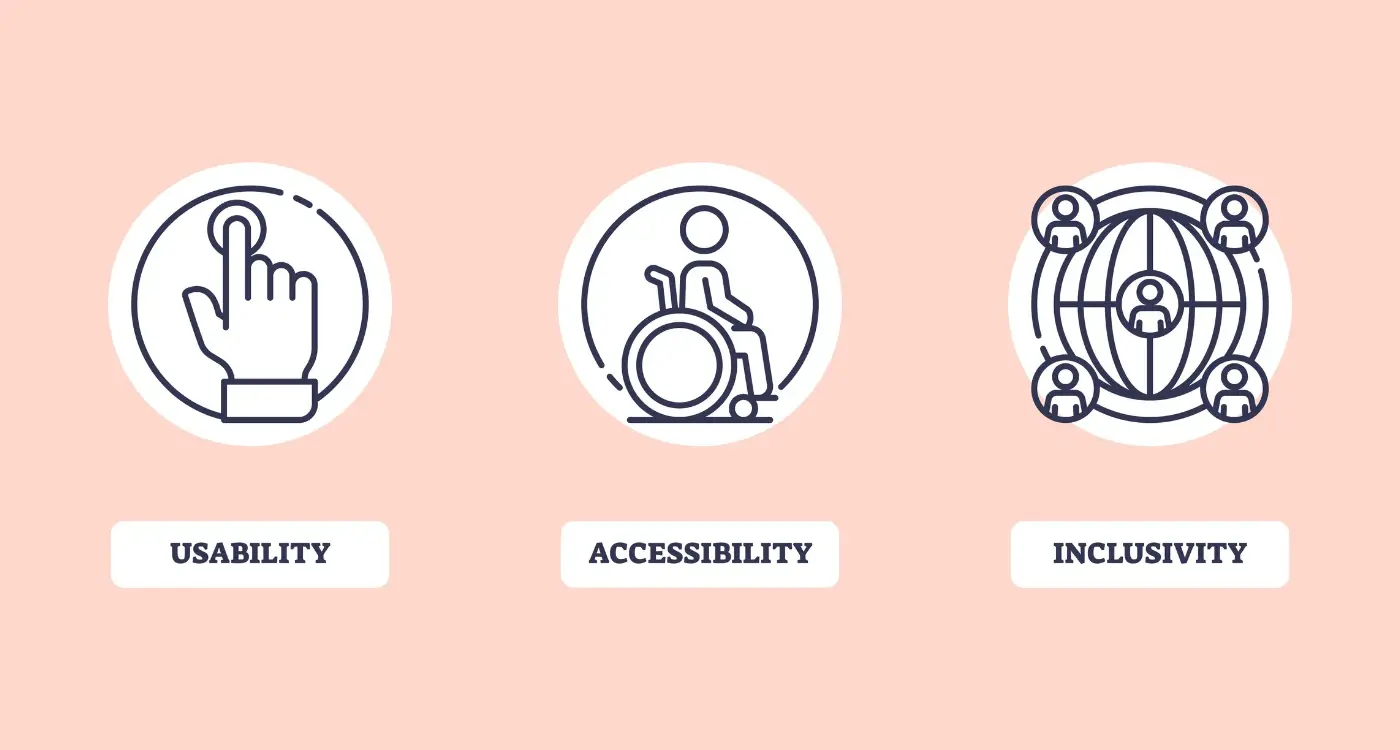
Inclusive design isn't just the right thing to do—it makes business sense too, as accessible features often improve the experience for everyone
What I find fascinating is how inclusive design benefits everyone, not just users with disabilities. Those captions you add for deaf users? They help people watching videos in noisy environments or quiet libraries. Voice controls designed for users with motor impairments? Perfect when your hands are full with shopping bags. The high contrast modes for users with low vision? Brilliant for anyone trying to read their phone in bright sunlight. This guide will walk you through everything you need to know about making your mobile app work for all users—from understanding common barriers to implementing practical solutions that actually work.
Understanding Mobile App Accessibility And Why It Matters
Mobile app accessibility means making sure your app works for everyone—including people with disabilities. This isn't just about being nice; it's about creating apps that millions of people can actually use. When we talk about disabilities, we mean things like vision problems, hearing difficulties, trouble moving their hands, or challenges with learning and thinking.
Here's the thing that many app developers don't realise: accessibility features help everyone, not just people with disabilities. Those captions you add for deaf users? They're brilliant for people watching videos in noisy coffee shops. Voice commands designed for people who can't use touchscreens? Perfect for when you're driving or cooking dinner with messy hands.
The Numbers Tell A Story
Around 15% of the world's population lives with some form of disability. That's over one billion people who might struggle to use your app if you haven't thought about accessibility. From a business perspective—and I know this sounds harsh—you're potentially losing a huge chunk of your audience before they even get started.
But there's more to it than numbers. When you build accessible apps, you're solving real problems for real people. Someone with low vision should be able to book a taxi just as easily as anyone else. A person who's deaf shouldn't miss out on social media because your app doesn't support captions.
It's Getting Easier (And More Important)
The good news is that both Apple and Google have built loads of accessibility tools into their platforms. Screen readers, voice control, high contrast modes—they're all there waiting for you to support them properly. Plus, many countries now have laws requiring digital accessibility, so this isn't optional anymore.
Common Barriers That Block Users From Accessing Mobile Apps
When we build mobile apps, we often forget that not everyone interacts with their phone in the same way. Some people can't see the screen clearly, others struggle with small buttons, and many rely on assistive technology to navigate their device. These aren't edge cases—we're talking about millions of users who face real barriers every day when trying to use apps.
Visual Barriers That Stop People in Their Tracks
Poor colour contrast is probably the biggest culprit here. When text blends into the background, it becomes impossible to read for people with visual impairments or colour blindness. Small text sizes create another massive hurdle; what looks fine to you might be completely unreadable to someone else. Images without alt text leave screen reader users completely in the dark about what's displayed on their screen.
Then there's the issue of relying solely on colour to convey information. If your app shows errors only in red text without any other indicator, users who can't distinguish colours will miss critical messages entirely.
Physical and Motor Challenges
Tiny tap targets make apps unusable for people with motor impairments or anyone using assistive devices. The standard recommendation is 44x44 pixels minimum—but many apps still use much smaller buttons. Complex gestures like pinch-to-zoom or multi-finger swipes can be impossible for users with limited dexterity.
Audio-only feedback presents another barrier. If your app relies on sounds to communicate important information, deaf and hard-of-hearing users will miss these cues completely. The same goes for apps that don't work properly with hearing aids or other assistive listening devices.
Start identifying barriers by using your own app with VoiceOver or TalkBack enabled—you'll be shocked at how many issues you discover within the first few minutes.
Building Apps That Work With Screen Readers And Voice Commands
Screen readers are brilliant pieces of software that read out what's on your phone screen—they're like having someone describe everything they can see. Users who are blind or have low vision rely on these tools every day, and your app needs to play nicely with them. The good news? Making this work isn't rocket science, but it does require thinking differently about how you build things.
When a screen reader encounters your app, it looks for something called semantic labels. Think of these as invisible descriptions that tell the software what each button, image, or piece of text actually does. A button that just says "Click here" is useless to someone using a screen reader—but one that says "Submit your order" tells them exactly what will happen when they tap it. Every interactive element in your app should have a clear, descriptive label that makes sense on its own.
Getting Your Code Structure Right
Screen readers navigate through apps in a logical order, usually from top to bottom and left to right. If your code is messy or your elements are arranged randomly, users will have a confusing experience as the screen reader jumps around unpredictably. Structure your content with proper headings—just like chapters in a book—so people can skip to the sections they need.
Voice Commands Need Clear Targets
Voice control works differently from screen readers but faces similar challenges. Users need to be able to say things like "tap submit button" or "open menu" and have your app respond correctly. This means every interactive element needs to be properly labelled and large enough for the system to target accurately. Voice commands also work better when your app follows standard design patterns that users already know.
Creating Visual Designs That Support All Users
Visual design in mobile apps isn't just about making things look pretty—it's about making sure everyone can actually use what you've built. I've worked on apps where the design looked fantastic but completely failed users with visual impairments, colour blindness, or cognitive differences. That's not good design; that's just decoration.
Colour contrast is your first checkpoint. Text needs to stand out clearly from its background, and this matters more than you might think. About 8% of men and 0.5% of women have some form of colour blindness, which means relying on colour alone to communicate information will leave people confused. Use high contrast ratios—aim for at least 4.5:1 for normal text and 3:1 for large text.
Text That Everyone Can Read
Font size matters enormously in mobile app design. Small text might look sleek, but it creates barriers for users with visual impairments or anyone using their phone in bright sunlight. Keep body text at 16px minimum and make sure users can increase text size through their device settings without breaking your layout.
Good visual design removes barriers rather than creating them—it opens doors instead of building walls
Icons and Visual Cues
Icons should never work alone. Pair them with text labels or provide alternative text descriptions that screen readers can announce. What seems obvious to you—like a hamburger menu icon—might not be clear to everyone using your app. Simple visual cues like button states, loading indicators, and error messages need to be obvious and understandable regardless of someone's abilities or technical knowledge.
Making Touch Controls And Navigation Easy For Everyone
When I'm designing touch controls for mobile apps, I always think about my mate who has arthritis in his hands—he struggles with tiny buttons and precise gestures that most of us take for granted. Touch controls need to work for people with limited dexterity, tremors, or those who use assistive devices like styluses or switch controls.
The golden rule here is simple: make your touch targets big enough. Apple recommends 44 pixels minimum, whilst Android suggests 48 pixels, but I'd say go bigger when you can. There's nothing worse than repeatedly missing a button because it's too small; it's frustrating for everyone, not just users with motor impairments.
Give People Space and Time
Space your interactive elements apart—cramming buttons together creates a nightmare for anyone with accuracy issues. I leave at least 8 pixels between touch targets, more if the screen real estate allows. Complex gestures like pinch-to-zoom or multi-finger swipes might look clever, but they exclude users who can only use one finger or have limited hand mobility.
Navigation That Actually Makes Sense
Your navigation should be predictable and consistent across every screen. Users with cognitive disabilities or those using assistive technology rely on patterns they can learn and remember. Keep your main navigation in the same place, use clear labels instead of cryptic icons, and provide multiple ways to reach important content.
Don't forget about timing—if your app has auto-advancing content or time limits, give users control to pause, extend, or disable these features. Some people need more time to read, understand, or interact with content, and that's perfectly normal. Even small details like accessible micro-interactions can make a huge difference to the overall user experience.
Testing Your App With Real Users Who Have Disabilities
Here's something I've learnt after years of building mobile apps—you can follow every accessibility guideline in the book, but until real people with disabilities actually use your app, you won't know if it truly works. Testing with automated tools is a good start, but they only catch obvious problems. The real test comes when someone who relies on a screen reader tries to book a taxi through your app, or when a user with motor difficulties attempts to navigate your checkout process.
Finding the right people to test your mobile app isn't as difficult as you might think. Many organisations work with people who have different disabilities and can help connect you with testers. Universities often have accessibility departments, and there are specialist agencies that focus on inclusive design testing. Some developers worry about the cost, but even testing with three to five users can reveal major issues that you'd never spot otherwise.
Start testing early in the development process, not just before launch. This saves time and money because you can fix problems whilst they're still easy to change.
What to Look For During Testing
When you're watching someone test your app, pay attention to where they get stuck or frustrated. Note if they're using assistive technology differently than you expected. Sometimes users develop workarounds that reveal design flaws you hadn't considered.
- Can users complete key tasks without help?
- Do they understand what each button does?
- Are error messages clear and helpful?
- Can they navigate back to where they started?
- Do loading times cause confusion or timeouts?
The feedback you get will be invaluable—users often suggest solutions that improve the app for everyone, not just people with disabilities. That's the beauty of inclusive design.
Meeting Legal Requirements And Accessibility Standards
When building accessible mobile apps, you need to know about the legal rules that exist to protect people with disabilities. These aren't just suggestions—they're actual laws that can get you into trouble if you ignore them. The main ones to know about are the Web Content Accessibility Guidelines (WCAG), which most countries use as their standard, and the Americans with Disabilities Act (ADA) if you're targeting users in the United States.
WCAG has three levels of compliance: A, AA, and AAA. Most apps should aim for AA compliance, which covers the most important accessibility features without being too difficult to achieve. Think of it like getting your driving licence—you need to meet the basic requirements to be allowed on the road.
Key Legal Standards You Must Follow
- WCAG 2.1 AA guidelines for web and mobile content
- Section 508 compliance for government projects in the US
- European Accessibility Act requirements for EU markets
- Disability Discrimination Act obligations in Australia
- Local accessibility laws in your target countries
The good news is that following these standards isn't just about avoiding lawsuits—it makes your app better for everyone. When you design with accessibility in mind from the start, you create cleaner interfaces, clearer navigation, and more intuitive user experiences.
Getting Your Compliance Documentation Right
You'll need to create an accessibility statement for your app that explains what you've done to make it accessible and how users can get help if they face problems. This document should be honest about any limitations whilst showing that you've made genuine efforts to include all users. Keep records of your testing, the tools you've used, and any feedback you've received from users with disabilities. Proper documentation practices ensure your development team maintains these standards throughout the project lifecycle.
Conclusion
Building an accessible mobile app isn't just about ticking boxes or following rules—it's about opening your app to millions of people who might otherwise be locked out. When you design with disabilities in mind, you're not just doing the right thing; you're making smart business sense too. More users means more success, and accessible design often makes apps better for everyone.
The truth is, accessibility doesn't have to be complicated or expensive if you build it in from the start. Screen reader support, proper colour contrast, clear navigation—these aren't fancy add-ons that slow you down. They're basic features that should be part of every mobile app from day one. I've seen too many teams try to bolt accessibility on at the end, and it never works as well as when it's baked into the design process.
Testing with real users who have disabilities will teach you more than any guideline ever could. Their feedback shows you what actually works in the real world, not just what looks good on paper. And remember, inclusive design principles benefit everyone—larger touch targets help people with shaky hands but also help everyone using their phone on a bumpy bus ride.
The legal requirements are getting stricter, but that shouldn't be your main motivation. Focus on creating genuinely usable experiences for all your users. When you do that properly, compliance with accessibility standards tends to follow naturally. Your mobile app has the potential to change someone's day—make sure it can change anyone's day, regardless of their abilities.
Share this
Subscribe To Our Learning Centre
You May Also Like
These Related Guides

How Do I Create Accessible Mobile App Interfaces?

What Is Accessibility in Mobile App Design and Why Does It Matter?


