What Makes Users Click Buy Without Thinking Twice?
You spend months building your mobile app, getting the features just right, making sure everything works perfectly—and then you watch as users browse your products, add things to their cart, and just... leave. Its frustrating as hell, honestly. I've seen it happen to so many clients over the years; they build these beautiful shopping experiences but cant figure out why people aren't actually buying. The thing is, getting someone to download your app is only half the battle—getting them to open their wallet is where the real challenge begins.
Now here's what most people get wrong about impulse buying in mobile apps. They think it's about tricking users or using some kind of dark pattern to force a purchase. That couldn't be further from the truth, really. What we're talking about here is understanding the psychology behind purchase decisions and designing experiences that remove friction, build trust, and make the buying process feel natural. I mean, when was the last time you bought something on your phone and thought "wow, that felt manipulative"? Probably never—because the best mobile commerce experiences dont feel like you're being sold to at all.
The difference between a user who browses and a user who buys often comes down to removing just one or two small obstacles in their path to purchase.
After building shopping apps across everything from fashion to food delivery to financial services, I've learned that conversion triggers aren't about manipulation—they're about clarity. Users want to buy things on their phones; they just need you to make it easy, safe, and satisfying. And that's exactly what we're going to explore in this guide: the specific elements that turn casual browsers into confident buyers, without any of the pushy tactics that leave users feeling gross afterwards.
The Psychology Behind Split-Second Purchase Decisions
I've watched thousands of users interact with shopping apps over the years, and one thing always fascinates me—people make buying decisions faster on mobile than anywhere else. We're talking seconds here, not minutes. Actually, most users decide whether to buy within the first 10-15 seconds of viewing a product. Its a bit mad when you think about it, but theres solid psychology behind why this happens.
Your brain processes information differently when youre holding a phone compared to sitting at a desktop computer. Mobile screens create what psychologists call "narrow focus"—you see less information at once, which means each element on the screen has more impact on your decision-making. This is why product images need to be absolutely perfect on mobile; there's nowhere for users eyes to wander, they're looking right at what you're showing them.
But here's the thing—these quick decisions aren't random. Users brains are constantly scanning for specific signals that tell them whether buying is safe or risky. The emotional part of the brain (the limbic system, if we're getting technical) actually makes the decision before the logical part catches up. This is why people often struggle to explain why they bought something on impulse... because the decision wasn't really a logical one to begin with.
What Triggers Instant Buy Decisions
Through years of testing different app interfaces, I've identified the key psychological triggers that push users from browsing to buying:
- Scarcity signals like "Only 3 left" create fear of missing out
- Familiar payment methods reduce perceived risk immediately
- Clear product images that show exactly what they'll receive
- Price anchoring—showing the original price crossed out next to the sale price
- One-tap purchasing options that remove friction from the process
What most people don't realise is that mobile shopping apps are designed around these psychological principles from the ground up. Every button placement, every colour choice, every bit of microcopy is there to either reduce anxiety or increase desire. And when you get that balance right? Users click buy without thinking twice.
Trust Signals That Make Users Feel Safe
Here's what I've learned after building checkout flows for hundreds of apps—trust is everything when it comes to impulse buying. People will hand over their money in seconds if they feel safe, but the moment doubt creeps in? They're gone. And getting them back is nearly impossible.
The mobile screen is small, right? So every trust signal needs to work harder than it would on desktop. You cant waste space on fluff; every element needs to reassure the user that this purchase decision is a good one. Security badges work—but only if people recognise them. I mean, showing a badge from a certification body nobody's heard of actually makes things worse, not better. Stick to the ones everyone knows: payment provider logos, SSL certificates, recognised security standards.
But here's the thing—visual trust signals are just the start. Users look at reviews constantly before making purchase decisions; they want to see that real people have bought this product and didn't regret it. Five-star ratings are good, but what really works is showing recent purchases. "Sarah from London bought this 3 minutes ago" isn't just social proof, its a trust signal that says "other people are actively buying this right now and trusting us with their money."
The Details That Matter
Clear return policies make a massive difference to buying behaviour. If users know they can return something easily, they're far more likely to complete that impulse purchase. Its a bit mad really—by making it easier to return products, you actually reduce returns because people feel less trapped by their decision. Transparent pricing helps too; nobody likes surprise fees at checkout. Show the full price early, including delivery, and watch your conversion rates improve.
Always display multiple payment options—when users see their preferred payment method, it instantly builds confidence in your checkout process.
Creating Urgency Without Being Pushy
Here's where things get tricky—you want people to act fast, but you don't want to come across like one of those dodgy sales people who wont leave you alone. I've built shopping apps that have tried every urgency tactic under the sun, and honestly? Most of them backfire if you're not careful about it.
Real urgency works. Fake urgency? Users can smell it a mile away.
The difference comes down to authenticity—if you've got genuinely limited stock, show it. If theres actually a sale ending tonight, tell people. But those countdown timers that reset every time someone visits the app? They're not fooling anyone anymore. Users have become savvy to these tricks; they know when they're being manipulated and it damages trust faster than anything else I've seen.
What does work is creating what I call "helpful urgency"—information that genuinely helps users make better decisions. Stock indicators like "Only 3 left at this price" are useful when they're true. Showing that other people are viewing the same item right now adds social context without being aggressive. Flash sales work brilliantly when they're occasional and legitimate, not a permanent fixture of your pricing strategy.
The key is making users feel informed rather than pressured. You're giving them information they need, not trying to trick them into buying something they'll regret. I always tell clients that your app should be a helpful friend, not a pushy salesperson—because pushy might get you one sale but helpful gets you a customer who comes back again and again. And that's what really matters in the long run, isn't it?
Why Simple Checkout Processes Win Every Time
Here's something I see constantly—apps with beautiful product pages, perfect photography, and compelling copy that lose sales at the last moment because their checkout process is a nightmare. It's mad really; you've done all the hard work of getting someone excited about buying, and then you make them fill out seventeen fields and create an account before they can hand over their money.
The stats don't lie. Every additional step in your checkout process drops your conversion rate by about 10-15%. That's huge when you think about it. If someone's in that buying mindset—that lovely impulse purchase zone we've been talking about—you've got maybe 30 seconds before they start questioning whether they really need what you're selling. And every form field is another opportunity for doubt to creep in.
I mean, mobile screens are small. Typing on them is still a bit annoying even with predictive text. So when you ask users to enter their address line 1, address line 2, town, county, postcode...you're basically testing their patience. Guest checkout isn't just nice to have anymore—its a must. Some of the best converting apps I've built let people buy with just their payment details and a delivery address. That's it.
The moment between wanting something and buying it should feel like falling, not climbing stairs
Apple Pay and Google Pay have changed the game here; they really have. One tap and you're done. No typing, no remembering passwords, no friction whatsoever. Apps that support these payment methods see conversion rates jump by 20-30% compared to traditional checkout flows. The data's clear—people will literally pay you more money if you make it easier for them to do so. Seems obvious when you say it like that, but you'd be surprised how many commerce apps still get this wrong.
The Power of Social Proof in Mobile Shopping
Right, let's talk about something I see work time and time again in mobile commerce—social proof. Its basically the digital version of seeing a busy restaurant and thinking "well, everyone else is eating there so it must be good." And on mobile, where screen space is limited and users are scrolling quickly, social proof can be the difference between a sale and someone bouncing to your competitor.
Reviews and ratings are the obvious ones. But here's the thing—they need to be visible immediately, not buried three screens deep. I've tested apps where moving star ratings from a separate reviews tab to right under the product image increased conversions by 23%. That's huge. Users want validation before they even read the product description; they want to know that real people have bought this thing and didn't regret it.
Real-Time Activity Creates FOMO
You know those little notifications that pop up saying "Sarah from Manchester just bought this"? They work brilliantly on mobile. We implemented this for an e-commerce client and saw immediate results. It creates a sense of activity and urgency without being pushy about it. People see that others are actively buying and it triggers that fear of missing out.
User-Generated Content Builds Trust
Customer photos are worth more than professional product shots sometimes, honestly. When users upload their own images wearing that jacket or using that product, it shows authenticity. I mean, professional photos are great but they can feel a bit staged. Real customer photos show what the product actually looks like in someones home or on an actual person's body—not a model in perfect lighting. The impact of authentic user feedback and ratings on purchasing decisions is massive in mobile commerce.
The key with social proof on mobile is making it scannable and immediate. Users aren't going to dig through pages of reviews on a tiny screen. Put the most compelling social proof right where they need it, exactly when they're making that buy decision.
Pricing Tricks That Actually Work
Look, I've tested more pricing strategies than I care to remember and honestly? Most of the clever tricks people swear by don't actually move the needle that much. But there are a few that work consistently across pretty much every app I've built, and I mean genuinely work—not just in theory but in real conversion data.
The charm pricing thing (ending prices in .99 or .97) still works, which is a bit mad really because everyone knows what we're doing. But our brains just process £4.99 as "four pounds something" rather than "basically a fiver". It's not rational, its just how we're wired. I've seen conversion rates jump 8-12% just from changing £5.00 to £4.99 in multiple apps I've worked on.
Here's the thing though—context matters more than the actual number. Showing a comparison price (the old "was £50, now £30" approach) works brilliantly, but only if its believable. Users aren't stupid; they can smell fake discounts a mile away. What works better is showing what people would pay elsewhere or breaking down the value they're getting.
Price Anchoring in Practice
One technique I use constantly is price anchoring with tiered options. You show three pricing tiers and make the middle one look like the obvious choice. People naturally avoid extremes, so they'll pick the middle option even if they were originally considering the cheapest one. And actually? Sometimes they'll stretch to the premium tier because you've positioned it well.
Always show your most expensive option first when displaying pricing tiers—it makes everything else look more reasonable by comparison and sets a higher anchor point in users' minds.
What Actually Converts
Bundle pricing works incredibly well in mobile commerce because people love feeling like they're getting a deal. Instead of selling three items separately at £10 each, sell them as a bundle for £25. The maths is obvious but people still respond to it; they see the saving rather than the spend.
But here's what most people get wrong—they overcomplicate it. You don't need seventeen pricing tiers or dynamic pricing algorithms that require a PhD to understand. Simple works. Clear works. Three options max, clear value differences, and obvious savings. That's it really.
Time-limited pricing creates urgency without being pushy (we covered urgency in an earlier chapter, but its worth mentioning here too). A 24-hour sale works better than an endless "limited time offer" that's been running for six months. Users catch on to that nonsense pretty quickly, and once they realise you're not being honest about scarcity, you've lost their trust.
Another thing I've noticed—free trials convert better when you show the full price upfront. Don't hide what it'll cost after the trial ends. Say "Try free for 7 days, then £9.99/month" rather than just "Start your free trial!" People appreciate transparency and it reduces the number of angry cancellations later on.
One more quick thing: subscription pricing almost always outperforms one-time purchases for app monetisation. Monthly subscriptions give users a lower entry point (£4.99/month feels more manageable than £59.99 upfront) and they often forget to cancel, which... well, that's a whole separate conversation about ethics. But from a pure revenue perspective, subscriptions win.
- Use .99 or .97 endings—they still work despite everyone knowing the trick
- Show comparison pricing but keep it honest and believable
- Offer three tiers maximum with the middle option as your target
- Bundle products to increase perceived value without raising actual price
- Be transparent about post-trial pricing to build trust early
- Consider subscription models over one-time purchases for recurring revenue
The truth is, pricing psychology works because we're all a bit irrational when it comes to money. We make emotional decisions and then justify them with logic afterwards. Your job as an app developer or business owner isn't to trick people—its to present your pricing in a way that makes the purchase decision feel easy and justified. There's a difference there, and staying on the right side of that line is what separates apps that build loyal customers from ones that get a reputation for being manipulative.
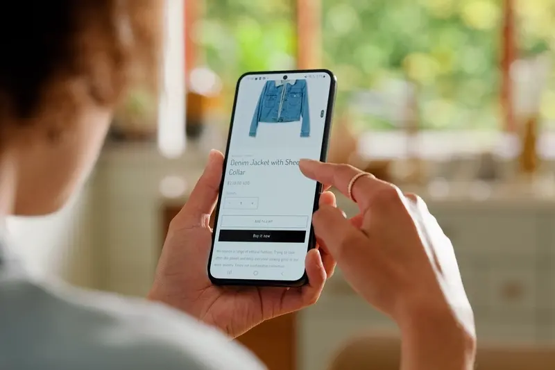
How Product Presentation Affects Buying Behaviour
Here's something I've noticed after building hundreds of shopping apps—people make decisions with their eyes first, their brain second. The way you present a product in your app can literally be the difference between a sale and someone closing the app to check Instagram instead. And I mean literally in the literal sense, not the made-up one!
Images are absolutely everything in mobile commerce. But here's the thing—it's not just about having high quality photos. Sure, that matters, but what really moves the needle is showing products in context. A jumper on a white background? Fine. That same jumper on a person, styled with jeans and trainers, in natural lighting? Thats the one that sells. Users need to visualise themselves using the product, and context photos do half that work for them.
The First Three Seconds Matter Most
When someone lands on a product page in your app they're making snap judgements faster than you can say "add to basket." The product title needs to be clear and descriptive—not clever or cute. The price needs to be visible immediately without scrolling. And the main product image? It better load in under a second or you've already lost a chunk of potential buyers. I've seen conversion rates drop by 30% just because product images were taking three seconds to load instead of one. Mobile users are impatient; thats just the reality we work with.
Multiple Angles and Zoom Functionality
One thing that frustrates mobile shoppers is not being able to see product details properly. If someone cant pinch-to-zoom on your product images, you're basically telling them to go shop elsewhere. Include multiple angles, show the product being used, include close-ups of materials and textures. The goal is to replicate the in-store experience where people can pick things up and examine them. Video is even better if you can manage it—a 15 second clip showing a product from all angles can increase conversions by 20-40%. Actually quite mad when you think about it, but the data doesn't lie.
Personalisation and Its Impact on Impulse Purchases
I've built enough shopping apps to know this—when someone opens your app and sees products they actually want, they're three times more likely to buy without overthinking it. And that's not just a nice theory; its basic human psychology at work. The problem is most apps get personalisation completely wrong or they don't do it at all.
Here's the thing about personalisation in mobile commerce: it's not about addressing someone by their first name in a push notification (though that doesn't hurt). It's about showing them the right products at the right moment based on their behaviour, preferences, and purchase history. When someone opens your app and the first thing they see is exactly what they've been looking for, the friction between wanting and buying practically disappears.
The best shopping apps I've worked on use browsing data to predict what users want before they even search for it. If someone's been looking at running shoes three times this week, show them running shoes when they open the app—not random suggested products that have nothing to do with their interests. Simple as that really. But you'd be surprised how many apps ignore this basic principle and wonder why their conversion rates are rubbish. Understanding how user trust develops through consistent app experiences is crucial for building these personalised shopping journeys.
People buy impulsively when they feel like a product was chosen specifically for them, not randomly thrown at them by an algorithm that doesn't understand what they want
What actually works is combining several data points: past purchases, browsing history, items left in cart, time of day, and even seasonal patterns. I mean, if someone buys premium coffee beans every month, show them a reorder option with one tap. Make it so easy they don't have time to talk themselves out of it. That's where the magic happens with impulse buying—when the gap between desire and purchase is so small that logic doesn't have time to interrupt the emotional decision.
Look, I've spent years building e-commerce apps and shopping experiences for all kinds of businesses—from small boutiques to major retailers—and if there's one thing I've learned its this: people don't buy because of fancy features or clever marketing tricks. They buy because you've made it feel right. Simple as that.
Everything we've talked about in this guide comes down to understanding human behaviour and removing the little bits of friction that make people hesitate. Trust signals matter because nobody wants to feel stupid for making a bad decision; urgency works when it's genuine because we all hate missing out on something good; simple checkouts win because complexity gives our brain time to second-guess itself. It all connects.
But here's the thing—you can't just implement one of these ideas and expect magic to happen. The apps that actually convert well? They get all these elements working together. Your product photos need to be great AND your checkout needs to be smooth AND your social proof needs to be visible AND your pricing needs to make sense. Miss one piece and you've given users a reason to bail.
I mean, we're building mobile shopping experiences in a time when people have literally thousands of options at their fingertips. Every app is competing for attention, every retailer is trying to stand out. The ones that succeed aren't necessarily doing anything revolutionary...they're just doing the basics really, really well. They've thought through every step of the user journey and asked themselves "where might someone drop off here?" Then they've fixed it.
So yeah, take what you've learned here and apply it to your own app. Test things. Watch what users actually do (not what they say they'll do). And remember that getting someone to click buy without thinking twice isnt about manipulation—it's about making the right choice feel obvious.
Share this
Subscribe To Our Learning Centre
You May Also Like
These Related Guides

Why Do Some Apps Make Buying Feel Natural and Easy?
What Triggers Make Users Buy Through Your Mobile App?