Mobile commerce isn't just about putting products on a screen and hoping people will buy them—there's so much more happening behind the scenes than most people realise. After working with countless shopping apps and e-commerce platforms over the years, I've noticed something fascinating: the most successful apps aren't just the ones with the best products or the lowest prices. They're the ones that understand how people think and make decisions.
When someone opens a shopping app, their brain starts processing information in ways they don't even notice. They're influenced by colours, words, layout, timing—even the order things appear on screen. These psychological triggers are working away in the background, nudging people towards making purchases or clicking that checkout button.
The best mobile commerce experiences feel effortless to users, but they're actually the result of careful psychological design choices that guide behaviour without being pushy or manipulative
What I find really interesting is that these triggers aren't tricks or sneaky tactics—they're based on genuine human psychology and behaviour patterns. When done right, they actually make shopping easier and more enjoyable for customers whilst helping businesses grow. Throughout this guide, we'll explore the key psychological principles that drive mobile commerce success and how you can apply them ethically in your own shopping app behavioural design.
The Scarcity Effect—Why Limited Time Offers Make People Buy Now
Picture this: you're scrolling through a shopping app and see "Only 3 left in stock!" or "Sale ends in 2 hours!" Suddenly you feel this urge to buy right now, even though five minutes ago you weren't even thinking about shopping. That's the scarcity effect doing its job—and it's one of the most powerful psychological triggers we can use in mobile commerce.
The scarcity principle works because our brains are wired to value things more when they're hard to get. When something appears limited or about to disappear, we automatically assume it must be valuable. It's the same reason people queue for hours outside a new restaurant or fight over the last item on a sale rack.
Making Scarcity Work on Mobile
In mobile apps, scarcity works brilliantly because everything happens in real-time. You can show live stock counts, countdown timers, or flash sales that create genuine urgency. The key is making it feel authentic—fake scarcity backfires spectacularly when people catch on.
I've seen apps increase conversion rates by 30% just by adding honest stock counters. Users see "7 left" and suddenly that item they were thinking about becomes something they need right now. The smaller mobile screen makes these messages feel more immediate too—there's nowhere else to look, so the urgency hits harder.
Social Proof—How Reviews and Ratings Drive Mobile Sales
I've watched thousands of people shop on mobile apps over the years, and there's one behaviour that shows up time and time again—people scroll straight to the reviews. It doesn't matter if it's a £5 phone case or a £500 jacket; shoppers want to know what others think before they buy. This isn't just curiosity; it's one of the most powerful forces in mobile commerce.
Reviews and ratings work because they solve a big problem for mobile shoppers. When you're buying something on a small screen, you can't touch it, smell it, or try it on. You're making decisions based on photos and descriptions alone, which feels risky. But when you see that 847 other people bought the same item and loved it? That risk suddenly feels much smaller.
The Magic Numbers That Convert
Not all reviews are created equal when it comes to driving sales. Products with ratings between 4.2 and 4.5 stars often perform better than those with perfect 5-star ratings—shoppers find them more believable. A few negative reviews mixed in with positive ones actually builds trust; it shows the reviews are real.
Place your highest-rated products prominently on your homepage and category pages. Mobile users make quick decisions, so leading with social proof helps them choose faster.
The key is making reviews easy to find and read on mobile screens. Short, specific reviews with photos work better than long paragraphs that require endless scrolling. This is why developing a mobile shopping app with intuitive review features is crucial for conversion success.
The Power of Personalisation—Making Every Shopper Feel Special
I'll be honest with you—personalisation in mobile commerce isn't just a nice-to-have feature anymore, it's what separates the apps that thrive from those that get deleted after a few uses. After building countless shopping apps over the years, I've watched customers light up when an app seems to "get" them; when it shows them exactly what they want without endless scrolling and searching.
Why Our Brains Love Personal Attention
Here's the thing about personalisation—it taps into something really basic about how we think. When someone uses our name or remembers what we like, our brain releases happy chemicals called dopamine. It's the same feeling you get when a shopkeeper remembers your usual order. Mobile apps can do this too, but they can remember much more than any human ever could.
The shift towards personalised experiences shows how mobile apps are changing business operations, allowing companies to build deeper relationships with customers than ever before.
Simple Ways to Make Shopping Feel Personal
The best personalisation doesn't feel clever or flashy—it just works. Showing products based on what someone bought before, sending push notifications about sales on items they've looked at, or even just greeting them by name when they open the app. These small touches make people feel seen and understood, which makes them want to keep coming back and buying more.
Anchoring Bias—How Price Positioning Influences Purchase Decisions
Picture this: you open a shopping app and see a jumper priced at £200, then scroll down to find another one for £80. Suddenly that £80 jumper feels like a bargain, doesn't it? That's anchoring bias at work—our brains grab onto the first price we see and use it as a reference point for everything else.
In mobile commerce, smart retailers position their most expensive items first. Not because they expect everyone to buy them, but because they make everything else look reasonably priced. I've watched this play out in countless e-commerce app projects over the years. When clients rearrange their product listings to show premium options first, their average order values almost always go up.
The Three-Tier Trap
You've probably noticed how subscription apps offer three pricing tiers. The expensive one at the top? That's your anchor. Most people won't choose it, but it makes the middle option—which is exactly what the company wants you to pick—seem perfectly reasonable.
The first price customers see becomes their internal measuring stick for everything that follows
Shopping app behavioural design exploits this beautifully. Strike-through prices, "compare at" labels, and premium product carousels all serve the same purpose: they set high anchors that make your actual purchase feel smart rather than expensive. It's not manipulation—it's understanding how our brains naturally process pricing information. This is particularly important when developing an app for high-end retail, where price positioning directly impacts brand perception.
Loss Aversion—Why Fear of Missing Out Works So Well
People hate losing things more than they like gaining them—it's just how our brains work. I've watched countless users abandon their shopping carts only to come rushing back when they see a "Your items are almost gone!" notification pop up on their phone. That's loss aversion in action, and it's one of the most powerful psychological triggers we can use in mobile commerce.
The Fear Factor
When someone sees "Only 2 left in stock" or "Sale ends in 30 minutes", their brain shifts into panic mode. They start imagining how annoyed they'll be if they miss out. This fear of missing out—or FOMO as the marketing crowd calls it—makes people act fast. Much faster than they would if we just said "Buy now and save money!"
Making It Work on Mobile
The trick is being genuine about it. Fake countdown timers and made-up stock levels will backfire spectacularly when people catch on—and they always do. Instead, show real information about limited quantities or genuine time-sensitive offers. Push notifications work brilliantly here too; a well-timed message about an abandoned cart or expiring discount can turn a maybe into a definite yes. Just don't overdo it—nobody likes feeling manipulated, even when the psychology works.
The Commitment Principle—Getting Customers to Follow Through
Here's something I've noticed after years of building mobile commerce apps—people love making promises to themselves, but they're terrible at keeping them. That shopping cart full of items? Abandoned. That wishlist they spent ages curating? Forgotten. The subscription they signed up for during a free trial? Cancelled before the first payment.
But here's where it gets interesting. When people make a small commitment first, they're much more likely to follow through with bigger actions later. This is the commitment principle in action, and it's pure psychological gold for shopping app behavioural design.
Start Small, Think Big
The best e-commerce app triggers work by getting users to take tiny steps first. Ask them to create a wishlist before they buy anything. Get them to set up their profile completely. Have them choose their preferences during onboarding. Each small action creates a sense of investment—they've put effort in, so they're more likely to continue.
I've seen apps increase conversion rates by 40% just by adding a simple "Save for Later" button that required users to create an account first. Once they'd made that micro-commitment, they felt obligated to complete their purchase. Understanding why ignoring mobile will cost you sales is crucial here—these commitment techniques only work when properly implemented in mobile-first experiences.
Add progress bars to your checkout process. When users see they're "2 of 3 steps complete," they'll push through to finish rather than abandon their cart.
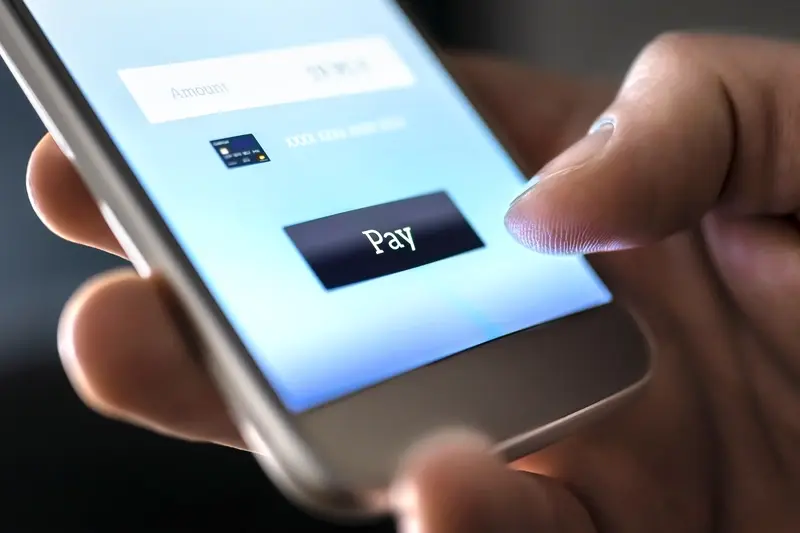
Instant Gratification—The Psychology of One-Click Purchasing
We live in an age where people expect everything right now. I mean, really right now—not tomorrow, not in an hour, but this very second. When someone wants to buy something on their phone, they don't want to fill out lengthy forms or create accounts or remember passwords. They just want to tap once and be done with it.
One-click purchasing works because it removes what we call friction from the buying process. Every extra step you add between "I want this" and "I own this" gives people a chance to change their minds. Think about it—how many times have you abandoned a purchase online because the checkout process was too complicated? Amazon figured this out years ago with their one-click patent, and it made them billions.
The Science Behind the Speed
Our brains are wired to seek rewards quickly. When we see something we want and can get it instantly, we release dopamine—the same chemical that makes us feel good when we eat chocolate or get likes on social media. The longer the delay between wanting and getting, the more time our rational brain has to kick in and talk us out of the purchase.
This instant gratification trend demonstrates how developing a luxury retail app improves ROI by meeting customers' expectations for seamless, immediate purchasing experiences.
Making It Work in Your App
The key is storing payment methods securely and making the buying process feel effortless. Face ID, fingerprint scanning, and mobile wallets like Apple Pay all tap into this desire for instant satisfaction whilst keeping things secure.
Conclusion
After working on hundreds of mobile commerce projects, I can tell you that the apps which succeed aren't just the ones with pretty interfaces—they're the ones that understand how people's minds work. The psychological triggers we've covered aren't tricks or manipulation; they're ways to make shopping genuinely easier and more enjoyable for your customers.
What I find fascinating is how these principles work together. You might use scarcity to create urgency, then combine it with social proof to build trust, and finish with one-click purchasing for instant gratification. The magic happens when these elements feel natural rather than forced—nobody likes feeling pushed into a purchase, but everyone appreciates an app that seems to understand what they want.
The best mobile commerce apps I've helped create don't use every single trigger we've discussed. Instead, they pick the ones that make sense for their customers and their products. A luxury brand might focus on personalisation and anchoring bias, while a flash sale app might lean heavily on scarcity and loss aversion. The key is testing what works for your specific audience and refining from there.
Shopping app behavioural design isn't about getting people to buy things they don't want—it's about removing the barriers that stop them from buying things they do want. When you get that balance right, everyone wins.