Why Do Some Apps Make Buying Feel Natural and Easy?
I've spent years watching people abandon shopping carts on mobile apps, and its honestly one of the most frustrating things to witness—especially when you know the customer actually wants what they're buying. The problem isn't that people don't want to spend money on their phones; they absolutely do. Mobile commerce is massive now. But here's the thing—most apps make it unnecessarily difficult to hand over your money, and that's costing businesses millions in lost revenue every single day.
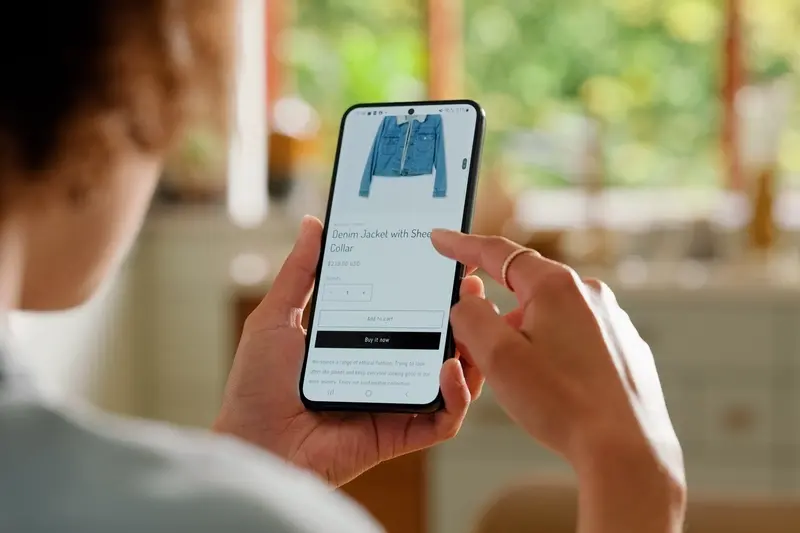
You know what? The best checkout experiences are the ones you barely notice. They happen so smoothly that you don't even remember completing them. You wanted something, you tapped a few buttons, and suddenly its on its way to your door. That's the goal we should all be aiming for. But getting there requires understanding how people actually think when they're about to make a purchase on their phone... and more importantly, what makes them stop halfway through.
The difference between a sale and an abandoned cart often comes down to seconds—literally how long it takes someone to complete your checkout flow before they get distracted or frustrated.
I mean, think about your own behaviour for a second. When was the last time you abandoned a purchase on your phone? Was it because you didn't want the product anymore, or was it because the app asked you to create an account, or fill in twenty form fields, or worse—made you type in a long card number on a tiny keyboard? The truth is that buying on mobile requires a completely different approach to desktop; what works on a big screen with a mouse and keyboard falls apart when someone's using their thumb whilst sitting on the bus. And that's exactly what we need to understand if we want to build apps where buying feels natural and easy.
Understanding How People Actually Buy Things on Their Phone
Right, so here's what I've noticed after years of building commerce apps—people on their phones are basically shopping with one hand whilst doing something else. They're on the bus, they're waiting for a coffee, they're half-watching telly. This changes everything about how they buy things; it really does.
Mobile shopping isn't just desktop shopping on a smaller screen (though a lot of businesses still treat it that way, which is mad). When someone's on their phone, they've got about three minutes of attention at most before they get distracted or their stop comes up or whatever. And here's the thing—if your checkout takes longer than that? They're gone. They'll add stuff to their basket and then just... never come back. I've seen cart abandonment rates of 85% on mobile apps that make people jump through too many hoops.
The best apps I've worked on understand that mobile buyers want speed over everything else. They don't want to type. They don't want multiple screens. They definitely don't want to create an account before they can see the checkout. Actually, forcing account creation before purchase is one of the biggest conversion killers I see, and businesses keep doing it because they want that customer data. But you know what? Dead users don't buy things.
What Mobile Buyers Are Actually Doing
When someone decides to buy on their phone, its usually an impulse decision made in a small window of time. They might have been thinking about the product for ages, sure, but the actual moment of purchase happens fast. This means:
- They want to complete checkout in under 60 seconds if possible
- They'll use saved payment details every single time theyre available
- They hate typing their address—autocomplete is basically expected now
- They need to see exactly what they're paying before they commit
- Any unexpected costs at checkout will make them bounce immediately
The apps that get this right treat mobile checkout like its own separate thing, not just a responsive version of their website checkout. They remove fields, they pre-fill everything they can, and they make the "buy now" button impossible to miss. Because mobile buyers aren't browsing leisurely—they're buying quickly or they're not buying at all.
What Makes Someone Trust an App Enough to Enter Their Card Details
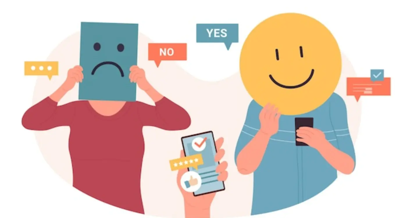
Trust is bloody tricky to build in mobile commerce;it takes ages to earn but can disappear in seconds. I've seen apps with beautiful designs and perfect functionality lose customers at checkout simply because something felt off. And here's the thing—people can't always tell you why they didn't trust your app enough to buy. They just... don't.
The basics matter more than you'd think. SSL certificates, padlock icons, clear privacy policies—these aren't just nice-to-haves anymore, they're table stakes. But I mean, even with all the security badges in the world, if your app looks like it was built in someone's garage (and not in a cool startup way), people will hesitate. Visual polish communicates competence, and competence builds confidence. Understanding how apps keep your money safe when you pay is crucial for building that essential trust with your users.
Social Proof Makes People Feel Safe
Reviews and ratings are massive trust signals—probably the biggest ones we have at our disposal. When users see that thousands of other people have successfully bought from your app and lived to tell the tale, its like getting permission to trust you. I always recommend showing review counts prominently, especially near checkout. Real customer photos help too; they make your app feel like a real business with real people behind it.
Transparency About Everything
People want to know exactly what they're paying for and when it'll arrive. Hidden fees that appear at checkout? That's how you destroy trust instantly. Unclear delivery timeframes? Same problem. The apps that convert best are the ones that are almost annoyingly clear about costs, timeframes, and policies from the very start. No surprises means no anxiety, and reducing anxiety is half the battle in mobile commerce.
Show recognised payment provider logos (Visa, Mastercard, PayPal) at checkout—people trust these brands, and that trust transfers to your app by association.
Your return policy needs to be easy to find and actually reasonable. If returning something feels like it'll be a nightmare, people won't risk the purchase in the first place. I've worked with clients who improved conversion rates by simply making their returns process more visible and generous.
The Real Reason Most Checkout Flows Lose Half Their Customers
Right, lets talk about the bit that really hurts—watching people abandon their carts right at the finish line. I've built checkout flows for all sorts of apps over the years and the pattern is always the same; you get people excited about your product, they add items to their basket, they're ready to buy and then... they disappear. Just like that.
Here's what actually happens (and this is based on real data from apps I've worked on): most people don't leave because they changed their mind about buying. They leave because the checkout process itself creates friction at the exact moment when friction is most damaging. Its like asking someone to fill out a job application when all they wanted to do was buy a pair of trainers.
The biggest culprit? Form fields. Too many of them. Every additional field you add to your checkout drops your conversion rate by roughly 5-10%. I mean, think about it from the users perspective—they're standing on the bus or sitting on the sofa, using one thumb to navigate, and you're asking them to type out their full address including postcode, then their card number, then the expiry date, then the security code, then their billing address if its different... bloody hell, no wonder they give up!
The Three Main Friction Points
Through testing hundreds of checkout flows, I've found three places where people consistently drop off:
- Having to create an account before purchasing—this single requirement can kill 30% of your conversions right away
- Poor mobile keyboard handling where the app doesn't automatically switch between text and number keyboards based on what field you're in
- Unclear shipping costs that only appear at the final step, making people feel tricked or surprised by the total
- Payment forms that don't save any details, forcing users to re-enter everything each time they buy
- Error messages that don't clearly explain whats wrong or how to fix it
What The Data Actually Shows
Apps that reduce their checkout to three screens or fewer see completion rates that are 2-3 times higher than apps with longer flows. But heres the thing—it's not just about the number of screens, its about the perceived effort required. If someone sees a form with 15 fields on one screen, that feels harder than three screens with five fields each, even though its the same amount of work.
Another pattern I've noticed: error handling makes or breaks the experience. When someone enters their card details wrong and your app just shows a generic "payment failed" message, they're done. They won't try again. But if you specifically say "the expiry date format should be MM/YY" or "this card type isn't accepted, please try another", conversion rates jump significantly because you've removed the mystery.
How Top Apps Remove Every Tiny Obstacle Between Wanting and Buying
The best apps I've worked on don't just make buying easy—they make it feel like its barely happening at all. Every extra tap, every unnecessary field, every moment of confusion is a chance for someone to change their mind and close the app. And here's the thing: most people don't need much of an excuse to abandon a purchase on their phone.
I've seen checkout flows that ask for twelve different pieces of information when they really only need five. Why? Because nobody bothered to question whether the marketing department actually needed that postal code for their newsletter or if the warehouse genuinely required a phone number for every delivery. Each field you add drops your conversion rate by a measurable amount—I'm talking 5-10% sometimes, which is bloody mad when you think about it.
The apps that get this right focus obsessively on reducing steps. They pre-fill everything they can. They remember your address from last time. They dont make you re-enter your card details every single purchase. Uber does this brilliantly; you request a ride and it just happens, the payment is so invisible you barely register it. That's not an accident—thats hundreds of hours of testing and refinement to remove every possible friction point.
Every extra second between wanting something and owning it is a second where doubt creeps in and wallets stay closed
Smart apps also show progress. People want to know they're three steps away from finishing, not stuck in some endless loop of forms. A simple progress bar or step indicator ("2 of 3") makes a genuine difference because it sets expectations. And they make buttons obvious—none of this tiny grey text that looks like a link when you need a big clear "Continue" button that screams "tap me."
Error handling matters too. If someone enters their card number wrong, dont make them re-enter their entire address as well. Just highlight the problem field and let them fix that one thing. The best apps I've built treat errors like helpful corrections, not punishments.
Why Payment Methods and Delivery Options Matter More Than You Think
Look, I'll be honest with you—most app developers obsess over design and features but completely overlook the payment methods they offer. Its a massive mistake. I've seen apps with beautiful interfaces and clever functionality fail because they only accepted one type of payment, or worse, made users choose from confusing delivery options that felt like homework.
Here's the thing; people have their preferred ways to pay and if you dont support them, they'll just leave. Simple as that. Some folks love Apple Pay because its quick and they dont need to dig out their wallet. Others prefer PayPal because they trust it more than giving their card details directly. And in certain markets? Digital wallets like Google Pay are king. The apps that convert best typically offer at least three or four payment options—not because they're trying to be fancy, but because they understand their users actually come from different backgrounds and have different comfort levels with secure payment processing.
Delivery options work the same way. I mean, think about it from your own experience; sometimes you need something tomorrow and you're willing to pay extra for it. Other times you're happy to wait a week if it saves you a few quid. But if an app only offers standard delivery with no other choices? You feel trapped... like you dont have control over your own purchase. That feeling kills conversions faster than almost anything else.
The apps that nail this part give users real choices without overwhelming them. Two or three clear delivery options, each with honest timeframes and costs shown upfront. No surprises at the last second. No hidden fees that suddenly appear. Just straightforward options that let people pick what works for their situation, and crucially, their budget.
The Psychology Behind One-Tap Purchases and Saved Details
There's a reason why people spend more money when they save their payment details—and it's not just about convenience. When you reduce the friction between wanting something and actually buying it, you remove the moments where people can talk themselves out of a purchase. Its simple really; every extra tap, every form field, every moment of hesitation is an opportunity for someone to think "do I really need this?" and close your app.
I've watched user behaviour on hundreds of checkout flows over the years, and the data is pretty clear—people who save their payment details spend roughly 30-40% more than those who enter their card every time. But here's the thing; its not because they're being tricked or manipulated. They're simply able to act on their genuine purchase intent without the process getting in the way. Think about Amazon's one-click buying...it works because the psychological weight of entering card details is completely removed.
The human brain treats saved payment information differently to manual entry. When you have to type in your card number, expiry date, and CVV, you're forced to engage with the financial reality of what you're doing. You see the numbers. You think about your bank account. But when its already saved? The purchase feels more like a decision than a transaction. And that's a massive difference in how people perceive spending.
Don't just save payment details—save delivery addresses and preferences too. The more you can remember about a user, the less work they have to do, and the more likely they are to complete their purchase without second-guessing themselves.
I always tell clients that one-tap purchasing isn't about making people spend money they shouldn't...its about removing barriers for people who've already decided they want to buy. The psychology is straightforward; when the buying process takes effort, people abandon. When it feels natural and easy, they follow through on their genuine intent. That's why apps like Uber and Deliveroo have been so successful—they understood early on that saved details aren't just convenient, they're a fundamental part of creating a purchase flow that respects how people actually make decisions on mobile devices.
Testing and Improving Your Checkout Without Annoying Your Users
Right, so you've built your checkout flow—but here's where most developers get it wrong. They either test nothing and hope for the best, or they run so many A/B tests that users feel like lab rats. I mean, there's definitely a middle ground here.
The truth is, you need data to know what's actually happening in your checkout. Not what you think is happening. Its one thing to believe your flow is smooth; its another to see that 60% of people are dropping off at the delivery options screen. That's why I always implement proper analytics tracking at every single step. Every tap, every form field, every abandoned cart—all of it needs to be measured.
But here's the thing—you can't test everything at once. Pick one element that you suspect is causing problems and focus on that. Maybe its the button colour? Probably not, to be honest. More likely its something bigger like the number of form fields or whether you're asking for account creation too early in the process.
What Actually Needs Testing
Here are the checkout elements that genuinely affect conversion rates based on what I've seen work (and fail) across dozens of apps:
- The number of steps in your checkout process—fewer is usually better but not always
- When you ask users to create an account—during checkout is almost always a mistake
- How you display shipping costs—hiding them until the last second kills conversions dead
- Your error messages—vague errors frustrate people more than you'd think
- Loading times between steps—anything over 2 seconds and people start dropping off
- Payment method options—not having Apple Pay or Google Pay costs you sales
The best approach? Make small changes, measure everything, and give each test enough time to gather real data. Don't change your entire checkout based on three days worth of traffic. And whatever you do, don't test during busy periods like sales—you'll never know if the change or the traffic spike affected your results.
Building an app that makes buying feel natural isn't about fancy features or complex psychology tricks—its about understanding that every extra tap, every confusing button, every moment of hesitation is costing you money. I mean, when you strip away all the technical jargon and design theory, it really comes down to one thing: making people feel confident enough to hand over their card details and then getting out of their way.
Throughout this guide we've looked at the mechanics of frictionless checkout, from trust signals to payment options to the psychology behind saved details. But here's the thing—knowing all this means nothing if you don't actually implement it; and more importantly, if you dont test whether its working for your specific users. What works brilliantly for a fashion app might fail completely for a healthcare app, because context matters. The buying journey isn't universal.
I've built enough apps now to know that the most successful ones are constantly evolving their purchase flow based on real user behaviour, not assumptions. They're watching where people drop off, testing different approaches, and actually listening when users say something feels wrong. Sometimes the smallest change—moving a button up by 20 pixels or rewording a single line of text—can have a massive impact on conversion rates. Its a bit mad really how much these tiny details matter.
Your checkout flow is never truly finished. User expectations change, new payment methods emerge, and your audience's needs shift over time. The apps that consistently convert well are the ones treating their purchase experience as a living thing that needs regular attention...not something you build once and forget about. Start with the basics we've covered, measure everything, and keep removing friction wherever you find it.
Share this
Subscribe To Our Learning Centre
You May Also Like
These Related Guides

What Makes Users Click Buy Without Thinking Twice?
How Do You Create Dynamic Content That Adapts to User Behaviour?